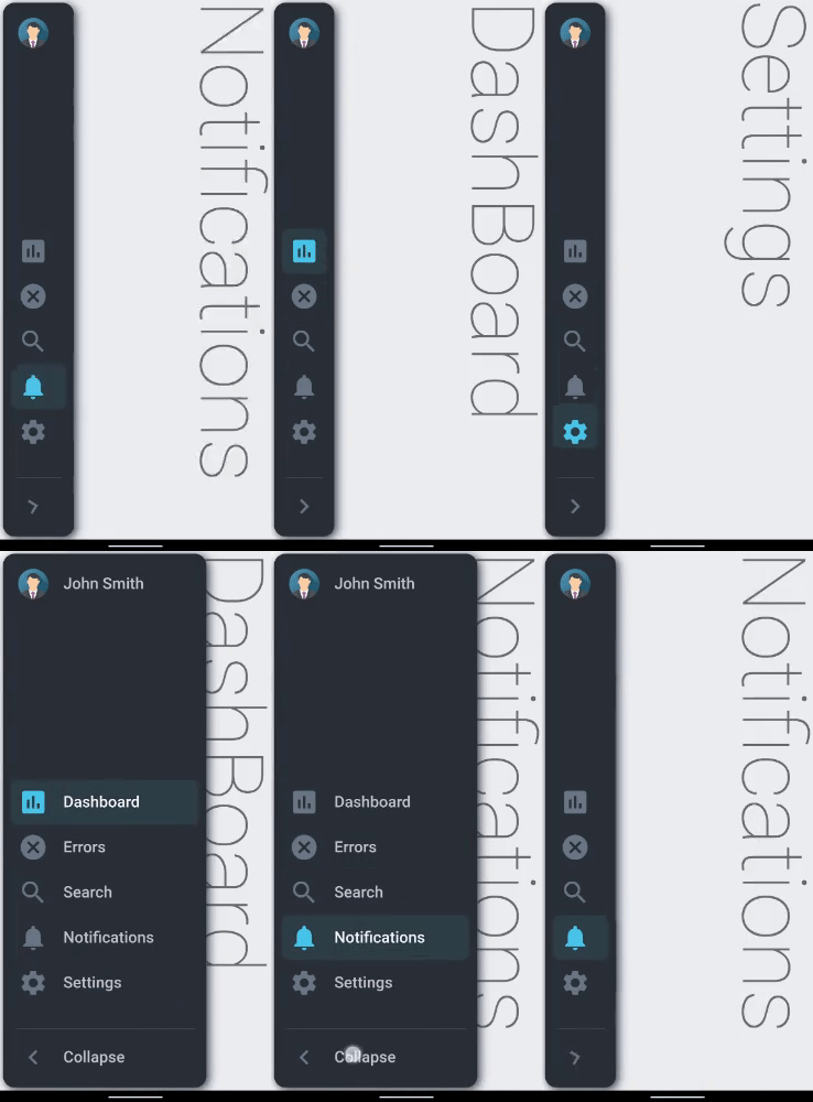
A collapsible sidebar for Flutter apps implementing the Material Design.
- Material Design
- Pre-built customizable tile widgets (CollapsibleItems)
- Smooth Animation
- Flutter Android
- Flutter iOS
- Flutter web
- Flutter desktop
- Added ability to handle lists of icons
- Added ability to apply bottom and top padding to List of icons
- Added ability to choose direction of icon tiles (top/bottom) using
fitItemsToBottomproperty. - Added ability to give custom name to toggle button
- Added ability to give custom Style to sidebar title using
titleStyleproperty. - Added ability to give custom Style to collapsible items text using
textStyleproperty. - Added ability to give custom Style to toggle button title using
toggleTitleStyleproperty. - Added support for Null-Safety. (By ⭐José Luis⭐)
- Added Mouse Region Detection on Web and ability to change Cursor type. (By ⭐TheLonelyNull⭐)
- Title Avatar picture can be replaced with custom back icon. (By ⭐TheLonelyNull⭐)
- Title Avatar clickable with custom callback function. (By ⭐TheLonelyNull⭐)
- Added ability to set Sidebar Collapsed or Expanded initially by changing the
isCollapsedparameter. - Added ability to set custom BoxShadows to the sidebar using the
sidebarBoxShadowparameter.
https://ryuukenshi.github.io/flutter_collapsible_sidebar
Note: this page is built with flutter-web. For a better user experience, please use a mobile device to open this link.
Add collapsible_sidebar: ^2.0.1+2 to your pubspec.yaml dependencies. And import it:
import 'package:collapsible_sidebar/collapsible_sidebar.dart';Simply create a CollapsibleSidebar widget and a list of CollapsibleItems suppose _items. Finally add the required parameters to CollapsibleSidebar and a body widget suppose _body which will occupy the remaining screen:
CollapsibleSidebar(
  items: _items,
  avatarImg: _avatarImg,
  title: 'John Smith',
  body: _body,
)CollapsibleSidebar(
isCollapsed: true, //true by default, set to 'false' to have the full sidebar open on initially loading the app
items: _items,
title: 'Lorem Ipsum',
titleBack: false, //false by default, set to 'true' to use a back icon instead of avatar picture
titleBackIcon: Icons.arrow_back, //the back icon is 'arrow_back' by default (customizable)
onTitleTap: () { //custom callback function called when title avatar or back icon is pressed
ScaffoldMessenger.of(context).showSnackBar(
SnackBar(content: Text('Yay! Flutter Collapsible Sidebar!')));
},
onHoverPointer: SystemMouseCursors.click, //the default hover mouse pointer is set to 'click' type by default (customizable)
textStyle: TextStyle(fontSize: 20), //custom style for sidebar title
titleStyle: TextStyle(fontSize: 20), //custom style for collapsible items text
toggleTitleStyle: TextStyle(fontSize: 20), //custom style for toggle button title
avatarImg: NetworkImage('https://www.w3schools.com/howto/img_avatar.png'),
body: _body,
height: double.infinity,
minWidth: 80,
maxWidth: 270,
borderRadius: 15,
iconSize: 40,
toggleTitle: 'Collapse', //title text of Toggle Button
toggleButtonIcon: Icons.chevron_right,
backgroundColor: Color(0xff2B3138),
selectedIconBox: Color(0xff2F4047),
selectedIconColor: Color(0xff4AC6EA),
selectedTextColor: Color(0xffF3F7F7),
unselectedIconColor: Color(0xff6A7886),
unselectedTextColor: Color(0xffC0C7D0),
duration: Duration(milliseconds: 500),
curve: Curves.fastLinearToSlowEaseIn,
screenPadding: 4,
topPadding: 0, //space between image avatar and icons
bottomPadding: 0, //space between icons and toggle button
fitItemsToBottom: true, //fit all icons to the end of the space between image avatar and toggle button
showToggleButton: true,
sidebarBoxShadow: [BoxShadow(
color: Colors.blue,
blurRadius: 10,
spreadRadius: 0.01,
offset: Offset(3, 3),
),],
//sidebarBoxShadow accepts a list<BoxShadow> just like the "BoxDecoration" parameter of a "Container". By default a black shadow is applied.
)Apache 2.0
