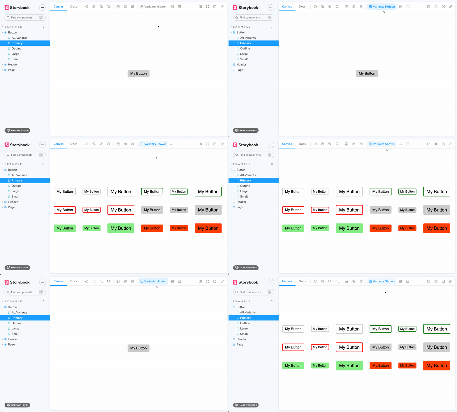
Show all variants of a component in a grid
- 📦 No extra code required for creating variants.
- 📝 Editing from Controls table and editor re-renders all variants.
npm install storybook-addon-variants// .storybook/main.js
module.exports = {
stories: [...],
addons: ["storybook-addon-variants"],
};There are two ways to do so:
- By using the toolbar button:
- By defining a parameter in your story:
// /MyComponent.stories.js

// ...rest of code omitted for brevity

// CSF2 syntax example
export const MyStory = Template.bind({})
MyStory.parameters = {
  variants: {
    enable: true
  }
};

// or CSF3 syntax example
export const MyStory = {
  parameters: {
    variants: {
      enable: true
    }
  }
};
By defining this parameter, this story will always render with all variants, regardless of what you select in the toolbar.
This method is quite useful if you want to have a fixed story that shows all variants in your sidebar. It's particularly useful for visual regression testing, when you want to take snapshots of all variants at once with tools like Chromatic.

