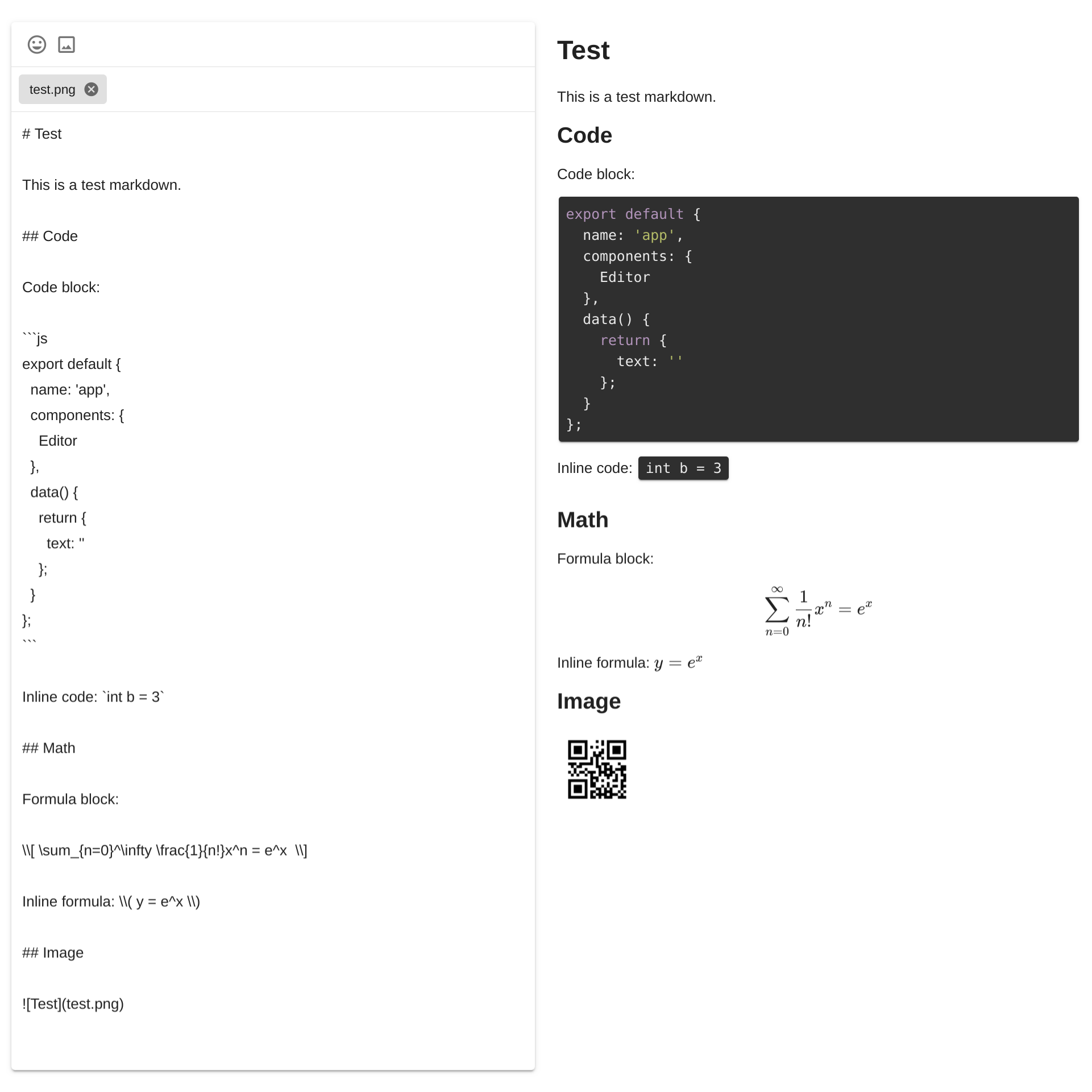
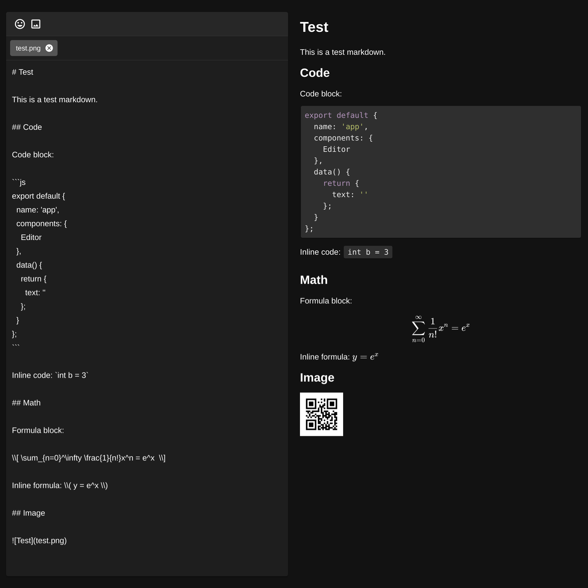
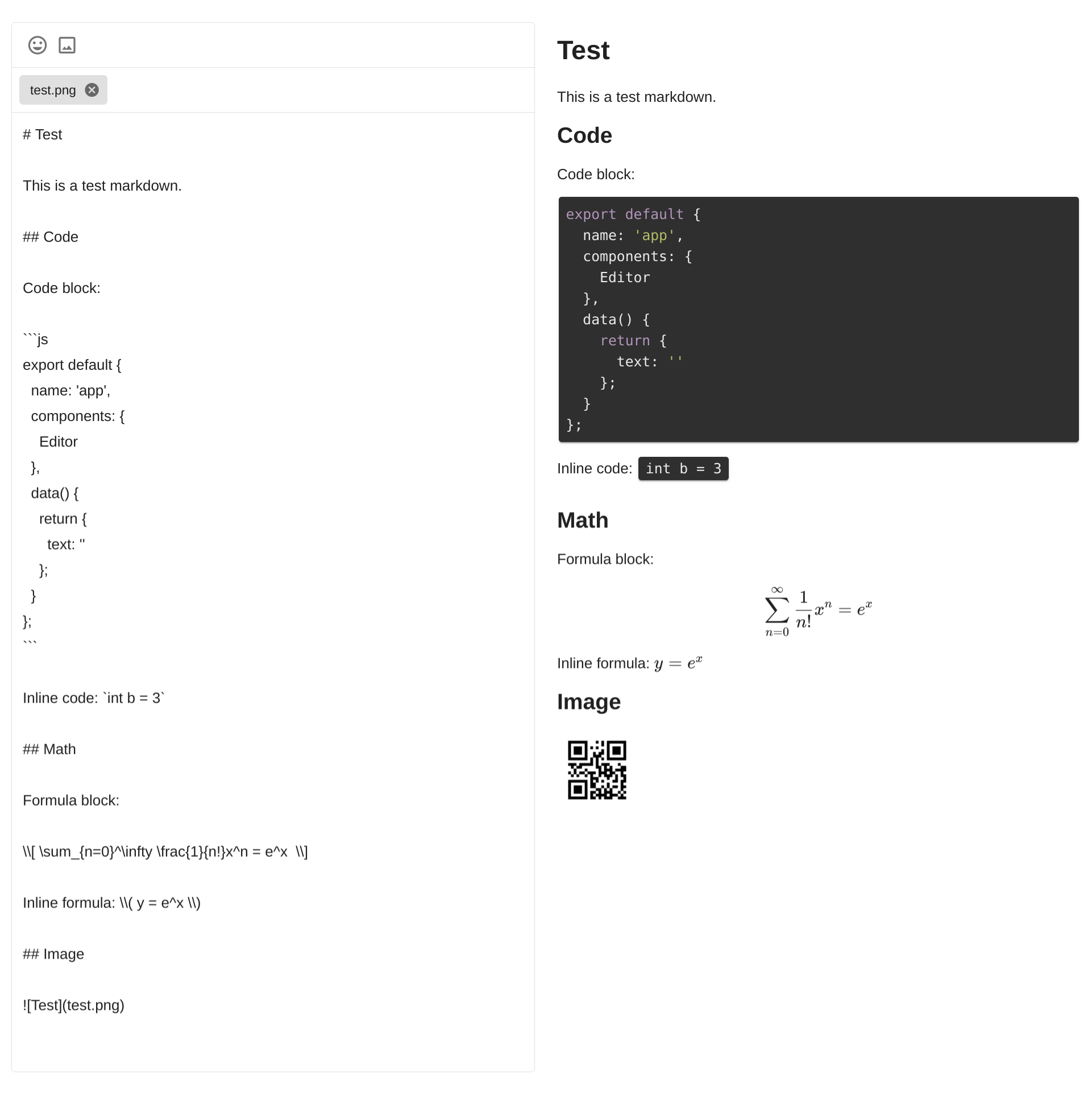
A Vue.js Component for editing and previewing markdown using Vuetify.js and markdown-it.
npm install vuetify-markdown-editor
Since this component is based on Vuetify, it is required to install and configure Vuetify. For installing Vuetify, please visit https://vuetifyjs.com/en/getting-started/quick-start.
- TypeScript support
- Solo and inline mode
- Editor-only and Editor-Preview mode
- Code highlighting
- Emoji picking
- Math formula (See markdown-it-texmath)
- Image uploading and previewing (to use uploaded image in markdown, use the filename as the link)
- Mermaid diagram rendering (use code block with language
mermaid)
- Fix SSR
- Allow to change sets of emoji
- Add typescript support
- Add copy icon
- Add viewer mode
- Fix large image
- Add self-hosted emoji images
- Add emoji rendering in rendered text
- Add more WYSIWYG functions
- Add plantuml support
This package can be used in Node.js module:
<template>
  <v-app>
    <Editor
      mode="preview"
      ref="editor"
      hint="Hint"
      :outline="false"
      :render-config="renderConfig"
      v-model="text"
    />
  </v-app>
</template>

<script>
import { Editor } from "vuetify-markdown-editor";
import { VApp } from 'vuetify/lib';

export default {
  name: "app",
  components: {
    Editor,
    VApp
  },
  data() {
    return {
      text: "",
      renderConfig: {
        // Mermaid config
        mermaid: {
          theme: "dark"
        }
      }
    };
  },
  mounted() {
    // Access properties or methods using $refs
    // this.$refs.editor.focus();
    // this.$refs.editor.upload();

    // Dark theme
    this.$vuetify.theme.dark = true;
  }
};
</script>
To show the rendered html only, use viewer mode.
To use the markdown-it renderer directly,
use createRenderer to create it.
- Editor: a vue component to edit markdown
- createRenderer: a function to create a markdown-it render
| Prop | Default | Description |
|---|---|---|
| value | '' |
String that binds to the textarea |
| mode | 'preview' |
Possible value 'editor', 'preview' or 'viewer'. When set to 'editor' or 'viewer', only the editor or viewer is displayed, while 'preview' mode displays both. |
| renderConfig | undefined |
Override default configurations |
| outline | false |
The border will be outlined instead of card style |
| color | undefined |
The outline and icon's color |
| nativeEmoji | false |
Use native emoji instead of pictures |
| emoji | true |
Enable emoji input |
| emojiSet | "apple" |
Supported emoji sets: 'apple', 'google', 'twitter', 'facebook' |
| image | true |
Enable image upload |
| fileTarget | '/' |
Image upload target uri |
| fileFilter | file => file.type.startsWith('image') |
Allow only specific files. Return true to allow, false to reject |
| baseUrl | '/' |
The baseUrl for uploaded images. Must end with a slash (mainly used in viewer mode) |
Other props that are not listed in the above table will be directly passed to v-textarea,
which enables you to set the native props in v-textarea.
{
  // markdown-it-texmath config
  texmath: undefined,
  // markdown-it-highlightjs config
  hightlightjs: undefined,
  // markdown-it-code-copy config
  codeCopy: {
    buttonClass: 'v-icon theme--dark'
  },
  // The native mermaid config
  mermaid: undefined,
  // Markdown-it config
  markdownIt: undefined
}| Method | Description |
|---|---|
| upload() | Start or resume uploading all files in list |
| pause() | Pause uploading |
| resume() | Resume uploading |
| focus() | Focus on the editor |
| Property | Description |
|---|---|
| files | Get all files in list in FlowFile format |
Clone this repository, and then run:
npm install
npm run serve
Then open http://localhost:8080 in browser to test.
Solo mode: <Editor v-model="text" />
Dark mode: this.$vuetify.theme.dark = true;
Outline mode: <Editor outline v-model="text" />
- mermaid
- KaTeX
- markdown-it
- markdown-it-highlightjs
- markdown-it-texmath
- markdown-it-code-copy
- markdown-it-mermaid-plugin
- Vuetify
- emoji-mart-vue
- v-click-outside
- Flow.js
MIT License


