The United States Geological Survey (USGS), is responsible for providing scientific data about natural hazards, the health of ecosystems and environment and the impacts of climate and land-use change. Their scientists develop new methods and tools to supply timely, relevant and useful information about the Earth and its processes.
The USGS is interested in building a new set of tools that will allow them to visualize their earthquake data. They collect a massive amount of data from all over the world each day, but they lack a meaningful way of displaying it.
In this challenge, I was tasked with developing a way to visualize USGS data that will allow the USGS to better educate the public and other government organizations (and hopefully secure more funding) on issues facing our planet.
Please view the live file here: https://tmard.github.io/Leaflet-Challenge/
Part 1: Create the Earthquake Visualization
The first task is to visualize an earthquake dataset. The following steps were completed:
-
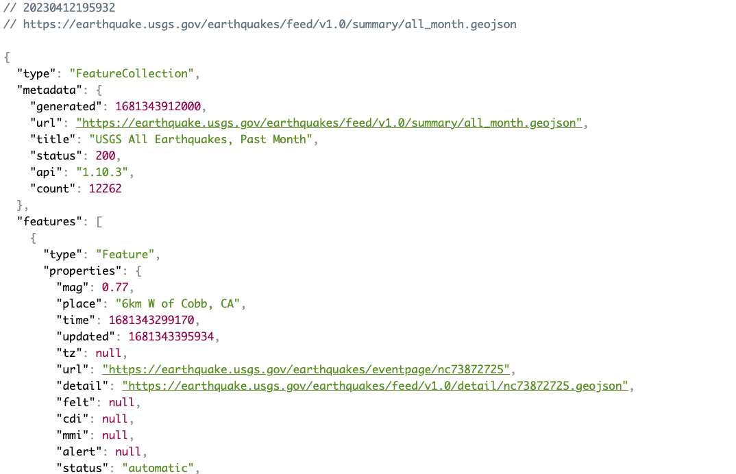
Obtained the 'All Month' earthquake data set. A JSON representation was provided to pull the data for the visualization. The following image is a sampling of earthquake data in JSON format:
-
Import and visualize the data by completing the following:

- Using Leaflet, create a map that plots all the earthquakes from the dataset based on logitude and latitude
- Data markers should reflect the magnitude of the earthquake by size and depth of the earthquake by colour
- Earthquakes with higher magnitudes should appear larger
- Earthquakes with greater depth should appear darker
- Popups with additional information about the earthquake when the associated marker is lcikced
- Created a legend that provided context for the map data
Below is an example:

Part 2: Gather and Plot More Data
Performed the following tasks:
- Plot the tectonic plates dataset on the map in addition to the earthquakes.
- Added other base maps to choose from.
- Put each dataset into separate overlays that can be turned on and off independently.
- Added layer controls to the map.
Below is an example:

Dataset created by the United States Geological Survey.
- Dataset provided by edX UofT Data Analytics, which had been generated by Trilogy Education Services, LLC.