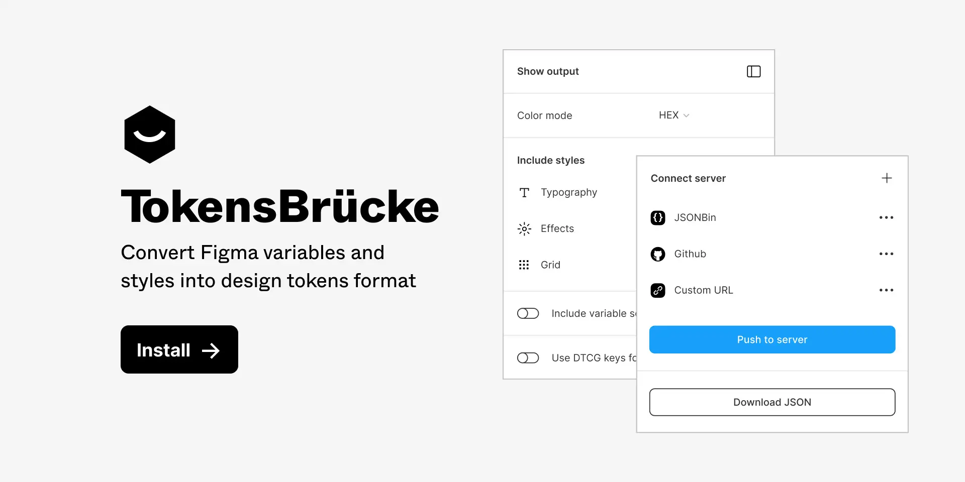
The plugin converts Figma variables into design-tokens JSON that are compatible with the latest Design Tokens specification.
- TokensBrücke — Figma plugin
In the new version of the plugin all mode variables moved into the $extensions / modes object.
This is how Terrazzo (formerly “Cobalt UI”) works with multiple modes. Check it here — https://terrazzo.app/docs/
You can download and install previos version 1.6.1 here — github.com/tokens-bruecke/figma-plugin/files/13536853/build.zip
- Install the plugin from the Figma Community.
- Make sure you have variables in your Figma file.
- Run the plugin.
- Adjust the settings.
- Then you can download the JSON file or push it to on of the supported services.
Allows you to choose the color mode for the generated JSON. Default value is HEX. The plugin supports the following color modes:
HEX— HEX color format. Could be converted intoHEXAif the color has an alpha channel.RGBA CSS— RGBA color format in CSS syntax, e.g.rgba(0, 0, 0, 0.5).RGBA Object— RGBA color format in object syntax, e.g.{ r: 0, g: 0, b: 0, a: 0.5 }.HSLA CSS— HSLA color format in CSS syntax, e.g.hsla(0, 0%, 0%, 0.5).HSLA Object— HSLA color format in object syntax, e.g.{ h: 0, s: 0, l: 0, a: 0.5 }.
Allows you to include styles into the generated JSON. See more about styles support in the Styles support section.
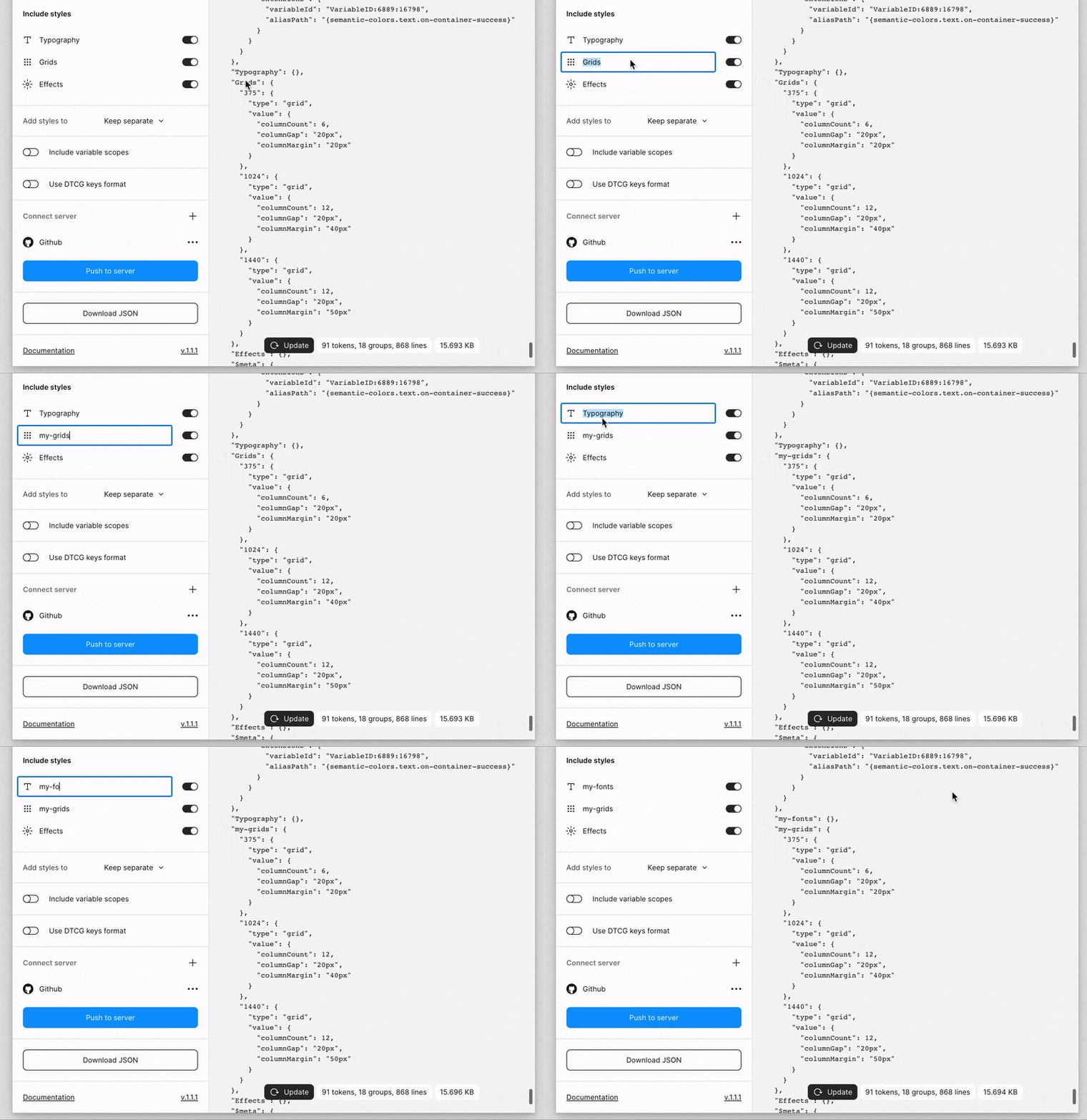
There is an option to rename each style's group and give it a custom name for better organization.
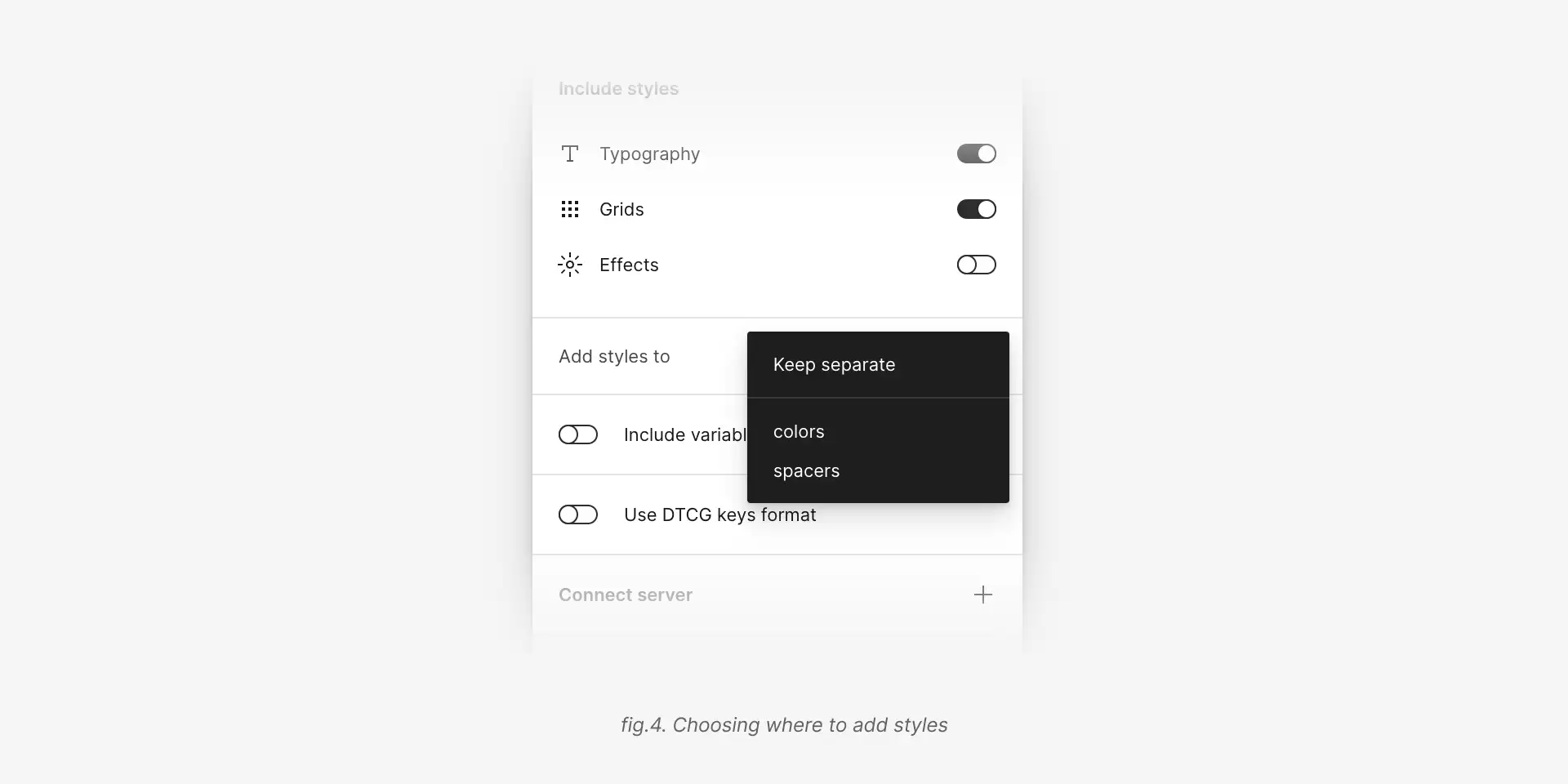
Allows you to choose where to put styles in the generated JSON. By default, the selected value is Keep separate. In this case styles will be added into the root of the JSON and will be treated as collections. There is also an option to add styles into the corresponding collection (fig.4).
Each Figma variable has a scope property. The plugin allows you to include scopes into the generated JSON. It will be included as an array of strings without any transformations.
{
  "button": {
    "background": {
      "type": "color",
      "value": "#000000",
      "scopes": ["ALL_SCOPES"]
    }
  }
}Is off by default. Currently many design tokens tools doesn't support DTCG keys format. All DTCG keys are prefixed with $ symbol.
// Without DTCG keys format
{
  "button": {
    "background": {
      "type": "color",
      "value": "#000000"
    }
  }
}

// With DTCG keys format
{
  "button": {
    "background": {
      "$type": "color",
      "$value": "#000000",
    }
  }
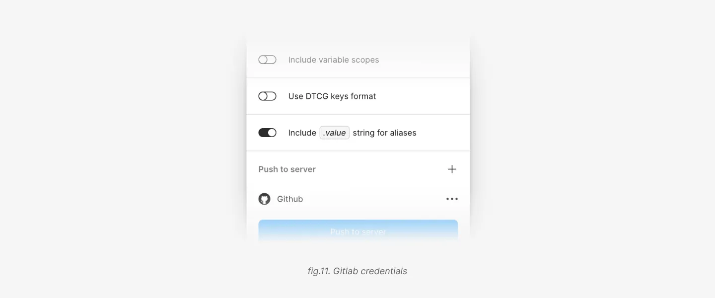
}Is off by default. Allows you to include .value string to the end of the path for aliases. It will be added to the alias string.
{
  "button": {
    "background": {
      "type": "color",
      "value": "{colors.light.primary.10.value}"
    }
  }
}
If the format is DTCG:
{
  "button": {
    "background": {
      "$type": "color",
      "$value": "{colors.light.primary.10.$value}"
    }
  }
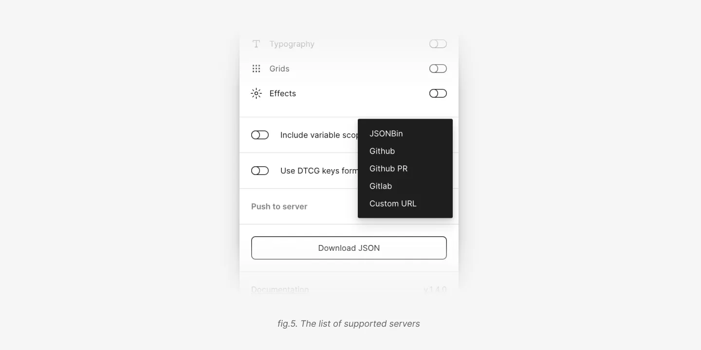
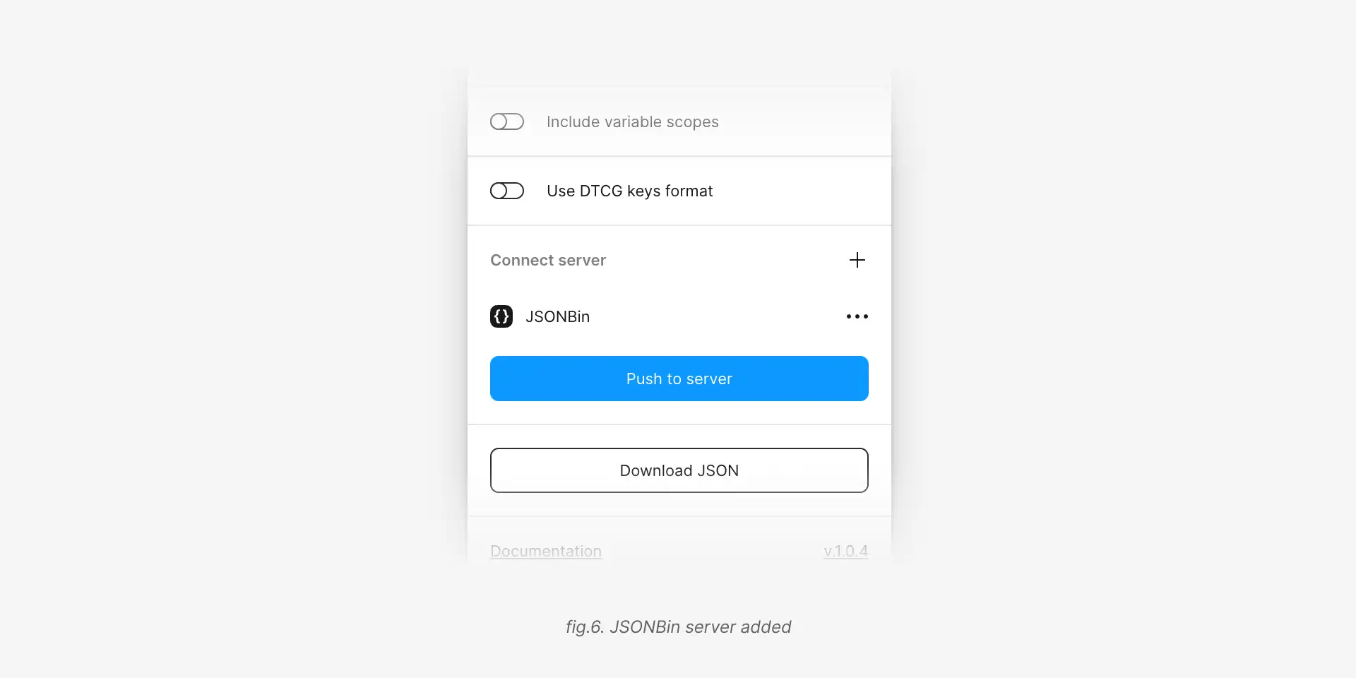
}With this feature you can connect a server and push the generated JSON directly to it. At the moment the plugin supports JSONBin, GitHub and custom servers.
If you connected multiple servers, the plugin will try to push the tokens to all of them one by one.
In ordere to test if your credentials are valid you can make a test request by clicking the Push to server button (fig.6).
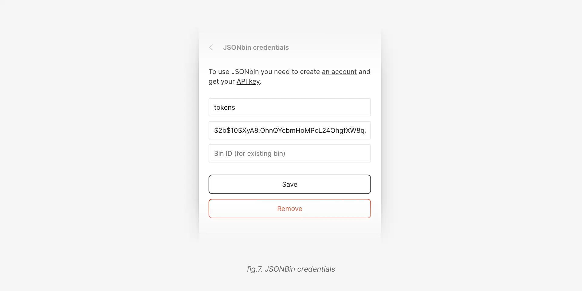
- Open JSONBin and create an account.
- Generate a new API key.
- If you want to use an existing bin, copy its ID. Otherwise just leave the ID field empty in the plugin settings.
- Add a name for the bin.
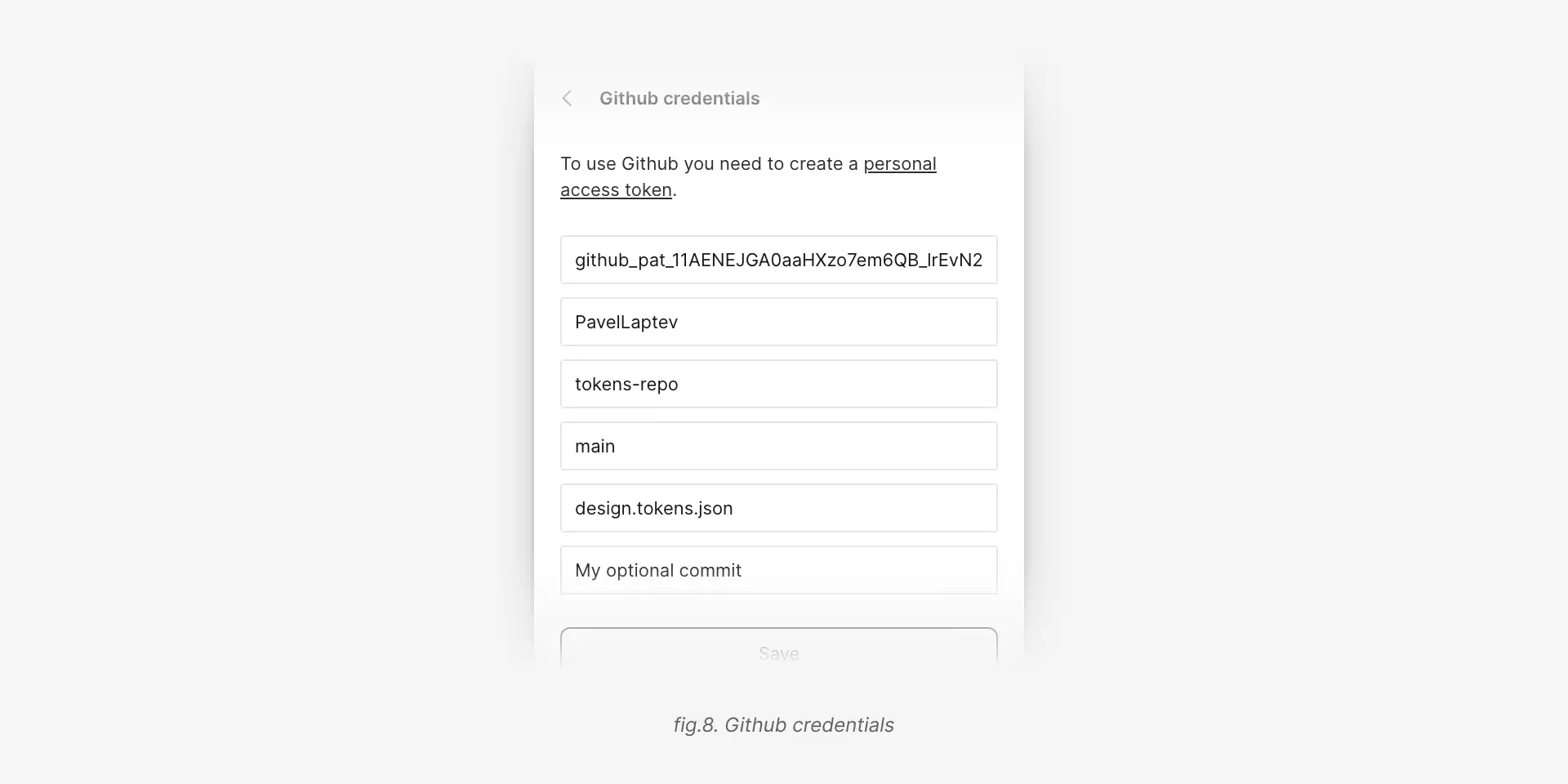
- You need to create a personal access token with
reposcope. - In the plugin settings paste the token into the
Personal access tokenfield. - Add an owner name, repository name and a branch name.
- In the file name field you can specify a path to the file. If the file doesn't exist, it will be created. If the file exists, it will be overwritten. File name should include the file extension, e.g.
tokens.json. - You can also specify a commit message.
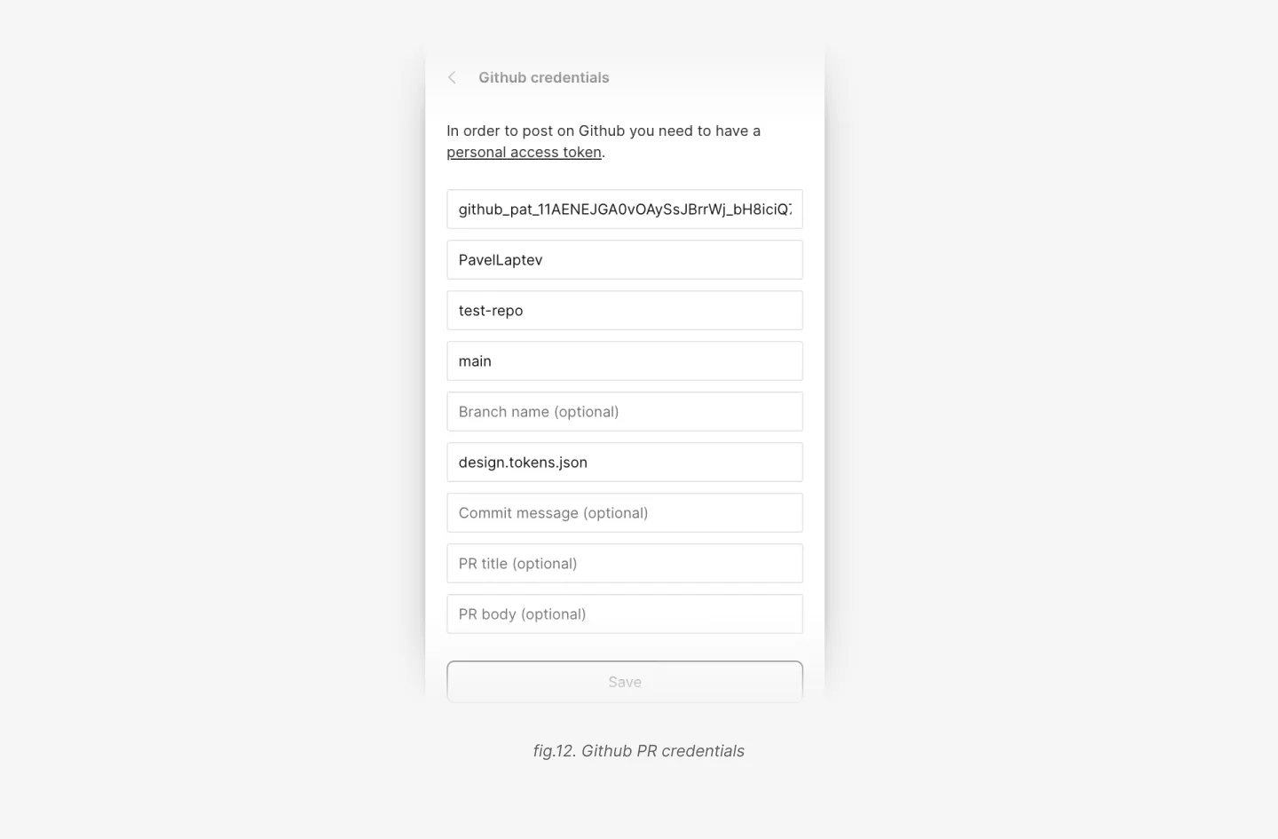
All the steps are the same as for the GitHub server, except the last two.
- PR title. You can specify a title for the PR. If you leave it empty, the plugin will use
chore(tokens): update tokensas a default title. - PR body. You can specify a body for the PR. If you leave it empty, the plugin won't add any body to the PR.
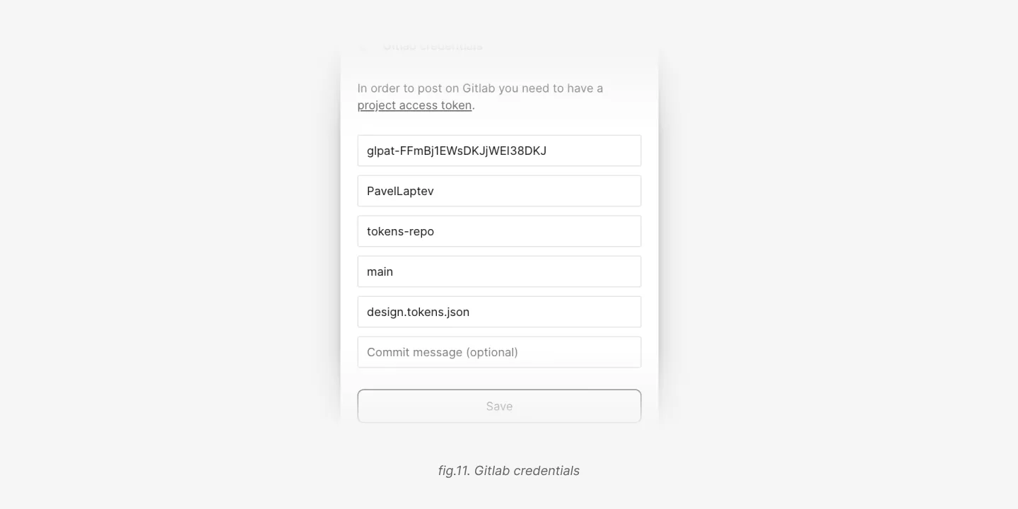
- You need to create a project access token with
apiscope. - In the plugin settings paste the token into the
Project access tokenfield. - Add an owner name, repository name and a branch name.
- In the file name field you can specify a path to the file. If the file doesn't exist, it will be created. If the file exists, it will be overwritten. File name should include the file extension, e.g.
tokens.json. 5. You can also specify a commit message.
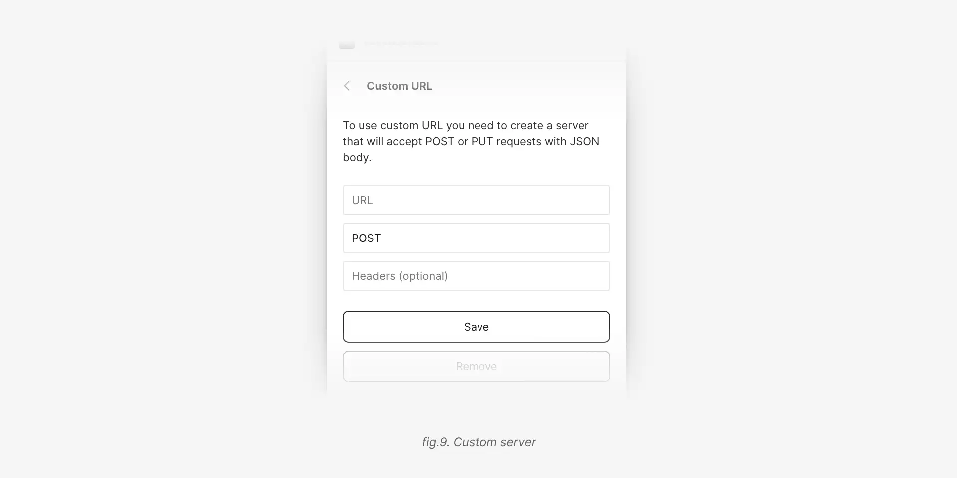
There is a possibilty to connect a custom server. In order to do that you need to specify a URL, a method (by default it's POST) and headers.
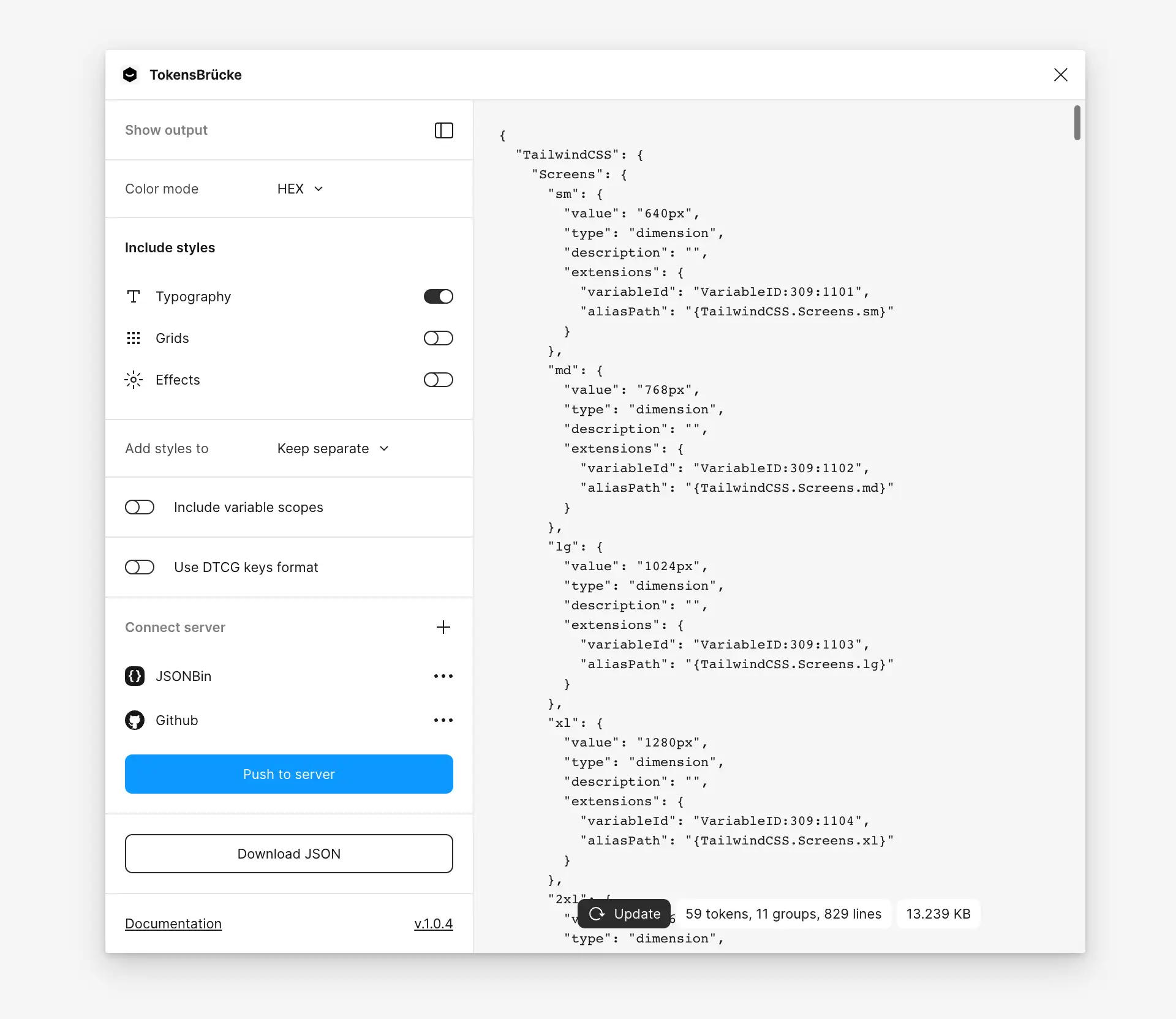
If you want to see the generated JSON, you can enable the Show output option. The plugin will show the JSON in the sidebar. The output doesn't update automatically, in order to optimize the performance. So, if you want to see the updated JSON, you need to click the Update button.
The plugin saves the config automatically. So, you don't need to set it up every time you run the plugin.
The plugin can support some styles and effects too. Until Figma will support all the styles and effects, the plugin will convert them into the corresponding design tokens types. But it's not a backward compatibility, it's a temporary solution until Figma will support all the styles and effects as variables.
Supported styles:
- Typography
- Grids
- Shadows (including
insetshadows) - Blur (including
backgroundandlayerblur)
"extralight": {
  "type": "typography",
  "value": {
    "fontFamily": "Inter",
    "fontWeight": 400,
    "fontSize": "18px",
    "lineHeight": "28px",
    "letterSpacing": "0%"
  },
  "description": "",
  "extensions": {
    "styleId": "S:0ffe98ad785a13839980113831d5fbaf21724594,"
  }
}In Figma you can add as many grids in the style as you want. But the plugin will take only first two grids and treat the first one as column grid and the second one as row grid.
// Column grid
"1024": {
  "type": "grid",
  "value": {
    "columnCount": 12,
    "columnGap": "20px",
    "columnMargin": "40px"
  }
}

// Row grid
"1024": {
  "type": "grid",
  "value": {
    "rowCount": 12,
    "rowGap": "20px",
    "rowMargin": "40px"
  }
}

// Both grids
"1024": {
  "type": "grid",
  "value": {
    "columnCount": 12,
    "columnGap": "20px",
    "columnMargin": "40px",
    "rowCount": 12,
    "rowGap": "20px",
    "rowMargin": "40px"
  }
}The plugin supports drop-shadow and inner-shadow effects. If the effect is inner-shadow, the plugin will set the inset property to true.
"xl": {
  "type": "shadow",
  "value": {
    "inset": false,
    "color": "#0000000a",
    "offsetX": "0px",
    "offsetY": "10px",
    "blur": "10px",
    "spread": "-5px"
  }
}The plugin supports background and layer blur effects. In order to distinguish between them, the plugin adds the role property to the generated JSON.
// Background blur
"sm": {
  "type": "blur",
  "value": {
    "role": "background",
    "blur": "4px"
  }
}

// Layer blur
"md": {
  "type": "blur",
  "value": {
    "role": "layer",
    "blur": "12px"
  }
}If the style has multiple Shadow or Blur styles, the plugin will add them into the array.
"new-sh": {
  "$type": "shadow",
  "$value": [
    {
      "inset": false,
      "color": "#e4505040",
      "offsetX": "0px",
      "offsetY": "4px",
      "blur": "54px",
      "spread": "0px"
    },
    {
      "inset": false,
      "color": "#5b75ff40",
      "offsetX": "0px",
      "offsetY": "4px",
      "blur": "24px",
      "spread": "0px"
    },
    {
      "inset": false,
      "color": "#00000040",
      "offsetX": "0px",
      "offsetY": "4px",
      "blur": "4px",
      "spread": "0px"
    }
  ]
}Despite the fact that color styles could be important for backward compatibility — the main goal of the plugin is to convert Figma variables into design tokens. Since Figma already has a support for color in variables, there is no need to convert also color styles into design tokens.
Support for gradients is comming with the next major release.
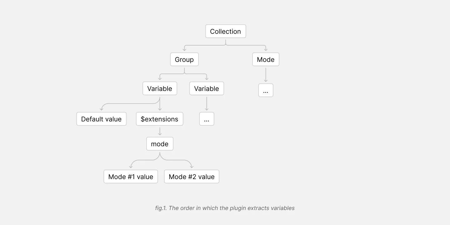
Plugin first takes the collection name, then the group and then the variable name (fig.1).
Mode variables will be wrapped under the $extensions objects
For example, if you have a collection named clr-theme, mode named light and variable named dark, the plugin will generate the following JSON:
"clr-theme": {
  "container-outline/mid": {
    "type": "color",
    "value": "{clr-core.ntrl.40}",
    "description": "",
    "$extensions": {
      "mode": {
        "light": "{clr-core.ntrl.40}",
        "dark": "{clr-core.ntrl.55}"
      }
    }
  }
}
,
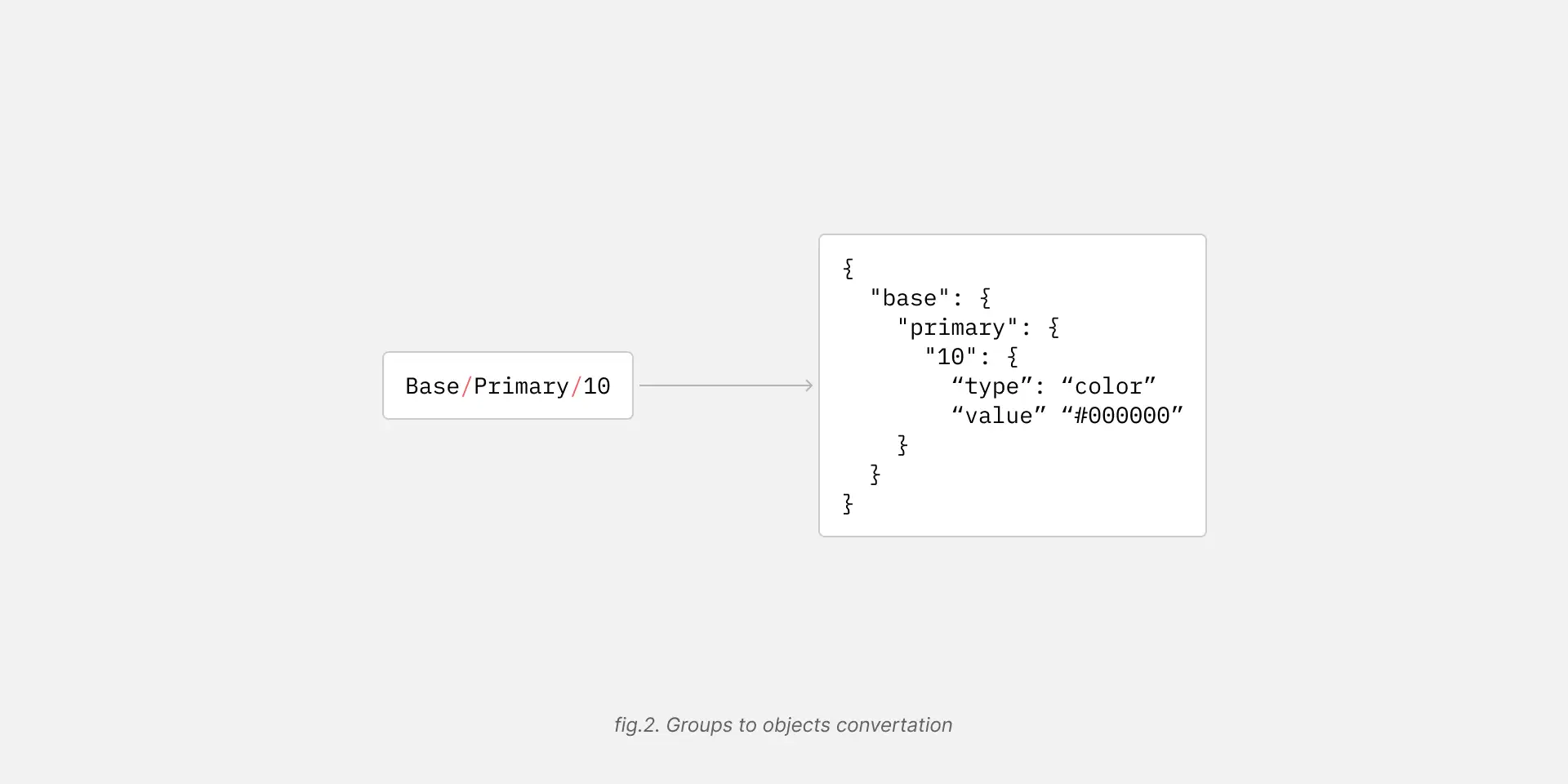
Figma automatically merges groups and their names into a single name, e.g. Base/Primary/10 (fig.2). In this case, the plugin will generate the following JSON:
{
  "base": {
    "primary": {
      "10": {
        "type": "color",
        "value": "#000000"
      }
    }
  }
}All aliases are converted into the alias string format from the Design Tokens specification.
{
  "button": {
    "background": {
      "type": "color",
      "value": "{colors.primary.10}"
    }
  }
}You can switch on the Include .value string for aliases option in the plugin settings.
Imagine you have a library from another file with "base" variables. And you use this variables in your current file.
The plugin will generate the alias name anyway, but it will be a path to the variable as if it was in the current file.
{
  "button": {
    "background": {
      "type": "color",
      "value": "{colors.primary.10}"
    }
  }
}
The plugin wouldn't include the variable into the generated JSON in order to avoid duplicates or conflicts with JSON files you can generate from another Figma files.
So you will need to merge the file with the base variables from one file with another where you use them. Otherwise tools like Style Dictionary wouldn't be able to resolve the aliases.
If there is only one mode — the plugin wouldn't include it in a generated JSON.
If there are multiple modes, the plugin will place them under the $extensions objects.
It follows the same pattern as used by Cobalt
Unlike design tokens, Figma variables now support only 4 types — COLOR, BOOLEAN, FLOAT and STRING. So, the plugin converts them into the corresponding types from the Design Tokens specification.
| Figma type | Design Tokens type |
|---|---|
| COLOR | color |
| BOOLEAN | boolean * |
| FLOAT | dimension ** |
| STRING | string * |
* native JSON types. The specification doesn't restrict the type of the value, so it could be any JSON type. Also see this issue.
** currently figma supports only the FLOAT type for dimensions, that could be used only for px values. So, the plugin converts FLOAT values into dimension type with px unit.
In order to validate types, the plugin uses the Design Tokens types.
There is a set of utils for Style Dictionary.
Comming soon.
If you have any questions or suggestions, feel free to create an issue
1.0.0
- Initial release
1.0.1
- Fixed Aliases handling. Removed
modefrom the alias string if there is only one mode in the collection.
1.0.2
- Fixed RGBA to HEXA conversion
- Added color styles support
- Added basic support for linear and radial gradients
1.0.3
- HEX color fixed
- Alias variables fixed
1.0.4
- Fix scopes conversion
$metainfo adding order fixed
1.0.5
- Allowed to use plugin in files without variables
1.0.6
1.0.7
- Code cleanup
1.0.8
1.0.9
- Fixed
line-heightvalue conversion. It wasn't rounded to the nearest integer.
1.1.0
Updatebutton animation added- added token types as a separate package
1.1.1
- Updated errors handling for GitHub server
1.2.0
- Updated method to check
VARIABLE_ALIASinnormalizeValuefunction - Handle aliases from another files
- Removed the property
aliasPathfrom$extensionsobject, since it's not needed anymore
1.3.0
- Functions names refactoring
1.4.0
- Added
warningtype to theToastcomponent - structure refactoring
- code refactoring
- updated
Githuberrors handling - added
valueto all aliases at the end of the path. Also support forDTCGkeys format added - added storage versioning
- updated DTCG format switching
- added
Copybutton for the tokens preview
1.5.0
- Added
GitHub PRoption to thePush to serverfeature Connect serverrenamed toPush to server- Thanks for contribution to @distolma
1.6.0
valuestring for aliases is now optional
2.0.0
- tokens structure was changed. All modes now moved from variable names into
$extensions/modesobject. In order to make it work with Cobalt. For morre details see this issue — Multiple collection and modes. Previous implementation didn't work correctly with multiple modes and aliasees.
2.1.0
- Multiple
ShadowandBlurstyles support added. Link to the PR
2.1.1
$metatag moved to$extensionsobject. See issue — $meta is not valid DTCG
2.1.2
- Updated the function to generate text styles. Related PR — Update textStylesToTokens.ts
2.1.3
- Fixed font weights to be numbers. Related PR — Font weights fix - output as numbers (DTCG format)
2.1.4 and 2.1.5
- Fix wrong font weight output. Related PR — Right the heuristic wrongs. Thanks to @JeroenRoodIHS
2.2.0
- Added aliases handling for typography styles — Related issue
- Added aliases handling for effects
2.2.1
- Added
paragraphSpacingandparagraphIndentto the typography styles
2.2.2
- Do not convert the value to PX units if the variable scope is
FONT_WEIGHT
