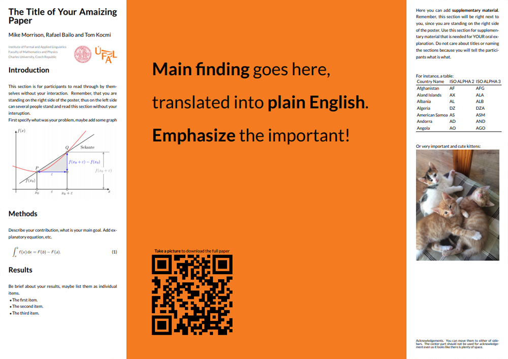
The Better Poster is Mike Morrison's response to the traditional academic poster. In his own words:
Every field in science uses the same, old, wall-of-text poster design. If we can improve the knowledge transfer efficiency of that design even by a little bit, it could have massive ripple effects on all of science.
Also, poster sessions tend to suck, so here's my pitch to make them more efficient AND more fun with a new approach to designing scientific posters/academic posters that is both more usable, and easier to create!
- If you want to learn more about the reasons behind the design and how it improves upon more typical academic poster templates, I recommend Mike's video.
- If you want to see how people are using the Better Poster design, see #betterposter on twitter.

Quickly transform poster to vertical layout by removing `landscape' from documentclass definition
The betterposter class accepts three options which change the paper size:
a0paper, for A0, the default size.a1paper, for A1.a2paper, for A2.
These options behave like the usual LaTeX class options, for instance:
\documentclass[a0paper]{betterposter}
The betterposter class extends the basic article class. Any options you give betterposter, other than the ones mentioned above, will be passed directly to article. For instance,
\documentclass[a0paper,fleqn]{betterposter}
will let betterposter deal with the a0paper option, but will pass fleqn directly to article.
Mike Morrison - Author of Better Poster design
Rafael Bailo - design imported to latex
Tom Kocmi - modified for UFAL purposes, added vertical design