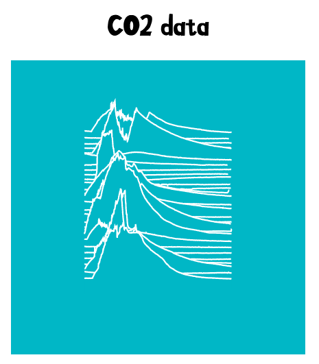
A visualisation of CO2 levels as a vertically stacked graph, with days going upwards. Using @tomhazledine's <stacked-sparklines> web component.
The original data looked something like this:
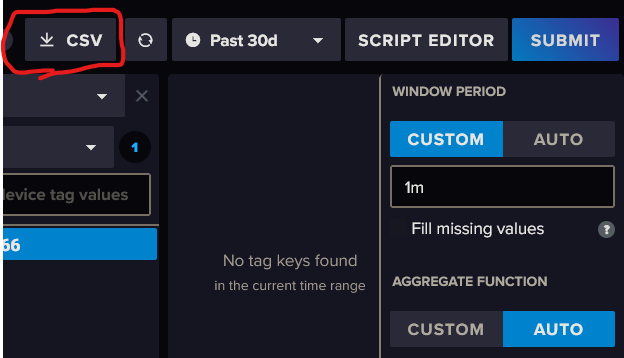
Export CO2 data as CSV from InfluxDB via the data explorer. It should be several days of data, and the window range can be whatever, but probably change it from auto.
Put this file in this repository, named query.csv. Then, run the python script to generate the visualisation.
python ./csv_to_list-of-lists.pyThis was made brashly in a few minutes. Do not expect it to work perfectly ;)


