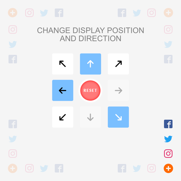
Speed dial menu, simple construction. You can set a button in every corner of the page and display smaller buttons in each direction. It is also possible to activate the 'scroll up' button
See the demo - example
A clean css version with no dependencies is also available -> speed-dial-css
<link
  rel="stylesheet"
  href="https://cdn.jsdelivr.net/gh/tomik23/speed-dial-menu@1.1.0/dist/css/speed-dial.min.css"
/><script src="https://cdn.jsdelivr.net/gh/tomik23/speed-dial-menu@1.1.0/dist/js/speed-dial.min.js"></script>Download from dist folder and insert to html:
- dist/css/speed-dial.min.css
- dist/js/speed-dial.min.js
You can choose iife, umd and esm libraries and IE version
git clone
cd speed-dial-menu
yarn
// or
npm iDev
yarn dev
// or
npm run dev
Prod
yarn prod
// or
npm run prodthe best place is right after opening the
<body>
<svg xmlns="http://www.w3.org/2000/svg" style="display: none;">
  <symbol id="menu" viewBox="0 0 32 32">
    <path d="M16 0c-8.836 0-16 7.164-16 ..."></path>
  </symbol>
  <symbol id="top" viewBox="0 0 24 24">
    <path d="M7.406 15.422L6 14.016l6-6 ..."></path>
  </symbol>
  <symbol id="lightning" viewBox="0 0 32 32">
    <path d="M29 0H3C1.35 0 0 1.35 0311 ..."></path>
  </symbol>
  <symbol id="wind" viewBox="0 0 32 32">
    <path d="M32 7.075a12.941 12.941 20 ..."></path>
  </symbol>
</svg>const speedIcons = {
iconPlus: {
symbol: "menu",
color: "#1976d2", // not required
ariaLabel: "show social buttons", // not required
},
iconTop: {
symbol: "top",
color: "red", // not required
ariaLabel: "scroll to top", // not required
},
iconsSmall: [
{
id: 1,
symbol: "lightning",
url: "https://url.com", // not required
target: "_blank", // not required
tooltipText: "lightning", // nor required
className: "lightning", // not required
ariaLabel: "open lightning", // not required
},
{
id: 2,
symbol: "wind",
className: "wind", // not required
tooltipText: "wind", // nor required
ariaLabel: "open wind ;)", // not required
},
],
};| key | type | require | description |
|---|---|---|---|
| id | number | ✔ | This element is used to show the order of items with icons |
| symbol | string | ✔ | Symbol id name from svg |
| url | string | The Url specifies the link's destination, not required | |
| target | string | _blank/_self/_parent/_top, not required | |
| className | string | An additional class after which we can make events, not required | |
| ariaLabel | string | An aria-label is added to button elements | |
| color | string | Color will be used for the main button or top button | |
| tooltipText | string | Text that appears when you hover over the small icons |
new SpeedDial({
  icons: speedIcons,

  // delay animation time for small buttons in ms
  steps: 50,

  // show button 'scroll-top' at 100px - not required
  position: 100,

  // the option to enable the layer that covers the
  // page but is located under the speed-dial buttons
  modal: true,

  // you can hidden scroll button to to top - not required
  showTopBtn: true,

  // small icons visible after clicking on the main
  // button it doesn't hide on mouse out
  visibility: true,

  // select the page corner you want is not required
  data: {
    // bottom-right, bottom-left, top-right, top-left
    position: "bottom-right",

    // top, bottom, left, right
    direction: "top",
  },
});| props | type | require | default | description |
|---|---|---|---|---|
| icons | object | ✔ | Icons object. Show the tooltip on the hover event | |
| steps | number | 50 |
Show icons with a delay animation | |
| position | number | null |
Show button 'scroll-top-top' at 100px | |
| modal | boolean | false |
This option allows you to turn on the layer that is generated and inserted after the div with the speed-dial class. It appears when you hover over the large button. Color control and fade in and fade out possible in css | |
| visibility | boolean | false |
Smaller icons visible by default | |
| showTopBtn | boolean | true |
You can hidden scroll button | |
| data/position | string | bottom-right |
Sets the main button for us in one of the four corners [bottom-right, bottom-left, top-right, top-left] | |
| data/direction | string | top |
In which direction are the small icons to be displayed [top, bottom, left, right] |
speed-dial supports all major browsers including IE 10 and above
Configuration for IE:
- dist/js/speed-dial.ie.min.js
This project is available under the MIT license.


