A React component for swipeable views.
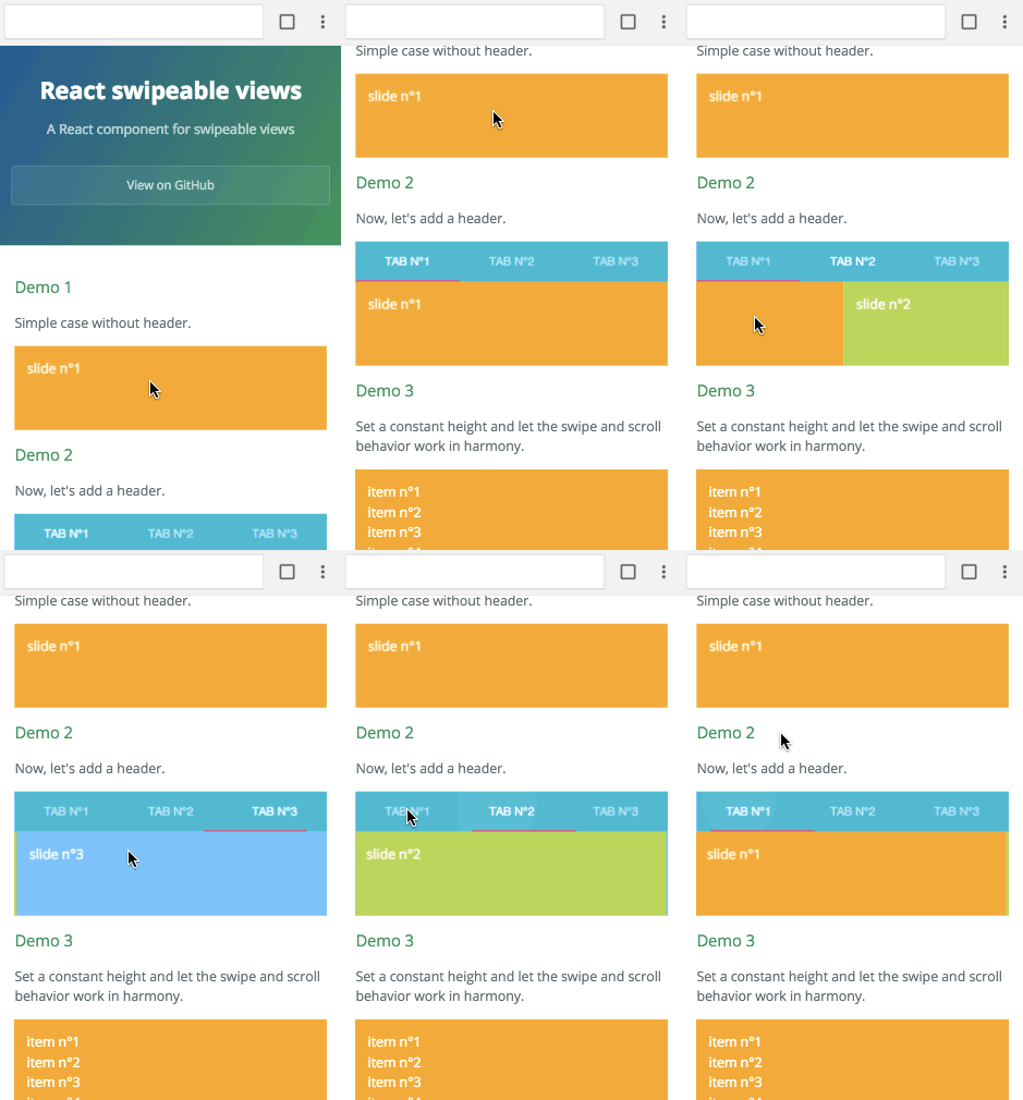
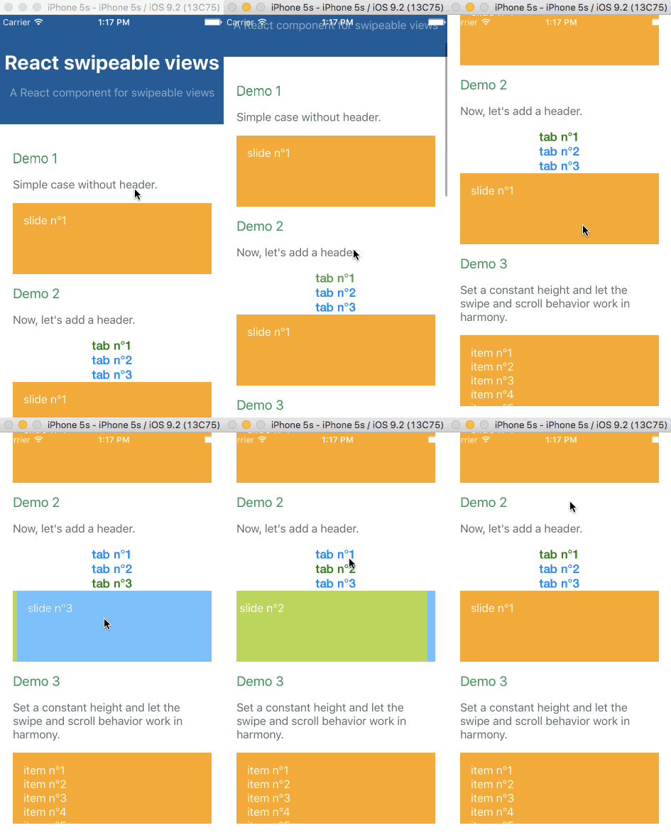
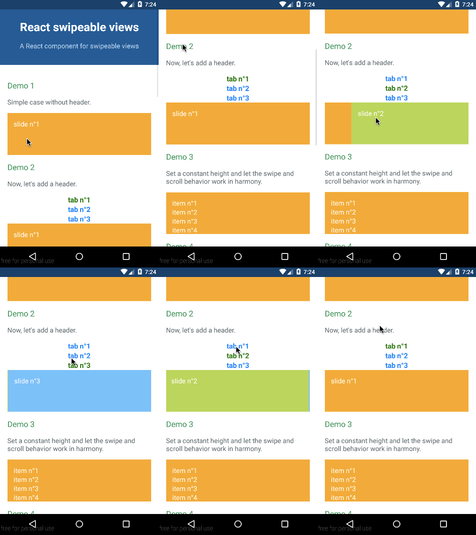
Check out the demos from a mobile device (real or emulated). It is tiny (<4kB) and quickly render the first slide then lasy-load the other.
npm install react-swipeable-views react-motionimport React from 'react';
import SwipeableViews from 'react-swipeable-views';
const MyComponent = () => (
<SwipeableViews>
<div style={Object.assign({}, styles.slide, styles.slide1)}>
slide n°1
</div>
<div style={Object.assign({}, styles.slide, styles.slide2)}>
slide n°2
</div>
<div style={Object.assign({}, styles.slide, styles.slide3)}>
slide n°3
</div>
</SwipeableViews>
);
const styles = {
slide: {
padding: 15,
minHeight: 100,
color: '#fff',
},
slide1: {
background: '#FEA900',
},
slide2: {
background: '#B3DC4A',
},
slide3: {
background: '#6AC0FF',
},
};
export default MyComponent;import React, {
StyleSheet,
Text,
View,
} from 'react-native';
import Button from 'react-native-button';
import SwipeableViews from 'react-swipeable-views/lib/index.native.animated';
// There is another version. I'm unsure which one give the best UX.
// import SwipeableViews from 'react-swipeable-views/lib/index.native.scroll';
const MyComponent = () => (
<SwipeableViews style={slideContainer}>
<View style={[styles.slide, styles.slide1]}>
<Text style={styles.text}>
slide n°1
</Text>
</View>
<View style={[styles.slide, styles.slide2]}>
<Text style={styles.text}>
slide n°2
</Text>
</View>
<View style={[styles.slide, styles.slide3]}>
<Text style={styles.text}>
slide n°3
</Text>
</View>
</SwipeableViews>
);
const styles = StyleSheet.create({
slideContainer: {
height: 100,
},
slide: {
padding: 15,
height: 100,
},
slide1: {
backgroundColor: '#FEA900',
},
slide2: {
backgroundColor: '#B3DC4A',
},
slide3: {
backgroundColor: '#6AC0FF',
},
text: {
color: '#fff',
fontSize: 16,
},
});
export default MyComponent;The API is as consistent as possible between the three platforms so the same component can be used independently on where it's running.
The auto play feature is provided thanks to an High Order Component. It's working independently of the targeted platform. You can have a look at the Demo 7 to see it in action. Let's see an example with the browser:
import autoPlay from 'react-swipeable-views/lib/autoPlay';
import SwipeableViews from 'react-swipeable-views';

const AutoPlaySwipeableViews = autoPlay(SwipeableViews);

const MyComponent = () => (
  <AutoPlaySwipeableViews>
    <div>
      slide n°1
    </div>
    <div>
      slide n°2
    </div>
    <div>
      slide n°3
    </div>
  </AutoPlaySwipeableViews>
);

export default MyComponent;| Name | Type | Default | Platform | Description |
|---|---|---|---|---|
| children | node | Use this property to provide your slides. | ||
| containerStyle | object | {} | Whether or not the auto complete is animated as it is toggled. | |
| disabled | bool | false |
If true, it will disable touch events. This is useful when you want to prohibit the user from changing slides. |
|
| index | integer | 0 | This is the index of the slide to show. This is useful when you want to change the default slide shown. Or when you have tabs linked to each slide. | |
| onChangeIndex | function(index, fromIndex) | This is callback prop. It's call by the component when the shown slide change after a swipe made by the user. This is useful when you have tabs linked to each slide. | ||
| onSwitching | function(index, type) | This is callback prop. It's called by the component when the slide switching. This is useful when you want to implement something corresponding to the current slide position. | ||
| resistance | bool | false |
If true, it will add bounds effect on the edges. | |
| style | object | {} | This is the inlined style that will be applied on the root component. | |
| slideStyle | object | {} | This is the inlined style that will be applied on the slide component. | |
| springConfig | object | {stiffness: 300, damping: 30} | Browser | This is the config given to react-motion for the spring. This is useful to change the dynamic of the transition. |
| threshold | integer | 5 | This is the threshold used for detectinga quick swipe. If the computed speed is above this value, the index change. |
Any other properties like className will be applied to the root component.
Extends the properties of <SwipeableViews /> and add the following ones:
| Name | Type | Default | Description |
|---|---|---|---|
| autoplay | bool | true | If false, the auto play behavior is disabled. |
| direction | enum: 'incremental' 'decremental' |
'incremental' | This is the auto play direction. |
| interval | integer | 3000 | Delay between auto play transitions (in ms). |
MIT


