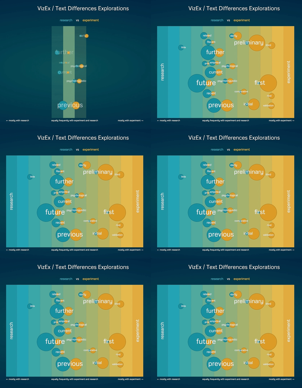
This is an interface for SkE Data Visualizations, which creates SVG panel containing text data visualization with animated and interactive elements which can have callbacks to add functionality.
Also, this is an experimental work to determine boundaries of interactivity and work-arounds between a visualization that is independently generated with its own sets of listeners and an interface that is triggering its own sets of events and behavior around the dataviz.
Additional interaction around the visualization was made with jQuery for experimental purposes. (Of course, d3 could have been used instead to avoid adding a dependency, but comparison of these two tools wanted to tested).
The application is responsive and depending on the screen size, it adjusts the number of word shown to keep the eligibility.
Tooltip, notification information, loading, buttons and input are independently created to create a better user experience.
This is an interactive visualization of a thesaurus – the view highlights the relationship between the central search word and its reference to other words used in context within the dataset.
This interactive visualization shows you the differences based on the frequency and contextual relationship between two query words within the same dataset – this visualisation is especially useful for understanding and articulating the data landscape of close synonyms and antonyms, for example research vs experiment.
The live application can be accessed at SkE Data Visualizations
Data is taken from corpus management and analysis tool SketchEngine.
Attribution-NonCommercial-NoDerivatives 4.0 International (CC BY-NC-ND 4.0), for full text see the link or LICENCE.

