This project is called Prosperity Adviser for Restaurants (PAFS), a web-based service based on Yelp's dataset.
The goal of PAFS is to give restaurant owner a report about their businesses’ or their potential business’s local surrounding information and provide a investment score based on their customized weight factors.
Furthermore, it can give a report that if I want to or already have a restaurant here, what features I should care most to make my restaurant more popular.
Currently, this product is only work in Phoenix, Arizona.
As restaurant owner, it is important to know the surrounding information such as population and costumer’s interests. Although, the restaurant's objective condition is the decisive factor of success, knowing the surrounding competitor’s information and local landscape are also very important.
Our aims are:
1.Help our user to know more about their target locations’ surroundings, to see if that is a great place to open a restaurant.
2.If the user already owns a place, we want to help them to know their potentials and what they can improve.
Our project has several advantages. First, it is very practical. Our service turns technologies and data into a tool that can make benefit to the society. Second, our users can manage their factors’ preference. It allows user to adjust the weight of different factors based on their willing. The third and most important, it has huge potential. We can expand the service area by adding more cities’ restaurant data, different key factors’ data, and more advanced method and algorithms.
Our main datasets are yelp datasets, The Yelp dataset is a subset of yelp’s registered businesses, reviews, and other data for use in personal, educational, and academic purposes. Available as JSON files.
Other datasets we use are:
1.Earnings and population datasets from census.gov
2.Communal facilities and crime datasets from the City of Phoenix Mapping Open Data.
3.School dataset from National Center for Education Statistics
| Data Source | Dataset | Size | Description | Web Link |
|---|---|---|---|---|
| Yelp Challenge Data | Business | 135 MB | Business characteristics | https://www.yelp.com/dataset |
| User | 2.4 GB | User characteristics | https://www.yelp.com/dataset | |
| Checkin | 399 MB | Checkin timestamp | https://www.yelp.com/dataset | |
| Photos | 25 MB | Photo caption and classification | https://www.yelp.com/dataset | |
| Review | 5.2 GB | User review | https://www.yelp.com/dataset | |
| Tip | 238 MB | User suggestions | https://www.yelp.com/dataset | |
| Census Data | Population | 975 MB | Population and earning information | https://factfinder.census |
| City of Phoenix Mapping Open Data | Park | 30KB | Location of parks and links to websites | https://mapping-phoenix.opendata.arcgis.com/ |
| Hospital | 15KB | Hospital locations | https://mapping-phoenix.opendata.arcgis.com/ | |
| Points of Pride | 25KB | Points of pride locations and images | https://mapping-phoenix.opendata.arcgis.com/ | |
| Light Rail Station | 12KB | Light rail station locations | https://mapping-phoenix.opendata.arcgis.com/ | |
| Traffic Volume | 14.4MB | Traffic volume measurement location and recorded volume counts from year 2009 to 2018 | https://mapping-phoenix.opendata.arcgis.com/ | |
| Crime | 24MB | Crime data between 2015 and 2019 | https://mapping-phoenix.opendata.arcgis.com/ | |
| National Center for Education Statistics | School | 535KB | School location and enrollment data from the academic year 2008 to 2018 | https://nces.ed.gov/ccd/elsi/expressTables.aspx |
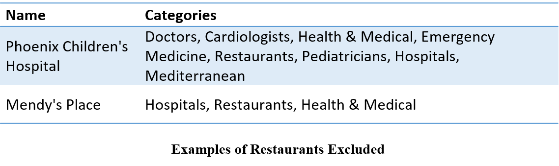
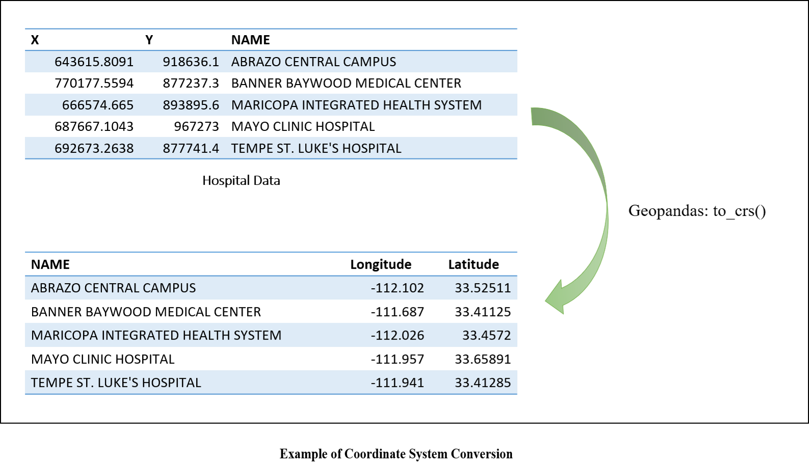
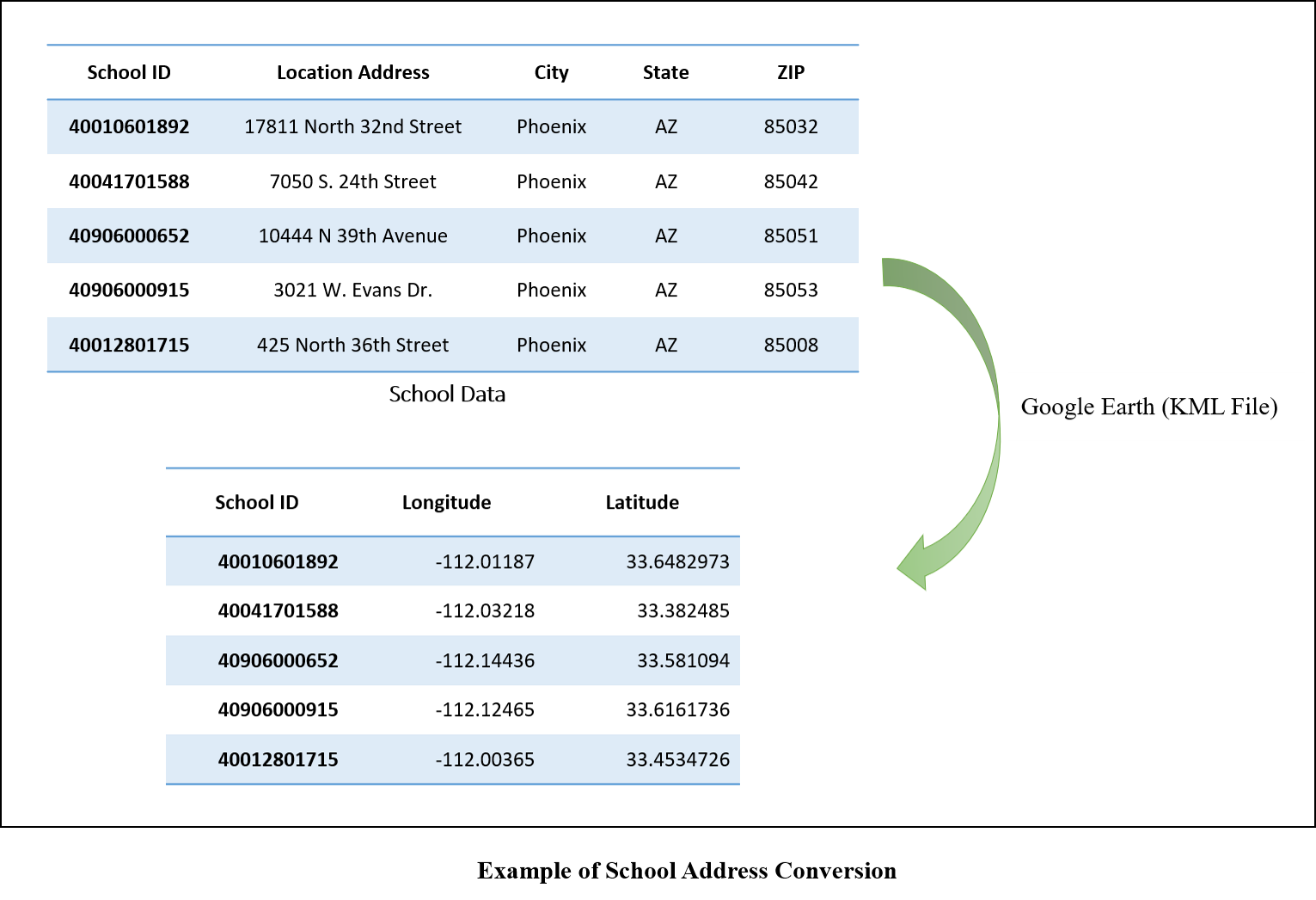
A number of data preprocessing steps were applied to the Yelp business data, including flattening business Json data file attributes, removing restaurants afficiated with other business types, identifying restaurant cuisine type, and converting the coordinate systems of supplemental data to latitude and longitude-based geographical coordinate system. The raw Yelp json file uses double quote mark for the first and two levels of attributes and single quote mark for the third level attribute. The python json package can only identify the attributes within double quote mark, and the attributes within a single quote mark have to be expanded by writing codes. A hospital or a shopping mall listed in the yelp data can also have the category of restaurant because there is a restaurant within it. The corresponding star scores may be for the hospital or shopping mall, not just for restaurants. Such types of restaurants have to be excluded from the analysis. In this study, these types of restaurants as well as restaurant cuisine types were extracted based on comparisons with the complete list of yelp categories for businesses. The web application developed in this project requires the use of latitude and longitude-based geographical coordinate system in order to calculate the distances between selected restaurant site and its neighboring facilities. However, the supplemental data such as parks, hospitals, schools, and so on use different coordinate systems, which have to be converted to latitude and longitude either by python Geopandas library or Google Earth.
In our project, the first question to solve is: Is the place a good one to open a restaurant? To answer this question, we considered several factors that may affect the population flow in common sense: earnings, popultion, nearby schools, parks, train stations, hospital, tourist attraction (the dataset of those factors are given in forms of longitude and latitude).
The final score ouput is in 100 scale, like this:

As shown, there are 7 terms in the form, every term has 100 scaled score, and the seekbar is used for setting the weight among 7 terms. It works just like your final grade in your college class, for example, the "park" as your "midterm exam", "school" is "homework", "earning" is "final exam", your final grade is based on every grade of single term multiply it's weight, and in our project, the weight is adjustable by yourself! So, the question is, how to give out score for single term.
Here we use park data as sample, the pipe line for other data is almostly same. So, tell a location is good or not among the whole city, user need choose a small area which he wants to be reported. We temporarily call this location A. We give the density of park in this area, compare with the max density of the whole city, give out the score. For density of location A, it's easy to calculate, because we can easily get the amount of park from our data set, and the area size also easily calculate because the location A is a circle, and the radius can be set by user. i.e. the area size of A is set by user. So, the key question is how to calculate the max density of the whole city.
The parks are presented by points with longitude and latitude. Shown as below, you can think the whole plane is the map of Phoenix City, points are parks.
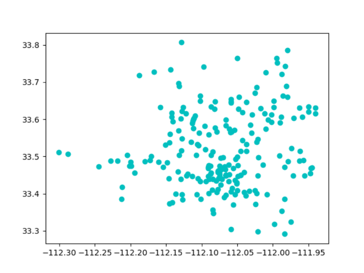
It's easy to see the most dense part in the graph is approximately at (-112,08,33.45). So we need to calculate the density around this point, the result can be think as the max density of this city.
So we dicide do a K-mean cluster to get those compact point together, like below graph:
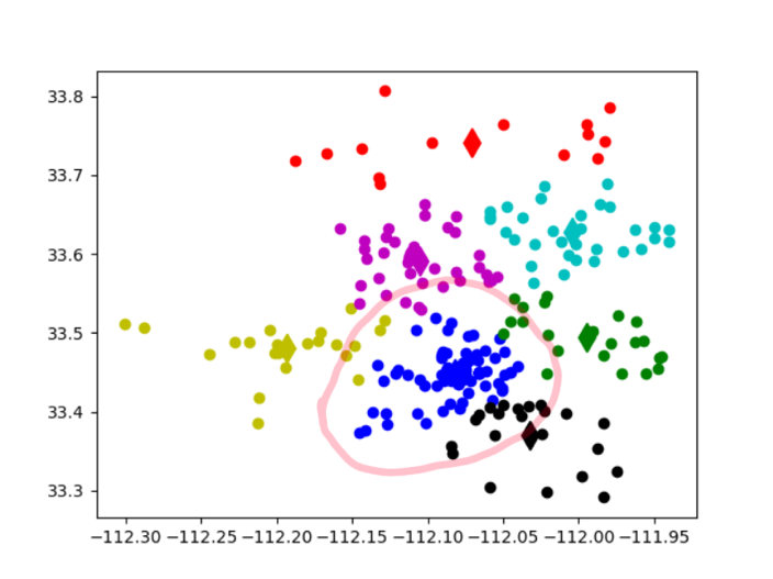
It's obviously in this graph that the most density part is successfully clustered together as blue. (you need to do many times of k-mean to see if the result is what you want, because k-mean result is different with different cluster amount and initial points)
To calculate the density of blue cluster, we need the amount and area size, the amount is easy to count but for area size, we used an approximate algorithm to do it: First, we find the convex hull (using Jarvis March algorithm) of those points, it's likely a ellipse. we set the longest distance of a pair among those hull points as the longer radius and divide other points into two groups using the line formed by longer radius, calculate the shortest distance between two groups, set the value as the shorter radius of our ellipse. Then we can calculate the max density of the area.
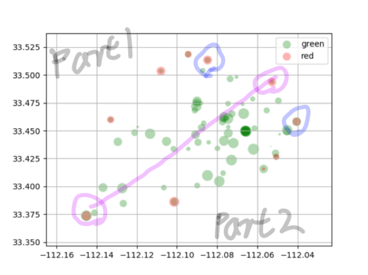
So the red points in above figure is the convex hull points of cluster-blue. And pink circled pair is points with longest distance among these shell points. And other shell point are divided into two parts, in this case, every part has four points, and blue-circled pair is the shortest pair between two parts. So, now we can calculate the area size according to ellipse formula: Pi ab(a=distance of pink-circled pair, b=istance of blue-circled pair). Then the density of cluster-blue can be easily calculated, which is the max park density of Phoenix city.
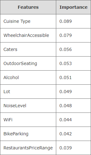
As a new restaurant owner, it is interesting to see what types of restaurants having been open or closed at the intended restaurant site, and what types of services these restaurants have provided. To help with that, the most important features that affect a restaurant star score were extracted using random forest regression analysis in this project. The attributes that are related to restaurant characteristics were used as independent varables and the scores of restaurants were treated as a dependent variable. Before conducting regression analysis, the attributes with large missing data that is greater than 90% were removed from analysis. The remaining text attributes were then converted to categorical variables. The restaurant data was divided into training and testing data sets and fit to the random forest regressor of python sklearn package. The mean absolute percentage error (MAPE) between the predicted restaurant scores and the actual scores was calculated and the prediction accuracy of this analysis, defined as 100% minus mean percentage absolute error, is 80.25%. The table below lists the top 10 features identified by random forest regression analysis and their corresponding importance scores. As shown in this table, attributes of cuisine type, wheelchair accessibility, catering capability, provision of outdoor seating, alcohol provision, parking lot, noise level, provision of WiFi, parking for bikes, and restaurant prices are important features that affect the star scores of restaurants.
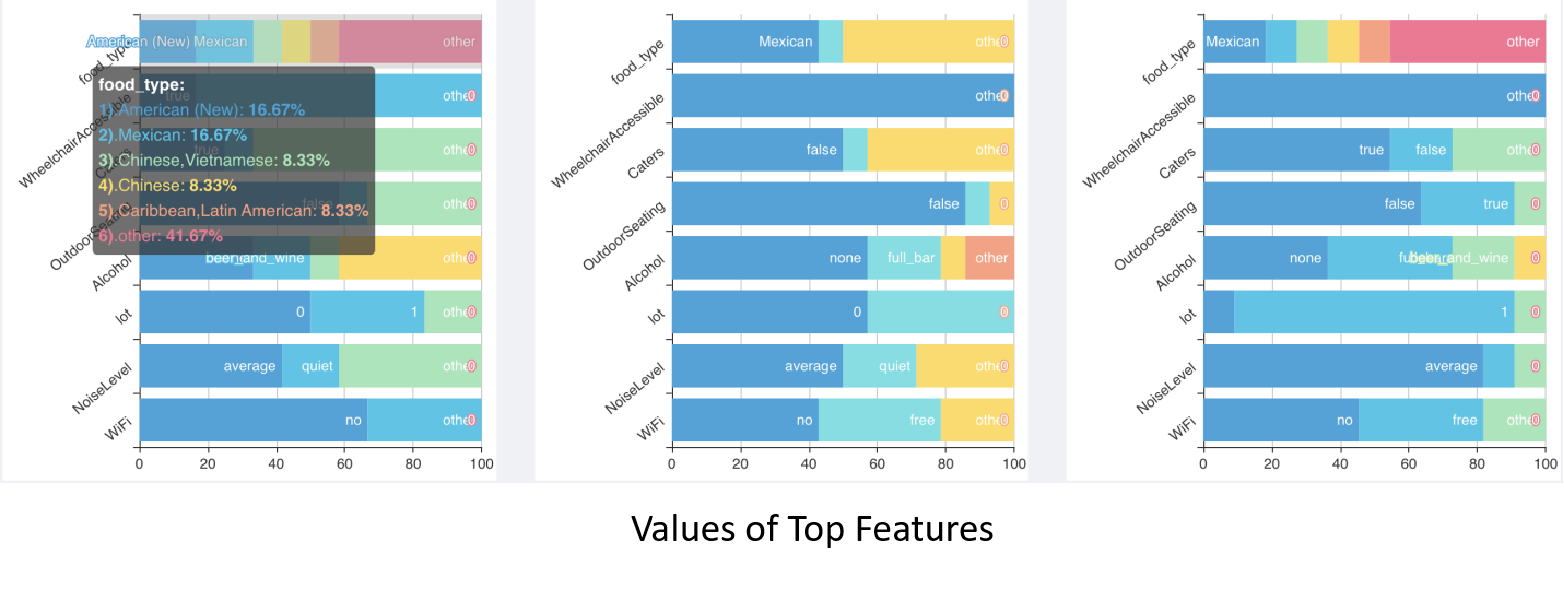
The percentage distributions of possible values for these features are displayed in the user interface in the format of stacked bar charts. Three charts for three categories of restaurants, that is, one category for open restaurants with a score greater than or equal to 4, one category for open restaurants with score less than 4, and the third category of closed restaurants. As shown in the charts below, the y-axis lists the top 10 features from the most important feature at the top to the least important feature at the bottom. The x-axis shows the percentage of each possible value for each feature. By looking at the distribution of each feature value and comparing them among three restaurant groups, user can identify which type of food is dominant in study area and can get good star scores, and also determine if they want to provide the services such as WiFi, wheel chair services, and so on. For example, the charts below indicate that american food is popular in the selected area and can get a score of greater than four.
We divide all restaurants in area A into three groups: star 0-3, star 4-5 and closed. In this part, we try to give different features of three groups in users' eyes. We add all reviews of one same group, as features of this group given by users. And do the TF-IDF, output the term-weight list for every restaurant and get top 30 terms. Then, treat the output as new term frequency, do another TF-IDF algorithm. Pipe line as follow:
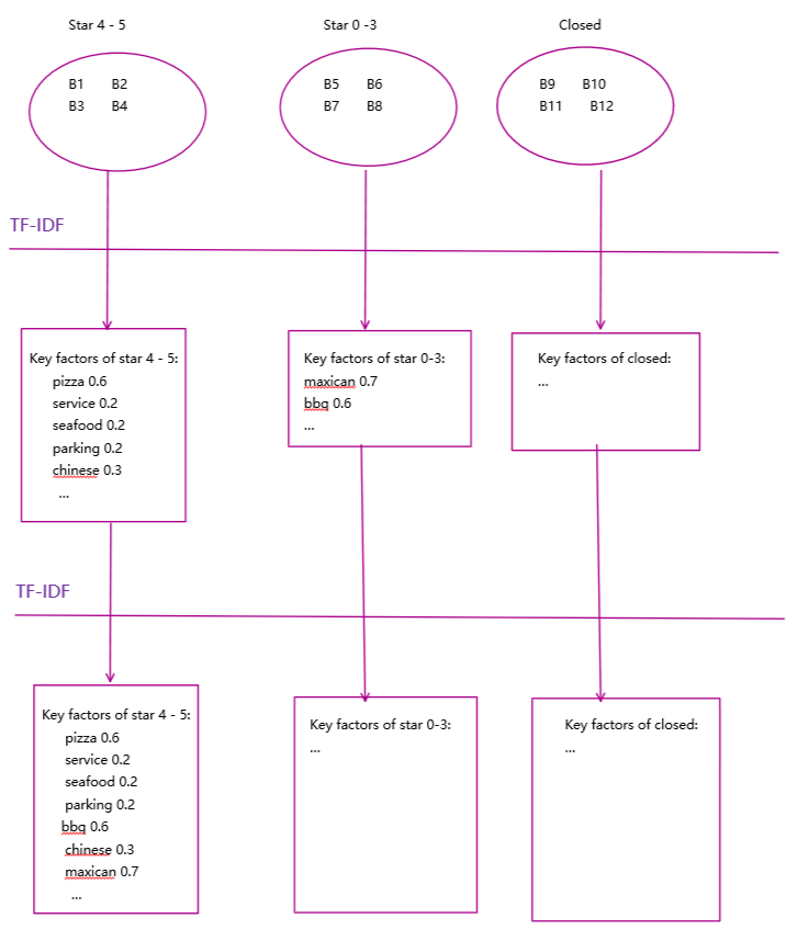
Significance: By given this data, we can figure out what feature costomers mentioned most, and that kind of reflects factors customers care most.
Result sample:
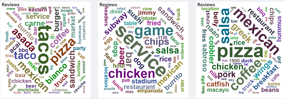
This is a real result of a certain point in the map. As we can see, in this case, for the first figure, we can figure out that maybe it's better to sell tacos, users in this area seems like tacos. And for the last figure, we can see people in this area seems don't like coffee. So on and so for. There are many interesting results you can conclude from these graph.
We use Python to develop the project Including data processing, data analysis, and a web server, this webserver bases on Flask. And also, we use NumPy, Pandas, and Scikit-learn to analyze datasets. We have many datasets with geographic information, so we create a geo index with Redis. So, you can see, we input the longitude and latitude, Redis will create a geo index of this dataset. When we query this index use longitude, latitude, and radius, it will return a list of points nearby that point we input and sorted by distance.
On the frontend, we use NodeJS to develop, bases on Vue and Element UI. These libraries help us fast to develop the frontend. Next, we use the Google Maps API to develop the map function. And the last, we have many diagrams bases on Apache Echarts. It's very professional at data visualization and easy to use.
The server process initiate will load and process all of the datasets. It will divide each dataset into two parts. One part has longitude and latitude and used to create the geo index. The other part is stored in memory, and it used to do some data analysis.
Then, the server starts, it will provide some APIs, when receiving a request, it will get some data from geo index and memory, then do some analysis, and return the result to the browser.
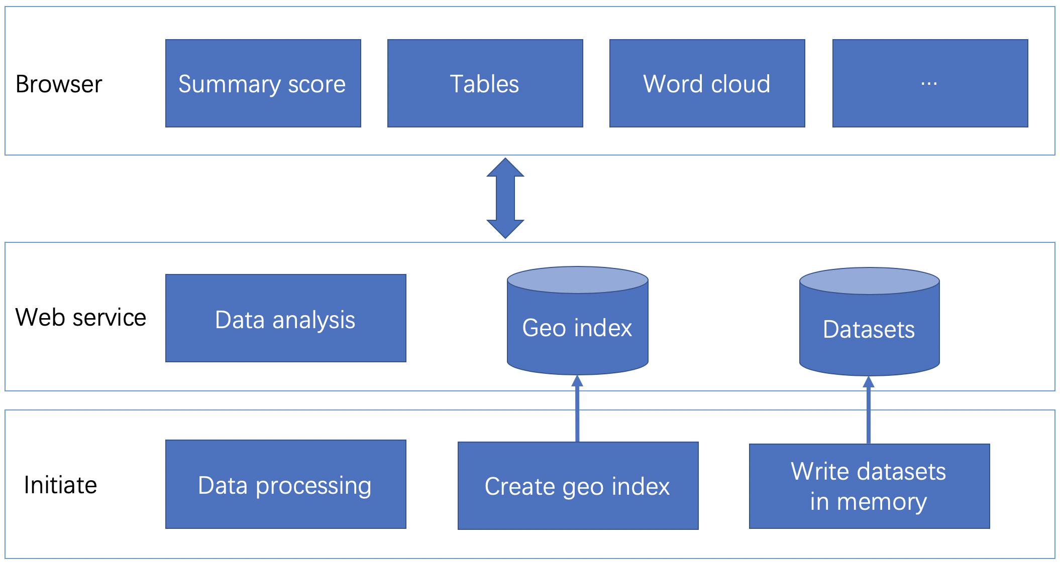
When you select a point on the map of the website, it can get the longitude, latitude, and zip code, and then, it will send some requests to the server. After that, it will draw some diagrams use the result from the server.
- Peng Hou phou001@fiu.edu
- Hongjing Wang hwang064@fiu.edu
- Zheya Wu zwu014@fiu.edu
- Yan Xiao yxiao001@fiu.edu
- Linlin Zhou lzhou012@fiu.edu
- Giri Narasimhan giri@cs.fiu.edu
https://docs.google.com/document/d/1uyUUb5cq5GBsxdCp3w2TQ2EmcofJ3vEVEWgirwEDKnU/edit?usp=sharing
https://drive.google.com/drive/u/1/folders/1eG8PzPnE26NfgQYkClc3b0GvYcTeicMS