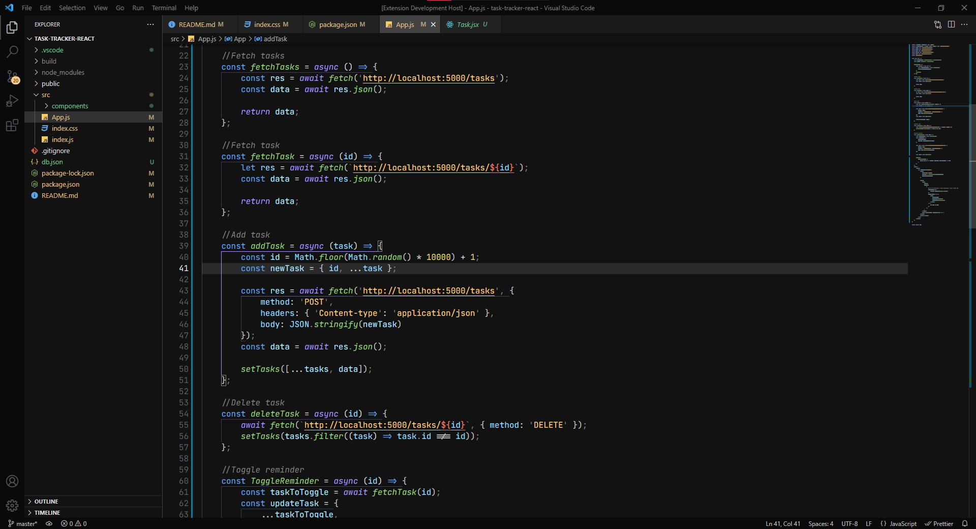
A Space-inspired Dark theme for those who like the default Dark+ visuals. It comes with a neutral background and a carefully picked color palette that blends in very nicely.
Cosmical creates it's own visual language by balancing the use of color and contrast to create a hierarchy of importance. This coloring pattern helps distinguish the code elements.
It aims to be an alternative for those who like the default dark look while being a completely new theme, not just an upgrade.
🌌 It will make you feel like you are an astronaut coding in space! 🌌
- Click here: Cosmical theme vscode martketplace to visit the VSCode marketplace website.
- Clicking "Intall" will open VSCode and the Cosmical theme extension page.
- Click on "Install" and "Set Color theme".
or
- Open extensions on the left side bar (
ctrl + shift + Xon Windows). - Search for "Cosmical" in the input field and click on the extension.
- Click on "Install" and "Set Color theme".
- A beautiful and well-thought color palette to provide amazing contrast and color distinction, making a nicely balanced theme.
- The primary colors are golden and blue
- The different parts of the code can be distinguished by color and contrast following a hierarchy of importance.
- To help the user, this theme follows its own coloring pattern across different file formats.
- Neutral background following the material guidelines for dark themes.
- Non-blueish background to improve sleep by decreasing blue-light exposure.
- Provides a good amount of contrast following accessibility guidelines without being too high contrast.
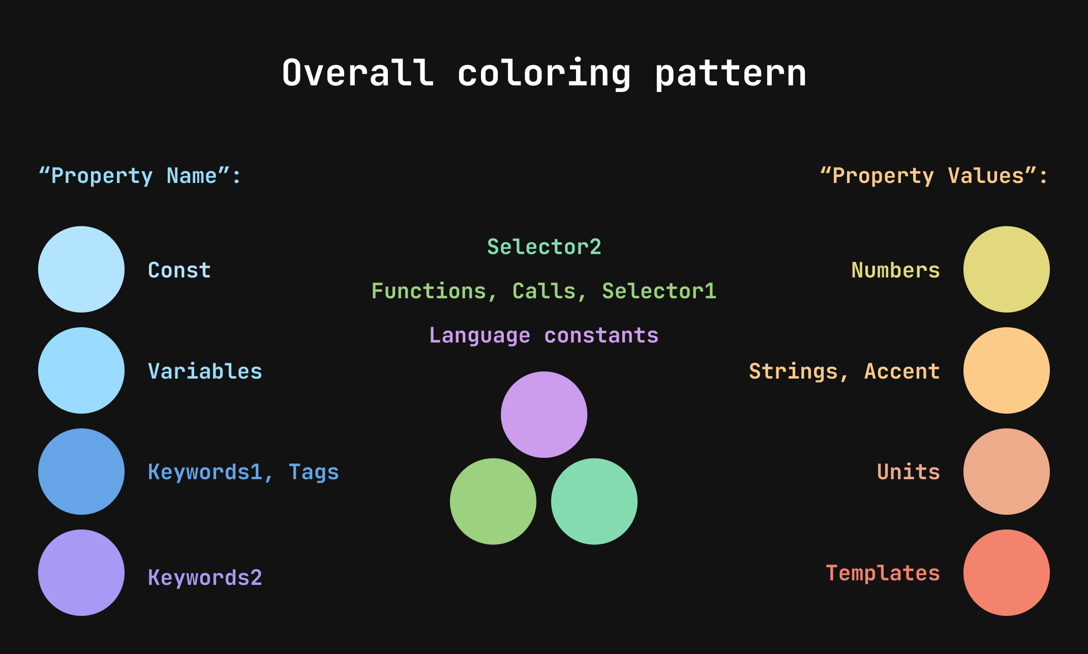
As seen in the image above Cosmical uses a coloring pattern divided by groups: Golden, Blue and Neutral.
To give you an example of this pattern in action, imagine a .json or .css file:
- In the Blue group (purple, dark-blue, blue) is everything related to language, variable names, property names, keywords...
- In the Golden group (orange, golden, yellow) is everything related to property values, strings, numbers...
- In the Neutral group (green, violet) is everything that isn't in the other groups, things like selectors, function calls, language constants(null, true)
This pattern is consistent across all the different file formats.
It all started when I was looking for a theme to stick with in my VSCode. After trying a lot of themes from the marketplace, I always came back to the default Dark+, everything else felt weird.
So I decided to do some minor tweaking to Dark+ in the settings, starting with the backgrounds and other UI elements. I continued tweaking it till it wasn't Dark+ anymore.
After reading Creating a VS Code Theme - CSS tricks, I decided to create my own theme and publish it.
If you use Dark+, this theme will be familiar to you as Cosmical is heavily influenced by it, aiming to be an alternative for those who like the default dark look while being a completely new theme, not just an upgrade.
This is my first theme release and it's only tested for Javascript, React, Svelte, HTML, CSS.
After a lot of recent changes, in order to improve the theme and add better support. I think that I've finally landed on a color placement and palette that feels good, so changes won't be that drastic from now on.
Feedback is appreciated! If you want to contribute, please check the github repo: https://github.com/jorgemrtr/cosmical-theme
These are some of my favourite settings based on my personal setup, you can change VSCode settings by:
Opening command palette (ctrl + shift + P)
Typing "Open Settings (JSON)"
Copy the following settings to your JSON inside the brackets
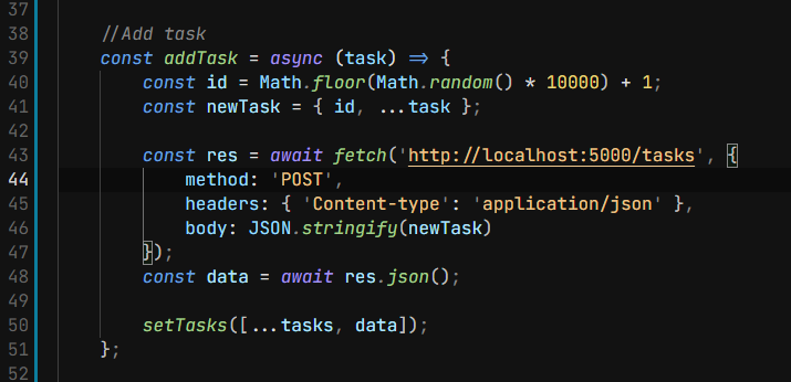
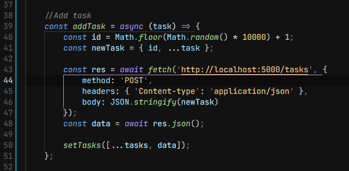
This setting is built in VSCode. I only turn on the option that draws colored vertical and horizontal lines because I find that the actual bracket colorization makes reading the code confusing.
"editor.bracketPairColorization.enabled": false,
"editor.guides.bracketPairs": true,
"editor.guides.bracketPairsHorizontal": true,
I feel like "JetBrains Mono" makes reading code a lot nicer than the default 'Consolas' font. You can install it from Google fonts
"editor.fontFamily": "'JetBrains Mono', 'Consolas', 'monospace'",
It also comes with ligatures that can make you code more aesthetic but can be confusing. They come disabled by default in VSCode
"editor.fontLigatures": true,
My recommendation for an icon pack is "Material Icon Theme" by Philipp Kief.Having an icon pack helps you differentiate the content inside your project.
I like to turn down saturation a bit so it isn't too distracting:
"material-icon-theme.saturation": 0.8,


