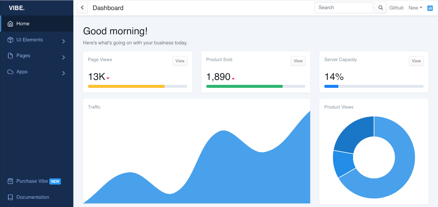
This is a beautiful React.js dashboard built with Bootstrap 4 and comes with lots of custom templates and components. It's built with Sass which allows you to quickly change global colors and styles.
- Install dependencies by running
yarnornpm install. - Run
yarn startornpm run startto start the local dev server.
Report any issues you may find with Vibe on the github issues tab. I will get an update to you as soon as possible. Feel free to open a pull request and I will review and merge.
Vibe is based on Create React App. Follow the documentation there for an introduction of the development environment.
The basic dashboard layout is defined in ./src/views/layouts/DashboardLayout.js. You can modify parts of the layout with the following code:
| Part | Modification |
|---|---|
| CSS | Sass files can be found in ./src/vibe/scss. Update ./src/vibe/scss/components/vars.scss to change global styles. |
| Responsivity | Configure the switch between mobile and desktop layout with the constant MOBILE_SIZE |
| Logo | Change file ./src/assets/images/vibe-logo.svg or import a different Logo |
| Chat | Enable/Disable it by default by setting the initial state of showChat1 |
| Header | Change function component HeaderNav. |
| Footer | Change the <Footer> part in the render() function of DashboardLayout. |
| Menu | See below. |
- Create your page as component in the folder
./src/views/pages. (You can actually create these components anywhere you wish, this is just a recommendation.) - Add your component to the
pageListarray in./src/views/index.js. - Call it by opening the route you've chosen.
| Key | Value |
|---|---|
component |
Your component name |
name |
The display name in the top bar (Header) of the dashboard |
route |
Route of this page, using the react-router-dom syntax |
exact |
(Optional) Set to true if you want to match this route exactly. See Routes documentation for details. |
See below for how to use Bootstrap components to design your page content.
All pages are accessible by their routes, but only pages manually added to ./src/_nav.js show up on the sidebar menu.
There are two menus available to fill: top and bottom.
Every top level menu entry can either be a top level button or a folder with a single level of child entries.
| Key | Value |
|---|---|
name |
Display name of the menu entry |
icon |
(Optional) Icon prefixed to the display name. The correct item gets autoloaded by Vibe. (react-feather is used for icons. |
url |
(Optional) Either a relative URL to the target page or an absolute URL to an external page (For linked menu entries. Make sure relative URLs start with a slash, i.e. /home) |
external |
(Optional) Set to true if the url points to an external page. |
target |
(Optional) Set to _blank if you want the link to an external page to open in a new window. |
children |
(Optional) Child entries as array (For folder menu entries) |
divider |
(Optional) Inserts a visual divider if set to true (Use this instead of a menu entry) |
Note: If you wish menus to be expanded by default, you have to change the initial state of open in ./src/vibe/components/SidebarNav/components/NavDropdownItem.js.
Vibe is using the Bootstrap-for-React library reactstrap. Follow the components documentation for using them in a Vibe Dashboard.
Note that Vibe overwrites the default Bootstrap styles in ./src/vibe/scss/components/.
Custom Vibe components are in the ./src/vibe/components/ directory.
Vibe is using react-feather for its icons.
A nice overview over all available icons can be found on https://feathericons.com/.
Note: In order to use a Feather icon in react, convert the name to camel case. (I.e. alert-circle becomes AlertCircle).
