A drawer view implemented by SwiftUI. This is not just simply a demo, instead, it can be directly used in project as a module as it has rudimentary customization flexibility.
- Fix the computed property error
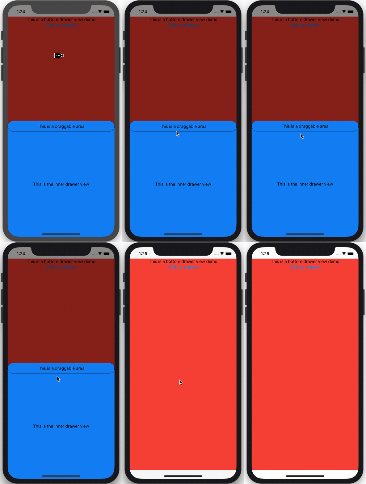
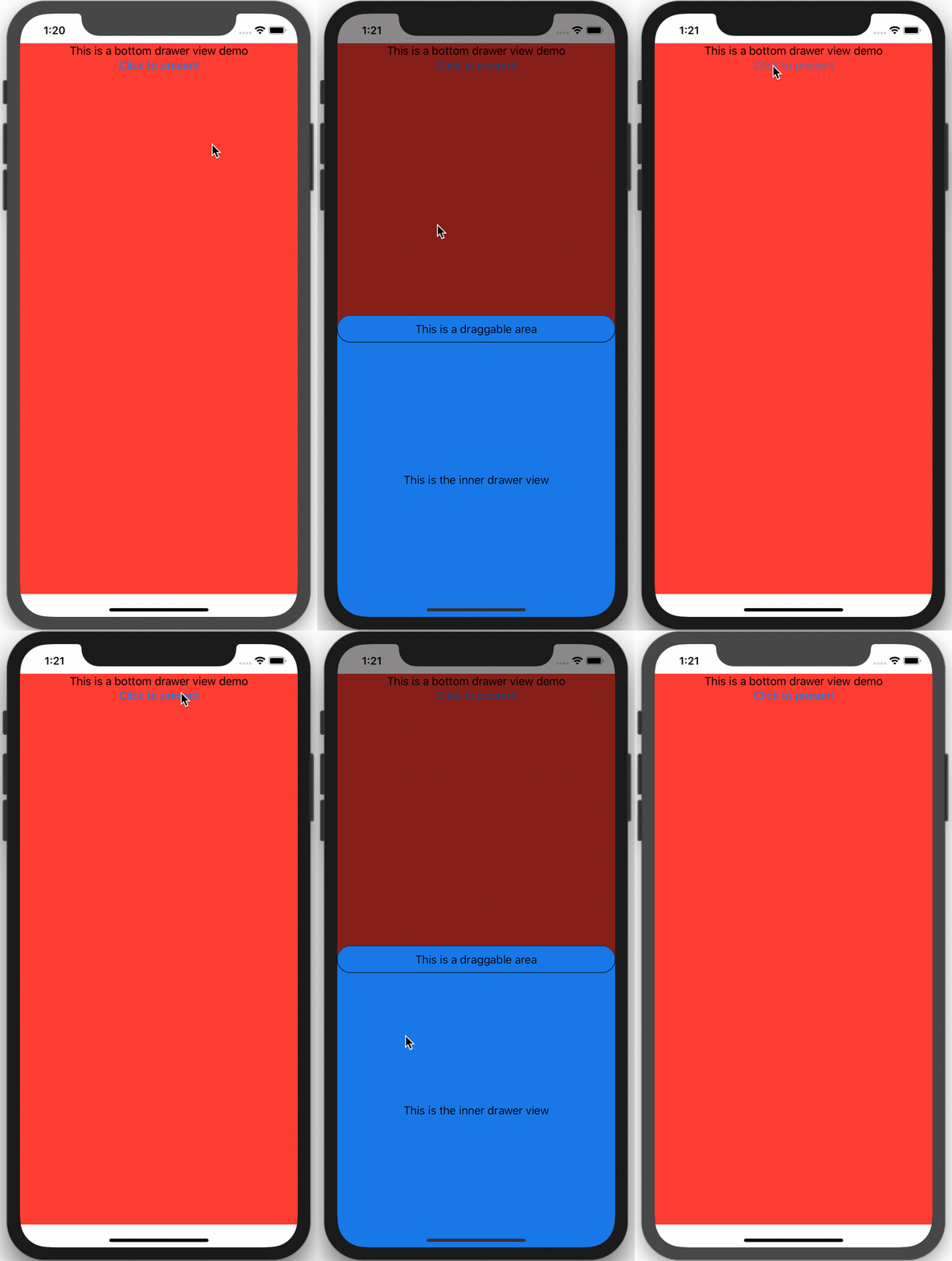
A drawer with some bouncing animation
You can click anywhere of the darken background to dismiss the DrawerView
-
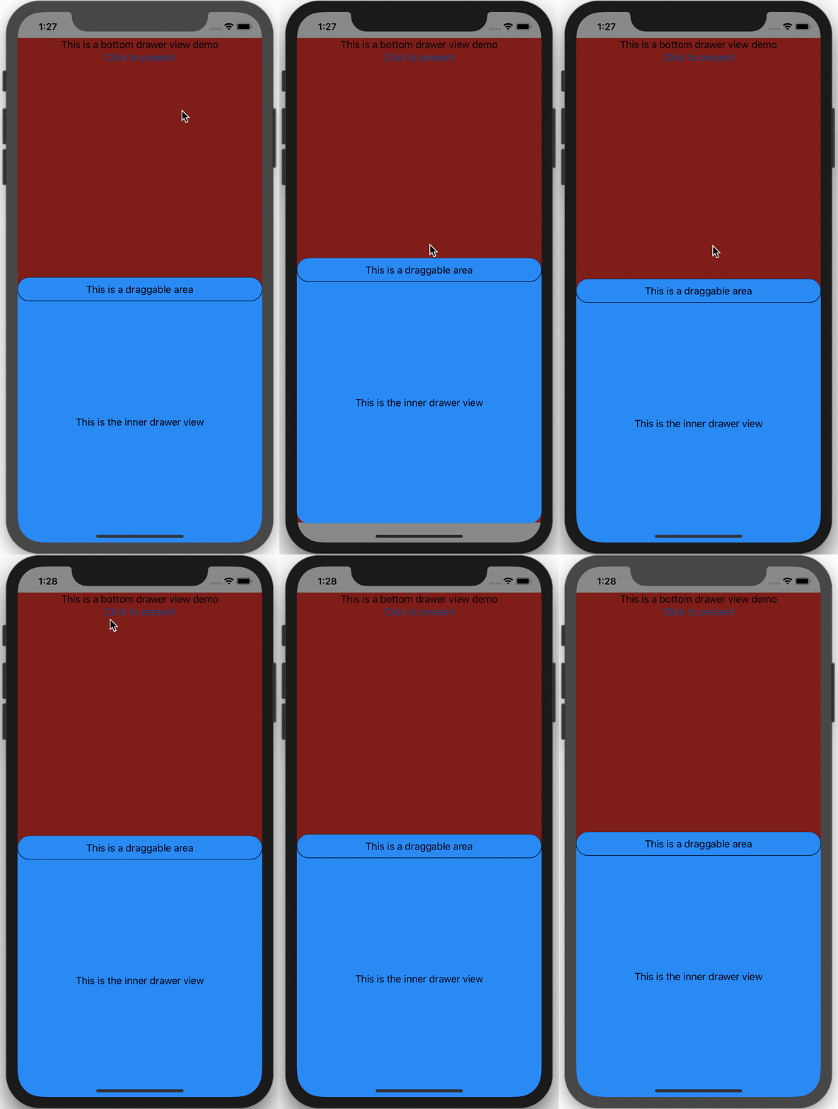
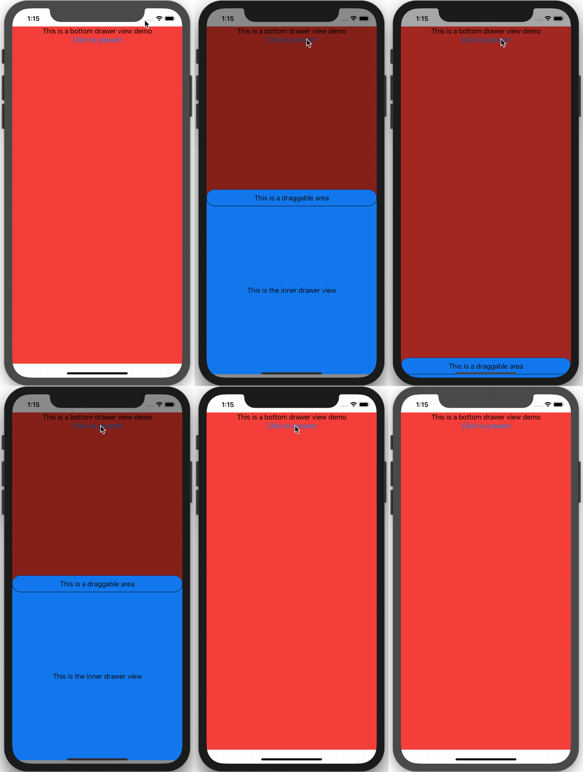
You can drag the draggable area to dismiss the DrawerView

-
However, if the translation of drag action is shorter than you want, you can still restore the DrawerView.

-
Actually, you can even drag it up if you want. You can modify this behavior in the code.

The entire DrawerView is coded in the file with the same name as DrawerView.swift. The setup code written in Content.swift which demonstrates how to use DrawerView.swift.
DrawerView takes one required argument isShow to open and dismiss itself. You need to create one in your main view and bind it to DrawerView
-
Use
DrawerViewasoverlayThe code provided in the
Content.swiftusesDrawerViewas aoverlayof the main view.VStack { // Create your own main view } .overlay( DrawerView(isShow: $isShow, content: SampleInnerView()) )
-
Use
DrawerViewinZStackZStack { VStack { // Create your own main view } DrawerView(isShow: $isShow, content: SampleInnerView()) }
In the above code,
contentis the inner view ofDrawerView.For example:
// file: SampleInnerView.swift
struct SampleInnerView: View {
  var body: some View {
    Text("This is the inner view of DrawerView")
  }
}
All customizable properties have been provided in the DrawerView.swift. You can directly assign the preferred value to these variables when you initialize the DrawerView
-
backLayerColor -
backLayerOpacity -
backLayerAnimation -
drawerOrientation -
drawerHeight -
drawerWidth -
drawerCornerRadius -
drawerBackgroundColor -
drawerOutAnimation -
isDrawerShadowEnable -
drawerShadowRadiusIf you want to customize this property, you need to set
isDrawerShadowEnabletotruefirst. By default, the animation of shadow is suppressed, but you can change it in source file. -
contentThis is property is required in the initializer. You can assign the view you want.
-
To Be Continued
This project is for demonstration purpose. Any contribution is welcome!
Best Luck and Happy Coding!

