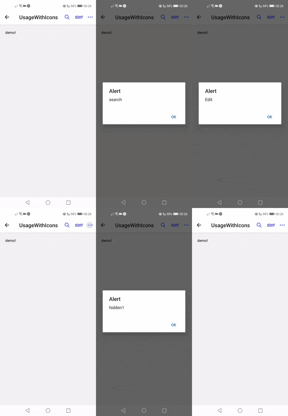
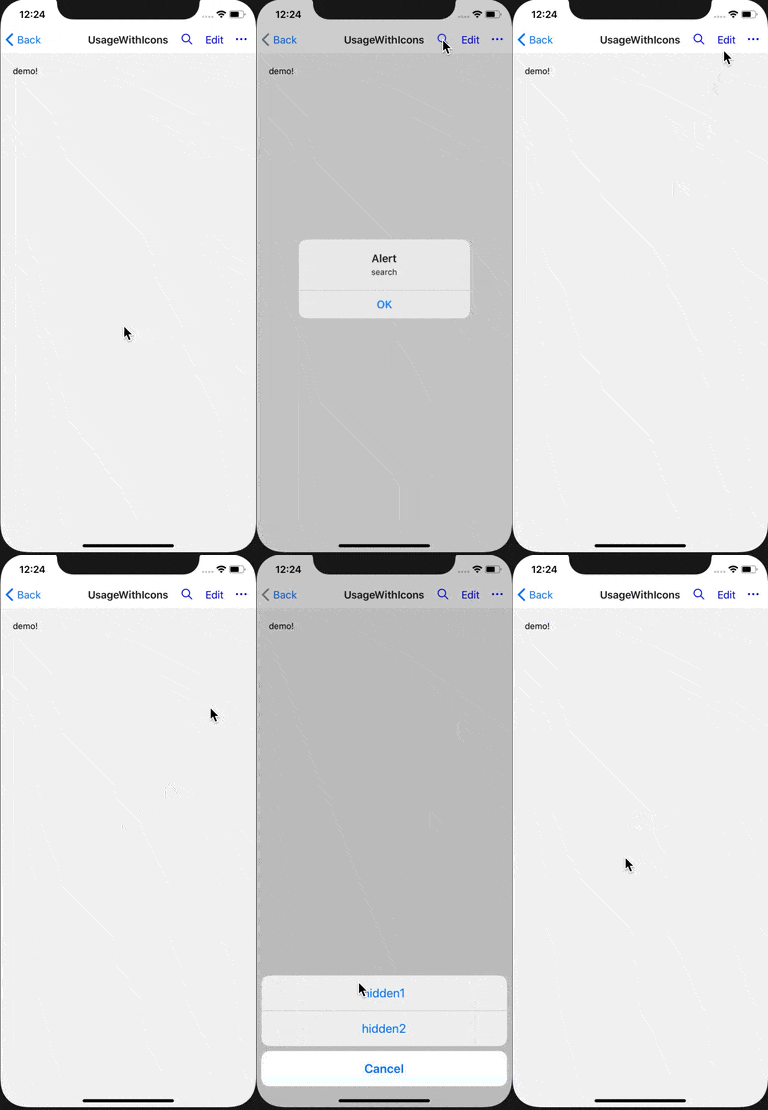
This package will help you render buttons in the navigation bar and handle the styling so you don't have to. It tries to mimic the appearance of native navbar buttons and attempts to offer simple and flexible interface for you to interact with. Typed with Flow and ships with TS typings. Supports iOS and Android, web support is experimental.
Contains many examples and is available via expo. Sources are in the example folder. I highly recommend you check out both links to get a better idea of the api.


The corresponding code:
import React from 'react';
import { Ionicons } from '@expo/vector-icons';
import { Text } from 'react-native';
import {
  HeaderButtons,
  HeaderButton,
  Item,
  HiddenItem,
  OverflowMenu,
} from 'react-navigation-header-buttons';

const IoniconsHeaderButton = (props) => (
  // the `props` here come from <Item ... />
  // you may access them and pass something else to `HeaderButton` if you like
  <HeaderButton IconComponent={Ionicons} iconSize={23} {...props} />
);

const ReusableItem = ({ onPress }) => <Item title="Edit" onPress={onPress} />;

const ReusableHiddenItem = ({ onPress }) => <HiddenItem title="hidden2" onPress={onPress} />;

export function UsageWithIcons({ navigation }) {
  React.useLayoutEffect(() => {
    navigation.setOptions({
      // in your app, you can extract the arrow function into a separate component
      // to avoid creating a new one every time you update the options
      headerRight: () => (
        <HeaderButtons HeaderButtonComponent={IoniconsHeaderButton}>
          <Item title="search" iconName="ios-search" onPress={() => alert('search')} />
          <ReusableItem onPress={() => alert('Edit')} />
          <OverflowMenu
            style={{ marginHorizontal: 10 }}
            OverflowIcon={({ color }) => <Ionicons name="ios-more" size={23} color={color} />}
          >
            <HiddenItem title="hidden1" onPress={() => alert('hidden1')} />
            <ReusableHiddenItem onPress={() => alert('hidden2')} />
          </OverflowMenu>
        </HeaderButtons>
      ),
    });
  }, [navigation]);

  return <Text style={{ flex: 1, margin: 20 }}>demo!</Text>;
}-
yarn add react-navigation-header-buttons -
Wrap your root component in
OverflowMenuProvider, as seen in example's App.tsx. IMPORTANTOverflowMenuProvidermust be placed so that it is a child ofNavigationContainer, otherwise this library may not receive the correct theme from React Navigation.
Version 7 and later gets colors for Android ripple effect, text and icons from React Navigation's theme, so you will not need to work with colors, with the exception of OverflowIcon as seen above. You can always override colors of text&icons (using color prop) or of the ripple effect on Android (using pressColor prop) as documented below.
Is a wrapper over all the visible header buttons (those can be text-buttons, icon-button, or any custom react elements).
The most important prop is HeaderButtonComponent that defines how all icons rendered in children will look.
In particular, it allows setting their IconComponent, size and color once so that you don't need to repeat it for each icon-button - but you can override those for each Item if you like.
HeaderButtons accepts:
| prop and type | description | note |
|---|---|---|
| HeaderButtonComponent?: React.ComponentType | component that renders the buttons, HeaderButton by default |
Typically, you'll want to provide a component that wraps HeaderButton provided by this package, as seen in the quick example. However, you're free to use your own component (see HeaderButton.js for reference). |
| children: React.Node | whatever you want to render inside | Typically, Item or your component that renders Item, but it can be any React element. |
| left?: boolean | whether the HeaderButtons are on the left from header title |
false by default, it only influences styling in a subtle way |
Renders text, or icon, and has an onPress handler. Take a look at the example to see how to use it.
Item accepts:
| prop and type | description |
|---|---|
| title: string | title for the button, required |
| onPress: ?() => any | function to call on press |
| iconName?: string | icon name, used together with the IconComponent prop |
| style?: ViewStyleProp | style to apply to the touchable element that wraps the button |
| buttonStyle?: ViewStyleProp | style to apply to the text / icon |
| testID?: string | testID to locate view in e2e tests |
| other props | whatever else you want to pass to the underlying touchable (eg. disabled) |
Item also accepts other props that you'll typically not need to pass because HeaderButtonComponent already knows them (eg. iconSize) or because they are pulled from the React Navigation's theme object (color).
| additional props and type | description | note |
|---|---|---|
| IconComponent?: React.ComponentType | component to use for the icons, for example from react-native-vector-icons |
|
| iconSize?: number | iconSize | |
| color?: string | color of icons and buttons |
Is the place to define the behavior for overflow button (if there is one). Please note you can render OverflowMenu only by itself too, you do not need to wrap it in HeaderButtons.
The most important prop is onPress which defines what kind of overflow menu we should show.
The package exports common handlers you can use, but you can provide your own too (via the onPress prop):
| exported handler | description |
|---|---|
overflowMenuPressHandlerActionSheet |
This is iOS-only: it displays overflow items in an ActionSheetIOS |
overflowMenuPressHandlerPopupMenu |
This is Android-only: it displays overflow items using UIManager.showPopupMenu |
overflowMenuPressHandlerDropdownMenu |
Can be used in iOS, Android and Web. Displays overflow items in a material popup adapted from react-native-paper, credit for amazing job goes to them. This Menu is bundled in this library (no dependency on react-native-paper). |
defaultOnOverflowMenuPress |
The default. Uses overflowMenuPressHandlerActionSheet on iOS, and overflowMenuPressHandlerDropdownMenu otherwise. |
OverflowMenu accepts:
| prop and type | description | note |
|---|---|---|
| OverflowIcon: React.Element | React.ComponentType | React element or component for the overflow icon | if you provide a component, it will receive color prop as seen in example above |
| style?: ViewStyleProp | optional styles for overflow button | there are some default styles set, as seen in OverflowButton.js |
| onPress?: (OnOverflowMenuPressParams) => any | function that is called when overflow menu is pressed. | This will override the default handler. Note the default handler offers (limited) customization. See more in "Recipes". |
| testID?: string | testID to locate the overflow button in e2e tests | the default is available under import { OVERFLOW_BUTTON_TEST_ID } from 'react-navigation-header-buttons/e2e' |
| accessibilityLabel?: string | 'More options' by default | |
| left?: boolean | whether the OverflowMenu is on the left from header title |
false by default, it just influences styling. No need to pass this if you already passed it to HeaderButtons. |
| children: React.Node | the overflow items | typically HiddenItems, please read the note below |
| other props | props passed to the nested Touchable | pass eg. pressColor to control ripple color on Android |
Children passed to OverflowMenu should be
- either
HiddenItems - or plain function components (no class components) without hooks that return
HiddenItem, as seen in the example above.
Anything else will be ignored and will not appear in the overflow menus shown by overflowMenuPressHandlerActionSheet and overflowMenuPressHandlerPopupMenu.
Only overflowMenuPressHandlerDropdownMenu supports rendering custom elements, such as <Divider /> (which is exported) or your custom ones.
This limitation may look weird, but it should not really bother you in any way: if you need to have state in your items, lift the state up.
The limitation exists because we need to be able to transform declarative React elements into imperative calls (ActionSheetIOS.showActionSheetWithOptions / UIManager.showPopupMenu).
If this is a problem for you for some reason, please raise an issue and we'll see what can be done about it.
If OverflowMenu contains no valid child elements, nothing will be rendered at all. (No OverflowIcon, no wrapper.)
examples
Please see UsageWithOverflowComplex.tsx for valid examples!
These will NOT work with overflowMenuPressHandlerActionSheet and overflowMenuPressHandlerPopupMenu:
- WRONG! no hooks are allowed!
function MyComponent({ title }) {
  const [titleFromState, setTitle] = React.useState('from state hook');
  return <HiddenItem title={titleFromState + title} onPress={() => alert('fail')} />;
}

<OverflowMenu OverflowIcon={<Ionicons name="ios-more" size={23} color="blue" />}>
  <MyComponent />
</OverflowMenu>;- WRONG! you can nest
HiddenItemonly once, not twice
const HiddenItemWrapped = () => <HiddenItem title="hidden2" onPress={() => alert('hidden2')} />;
const HiddenItemWrappedTwice = ()=> <HiddenItemWrapped />

<OverflowMenu OverflowIcon={<Ionicons name="ios-more" size={23} color="blue" />}>
  <HiddenItemWrappedTwice />
</OverflowMenu>;
HiddenItem
HiddenItem accepts:
| prop and type | description | note |
|---|---|---|
| title: string | title for the button, required | |
| style?: ViewStyleProp | style to apply to the touchable element that wraps the text | |
| titleStyle?: ViewStyleProp | style to apply to the text | |
| onPress: ?() => any | function to call on press | |
| testID?: string | testID to locate view in e2e tests | |
| disabled?: boolean | disabled 'item' is greyed out and onPress is not called on touch |
|
| destructive?: boolean | flag specifying whether this item is destructive | only applies to items shown with overflowMenuPressHandlerActionSheet |
This is a React context provider needed for overflowMenuPressHandlerDropdownMenu to work. If you're not using overflowMenuPressHandlerDropdownMenu then you don't need it.
By default, you need to wrap your root component with it.
OverflowMenuProvider accepts an optional spaceAboveMenu prop, which can be used to set the distance between the top of the screen and the top of the overflow menu.
You will typically not use HeaderButton directly. HeaderButton is where all the onPress, title and Icon-related props (color, size) meet to render actual button.
See the source if you want to customize it.
The default handler for overflow menu on iOS is overflowMenuPressHandlerActionSheet.
One of the usual things you may want to do is override the cancel button label on iOS - see example.
Use the buttonStyle prop to set textTransform styles for button titles.
This sections covers how you should use the library in your project. Please note that there are numerous example screens.
1 . Define one file where the styling of header buttons is taken care of.
// MyHeaderButtons.js

import * as React from 'react';
import MaterialIcons from 'react-native-vector-icons/MaterialIcons';
import { HeaderButtons, HeaderButton } from 'react-navigation-header-buttons';

// define IconComponent, color, sizes and OverflowIcon in one place
const MaterialHeaderButton = (props) => (
  <HeaderButton IconComponent={MaterialIcons} iconSize={23} color="blue" {...props} />
);

export const MaterialHeaderButtons = (props) => {
  return <HeaderButtons HeaderButtonComponent={MaterialHeaderButton} {...props} />;
};
2 . Import header buttons from the file defined previously.
// SomeScreen.js
import { MaterialHeaderButtons } from './MyHeaderButtons';
import { Item } from 'react-navigation-header-buttons';

React.useLayoutEffect(() => {
  navigation.setOptions({
    title: 'Demo',
    // use MaterialHeaderButtons with consistent styling across your app
    headerRight: () => (
      <MaterialHeaderButtons>
        <Item title="add" iconName="search" onPress={() => console.warn('add')} />
        <Item title="edit" onPress={() => console.warn('edit')} />
      </MaterialHeaderButtons>
    ),
  });
}, [navigation]);- it appears that when screen title is long, it might interfere with buttons (does not happen when using native stack). This is more probably a react-navigation error, but needs investigation.
- TS typings need improvement, plus I'd like to check their validity via the example project which is using TS. Please get in touch if you wanna help.
- missing styling support for material dropdown menu
- item margins need to be reviewed and polished; don't hesitate to contribute - this should help
- RTL is not tested