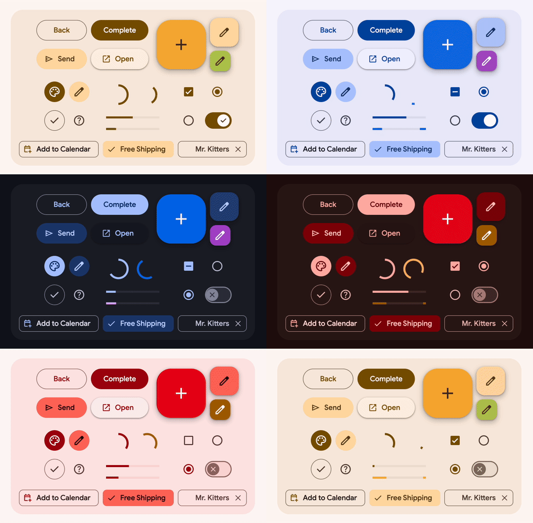
material is a library of
web components
that helps build beautiful and accessible web applications. It uses
Material 3, the latest version of Google's
open-source design system.
This is a fork of the original material web project that seems to be on hold. We are very grateful for the work the team at Google put into the project, but we just can't wait for them to start moving again and we don't want to stop using these material components we've grown to love. So we'll continue to develop this at our own pace, and that pace is FAST.
Please consider sponsoring before creating issues for us.
Demo is here: https://treeder.github.io/material/demo/
All the documentation here still applies: https://material-web.dev/
And we are adding README's in this repository for the new components that aren't in those docs.
npm install treeder/materialAdd this importmap to the <head> section of you app/site:
<script type="importmap">
  {
    "imports": {
      "lit": "https://cdn.jsdelivr.net/npm/lit@3/index.js",
      "lit/": "https://cdn.jsdelivr.net/npm/lit@3/",
      "@lit/localize": "https://cdn.jsdelivr.net/npm/@lit/localize/lit-localize.js",
      "@lit/reactive-element": "https://cdn.jsdelivr.net/npm/@lit/reactive-element@1/reactive-element.js",
      "@lit/reactive-element/": "https://cdn.jsdelivr.net/npm/@lit/reactive-element@1/",
      "lit-element/lit-element.js": "https://cdn.jsdelivr.net/npm/lit-element@4/lit-element.js",
      "lit-html": "https://cdn.jsdelivr.net/npm/lit-html@3/lit-html.js",
      "lit-html/": "https://cdn.jsdelivr.net/npm/lit-html@3/",
      "tslib": "https://cdn.jsdelivr.net/npm/tslib@2/tslib.es6.mjs",

      "material/": "https://cdn.jsdelivr.net/gh/treeder/material@0/"
    }
  }
</script>Then you can start using all the components like this:
<script type="module">
    import 'material/textfield/outlined-text-field.js'
    import 'material/button/filled-button.js'
</script>

<div>
  <md-outlined-text-field label="Name" required minlength="4"></md-outlined-text-field>
  <md-filled-button @click=${this.save}>Save</md-filled-button>
</div>
Or you'll more likely use them within other components, you'd do that like this.
Create a component with the material components in it:
import { html, css, LitElement } from 'lit'
import 'material/textfield/outlined-text-field.js'
import 'material/button/filled-button.js'

class DemoComponent extends LitElement {
    static styles = css`
        /* Add your component styles here */
    `

    render() {
        return html`
    <div style="display: flex; flex-direction: column; gap: 12px;">
        <md-outlined-text-field label="Name" required minlength="4"></md-outlined-text-field>
        <md-filled-button @click=${this.save}>Save</md-filled-button>
    </div>`
    }
    save() {
        console.log("Save button clicked")
    }
}

customElements.define('demo-component', DemoComponent)
Then in your HTML:
<script type="module">
    import './components/demo-component.js'
</script>

<demo-component></demo-component> In your CSS, set the default font family and sizes, set the following attributes in your CSS:
@import url(light.css) (prefers-color-scheme: light);
@import url(dark.css) (prefers-color-scheme: dark);

:root {
    --md-ref-typeface-brand: 'Roboto Flex', sans-serif;
    --md-ref-typeface-plain: 'Roboto Flex', sans-serif;

    font-family: var(--md-ref-typeface-plain);
    font-size: 14px;

    background: var(--md-sys-color-background);
    color: var(--md-sys-color-on-background);
}
Be sure to import the fonts you want to use along with Material Symbols:
<link rel="preconnect" href="https://fonts.googleapis.com">
<link rel="preconnect" href="https://fonts.gstatic.com" crossorigin>
<link rel="preload" href="https://fonts.googleapis.com/css2?family=Material+Symbols+Outlined:opsz,wght,FILL,GRAD@20..48,100..700,0..1,-50..200&display=swap" as="style" onload="this.onload=null;this.rel='stylesheet'"/>
<link rel="preload" href="https://fonts.googleapis.com/css2?family=Roboto+Flex:wght@400;500;700&display=swap" as="style" onload="this.onload=null;this.rel='stylesheet'">
To get your dark.css and light.css, go to Material Theme Builder, pick some colors and export to web/css. Extract the light.css and dark.css from the zip file and place beside your main css file.
We welcome contributions, please discuss and/or make pull requests.
Demo code is here: https://github.com/treeder/material/tree/main/demo
You can run it locally by checking out this repo and:
make run
