Pixie supports more TrueType / OpenType font features as well as rich text layout and rasterizizing through spans.
Consider migrating projects from Typography to Pixie for additional functionality and future improvements. 🚀🚀🚀🚀🚀
nimble install typography
Typography is pure nim implementation for font rasterization (letter drawing) and text typesetting (text layout). It does not rely on any external library such as FreeType, stb_truetype, pango or HarfBuzz.
See api reference: https://treeform.github.io/typography/typography.html
- SVG fonts - Most features are supported.
- TTF fonts - Fair support. Most modern features are supported but font format came out in 1994 and has a bunch of formats for different OSes that are not supported.
- OTF fonts - Basic TTF outline support only. No support for CFF or SVG outlines.
- vmath - vector stuff, vec2 and matrices.
- pixie - image stuff, saving and loading PNGs.
- chroma - color stuff, mostly to save and add rgba colors.
- print - better logging.
- bumpy - geometry stuff.
- flatty - dealing with binary encoding.
var font = readFontSvg("fonts/Ubuntu.svg")
font.drawText(image, vec2(10, 50), "The quick brown fox jumps over the lazy dog.")
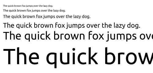
var font = readFontTtf("fonts/Ubuntu.ttf")
font.drawText(image, vec2(10, 50), "The quick brown fox jumps over the lazy dog.")font.size = 8
font.drawText(image, vec2(10, 10), "The quick brown fox jumps over the lazy dog.")
font.size = 10
font.drawText(image, vec2(10, 25), "The quick brown fox jumps over the lazy dog.")
font.size = 14
font.drawText(image, vec2(10, 45), "The quick brown fox jumps over the lazy dog.")
font.size = 22
font.drawText(image, vec2(10, 75), "The quick brown fox jumps over the lazy dog.")font.drawText(image, vec2(10, 10), readFile("examples/sample.ru.txt"))Each font has an table of glyphs.
font.glyphs["Q"]And for each glyphs, you can see what the SVG path of a glyph looks like:
echo font.glyphs["Q"].pathM754,236 Q555,236 414,377 Q273,518 273,717 Q273,916 414,1057 Q555,1198 754,1198 Q953,1198 1094,1057 Q1235,916 1235,717 Q1235,593 1175,485 L1096,565 Q1062,599 1013,599 Q964,599 929,565 Q895,530 895,481 Q895,432 929,398 L1014,313 Q895,236 754,236 Z M1347,314 Q1471,496 1471,717 Q1471,1014 1261,1224 Q1051,1434 754,1434 Q458,1434 247,1224 Q37,1014 37,717 Q37,421 247,210 Q458,0 754,0 Q993,0 1184,143 L1292,35 Q1327,0 1376,0 Q1425,0 1459,35 Q1494,69 1494,118 Q1494,167 1459,201 Z
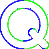
You can also draw this path to see all of the paths and all of the curve contorl points:
font.getGlyphOutlineImage("Q")Most of the time you would like to just get the image instead:
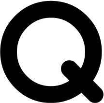
font.getGlyphImage("Q")You can then use this image in openGL, canvas, or even HTML.
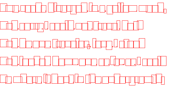
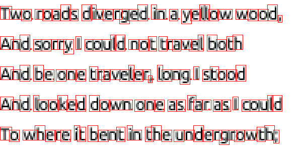
Each glyphs can be rendered with a subpixel offset, so that it fits into the layout:
Note how many of the "o"s and "m"s are different from each other. This happens because spaces between letters are not an integer number of pixels so glyphs must be rendred shifted by fraction of a pixel.
Here is how glyph changes with different subpixel offsets:
var glyphOffset # this is an offset of the image from the 0,0 position
var image = font.getGlyphImage(glyph, glyphOffset, subPixelShift=X)Before glyphs can be rendered they need to be typeset:
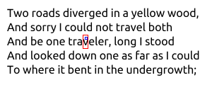
var layout = font.typeset("""
Two roads diverged in a yellow wood,
And sorry I could not travel both
And be one traveler, long I stood
And looked down one as far as I could
To where it bent in the undergrowth;""")
This produces a layout.
You can then use the simple drawing included to draw to an image, or use some other graphical librarry like openGL, canvas, or even HTML:
image.drawText(layout)You can also give the typeset region width and height so that text wraps and clips:
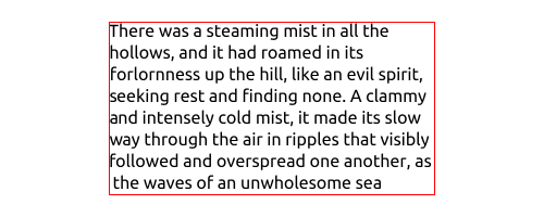
font.typeset(
  readFile("sample.wrap.txt"),
  pos=vec2(100, 20),
  size=vec2(300, 160)
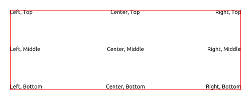
)There are 3 horizontal and 3 vertical alignment modes:
font.typeset("Center, Bottom",
  pos=vec2(20, 20),
  size=vec2(460, 160),
  hAlign=Center,
  vAlign=Bottom
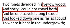
)When selecting text is useful to know where to highlighting rectangles.
layout.getSelection(23, 120) # selects char 23 to char 120 (not glyphs)When clicking on text is useful to know where to highlighting what glyph and what is the string index.
layout.pickGlyphAt(vec2(120, 48)) # selects glyph at cordiantesAt the large font sizes (more then 24 pixels) the fonts on most operating system looks nearly identical. But when you scale the font below 24px different OSs take different approaches.
- OSX - tries to render fonts most true to how font designer intended even if they look a blurry.
- Windows - tries to render fonts to a pixel grid making them look sharper.
- Linux - configurable and somewhere between the two.
- iOS, Android - it really does not matter how the font is rendered because its almost always above 24px because of high resolution screens phones have.
   var font = readFontSvg("fonts/DejaVuSans.svg")
   font.size = 11 # 11px or 8pt
   font.drawText(image, vec2(10, 15), "The quick brown fox jumps over the lazy dog.")
Typography renderer - this library (4x):
Apple Core Text renderer (4x):
Paint.net renderer (4x):
Bohemian Sketch renderer (4x):
Window ClearType renderer (4x):
How the font should look on screen is very subjective, some people love the crisp windows fonts, others swear by the apples adherence to design. But my opinion is it's all related a lot with familiarity. What you are used to is what you would like best, and when a person switches to a different screen with a different font rendering style brain immediately rejects it.
About a decade ago use of Subpixel Antialising improved readability of fonts. It would leak a bit of color to the left and right of text because color pixels were not square. The monitors followed predictable pixel patterns first in CRTs then in LCDs.
Then everything changed. Today our pixels small and they don't follow a typical CRT or LCD orientation.
The fact that there is no standard pixel layout grid anymore. And the fact that high resolution displays are everywhere makes subpixeling obsolete. Apple, Adobe, Bohemian and others in the typography space are abandoning subpixeling.
This library does not support Subpixel Antialising.
Neat tricks with Subpixel rendering
Apple removes Subpixel Antialising
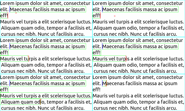
Full backend implementation of a text area. You need to connect your own rendering, keyboard and mouse input.
Often when displaying text you also need to edit text. This is where the textbox part of this library comes in. This implemented the backend of a text box/text area/input element/text field. Text boxes are surprisingly hard to implement right because the users are very familiar with how they work, so any missing features or inconsistencies are painfully obvious.
Here is a small list of some of the features:
- Typing, arrow keys, backspace and delete.
- Mouse clicking, dragging to select.
- Almost everything can be used to select with shift.
- Double click to select word, triple click to select paragraph, quad click to select all.
- Page up and page down.
- Move left/right by word.
- Move to start or end of lines.
- Copy, Cut and Paste.
- Scrolling and scroll to cursor when typing or selecting.
- Resizing of the text box while it’s being added.
- Remember your horizontal position when going up or down with short lines.
SVG fonts are really nice. The are simple to parse and understand and debug. They are very uncommon though. But they are good as a debug input, output, or intermediate step.
$ fontforge -c 'Open($1); Generate($2)' foo.ttf foo.svg

