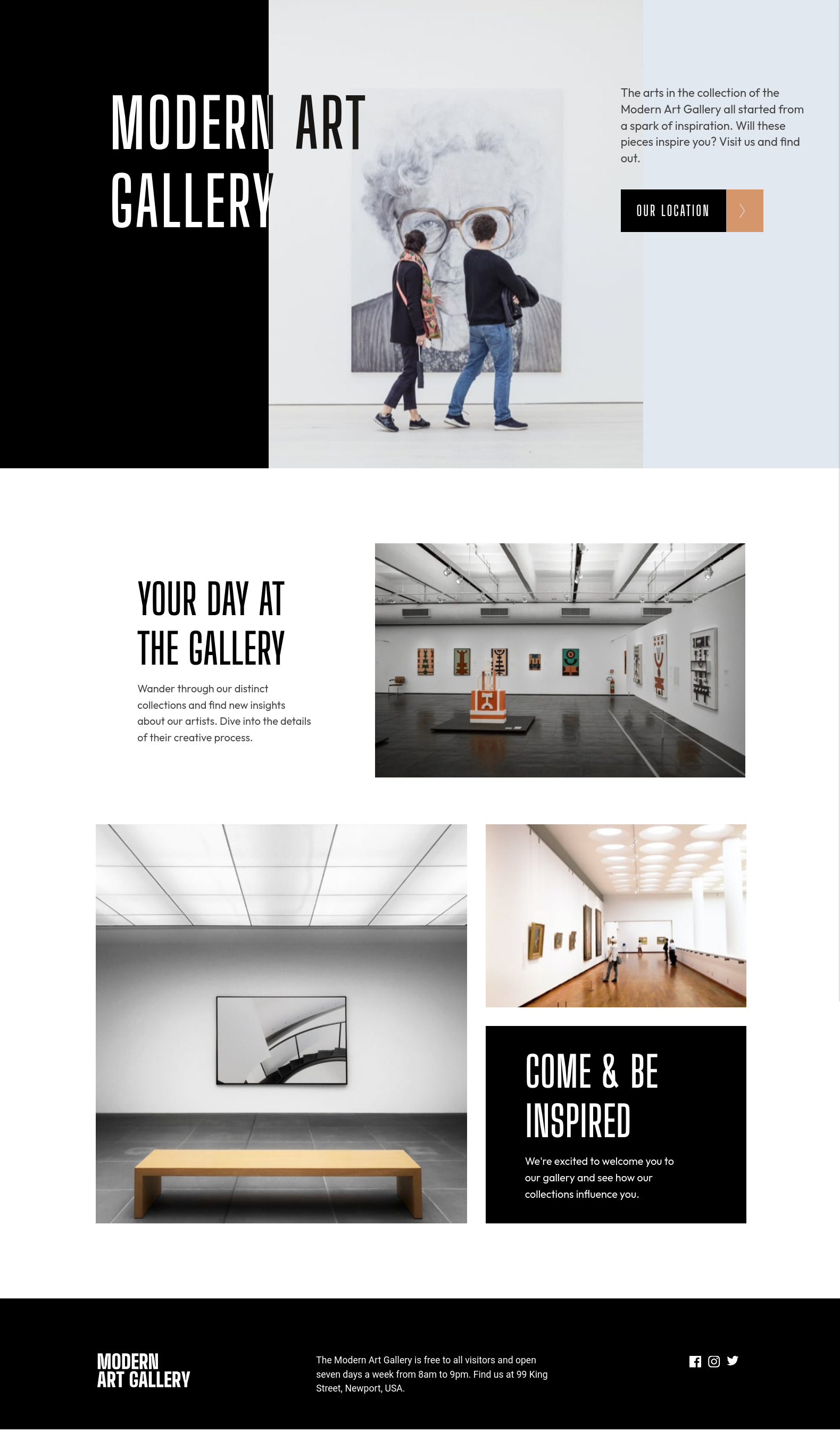
This is a solution to the Art gallery website challenge on Frontend Mentor. Frontend Mentor challenges help you improve your coding skills by building realistic projects.
Note: Delete this note and update the table of contents based on what sections you keep.
Users should be able to:
- View the optimal layout for each page depending on their device's screen size
- See hover states for all interactive elements throughout the site
- Bonus: Use Leaflet JS to create an interactive location map with custom location pin
- Solution URL: Add solution URL here
- Live Site URL: Add live site URL here
- Ionic UI utilities to frame the interface
- TailwindCSS to format the specific detais
- Split large, medium and small sizes is separate files
- React - JS library
- TailwindCSS - CSS utility classes
- Ionic - Render JS code to native APPs to Web, IOS and Android
More learning about the context of React, Tailwind and Ionic. How to render React components using the window object width propertie. That is a better approach than media qqueryes.
if (typeof window !== "undefined") {
  // Handler to call on window resize
  function handleResize() {
    // Set window width/height to state
    setWindowSize({
      width: window.innerWidth,
      height: window.innerHeight,
    });
  }
}Ionic framework do offer much help to build UIs and style them to Web, IOs and Android, but when a desing must be followed one will need to make use of Tailwind (or plain CSS) as Ionic format can get in the way.
- Use media queries with react hooks - This helped me for XYZ reason. I really liked this pattern and will use it going forward.
- Website - Thomas TS
- Frontend Mentor - @ttsoares
- Linkedin - thomas-soares-6791781b/
