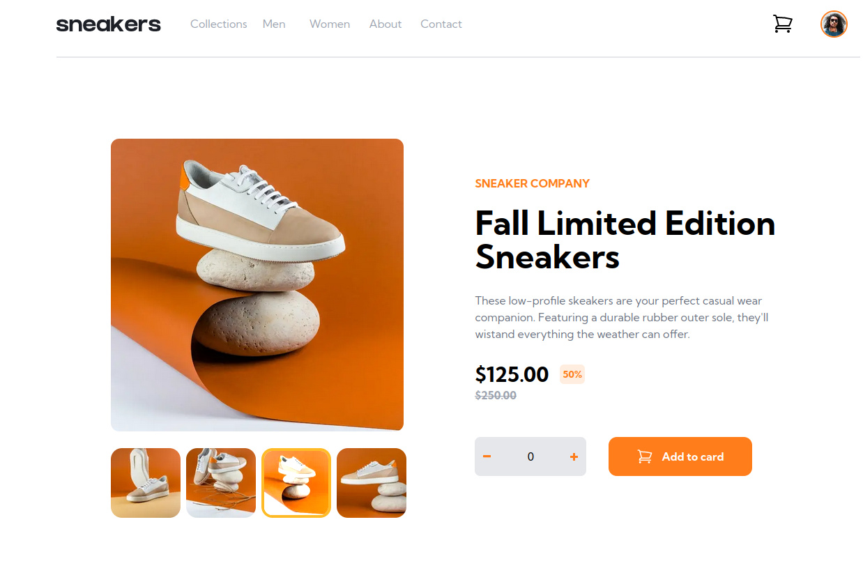
This is a solution to the E-commerce product page challenge on Frontend Mentor. Frontend Mentor challenges help you improve your coding skills by building realistic projects.
Note: Delete this note and update the table of contents based on what sections you keep.
Users should be able to:
- View the optimal layout for the site depending on their device's screen size
- See hover states for all interactive elements on the page
- Open a lightbox gallery by clicking on the large product image
- Switch the large product image by clicking on the small thumbnail images
- Add items to the cart
- View the cart and remove items from it
- Solution URL: Add solution URL here
- Live Site URL: Add live site URL here
- Flexbox
- React - JS library
- Next.js - React framework
- react-burger-menu - Library to facilitate burger menus
The use of the burger-menu library and the properties 'peer' of TailwindCSS
To see how you can add code snippets, see below:
<nav className="hidden md:flex h-20 ">
  {MENU_LIST.map((item, index) => (
    <div key={index} className="flex flex-col justify-evenly">
      <div className="w-20 relative text-center">
        <div className="peer w-20 h-6 text-gray-400">
          <Link href={item.href}>{item.text}</Link>
        </div>
        <div className="absolute top-6 hidden peer-hover:block w-20 h-1 bg-orange mt-8"></div>
      </div>
    </div>
  ))}
</nav>Keep unveiling the deeps of Tailwind...
- Jotai - Primitive and flexible state management for React
- Website - Thomas Tschoepke Soares
- Frontend Mentor - @ttsoares
This was - by far - the hardest project of all I completed in frontendMentor !
It is surprising that was classified as Intermediary...
