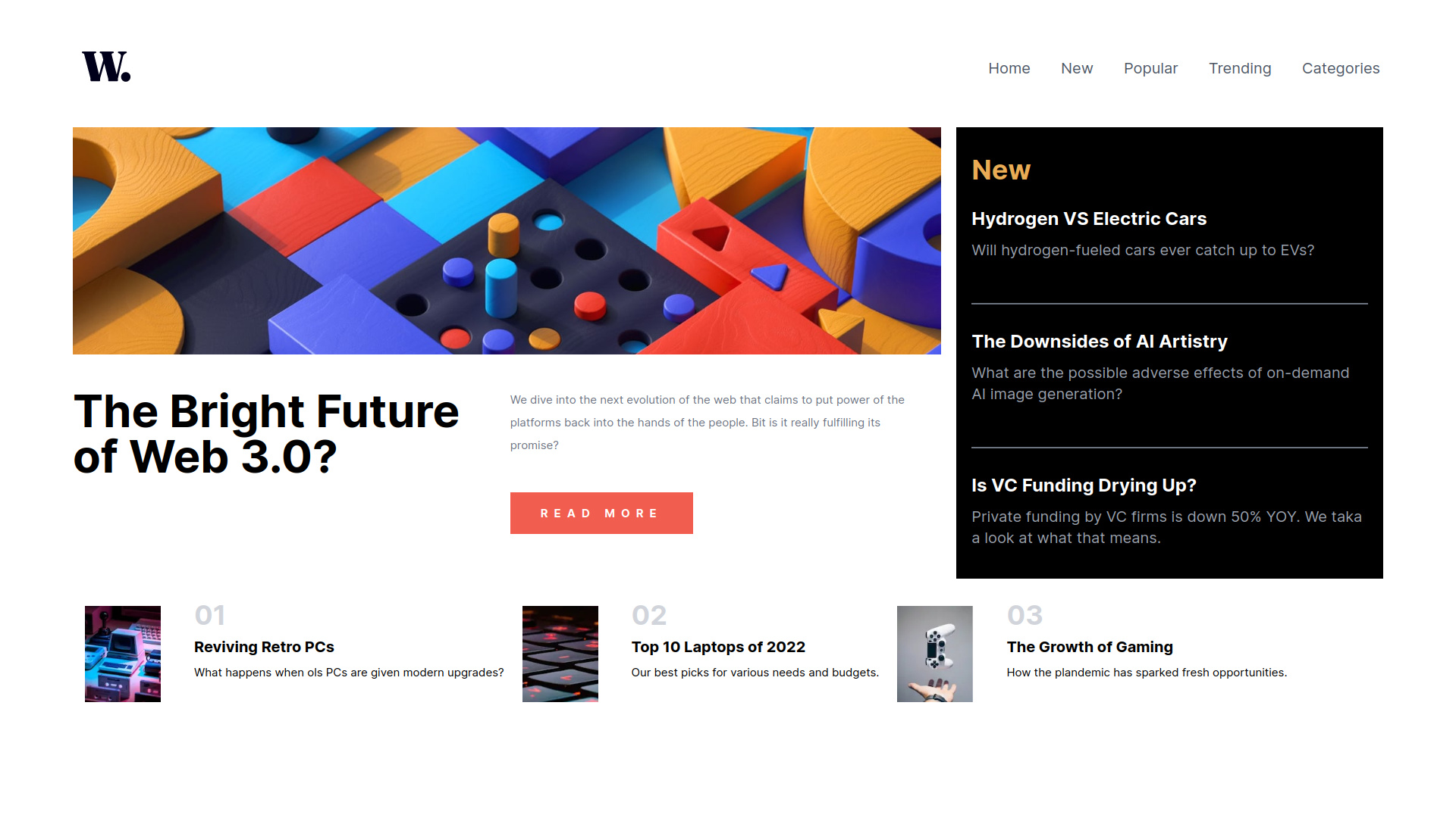
This is a solution to the News homepage challenge on Frontend Mentor. Frontend Mentor challenges help you improve your coding skills by building realistic projects.
Note: Delete this note and update the table of contents based on what sections you keep.
Users should be able to:
- View the optimal layout for the interface depending on their device's screen size
- See hover and focus states for all interactive elements on the page
- Solution URL: Add solution URL here
- Live Site URL: Add live site URL here
- Flexbox
- CSS Grid
- React - JS library
- Next.js - React framework
- react-burger-menu - Library to facilitate burger menus
Better understanding about grids with Tailwind
To see how you can add code snippets, see below:
<main className="flex flex-col md:grid grid-cols-1 grid-rows-8 md:grid-cols-3 gap-5  w-full h-fit">
<div className="order-1 w-full h-[300px] md:row-span-2 col-span-1 md:col-span-2 bg-img-top-mob md:bg-img-top-dsk bg-cover bg-no-repeat"></div>Each opportunity the deal with Tailwind new details emerge...
- Burger Menu - Tool to facilitate creation of burger-menus.
- Website - Thomas Tschoepke Soares
- Frontend Mentor - @ttsoares
I did this challenge several weeks ago but was too ashamed of the code to post it... Now after several projects I'm less ashamed.
