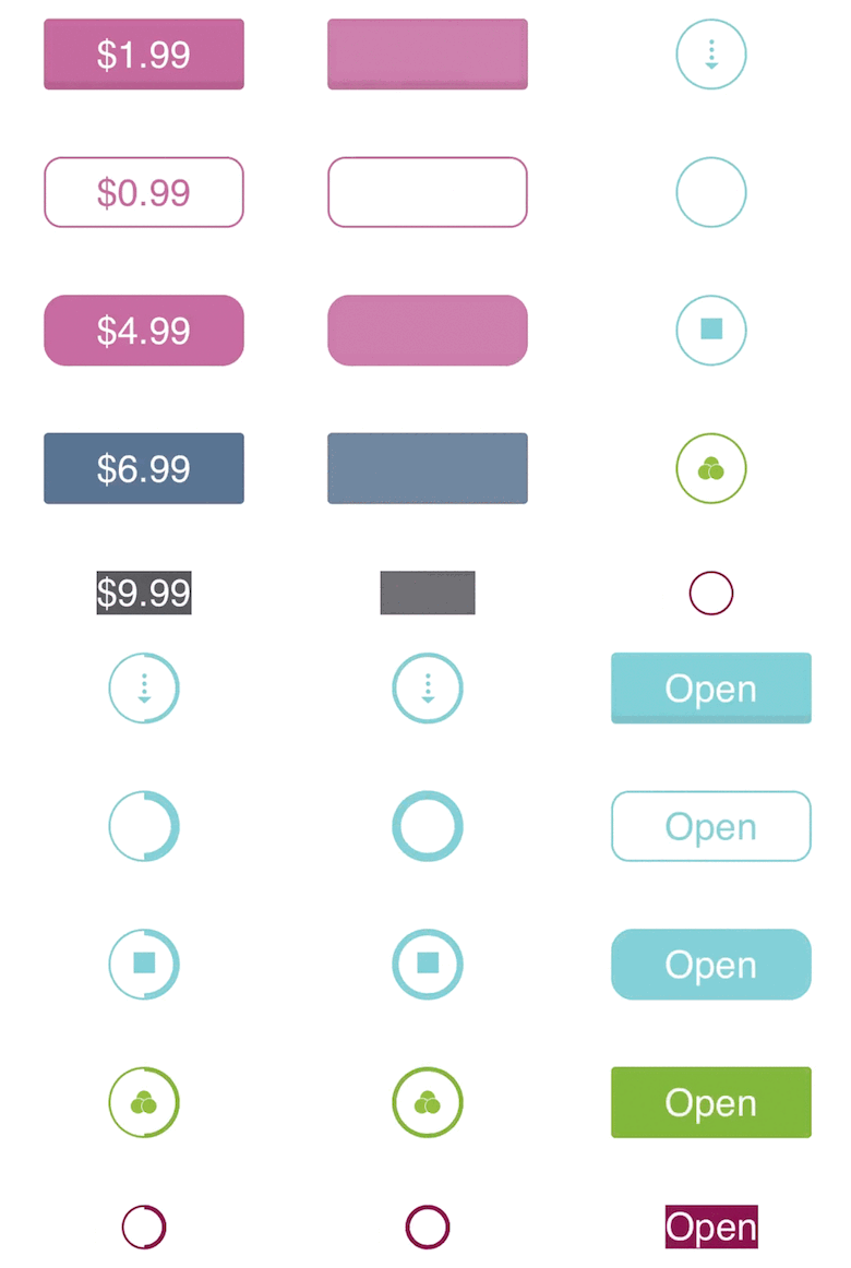
A simple and customisable in-app purchase button, written in Swift.
The most convenient way to install it is by using Cocoapods with Podfile:
pod 'InAppPurchaseButton'or using Carthage and add a line to Cartfile:
github "PGSSoft/InAppPurchaseButton"
iOS 8.4
import InAppPurchaseButtonOpen your storyboard or xib and drag and drop UIButton control.
Change custom class to InAppPurchaseButton.
Add constrains, but bear in mind that InAppPurchaseButton changes intrinsic content size by itself, so adding constrains like height or width will cause unexpected behaviour.
If you want to control size of InAppPurchaseButton, take a look at minExpandedSize and prefferedTitleMargins properties.
InAppPurchaseButton might have following states:
regular(active for purchased item or inactive for not purchased item) - use it to display text like Open (active) or Buy (for inactive)
Example:
button.buttonState = .regular(animate: true, intermediateState: .active)busy- intermediate state betweenregularanddownloading, usually used when application is waiting for something (e.g. response from the server)
Example:
button.buttonState = .busy(animate: true)downloading- showing current progress
Example
button.buttonState = .downloading(progress: 0.25)minExpandedSize- minimum size for expanded stateprefferedTitleMargins- preferred space between text and edgesborderColorForInactiveState- border color for inactive stateborderColorForActiveState- border color for active statebackgroundColorForInactiveState- fill color of the button in inactive statebackgroundColorForActiveState- fill color of the button in active stateimageForInactiveState- stretchable background image of the button in inactive stateimageForActiveState- stretchable background image of the button in active statewidthForBusyView- diameter of the button in case when indicator view is showncornerRadiusForExpandedBorder- corner radius of the border during transition from .regular to .busy stateborderWidthForBusyView- border width for .busy stateborderWidthForProgressView- border width for .downloading stateringColorForProgressView- color of the ring for .downloading stateattributedTextForProgressView- attributed string for .downloading stateindicatorImageForProgressMode- alternatively it is possible to display image for .downloading statetransitionAnimationDuration- the speed for all transition animationsshouldAlwaysDisplayBorder- indicates whether border for .active or .inactive should be visible all the time or only during transition (false by default)attributedTextForInactiveState- attributed string for .inactive stateattributedTextForActiveStateattributed string for .active state
For more information, please check InAppPurchaseButton.swift documentation and examples
Bug reports and pull requests are welcome on GitHub at https://github.com/PGSSoft/InAppPurchaseButton.
The project is available as open source under the terms of the MIT License.
The project maintained by software development agency PGS Software. See our other open-source projects or contact us to develop your product.


