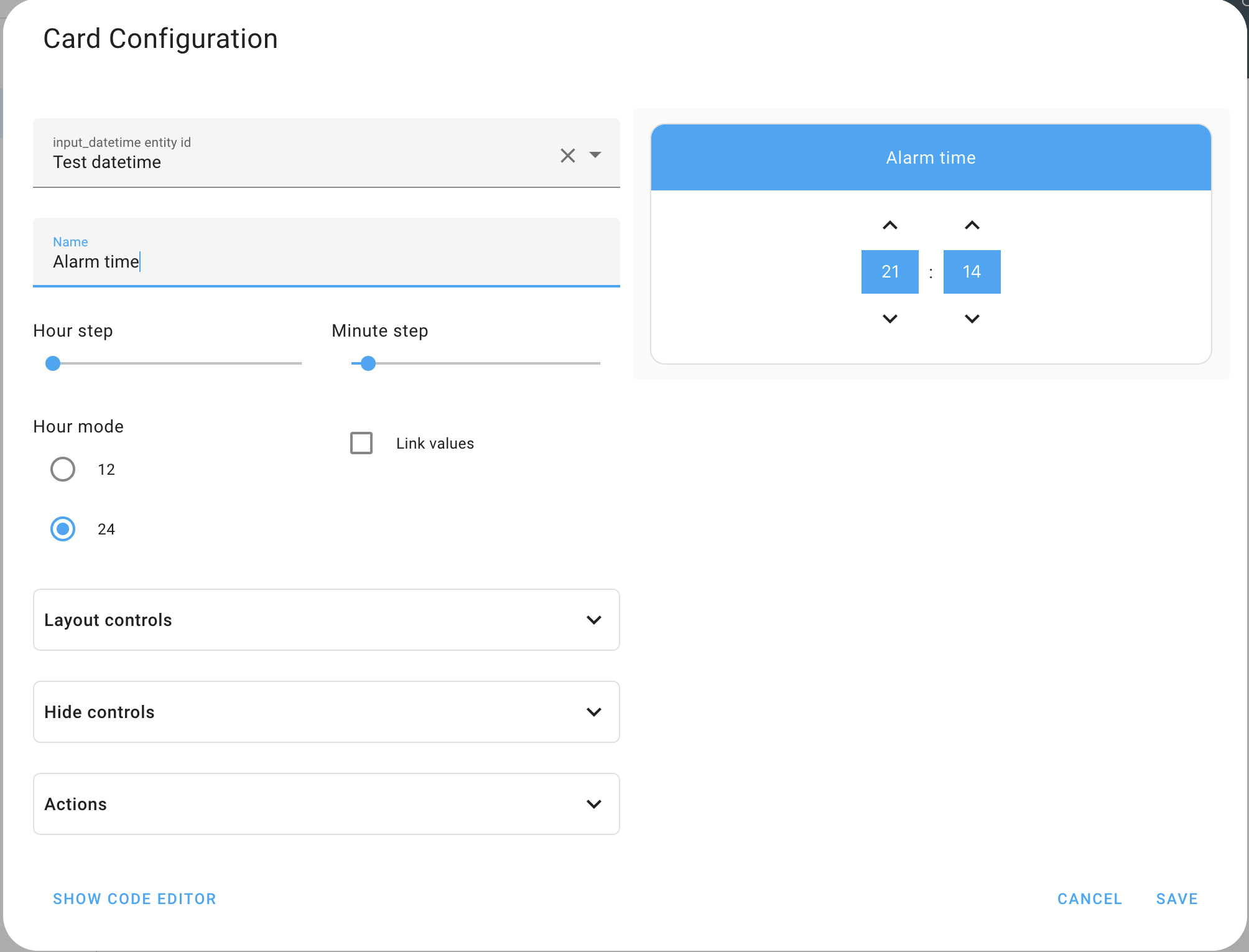
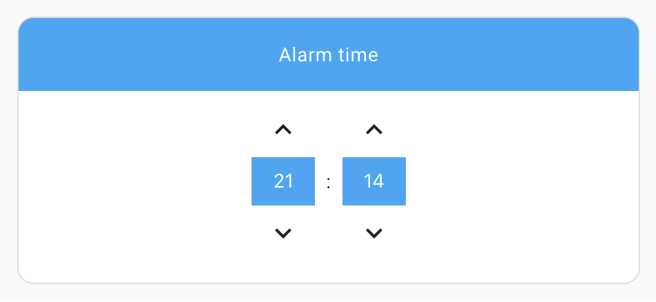
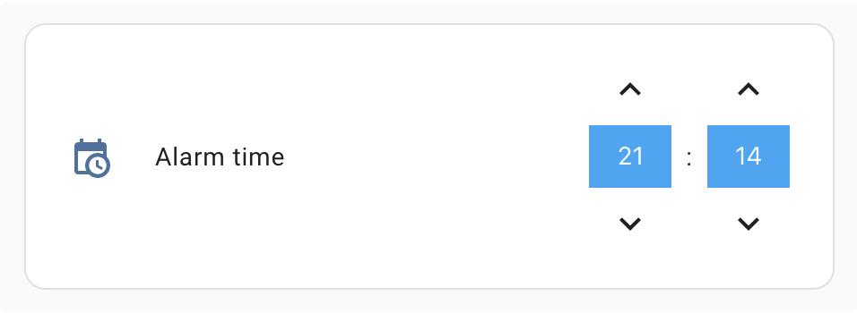
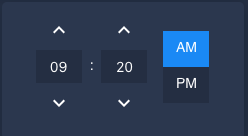
This is a Time Picker Card for Home Assistant's Lovelace UI.
Requires an Input Datetime that has time (has_time: true).
Install using HACS and add the following to your config:
resources:
  - url: /hacsfiles/lovelace-time-picker-card/time-picker-card.js
type: moduleDownload time-picker-card.js from the latest realease and place it in your config/www folder. Add the following to your config:
resources:
  - url: /local/time-picker-card.js
type: moduleTime Picker Card supports Lovelace's Visual Editor. Click the + button to add a card and search for time picker.
type: 'custom:time-picker-card'
entity: input_datetime.alarm_time
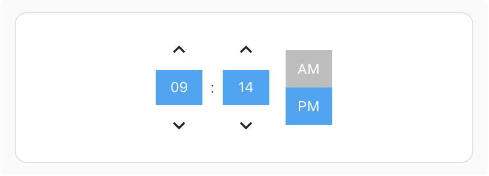
Custom config - hidden card name, 12 hour mode
type: 'custom:time-picker-card'
entity: input_datetime.alarm_time
hour_mode: 12
hide:
  name: true
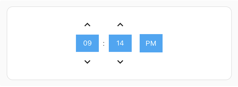
Custom config - hidden card name, 12 hour mode with a "single" hour mode picker
type: 'custom:time-picker-card'
entity: input_datetime.alarm_time
hour_mode: 12
layout:
  hour_mode: single
  align_controls: right
hide:
name: truetype: 'custom:time-picker-card'
entity: input_datetime.alarm_time
layout:
name: inside
align_controls: center| Name | Type | Requirement | Description | Default |
|---|---|---|---|---|
| type | string | Required | custom:time-picker-card |
|
| entity | string | Required | Input Datetime entity with has_time: true |
|
| name | string | Optional | Card name | Entity's friendly_name |
| link_values | boolean | Optional | If enabled, will change hour when minutes overflow. E.g. will go from 11:55 to 12:00, instead of 11:00 | false |
| hour_mode | 12 or 24 |
Optional | Hour format. If 12, card will show AM/PM picker |
24 |
| hour_step | number | Optional | Hour change when clicking arrows | 1 |
| minute_step | number | Optional | Minute change when clicking arrows | 5 |
| delay | number | Optional | Delay in ms before updating entity | 0 |
| layout | object | Optional | Card Layout configuration | none |
| hide | object | Optional | Hide object | none |
| tap_action | action | Optional | Home assistant action to perform on tap | more-info |
| double_tap_action | action | Optional | Home assistant action to perform on tap | more-info |
| hold_action | action | Optional | Home assistant action to perform on tap | more-info |
| Name | Value | Requirement | Description | Default |
|---|---|---|---|---|
| hour_mode | single, double |
Optional | Whether to show both AM/PM or just the current mode. In single mode, tap the value to change it. |
double |
| align_controls | left, center, right |
Optional | Horizontal alignment of the controls | center |
| name | header, inside |
Optional | Whether to show the name as a header or inside the card | header |
| embedded | boolean | Optional | Render with embedded style - disables padding, box shadow, and card header | false |
| thin | boolean | Optional | Render with reduced paddings | false |
| Name | Type | Requirement | Description | Default |
|---|---|---|---|---|
| name | boolean | Optional | Hides the card name | false |
| icon | boolean | Optional | Hides the card icon (only with controls "inside") | false |
| seconds | boolean | Optional | Hides seconds input | true |
Time Picker Card will automatically pick up colors from your lovelace theme, but if you want to customize some of them, you can use the following variables in your theme's config file:
| Name | Default | Description |
|---|---|---|
| time-picker-elements-background-color | var(--primary-color) |
Background color for header and inputs |
| time-picker-icon-color | var(--primary-text-color) |
Arrow color |
| time-picker-text-color | white |
Text color |
| time-picker-accent-color | var(--primary-color) |
AM / PM active color |
| time-picker-off-color | var(--disabled-text-color) |
AM / PM inactive color |
| time-picker-border-radius | var(--ha-card-border-radius) |
Border radius of the card |
| time-picker-control-padding | 8px |
Padding for interactive elements. Increase for larger hitboxes of the controls. Example: 10px 12px |
Georgi Gardev


