react-native-value-picker
Cross-Platform iOS style picker for react native.
Small, Performant
The Native picker on Android is a modal / dropdown design which is vastly different from the native iOS picker. In my current project we wanted a design more similar to the iOS native picker, and thus I created this Scroll Picker as a replacement on Android, but it works equally well on iOS for instance as an alternative to @react-native-community/picker native iOS picker module.
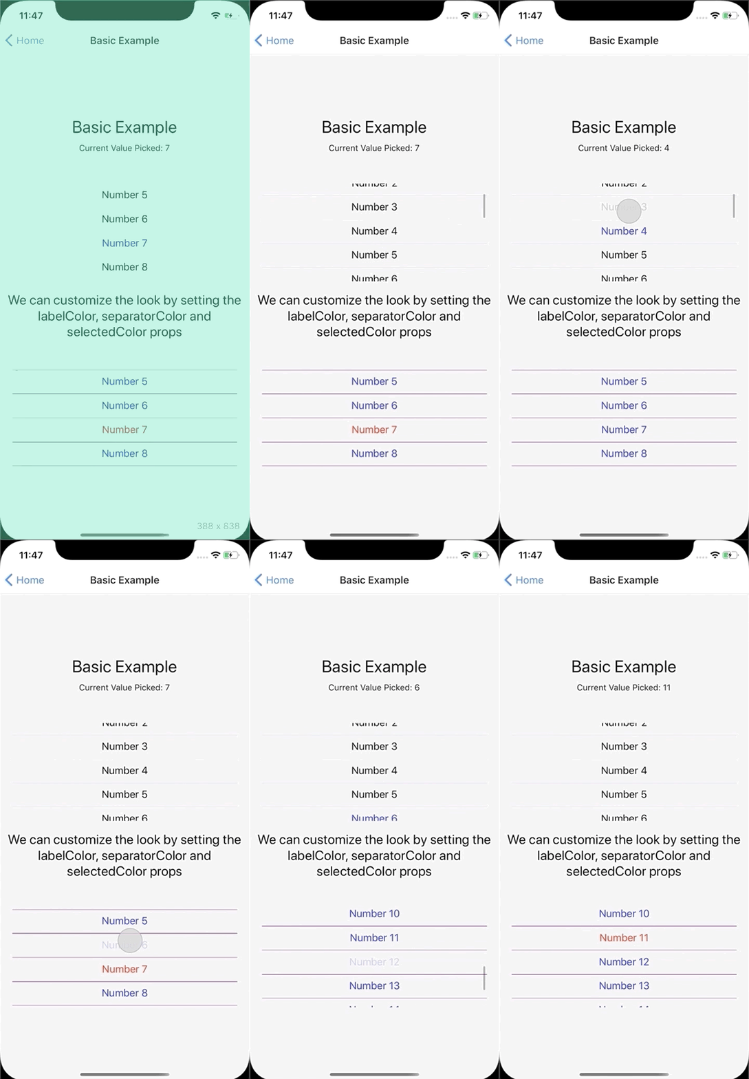
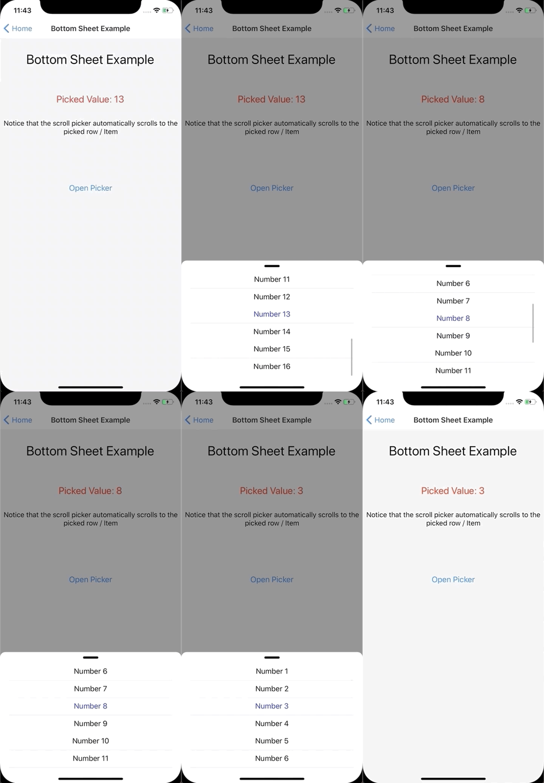
Examples
| Basic Example | Bottom Sheet Example |
|---|---|
 |
 |
Install into project
yarn add react-native-value-picker
import and usage
import {ScrollPicker} from 'react-native-value-picker';

        ...

        <ScrollPicker
          // We need to tell the picker the current picked value
          currentValue={pickedValue}
          // The picker is a pure component so we need to tell it
          // what data it needs to subscribe to, otherwise it won't
          // re-render
          extraData={pickedValue}
          // The array of objects which makes up the list
          list={MOCK_DATA}
          // Callback function to update the picked value
          onItemPress={setPickedValue}
          // Changes the text color in the list
          labelColor="blue"
          // Changes color of the row separator in the list
          separatorColor="purple"
          // Changes color of the text of the picked item in the list
          selectedColor="red"
        />

        ...
Picker List Data Structure
the list prop requires an array of Objects according to the below structure.
- value: the API value
- label: the text rendered into the picker list.
export const MOCK_DATA = [
  {
    value: 1,
    label: 'Number 1',
  },
  {
    value: 2,
    label: 'Number 2',
  },
  {
    value: 15,
    label: 'Number 15',
  },
  {
    value: 16,
    label: 'Number 16',
  },
];
Run the examples Locally
Clone project
git clone https://github.com/ugglr/react-native-value-picker.git
move into the examples folder.
cd react-native-value-picker && cd examples
in examples root
yarn
iOS Install pods and go back to examples root
cd ios && pod install && cd ..
Run react native
yarn run ios
Android run react native in examples root
yarn run android
ScrollPicker Props
| Prop | Description |
|---|---|
currentValue |
Tells the picker the current picked value |
extraData |
The underlying RN component which creates the list is FlatList. Which means, as a FlatList it is a pure component and won't re-render, unless it subscribes to a piece of data that will trigger a re-render. |
list |
The array of objects which makes up the list. Each Object in the Array needs to have a value-field, and a label-field. Value is the API value which the developer needs to user to pick. Label is the verbose friendly String which is displayed to the user. |
onItemPress |
Callback which get's executed when user presses an Item in the picker list. |
labelColor |
Changes the un-picked text color of the Items in the list |
separatorColor |
Changes color of the separator lines between the Items in the list. |
selectedColor |
Changes the picked Item text color |
Example Code
BasicExample.js
import React, {useState} from 'react';
import {View, Text, StyleSheet} from 'react-native';

import {ScrollPicker} from 'react-native-value-picker';

import {MOCK_DATA} from './mockData';

function BasicExample() {
  const [pickedValue, setPickedValue] = useState(7);

  return (
    <View style={styles.Container}>
      <Text style={styles.Title}>Basic Example</Text>
      <Text>Current Value Picked: {pickedValue}</Text>

      <View style={styles.PickerContainer}>
        <ScrollPicker
          currentValue={pickedValue}
          extraData={pickedValue}
          list={MOCK_DATA}
          onItemPress={setPickedValue}
        />
      </View>
      <Text style={{fontSize: 22, textAlign: 'center'}}>
        We can customize the look by setting the labelColor, separatorColor and
        selectedColor props
      </Text>
      <View style={styles.PickerContainer}>
        <ScrollPicker
          // We need to tell the picker the current picked value
          currentValue={pickedValue}
          // The picker is a pure component so we need to tell it
          // what data it needs to subscribe to, otherwise it won't
          // re-render
          extraData={pickedValue}
          // The array of objects which makes up the list
          list={MOCK_DATA}
          // Callback function to update the picked value
          onItemPress={setPickedValue}
          // Changes the text color in the list
          labelColor="blue"
          // Changes color of the row separator in the list
          separatorColor="purple"
          // Changes color of the text of the picked item in the list
          selectedColor="red"
        />
      </View>
    </View>
  );
}

const styles = StyleSheet.create({
... see example file for styles ...
});

export default BasicExample;
Bottom Sheet Example
Note: The bottom sheet component is not included in the package. I'm using react-native-raw-bottom-sheet
import React, {useRef, useState} from 'react';
import {View, Text, Button, StyleSheet} from 'react-native';
import RBSheet from 'react-native-raw-bottom-sheet';

import {ScrollPicker} from 'react-native-value-picker';

import {MOCK_DATA} from './mockData';

function BottomSheetExample() {
  const [pickedValue, setPickedValue] = useState(7);
  const refRBSheet = useRef();

  return (
    <View style={styles.Container}>

    ...

      <RBSheet
        ref={refRBSheet}
        closeOnDragDown={true}
        closeOnPressMask={true}
        height={300}
        customStyles={{
          draggableIcon: {
            backgroundColor: '#000',
          },
          container: {
            borderRadius: 12,
          },
        }}>
        {/* Start of Scroll Picker */}
        {/*
            The underlying FlatList is not wrapped with a View.
            So to align it in the sheet I wrap the picker and control
            the positioning. I like that approach because devs has full control
            over how the picker is placed & aligned.
        */}
        <View style={styles.SheetView}>
          <ScrollPicker
            // We need to tell the picker the current picked value
            currentValue={pickedValue}
            // The picker is a pure component so we need to tell it
            // what data it needs to subscribe to, otherwise it won't
            // re-render
            extraData={pickedValue}
            // The array of objects which makes up the list
            list={MOCK_DATA}
            // Callback function to update the picked value
            onItemPress={setPickedValue}
          />
        </View>
        {/* End of Scroll Picker */}
      </RBSheet>
    </View>
  );
}

const styles = StyleSheet.create({
... see the example file for styles ...
});

export default BottomSheetExample;


