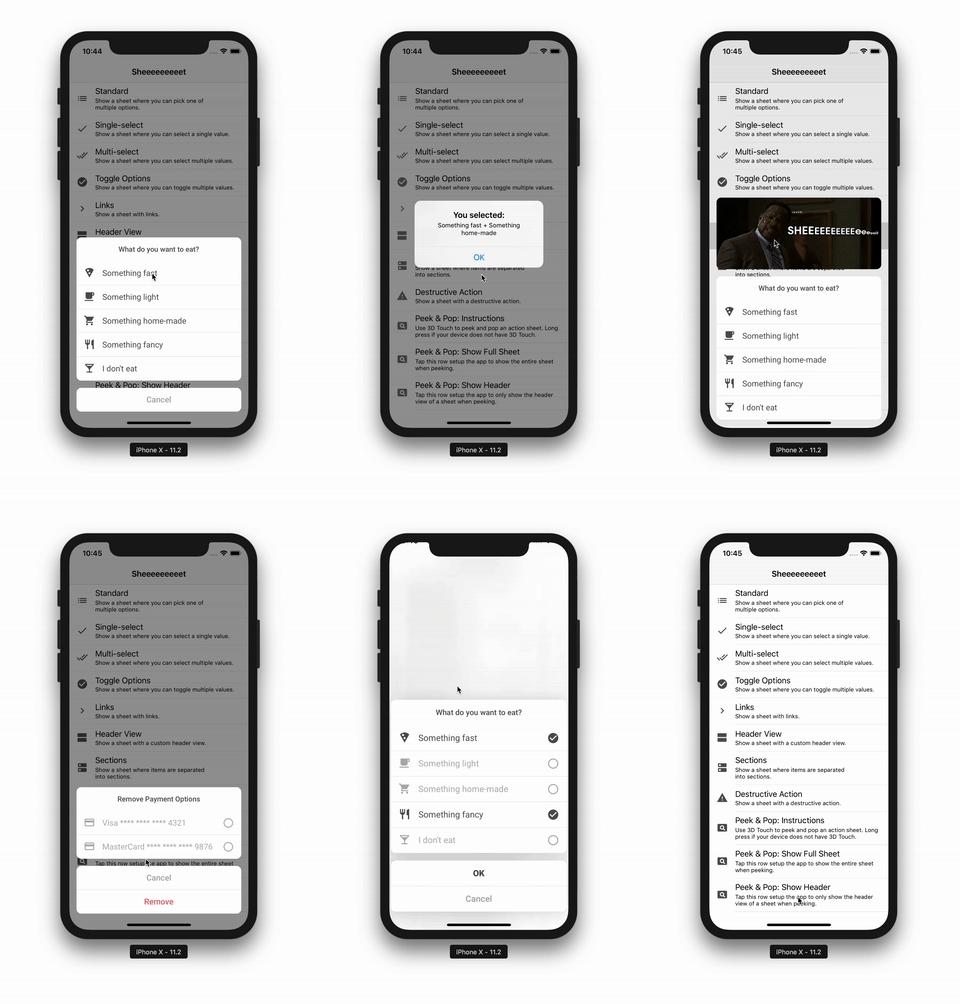
Sheeeeeeeeet is a Swift library for creating custom action sheets. It comes with some built-in items and can be extended with custom items that are more specific to your app as well.
Sheeeeeeeeet can be designed to look just like normal UIKit action sheets or way different. You can apply a global appearance to all action sheets, then override that global style with individual styles for each action sheet and item.
Sheeeeeeeeet action sheets can be peeked & popped on all devices that support 3D touch, with a long press gesture fallback for unsupported devices. You can setup Sheeeeeeeeet to peek just the header view or the full sheet.
Add this to your Podfile, run pod install then remember to use the generated
workspace afterwards:
pod 'Sheeeeeeeeet'
Add this to your Cartfile, run carthage update then add the framework to the
app from Carthage/Build:
github "danielsaidi/Sheeeeeeeeet"
To add Sheeeeeeeeet to your app without Carthage or CocoaPods, clone this repo
and place it somewhere in your project folder. Then, add Sheeeeeeeeet.xcodeproj
to your project, select your app target and add the Sheeeeeeeeet framework as an
embedded binary under General and as a target dependency under Build Phases.
This repository contains an example application. Open the Sheeeeeeeeet project
and run the SheeeeeeeeetExample target to try different types of action sheets.
Below is a basic way to create an action sheets with Sheeeeeeeeet. Have a look
at the example app for more examples, e.g. multi and single select items, toggle
items, links etc.
func createStandardActionSheet() -> ActionSheet {
    let title = ActionSheetTitle(title: "Select an option")
    let item1 = ActionSheetItem(title: "Option 1", value: "1", image: image1)
    let item2 = ActionSheetItem(title: "Option 2", value: "2", image: image2)
    let button = ActionSheetOkButton(title: "OK")
    return ActionSheet(items: items) { _, item in
        guard let value = item.value as? String else { return }
        // You now have the selected value, e.g. "1". The ok button uses `true`.
    }
}
In a larger app, you'll probably want to use your own domain model. Any model is
a valid item value, which means that you can always get the raw item value for
any item in a sheet.
To present an action sheet, you just have to call the present function as such:
actionSheet.present(in: self, from: sourceView)
where sourceView will be used when the sheet is presented using a popover, e.g.
on iPads. You can customize how a sheet is presented by replacing its presenter
with another implementation.
Sheeeeeeeeet comes with a large set of built-in components that can be used to
compose flexible action sheets. To create your own custom items, just inherit an
item class that best suits your needs.
Items are used to present options. Sheeeeeeeeet comes with these built-in types:
- Standard Item - A standard, tappable action sheet item
- Select Item - A single- or multi-select item with an
isSelectedstate - 🍾 Single Select Item - A single-select exclusive item with built-in handling
- 🍾 Collection Item - An action sheet item with an embedded collection view
- Toggle Item - A single- or multi-toggle item with an
isToggledstate - Link Item - Navigation links
The standard item corresponds to a default UIKit action sheet action. It has a
title and an image and serve as the base class for all other item types. It uses
.dismiss as tapBehavior, which automatically dismisses the action sheet when
it is tapped.
Select and toggle items are basically identical, but can be individually styled.
They both use .none as tapBehavior, which means that they will not cause the
action sheet to be dismissed. Instead, add a submit button to the sheet.
Buttons are used to apply or discard the effect of an action sheet. Sheeeeeeeeet comes with these built-in types:
- OK button - Standard OK button with a
truevalue - Cancel button - Standard cancel button
- Danger button - OK button with an alert style
Buttons are automatically separated from other items when you create your action sheet instance, and are presented in a separate list. On popovers, however, they are added back to the end of the item list, since popovers look different.
Titles are non-interactive items. Sheeeeeeeeet comes with these built-in types:
- Title - Shown topmost for an entire sheet
- Section Title - Shown topmost for a section
- Section Margin - Should be added before section titles
You can add title components anywhere you want in your action sheets, although a title probably looks best topmost.
If you set the headerView property of an action sheet, it will be displayed as
a floating header above the action sheet. You can use any view as long as it can
be resized to fit the header view size.
Header views are completely removed in popovers, since popovers are solid bodies with no transparent background.
Sheeeeeeeeet can be globally styled by using the ActionSheetAppearance.standard
instance. All action sheets copies this instance when they are created. They can
then be individually styled without affecting the global style.
Have a look at the demo application to see how global and individual styling can be setup. It's really easy.
Sheeeeeeeeet supports peek & pop on 3D Touch devices, with a long press fallback
on devices without 3D Touch. To enable peek and pop for any view controller that
implements ActionSheetPeekSource just create a strong ActionSheetPeekHandler
instance and provide it with a source view, from where peeks originate. This can
e.g. be a collection or table view. The peek handler uses this view to determine
the correct 3D touched frame.
If you want to use 3D touch, but not the long press fallback, you can disable it
by setting longPressFallback to false when creating the peek handler.
I hope you like this library. Feel free to reach out if you have questions or if you want to contribute in any way:
- E-mail: daniel.saidi@gmail.com
- Twitter: @danielsaidi
- Web site: danielsaidi.com
Sheeeeeeeeet is available under the MIT license. See LICENSE file for more info.

