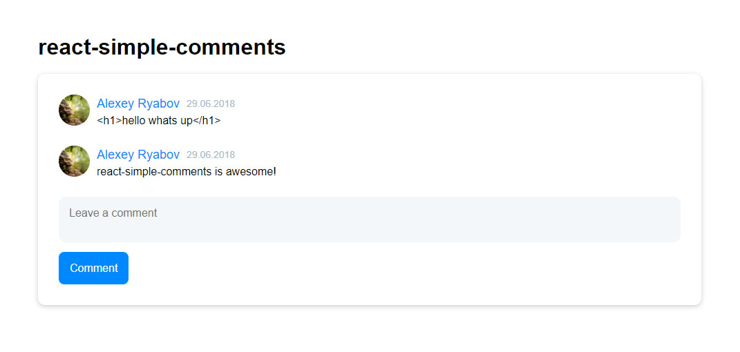
A comment module for React built with React and Typescript.
yarn add simple-react-comments
npm i -S simple-react-comments
import * as React from 'react';
import CommentsBlock from 'simple-react-comments';
import { commentsData } from './data/index'; // Some comment data

class App extends React.Component {
  constructor(props) {
    super(props);
    this.state = {
      comments: commentsData,
    };
  }

  render() {
    return (
      <div>
        <CommentsBlock
          comments={this.state.comments}
          signinUrl={'/signin'}
          isLoggedIn
          reactRouter // set to true if you are using react-router
          onSubmit={text => {
            if (text.length > 0) {
              this.setState({
                comments: [
                  ...this.state.comments,
                  {
                    authorUrl: '#',
                    avatarUrl: '#avatarUrl',
                    createdAt: new Date(),
                    fullName: 'Name',
                    text,
                  },
                ],
              });
              console.log('submit:', text);
            }
          }}
        />
      </div>
    );
  }
}

export default App;| PropName | Type | Default value |
|---|---|---|
| comments | CommentEntity[] | - |
| signinUrl | string | - |
| onSubmit | function(text: string): void | - |
| isLoggedIn? | boolean | false |
| reactRouter? | boolean | false |
| styles? | StylesEntity | Object |
Type: CommentEntity[]
CommentEntity = {
  avatarUrl: string;
  authorUrl: string;
  fullName: string;
  createdAt: Date;
  text: string;
}
Description: Comments data
Type: string
Description: This url is used when unauth user clicks on button "Sign In"
Type: function(text: string): void
Description: Function that is triggered when user submits a comment. Parameter "text" is a text of the comment.
Type: boolean
Default value: false
Description: If isLoggedIn == true then show form with textarea else show button "Sign In"
Type: boolean
Default value: false
Description: If reactRouter == true then all links use react-router's <Link> else <a>
Type: StylesEntity
CommentEntity = {
  btn?(base: any): any;
  comment?(base: any): any;
  textarea?(base: any): any;
}
Default value:
{
  btn: base => ({ ...base }),
  comment: base => ({ ...base }),
  textarea: base => ({ ...base }),
}
Description: That prop is used to change styles of module. You can change btn's, comment's, textarea's styles. If you include "base" then component uses its base styling.
Example:
{
  // Use base styles of btn and override background to red
  btn: base => ({
    ...base,
    background: red,
  }),
  // Reset styles of textarea and use new styles
  textarea: () => ({
    border: none,
    '&::placeholder': {
      color: 'blue'
    },
  }),
}