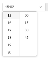
React Time Picker Control.
Based on https://github.com/react-component/time-picker
https://uncledent.github.io/time-picker
It was reworked to be able to navigate between pickers with tabs and auto open the dropdowns.
npm install react-awesome-time-picker
import TimePicker from 'react-awesome-time-picker';
import ReactDOM from 'react-dom';
import 'react-awesome-time-picker/assets/index.css';
ReactDOM.render(<TimePicker />, container);
| Name | Type | Default | Description |
|---|---|---|---|
| prefixCls | String | 'react-awesome-time-picker' | prefixCls of this component |
| clearText | String | 'clear' | clear tooltip of icon |
| disabled | Boolean | false | whether picker is disabled |
| allowEmpty | Boolean | true | allow clearing text |
| open | Boolean | false | current open state of picker. controlled prop |
| defaultValue | moment | null | default initial value |
| defaultOpenValue | moment | moment() | default open panel value, used to set utcOffset,locale if value/defaultValue absent |
| value | moment | null | current value |
| placeholder | String | '' | time input's placeholder |
| className | String | '' | time picker className |
| inputClassName | String | '' | time picker input element className |
| id | String | '' | time picker id |
| popupClassName | String | '' | time panel className |
| popupStyle | object | {} | customize popup style |
| showHour | Boolean | true | whether show hour |
| showMinute | Boolean | true | whether show minute |
| showSecond | Boolean | true | whether show second |
| format | String | - | moment format |
| disabledHours | Function | - | disabled hour options |
| disabledMinutes | Function | - | disabled minute options |
| disabledSeconds | Function | - | disabled second options |
| use12Hours | Boolean | false | 12 hours display mode |
| hideDisabledOptions | Boolean | false | whether hide disabled options |
| onChange | Function | null | called when time-picker a different value |
| onAmPmChange | Function | null | called when time-picker an am/pm value |
| addon | Function | - | called from timepicker panel to render some addon to its bottom, like an OK button. Receives panel instance as parameter, to be able to close it like panel.close(). |
| placement | String | bottomLeft | one of ['topLeft', 'topRight', 'bottomLeft', 'bottomRight'] |
| transitionName | String | '' | |
| name | String | - | sets the name of the generated input |
| onOpen | Function({ open }) | when TimePicker panel is opened | |
| onClose | Function({ open }) | when TimePicker panel is closed | |
| hourStep | Number | 1 | interval between hours in picker |
| minuteStep | Number | 1 | interval between minutes in picker |
| secondStep | Number | 1 | interval between seconds in picker |
| focusOnOpen | Boolean | false | automatically focus the input when the picker opens |
| inputReadOnly | Boolean | false | set input to read only |
| inputIcon | ReactNode | specific the time-picker icon. | |
| clearIcon | ReactNode | specific the clear icon. |
npm test
npm run coverage
open coverage/ dir
react-awesome-time-picker is released under the MIT license.
