A map projection is a systematic transformation of the latitudes and longitudes of locations on the surface of a sphere or an ellipsoid into locations on a plane.
— (Snyder, J. P., 1989)
Simply drawing a circle on that plane using cartesian coordinates will result in something that is…wrong.
Thomas Lecoq has helpfully translated some JS code written by Ed Williams into Python, in order to allow the correct calculation of great-circle distances for the WGS84 ellipsoid. I've reproduced it here with some minor alterations, in the form of Circles, a small convenience library. It's designed to be used with the Basemap extension to matplotlib, and it requires the Numpy library. Install it using pip: pip install circles
Circles exposes a single method, circle(). Pass it your Basemap instance, longitude and latitude of the point you'd like as the centre of your circle, and the radius. It will return a list of lon, lat tuples in map projection coordinates, which can be passed to your Basemap instance for plotting, or converted into Polygons using Shapely, and then plotted using Descartes.
A simple example:
# the shaded circle has the wrong shape

from Circles.circles import circle
from mpl_toolkits.basemap import Basemap
import matplotlib.pyplot as plt
from shapely.geometry import Polygon, Point
from descartes import PolygonPatch
import numpy as np

# use the Robinson projection - it'll distort nicely
m = Basemap(resolution='l', projection='robin', lon_0=0)

radius = 2000
centerlon = 0.135875
centerlat = 51.5219198

# initialise a point and construct a buffered polygon
p = Point(m(centerlon, centerlat))
buffered = p.buffer(radius * 1000)

# same radius, but with calculated coordinates
casa = circle(m, centerlon, centerlat, radius)
pol = Polygon(casa)

# initialise a new plot and axes
plt.clf()
fig = plt.figure()
ax = fig.add_subplot(111, axisbg='w', frame_on=False)

# draw map features
m.drawmapboundary(fill_color='#dfedff', linewidth=0.25, zorder=0, ax=ax)
m.drawcountries(linewidth=.25, color='#000000', zorder=2, ax=ax)
m.drawcoastlines(linewidth=1., zorder=1, ax=ax)
m.fillcontinents(color='#555555', lake_color='#C4C4C4',zorder=1, ax=ax)
m.drawparallels(np.arange(-90., 120., 30.), alpha=0.5, lw=0.25, zorder=1, ax=ax)
m.drawmeridians(np.arange(0., 360., 60.), alpha=0.5, lw=0.25, zorder=1, ax=ax)

# draw circles
incorrect = PolygonPatch(buffered, fc='none', ec='#333333', lw=0, ls='dotted', hatch='....', zorder=1)
correct = PolygonPatch(pol, fc='#00BABA', ec='#ffffff', alpha=.5, zorder=3)
ax.add_patch(incorrect)
ax.add_patch(correct)

# with apologies to the Sugababes
plt.title("Round round baby, round round")
plt.tight_layout()
fig.set_size_inches(12., 8.)
plt.show()
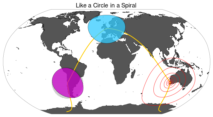
The shaded circle centred on Ritoque is drawn using cartesian coordinates, while the fuchsia, blue and transparent circles – the latter two centred on London and Perth, respectively – have been drawn using Circles. As can be seen, these are correctly distorted, in line with the parallels and meridians drawn on the Robinson projection, which distorts moderately at the latitudes in question.
The IPython Notebook used to generate the graphic can be viewed here.
- Wrapping the circle correctly across map bounds is a very tricky problem. I gather Leaflet does this well as of 0.8
This work may be cited using the following DOI:

