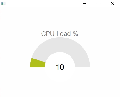
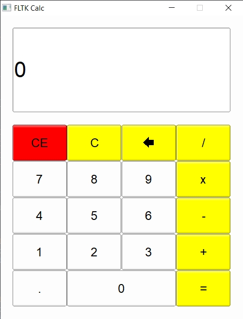
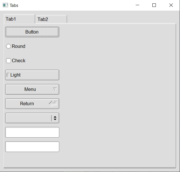
Rust bindings for the FLTK Graphical User Interface library.
The fltk crate is a crossplatform lightweight gui library which can be statically linked to produce small, self-contained and fast gui applications.
Resources:
- Written
- Video
- Discussions
- Demos
- 7guis-fltk-rs
- FLTK-RS-Examples
- Erco's FLTK cheat page, which is an excellent FLTK C++ reference.
Why choose FLTK?
- Lightweight. Small binary, around 1mb after stripping. Small memory footprint.
- Speed. Fast to install, fast to build, fast at startup and fast at runtime.
- Single executable. No DLLs to deploy.
- Supports old architectures.
- FLTK's permissive license which allows static linking for closed-source applications.
- Themability (4 supported schemes: Base, GTK, Plastic and Gleam), and additional theming using fltk-theme.
- Provides around 80 customizable widgets.
- Has inbuilt image support.
Here is a list of software using FLTK. For software using fltk-rs, check here.
Just add the following to your project's Cargo.toml file:
[dependencies]
fltk = "^1.1"
To use the latest changes in the repo:
[dependencies]
fltk = { version = "^1.1", git = "https://github.com/fltk-rs/fltk-rs" }
To use the bundled libs (available for x64 windows (msvc & gnu (msys2-mingw)), x64 linux & macos):
[dependencies]
fltk = { version = "^1.1", features = ["fltk-bundled"] }
The library is automatically built and statically linked to your binary.
For faster builds you can enable ninja builds for the C++ source using the "use-ninja" feature.
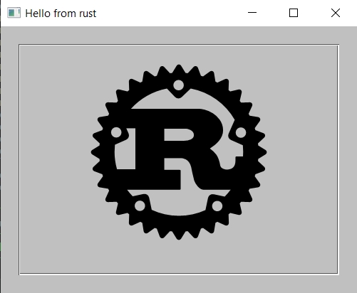
An example hello world application:
use fltk::{app, prelude::*, window::Window};

fn main() {
    let app = app::App::default();
    let mut wind = Window::new(100, 100, 400, 300, "Hello from rust");
    wind.end();
    wind.show();
    app.run().unwrap();
}
Another example showing the basic callback functionality:
use fltk::{app, button::Button, frame::Frame, prelude::*, window::Window};

fn main() {
    let app = app::App::default();
    let mut wind = Window::new(100, 100, 400, 300, "Hello from rust");
    let mut frame = Frame::new(0, 0, 400, 200, "");
    let mut but = Button::new(160, 210, 80, 40, "Click me!");
    wind.end();
    wind.show();
    but.set_callback(move |_| frame.set_label("Hello World!")); // the closure capture is mutable borrow to our button
    app.run().unwrap();
}
Please check the examples directory for more examples. You will notice that all widgets are instantiated with a new() method, taking the x and y coordinates, the width and height of the widget, as well as a label which can be left blank if needed. Another way to initialize a widget is using the builder pattern: (The following buttons are equivalent)
use fltk::{button::Button, prelude::*};
let but1 = Button::new(10, 10, 80, 40, "Button 1");

let but2 = Button::default()
    .with_pos(10, 10)
    .with_size(80, 40)
    .with_label("Button 2");
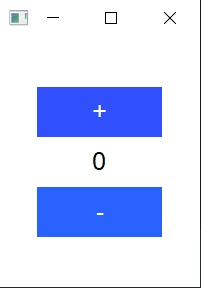
An example of a counter showing use of the builder pattern:
use fltk::{app, button::Button, frame::Frame, prelude::*, window::Window};
fn main() {
    let app = app::App::default();
    let mut wind = Window::default()
        .with_size(160, 200)
        .center_screen()
        .with_label("Counter");
    let mut frame = Frame::default()
        .with_size(100, 40)
        .center_of(&wind)
        .with_label("0");
    let mut but_inc = Button::default()
        .size_of(&frame)
        .above_of(&frame, 0)
        .with_label("+");
    let mut but_dec = Button::default()
        .size_of(&frame)
        .below_of(&frame, 0)
        .with_label("-");
    wind.make_resizable(true);
    wind.end();
    wind.show();
    /* Event handling */
    app.run().unwrap();
}
Alternatively, you can use packs, columns, rows to layout your widgets (or the fltk-flex crate for flexbox layouts):
use fltk::{app, button::Button, frame::Frame, group::Pack, prelude::*, window::Window};
fn main() {
    let app = app::App::default();
    let mut wind = Window::default().with_size(160, 200).with_label("Counter");
    // Vertical is default. You can choose horizontal using pack.set_type(PackType::Horizontal);
    let mut pack = Pack::default().with_size(120, 140).center_of(&wind);
    pack.set_spacing(10);
    let mut but_inc = Button::default().with_size(0, 40).with_label("+");
    let mut frame = Frame::default().with_size(0, 40).with_label("0");
    let mut but_dec = Button::default().with_size(0, 40).with_label("-");
    pack.end();
    wind.end();
    wind.show();
    app.run().unwrap();
}
Events can be handled using the set_callback method (as above) or the available fltk::app::set_callback() free function, which will handle the default trigger of each widget(like clicks for buttons):
    /* previous hello world code */
    but.set_callback(move |_| frame.set_label("Hello World!"));
    another_but.set_callback(|this_button| this_button.set_label("Works"));
    app.run().unwrap();
Another way is to use message passing:
    /* previous counter code */
    let (s, r) = app::channel::<Message>();

    but_inc.emit(s, Message::Increment);
    but_dec.emit(s, Message::Decrement);

    while app.wait() {
        let label: i32 = frame.label().parse().unwrap();
        if let Some(msg) = r.recv() {
            match msg {
                Message::Increment => frame.set_label(&(label + 1).to_string()),
                Message::Decrement => frame.set_label(&(label - 1).to_string()),
            }
        }
    }
For the remainder of the code, check the full example here.
For custom event handling, the handle() method can be used:
    some_widget.handle(move |widget, ev: Event| {
        match ev {
            Event::Push => {
                println!("Pushed!");
                true
            },
            /* other events to be handled */
            _ => false,
        }
    });
Handled or ignored events using the handle method should return true, unhandled events should return false. More examples are available in the fltk/examples directory.
FLTK offers 4 application schemes:
- Base
- Gtk
- Gleam
- Plastic
(Additional theming can be found in the fltk-theme crate)
These can be set using the App::with_scheme() method.
let app = app::App::default().with_scheme(app::Scheme::Gleam);Themes of individual widgets can be optionally modified using the provided methods in the WidgetExt trait, such as set_color(), set_label_font(), set_frame() etc:
    some_button.set_color(Color::Light1); // You can use one of the provided colors in the fltk enums
    some_button.set_color(Color::from_rgb(255, 0, 0)); // Or you can specify a color by rgb or hex/u32 value
    some_button.set_color(Color::from_u32(0xffebee));
    some_button.set_frame(FrameType::RoundUpBox);
    some_button.set_font(Font::TimesItalic);
For default application colors, fltk-rs provides app::background(), app::background2() and app::foreground(). You can also specify the default application selection/inactive colors, font, label size, frame type, scrollbar size, menu linespacing. Additionally the fltk-theme crate offers some other predefined color maps (dark theme, tan etc) and widget themes which can be loaded into your application.
Rust (version > 1.45), CMake (version > 3.0), Git and a C++11 compiler need to be installed and in your PATH for a crossplatform build from source. This crate also offers a bundled form of fltk on selected platforms (win 10 x64, macos 10.15 x64, linux x64), this can be enabled using the fltk-bundled feature-flag (which requires curl and tar to download and unpack the bundled libraries).
- Windows: No external dependencies.
- MacOS: No external dependencies.
- Linux/BSD: X11 and OpenGL development headers need to be installed for development. The libraries themselves are available on linux distros with a graphical user interface.
For Debian-based GUI distributions, that means running:
$ sudo apt-get install libx11-dev libxext-dev libxft-dev libxinerama-dev libxcursor-dev libxrender-dev libxfixes-dev libpango1.0-dev libpng-dev libgl1-mesa-dev libglu1-mesa-dev
For RHEL-based GUI distributions, that means running:
$ sudo yum groupinstall "X Software Development" && yum install pango-devel libXinerama-devel libpng-devel
For Arch-based GUI distributions, that means running:
$ sudo pacman -S libx11 libxext libxft libxinerama libxcursor libxrender libxfixes libpng pango cairo libgl mesa --needed
For Alpine linux:
$ apk add pango-dev fontconfig-dev libxinerama-dev libxfixes-dev libxcursor-dev libpng-dev mesa-gl
For NixOS (Linux distribution) this nix-shell environment can be used:
$ nix-shell --packages rustc cmake git gcc xorg.libXext xorg.libXft xorg.libXinerama xorg.libXcursor xorg.libXrender xorg.libXfixes libpng libcerf pango cairo libGL mesa pkg-config
The following are the features offered by the crate:
- no-pango: Build without pango support on Linux/BSD, if rtl/cjk font support is not needed.
- fltk-bundled: Support for bundled versions of cfltk and fltk on selected platforms (requires curl and tar)
- enable-glwindow: Support for drawing using OpenGL functions.
- use-ninja: If you have ninja build installed, it builds faster than make or VS
- system-libpng: Uses the system libpng
- system-libjpeg: Uses the system libjpeg
- system-zlib: Uses the system zlib
please check the FAQ page for frequently asked questions, encountered issues, guides on deployment, and contribution.
To build, just run:
$ git clone https://github.com/fltk-rs/fltk-rs
$ cd fltk-rs
$ cargo build
To run the examples:
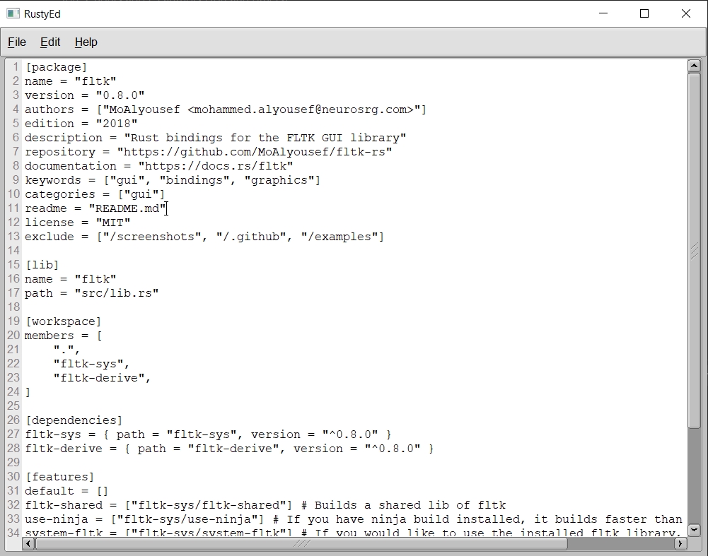
$ cargo run --example editor
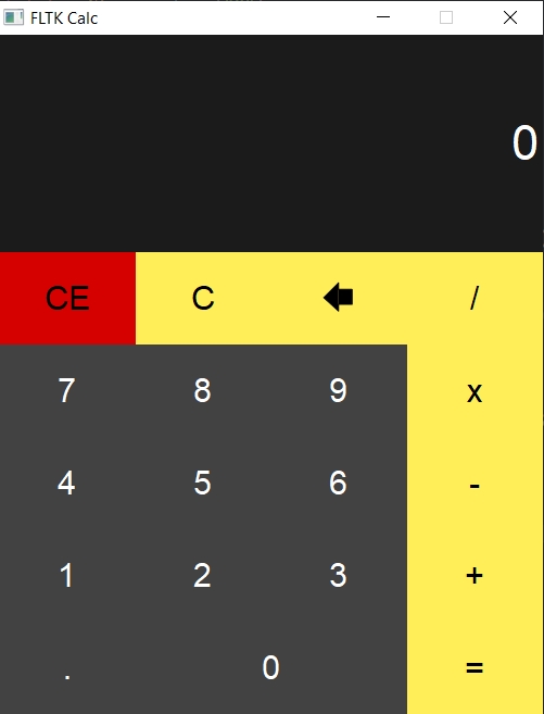
$ cargo run --example calculator
$ cargo run --example calculator2
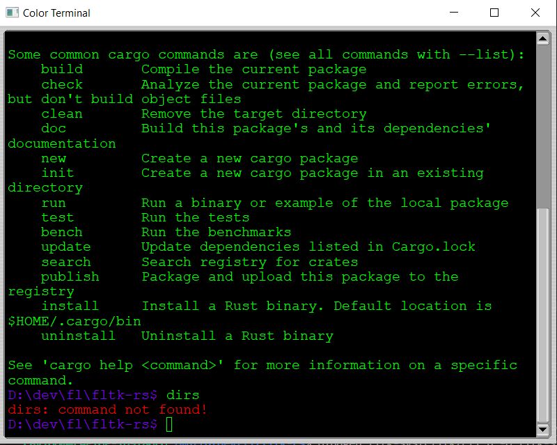
$ cargo run --example terminal
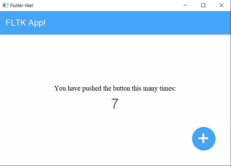
$ cargo run --example counter
$ cargo run --example hello
$ cargo run --example hello_button
$ cargo run --example fb
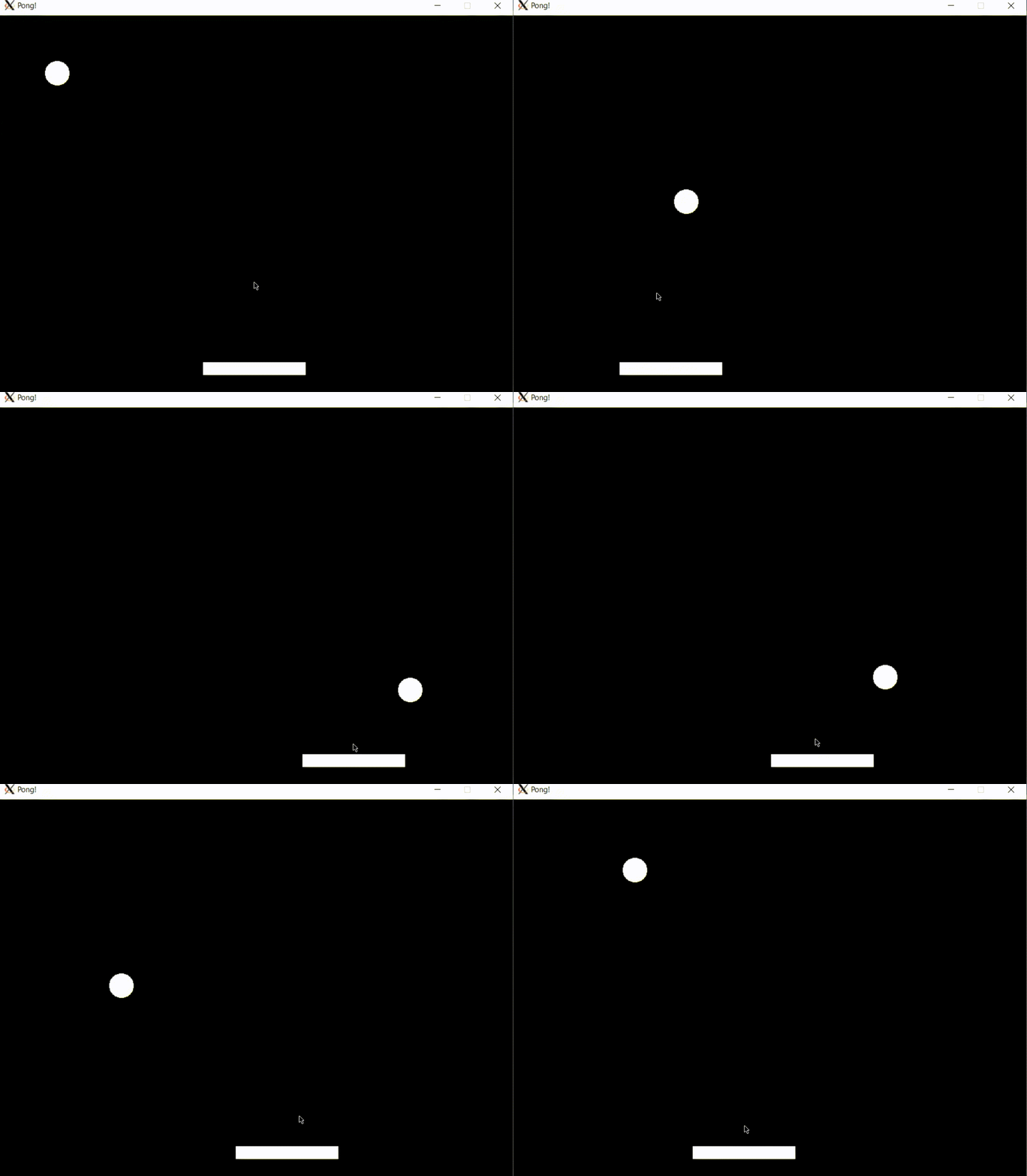
$ cargo run --example pong
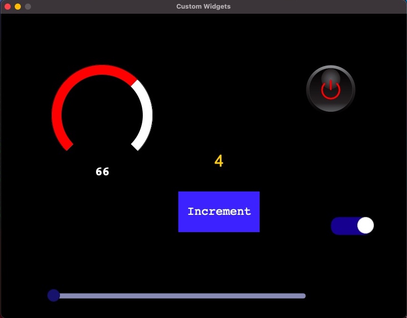
$ cargo run --example custom_widgets
$ cargo run --example custom_dial
...
Using custom theming and also FLTK provided default schemes like Gtk:
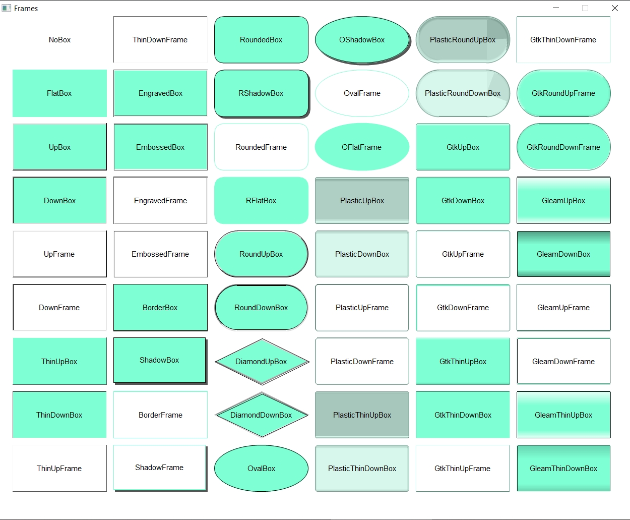
Different frame types which can be used with many different widgets such as Frame, Button widgets, In/Output widgets...etc.
More interesting examples can be found in the fltk-rs-demos repo. Also a nice implementation of the 7guis tasks can be found here. Various advanced examples can also be found here.
- SharedImage
- BmpImage
- JpegImage
- GifImage
- PngImage
- SvgImage
- Pixmap
- RgbImage
- XpmImage
- XbmImage
- PnmImage
- TiledImage
- Buttons
- Button
- RadioButton
- ToggleButton
- RoundButton
- CheckButton
- LightButton
- RepeatButton
- RadioLightButton
- RadioRoundButton
- Dialogs
- Native FileDialog
- FileChooser
- HelpDialog
- Message dialog
- Alert dialog
- Password dialog
- Choice dialog
- Input dialog
- ColorChooser dialog
- Frame (Fl_Box)
- Windows
- Window
- SingleWindow (single buffered)
- DoubleWindow (double buffered)
- MenuWindow
- OverlayWindow
- GlWindow (requires the "enable-glwindow" flag)
- GlutWindow (requires the "enable-glwindow" flag)
- Groups
- Group
- Pack (Horizontal and Vertical)
- Tabs
- Scroll
- Tile
- Wizard
- ColorChooser
- VGrid
- HGrid
- Column (vertical pack supporting auto layout)
- Row (horizontal pack supporting auto layout)
- Flex (Supports flexbox layouts, provided by the fltk-flex crate)
- Text display widgets
- TextDisplay
- TextEditor
- SimpleTerminal
- Input widgets
- Input
- IntInput
- FloatInput
- MultilineInput
- SecretInput
- FileInput
- Output widgets
- Output
- MultilineOutput
- Menu widgets
- MenuBar
- MenuItem
- Choice (dropdown list)
- SysMenuBar (MacOS menu bar which appears at the top of the screen)
- Valuator widgets
- Slider
- NiceSlider
- ValueSlider
- Dial
- LineDial
- Counter
- Scrollbar
- Roller
- Adjuster
- ValueInput
- ValueOutput
- FillSlider
- FillDial
- HorSlider (Horizontal slider)
- HorFillSlider
- HorNiceSlider
- HorValueSlider
- Browsing widgets
- Browser
- SelectBrowser
- HoldBrowser
- MultiBrowser
- FileBrowser
- CheckBrowser
- Miscelaneous widgets
- Spinner
- Clock (Round and Square)
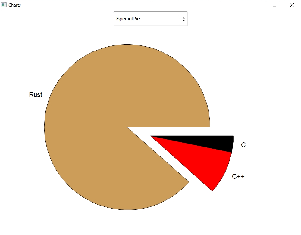
- Chart (several chart types are available)
- Progress (progress bar)
- Tooltip
- InputChoice
- HelpView
- Table widgets
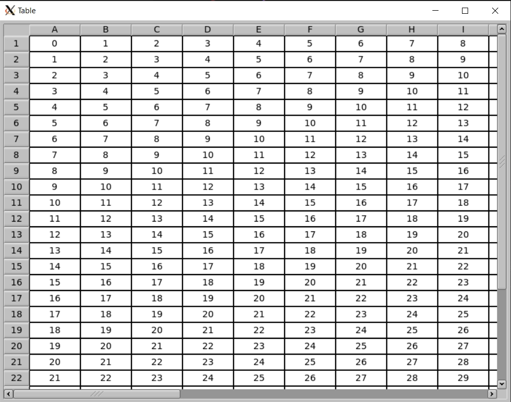
- Table
- TableRow
- Trees
- Tree
- TreeItem
(In the draw module)
- Printer.
- ImageSurface.
- SvgFileSurface.
- Basics
- User input
- Client-side web todo app
- Create a media player using the vlc crate
- Custom dialogs
- Add drag and drop to the editor example
- Drawing things with fltk
- Working with images
- Audio player with custom widgets
- Using FLTK on Android
- Use FLUID (RAD tool) with Rust
- multiple windows and embedding windows
- FLTK Rust tutorial: Improve FLTK's toggle button appearance!
- FLTK Rust: Customizing your app and widgets
More videos in the playlist here. Some of the demo projects can be found here.


