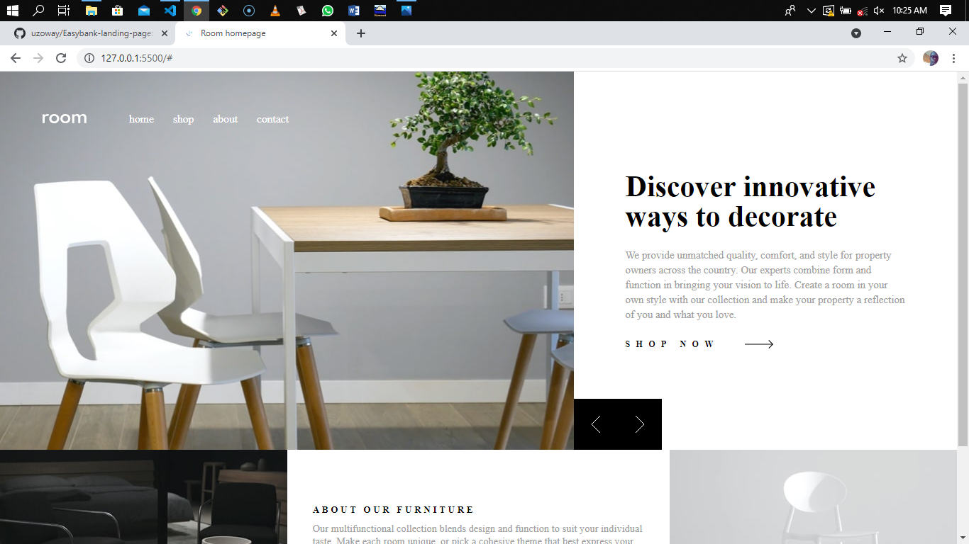
This is a solution to the Room homepage challenge on Frontend Mentor. Frontend Mentor challenges help you improve your coding skills by building realistic projects.
Users should be able to:
- View the optimal layout for the site depending on their device's screen size
- See hover states for all interactive elements on the page
- Navigate the slider using either their mouse/trackpad or keyboard
- See a preloader before the site fully loads
- Semantic HTML5 markup
- CSS
- Flexbox
- Desktop-first workflow
- Vanilla JS
Completing this project has helped me improve my Frontend coding skills and also learn new skills. Some of this new skills include:
- How to add a preloader to a website
- Check for device screen size/viewport before executing a particular code using Javascript
Below is a code snippet of how I successfully added the preloader to the website.
<div class="loader">
    <div id="round" class="round1">
      <span></span>
      <span></span>
    </div>
</div>.loader{
width: 100%;
height: 100vh;
position: fixed;
top: 0;
left: 0;
background: hsl(0, 0%, 100%);
z-index: 100;
display: flex;
align-items: center;
justify-content: center;
opacity: 1;
transition: opacity 2s ease-in;
}
.loader .round1{
display: block;
animation: round1-rotate 2.0s infinite linear;
}
.loader .round1 span{
width: 40px;
height: 40px;
background-color: hsl(0, 0%, 0%);
display: block;
border-radius: 50%;
animation: round1-bounce 2.0s infinite ease-in;
}
.loader .round1 span:nth-child(2){
animation-delay: -1.0s;
}
@keyframes round1-rotate{
100%{
transform: rotate(360deg);
}
}
@keyframes round1-bounce {
0%, 100%{
transform: scale(0);
}
50%{
transform: scale(1);
}
}const loader = document.querySelector(".loader");
const hero = document.querySelector(".hero");
const about = document.querySelector(".about");
function preloader(){
setTimeout(() => {
loader.style.opacity = 0;
loader.style.display = "none";
setTimeout(() => {
hero.style.opacity = 1;
about.style.opacity = 1;
}, 50);
}, 3500);
}
preloader();To check for device screen size/viewport before executing a line of code, the code snippet below shows how I was able to achieve that
leftBtn.onclick = function(){
    if(i>0 && document.documentElement.clientWidth < 991){
        gallery.style.backgroundImage = bgImageMobile[i-1];
        header.innerHTML = head[i-1];
        paraGraph.innerHTML = paragraph[i-1];
        i--;
}- Adding Preloader - This video from Brad Traversy youtube channel helped me understand the concept of adding a preloader to a website using HTML, CSS and Js
- Checking for device screen size using Js - This is an amazing article which helped me understand how to check for device screen size using JavaScript. I'd recommend it to anyone still learning this concept.
- LinkedIn - Uzochukwu Victor Okafor
- Frontend Mentor - @uzoway
Special appreciation goes to the Frontend Mentor Team for putting together these great challenges that helps developers gain experience by building real life projects.
