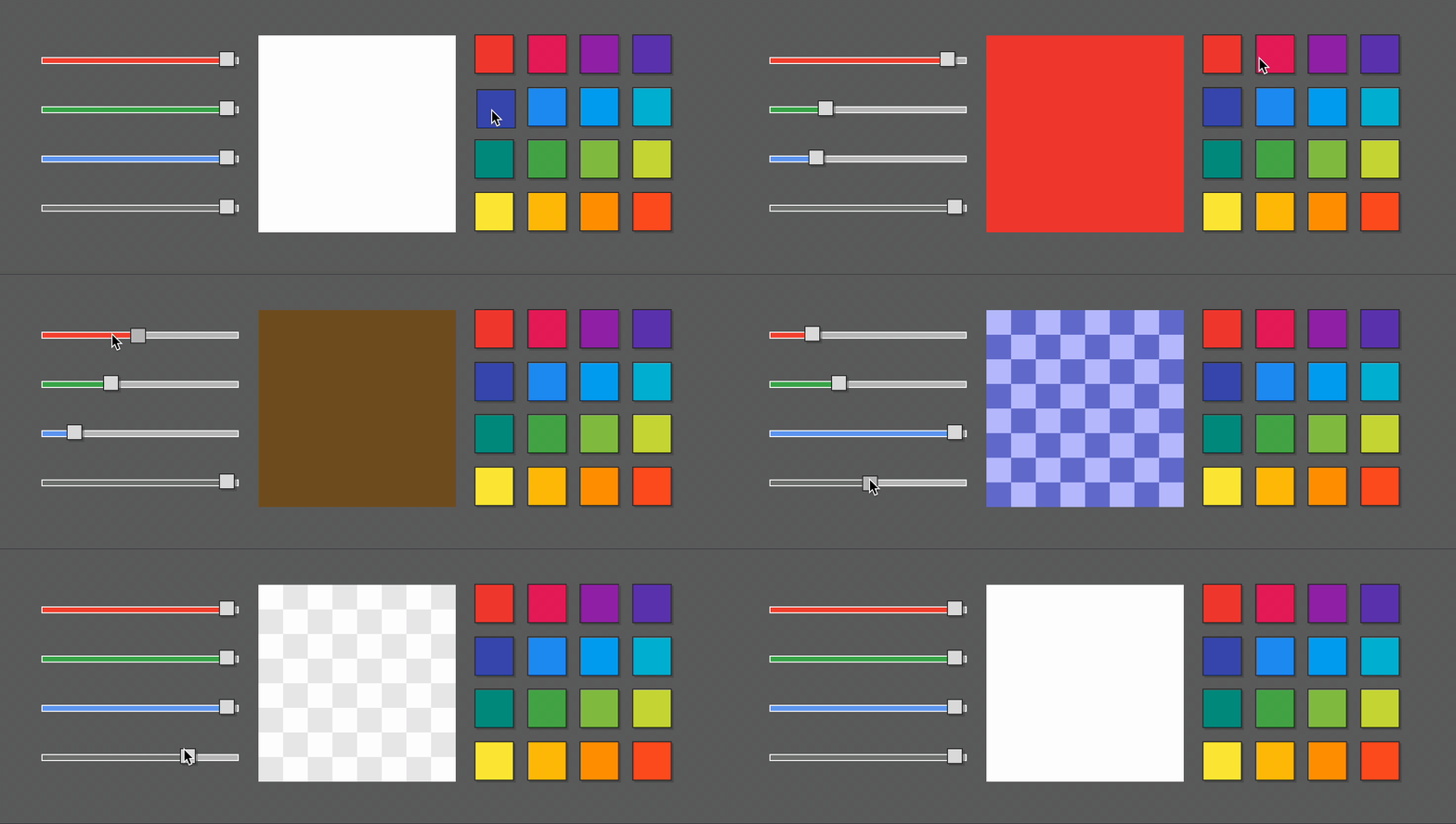
The belly is a plugin for a bevy game engine that helps to declaratively define a user interface with eml markup (macros & asset), style it with a very CSS-like ess syntax, and define data flow using from! & to! bind macros and/or connect to signals (events) with connect! macro.
// examples/color-picker.rs
// cargo run --example color-picker
use belly::prelude::*;
use bevy::prelude::*;

fn main() {
    App::new()
        .add_plugins(DefaultPlugins)
        .add_plugin(BellyPlugin)
        .add_startup_system(setup)
        .run();
}

const COLORS: &[&'static str] = &[
    // from https://colorswall.com/palette/105557
    // Red     Pink       Purple     Deep Purple
    "#f44336", "#e81e63", "#9c27b0", "#673ab7",
    // Indigo  Blue       Light Blue Cyan
    "#3f51b5", "#2196f3", "#03a9f4", "#00bcd4",
    // Teal    Green      Light      Green Lime
    "#009688", "#4caf50", "#8bc34a", "#cddc39",
    // Yellow  Amber      Orange     Deep Orange
    "#ffeb3b", "#ffc107", "#ff9800", "#ff5722",
];

fn setup(mut commands: Commands) {
    commands.spawn(Camera2dBundle::default());
    commands.add(StyleSheet::load("color-picker.ess"));
    let colorbox = commands.spawn_empty().id();
    commands.add(eml! {
        <body>
            <span c:controls on:ready=connect!(colorbox, |c: BackgroundColor| c.0 = Color::WHITE)>
                <slider c:red
                    bind:value=to!(colorbox, BackgroundColor:0|r)
                    bind:value=from!(colorbox, BackgroundColor:0.r())
                />
                <slider c:green
                    bind:value=to!(colorbox, BackgroundColor:0|g)
                    bind:value=from!(colorbox, BackgroundColor:0.g())
                />
                <slider c:blue
                    bind:value=to!(colorbox, BackgroundColor:0|b)
                    bind:value=from!(colorbox, BackgroundColor:0.b())
                />
                <slider c:alpha
                    bind:value=to!(colorbox, BackgroundColor:0|a)
                    bind:value=from!(colorbox, BackgroundColor:0.a())
                />
            </span>
            <img c:colorbox-holder src="trbg.png">
                <span {colorbox} c:colorbox/>
            </img>
            <span c:colors>
            <for color in = COLORS>
                <button on:press=connect!(colorbox, |c: BackgroundColor| { c.0 = Color::from_hex(color) })>
                    <span s:background-color=*color s:width="100%" s:height="100%"/>
                </button>
            </for>
            </span>
        </body>
    });
}
The main tasks the plugin is about to solve are:
- fill the space in the
bevyUI system (inputs, scrolls, text layout, etc.) - reduce the boilerplate defining the UI
- allow to effectively separate the layout, styling, data & logic from each other
- build the basis to provide various tools for
gamedevelopers & designers
- Hierarcy definition using
emlmacro or asset - Style definition using direct attributes or
essstylesheet assets - Hot-reloading for
emlandessassets - Data bindings for resources, components, params and content
- Event -> handler connections
- Predefined styles properties for every piece os UI
- Basic templating (for-loops, slots)
- Out of the box default styles & fonts
- Ability to define custom widgets, properties, and bind transformers
- Style & behaviour extending
- Predefined widgets for configuring layout, generating content and handling input:
- body, div, span, br, strong
- img, progressbar, label
- textinput, slider, button, buttongroup
- Styleboxes (9-patch-slices/
image-border-*) - Complete rich-text processing
- True inline/block/inline-block elements
- Binding transitions (changing values over time)
- Style transitions (changing style properties over time)
- Scene-based widgets
- Styled drawing primitives (lines, rects, curves, shapes)
- Asset validation tools
- In-game developer panel with UI tree & style inspector
- More widgets (tabview, scrollarea, checkbox, attach, line, popup, tooltip)
- Developer tools (vscode plugin)
- Localization
- Scripting
- Theming
- Asset loading progress handling
- More templating (if/else)
- Prerequisites & Setup
- Basics
- Tags, Widgets & Content
- Styling
- Data flow & relations
- Templating
- Building Widgets
- Implementing custom Styles
- Writing Transformers
- License
As far as the project has no cargo release yet, the only way to discover functionality is to clone the repo & play with examples:
git clone https://github.com/jkb0o/belly.git
cd belly
cargo run --example color-picker
If you are brave enough, you can connect the plugin by referencing the GitHub repo in your Cargo.toml.
In the belly, you define UI layout using eml. It is possible to do it directly from the code using the eml! macro or by loading the .eml asset and adding EmlScene. In the case of macro eml is more than just markup, but more like templating language, jsx from the javascript world. In the case of the .eml asset, eml is just an XML file with no special syntax. From now I'll focus on eml! macro:
// examples/hello-world.rs
// cargo run --example hello-world
use belly::prelude::*;
use bevy::prelude::*;

fn main() {
    App::new()
        .add_plugins(DefaultPlugins)
        .add_plugin(BellyPlugin)
        .add_startup_system(setup)
        .run();
}

fn setup(mut commands: Commands) {
    commands.spawn(Camera2dBundle::default());
    commands.add(eml! {
        <body s:padding="50px">
            "Hello, "<strong>"world"</strong>"!"
        </body>
    });
}
The eml! macro expands its content into multiple calls which spawn entities with required components based on the tags and their attributes. Most of these tags in the belly called Widgets. When the belly builds the tree it unfolds each widget into one (or more) entities. The structure from the example above becomes something like this:
- Node (body)
- TextNode ("Hello, ")
- Node (strong)
- TextNode ("world")
- TextNode ("!")
In addition to common bevy UI components (Node, Text, BackgroundColor, etc.) belly inserts an Element component. It holds information about tag name(s), styles, classes, and states.
For configuring widget style & behavior you can pass attributes within the tag. These attributes are called params in the belly and may be passed in different ways:
- common params passed as key-value pairs:
<img src="icon.pgn"> - style params passed using
s:prefix:<span s:padding="50px> - class params passed using
c:prefix (<span c:some-class>) or byclassparam (<span class="some-class-1 some-class-2">) - binds passed using
bind:prefix:<buttongroup bind:value=to!(img, Img:src)> - signals passed using
on:prefix:<button on:press=connect!(|| info!("I'm pressed!"))/> - entity passed using curly braces:
<span {span_id}>or usingentityparam:<span entity=span_id> - components passed using
withparam:<button with=(MyComponent, another_component_instance)/>
As I said eml consists of tags with attributes. Everything between the open-closing tag pair (<span>...</span>) becomes the children of this tag. The tag also may have no children at all, the self-closing tag used in this case: <button/>. Every tag may have this kind of child:
- other tags:
<span><button/></span> - string literals:
<span>"Hello world!"</span> - rust blocks:
<span>{ some_content() }</span>
Rust block can be any expression that returns impl IntoContent. String implements the IntoContent trait for example, as well as Vec<Entity> does. Some other types provide this implementation too, binds, for example, I'll talk about this later.
As I mentioned earlier, almost every tag meant to be Widgetit produces one or more entities with their own set of components, styles, and states. I will talk about widgets all the time. Later I'll introduce to you non-widget tags & some templating features of belly but for now, let's focus on widgets and styling features.
Usually, in bevy, you define styles (how your content looks) by passing properties to UI bundles. Unfortunately, it can produce a lot of boilerplate. belly can help you to create more readable styling code/content in multiple ways. The core idea is to define some style properties (width, background-color, flex-direction, etc.) and map them somehow to the actual components and their properties. This mapping is done by the Property trait. Implementations of this trait define the style property name (width), how it should be parsed (to Val), and how to apply parsed value to the exact component (Style's size.width)
There are two ways to provide style properties to nodes: by passing style param directly to a widget or by declaring the StyleSheet: the sets of style properties and rules that determine which nodes these sets should apply to.
The easiest way to provide some style to your UI using belly is to pass some params directly
to widgets:
// examples/style-params.rs
// cargo run --example style-params
use bevy::prelude::*;
use belly::prelude::*;

fn main() {
    App::new()
        .add_plugins(DefaultPlugins)
        .add_plugin(BellyPlugin)
        .add_startup_system(setup)
        .run();
}

fn setup(mut commands: Commands) {
    commands.spawn(Camera2dBundle::default());
    let ten_percent = Val::Percent(10.);
    commands.add(eml! {
        <body s:padding="5px">
            <span s:padding="25px" s:margin="5px" s:background-color="black">
                "Black span with padding of 25 px and margin of 5px"
            </span>
            <div s:font="bold" s:padding="3px" s:color="black" s:background-color=Color::WHITE  s:margin-left=ten_percent >
                "White div with 10% margin-left property, 3px padding and bold text"
            </div>
        </body>
    });
}
In the example above you can see various ways to pass style params to nodes.
- Passing as strings.
bellywill parse these strings once and convert them into actual values.s:padding="25px"is equivalent toStyle { padding: UISize::all(Val::Px(25.))} - Passing as values.
s:background-color=Color::REDpassed toStyleas is - Passing as variables. Style param can be any valid rust expression.
When you passing style (or common) param to the node, belly converts the value into the Variant enum using .into() call. This way you can pass to values everything matching these requirements:
- it should be able to be passed by value, not reference
- it should implement
Into<Variant>trait.
A Variant is used only for passing params and converting them to concrete types at the building stage and not used afterward, so performance loss is minimal. belly also will warn you about any failed conversion cases.
Adding styles using params is easy to write, but difficult to maintain. You also need to recompile your project to see the changes. This is time for the StyleSheet to come out:
/* stylesheet.ess */
body {
    padding: 5px;
}
span {
    padding: 25px;
    margin: 5px;
    background-color: black;
}
div {
    font: bold;
    color: black;
    padding: 3px;
    background-color: white;
    margin-left: 10%;
}
// examples/style-sheet.rs
// cargo run --example style-sheet
use belly::prelude::*;
use bevy::prelude::*;
fn main() {
App::new()
.add_plugins(DefaultPlugins)
.add_plugin(BellyPlugin)
.add_startup_system(setup)
.run();
}
fn setup(mut commands: Commands) {
commands.spawn(Camera2dBundle::default());
commands.add(StyleSheet::load("stylesheet.ess"));
commands.add(eml! {
<body>
<span>"Black span with padding of 25 px and margin of 5px"</span>
<div>"White div with 10% margin-left property, 3px padding and bold text"</div>
</body>
});
}The StyleSheet consists of sets of style properties and rules that determine which nodes these sets should apply to.
In the example above I define StyleSheet asset styelsheets.ess with styles for every <body>, <span>, or <div> you add to the UI. Each StyleSheet is loaded into the global namespace and affects all matched elements. You add as many stylesheets as you want. You can load stylesheets from assets as well as parse the content:
// load StyleSheet from asset
commands.add(StyleSheet::load("stylesheets.ess"));
// parse StyleSheet content
commands.add(StyleSheet::parse(r"#
    body {
        padding: 50px;
    }
#"));A StyleSheet contains the list of rules (selector with properties). In the example above the body is the selector and everything inside curly braces are properties. The body selector picks all nodes defined by the body tag. It is useful for some cases, but not enough for the rest when you want to select exact nodes to apply properties. In this case, you need a more complex selector, which consists of subselectors, button:pressed .colored-area for example. belly comes with this types of subselectors:
nameselects elements by tag name (body,span).classselects elements that contain exact class:.some-class#idselects elements with exact id:#some-id:stateselects elements with the exact state::pressed,:hover, etc.*(any) selects any element
There is a little bit more complex example:
/* selectors.ess */
* {
    font: bold;
    color: darkgrey;
}
body {
    padding: 20px;
}

button {
    width: 100px;
    height: 100px;
}

button .content {
    width: 100%;
    height: 100%;
    justify-content: center;
    align-items: center;
}

.red .content {
    background-color: lightcoral;
}
.green .content {
    background-color: lightgreen;
}

.blue .content {
    background-color: lightblue;
}

button:hover .content {
    background-color: white;
}
// examples/selectors.rs
// cargo run --example selectors
use belly::prelude::*;
use bevy::prelude::*;
fn main() {
App::new()
.add_plugins(DefaultPlugins)
.add_plugin(BellyPlugin)
.add_startup_system(setup)
.run();
}
fn setup(mut commands: Commands) {
commands.spawn(Camera2dBundle::default());
commands.add(StyleSheet::load("selectors.ess"));
commands.add(eml! {
<body>
<button c:red><span c:content>"red"</span></button>
<button c:green><span c:content>"green"</span></button>
<button c:blue><span c:content>"blue"</span></button>
</body>
});
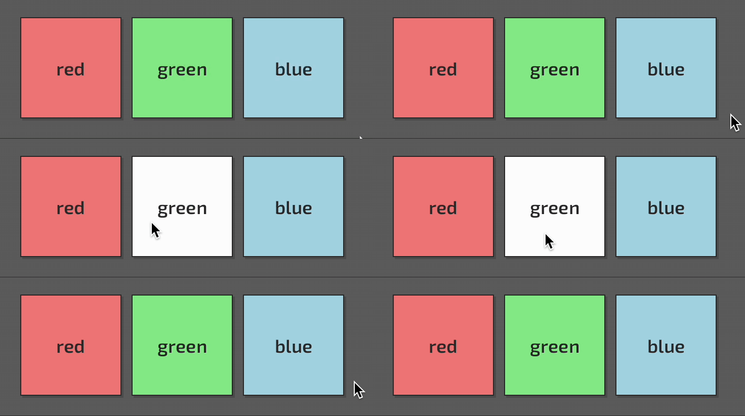
}In this example, I apply classes (red, green, blue, content) to the nodes and define StyleSheet with precise rules to achieve the task: three buttons of defined colors, each becoming white on hover.
I'd like to explain some selectors:
button .contentapplies its properties to every node with thecontentclass which is the any-level-child of thebuttonwidget..red .contentapplies its properties to every node with thecontentclass which is theany-level-childof a node with theredclassbutton:hover .contentapplies its properties to every node with thecontentclass which is theany-level-childof the hovered button (buttonwidget withhoverstate)
The interesting thing here is that at some point multiple selectors are valid for the same node: when I hover the red button both button:hover .content and .red .content pick the same node. Why the hovered button is always white but not red? How belly resolves this kind of conflict? I'm glad you asked!
When some Element is added or changed (you add/remove state or class for example), the belly begins the style resolving and applying process. This process is done for each property separately and consists of four main steps:
- check if
Elementhas defined by param style property - find all rules valid for the node
- select the most valuable rule for the node
- apply property defined in the selected rule
In the first step belly checks if the style property is defined using param (<span s:padding="5px">). If there is one, belly applies this property and does not process the next steps. This way, style props have the highest resolving priority.
The matching step is done by walking the tree branch from bottom to top. When belly does this step it also stores context_wight for each rule: the number or parents it needs to check before the complete selector match happens. Lower values mean a better match. This context_weight is used in the next step - rules ordering.
Each rule has its weight: rule_weight. This weight is calculated based on the selector:
- every
namesubselector adds 1 to the weight - every
.classand:stateadds 10 to the weight - every
#idadds 100 to the weight. - other selectors don't add any to the weight.
So, for example, button:hover .content has 21 rule_weight while .red .content has only 20.
After finding all matched rules, the belly sorts it by decreasing rule_weight and takes all rules with maximum rule_weight. If there is only a rule match, belly applies it. If there are multiple rules with the same rule_weight found, additional filtering is required:
- first of all, the
bellytakes the most context-precise rules (with the lowestcontext_weight) - if there are multiple rules matches,
bellytakes rules from the last addedStyleSheet - if there are still multiple rules matches,
bellytakes the last defined in theStyleSheetrule.
So, the answer to the question from the previous part (why the hovered button is always white but not red?) is: it happens because button:hover .content selector has a higher rule weight than .red .content selector.
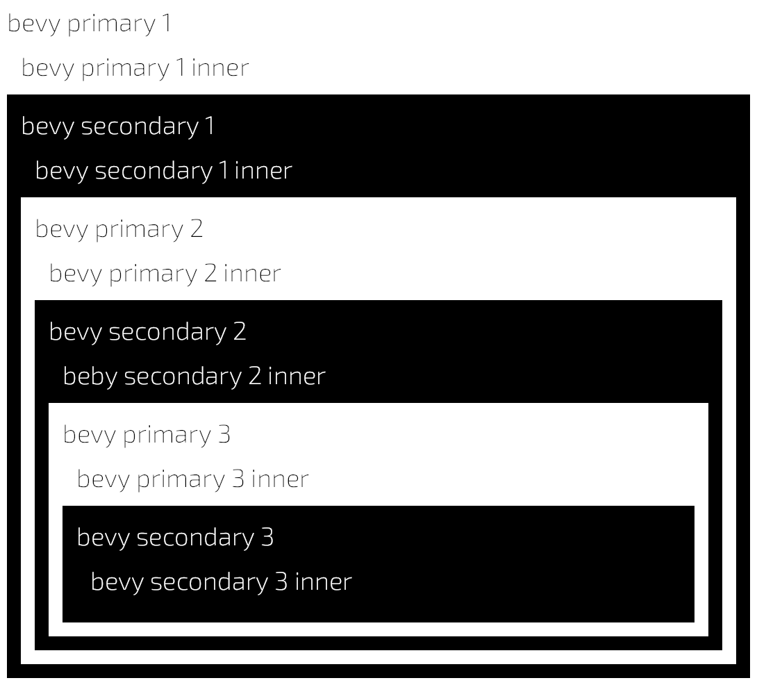
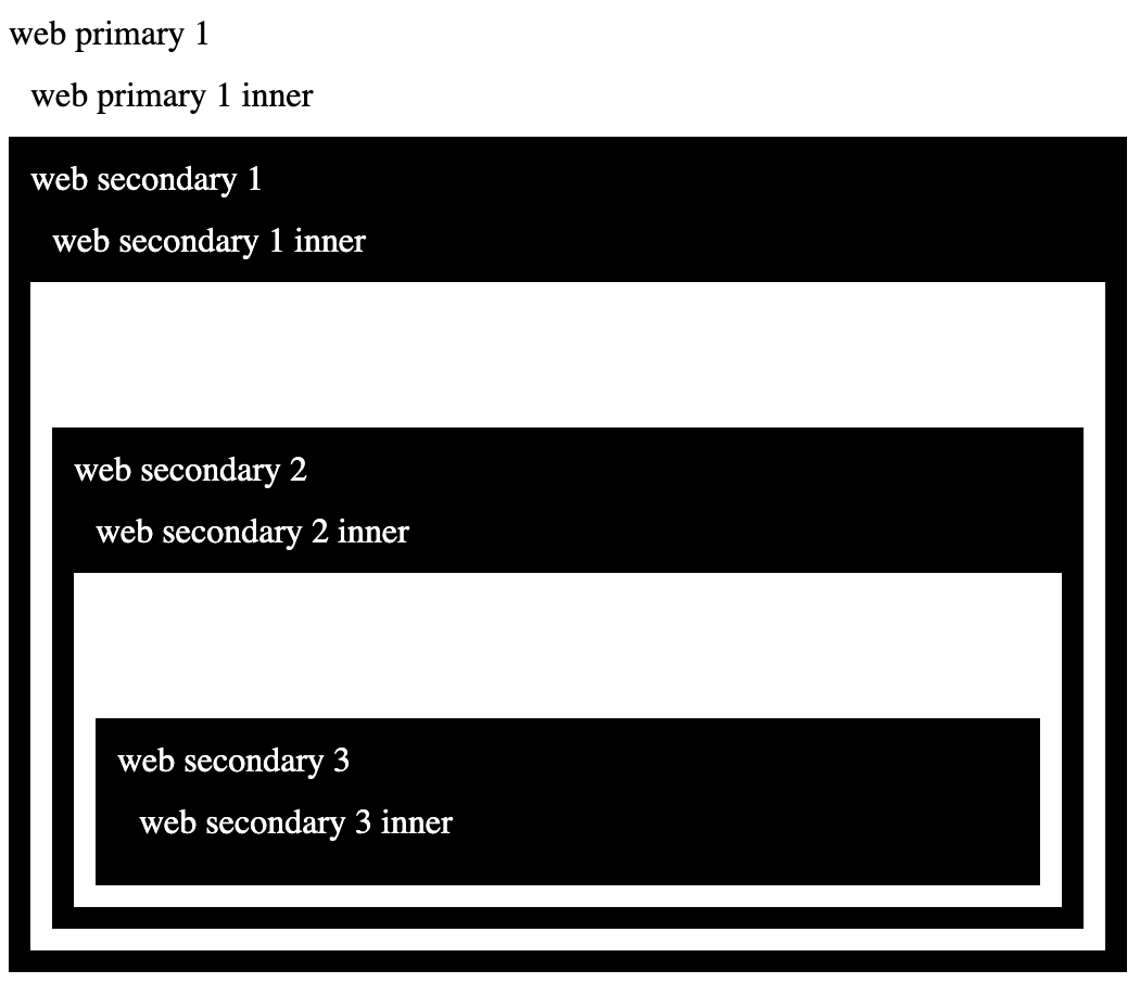
The resolving process is quite close to the way web browsers do it in classic CSS with the single exception: there is no context_weight calculation done on the web. This step makes selectors behave a bit more obvious. You can inspect the primary_secondary example to see the difference between belly resolving and web resolving:
div {
    padding: 10px;
}
.primary {
    background-color: white;
    color: black;
}
.primary * {
    color: black;
}
.secondary {
    background-color: black;
    color: white;
}
.secondary * {
    color: white;
}
// examples/primary_secondary.rs
commands.add(eml! {
<body>
<div c:primary>"bevy primary 1"<div>"bevy primary 1 inner"</div>
<div c:secondary>"bevy secondary 1"<div>"bevy secondary 1 inner"</div>
<div c:primary>"bevy primary 2"<div>"bevy primary 2 inner"</div>
<div c:secondary>"bevy secondary 2"<div>"beby secondary 2 inner"</div>
<div c:primary>"bevy primary 3"<div>"bevy primary 3 inner"</div>
<div c:secondary>"bevy secondary 3"<div>"bevy secondary 3 inner"</div>
</div>
</div>
</div>
</div>
</div>
</div>
</body>
});| Bevy | Web |
|---|---|
 |
 |
The one important thing I want to notice is managed properties. Sooner or later, if you choose to work with the belly, you'll find it can hurt you in many ways. There is one of them. While the belly takes control of how and when styles are applied to components, you may meet the situation when you miss this control and wish to take it back. For example, you may need to control some positioning by code and be sure the belly doesn't override your work in any way.
This is done by passing managed() value to a property you want to control:
commands.add(eml! {
    <span s:margin-right=managed()/>
})
From this point this span's margin-right property is your responsibility, belly hurts less from now.
Work in progress...
Now, when you know something about styling & layout in the belly it is time to react somehow to user input, other events, or data changes, and modify components data. The way data flows in the belly is the responsibility of the relations subsystem. The first step is to learn how to react to events.
Widgets in the belly among other things create entry points for connecting signals (events associated with entities) to handlers (closures):
// examples/counter-signals.rs
// cargo run --example counter-signals
use belly::prelude::*;
use bevy::prelude::*;

fn main() {
    App::new()
        .add_plugins(DefaultPlugins)
        .add_plugin(BellyPlugin)
        .add_startup_system(setup)
        .add_system(update_label)
        .run();
}

#[derive(Component, Default)]
struct Counter {
    count: i32,
}

fn setup(mut commands: Commands) {
    commands.spawn(Camera2dBundle::default());
    // spawn empty Entity to reference it in connections & widgets
    let counter = commands.spawn_empty().id();
    commands.add(eml! {
        <body s:justify-content="center" s:align-items="center">
            // connect the press signal to closure executed on the Counter context
            <button on:press=connect!(counter, |c: Counter| c.count += 1)>"+"</button>
            <span s:width="150px" s:justify-content="center">
                // insert label widget with Counter component to the predefined entity
                <label {counter} with=Counter/>
            </span>
            <button on:press=connect!(counter, |c: Counter| c.count -= 1)>"-"</button>
        </body>
    })
}

fn update_label(mut query: Query<(&Counter, &mut Label), Changed<Counter>>) {
    for (counter, mut label) in query.iter_mut() {
        label.value = format!("Value: {}", counter.count)
    }
}
When you want to connect the signal to the handler you use connect! macro:
<button on:press=connect!(counter, |c: Counter| c.count += 1)>What it means: when the button is pressed (on:press), execute some code on the Counter component (|c: Counter| c.count +=1) attached to the exact entity (counter). |c: counter| c.count += 1 looks like closure, but it is just a sytax sugar, conect! macro among other things expands this part into something like this:
|c: &mut Mut<Counter>| c.count += 1To be able to connect signals to handlers and execute code on exact entities, you need to spawn this entity in advance. You can pass this entity to the widget later (<label {counter}>).
Sometimes you need to add additional components to widgets. In this example, I use <label> widget. It has a Label component already. I also want the counter entity to have a Counter component attached. I tell belly to do this using with param:
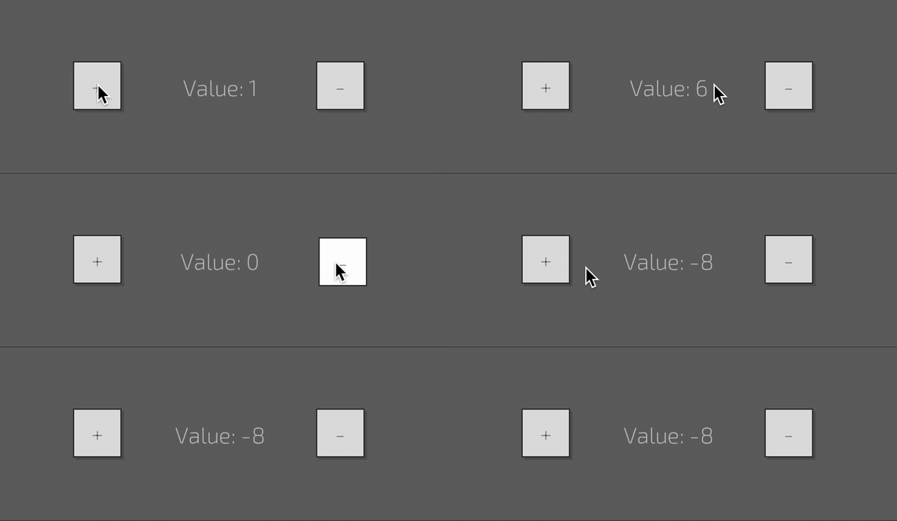
<label {label} with=Counter>When I press the buttons, the Counter.count property changes. To make these changes visible I use the update_label system: it sets the Label.value property when Counter changes.
This kind of system (change property ComponentA.a when ComponentB.b changed) is so common that belly can prepare this system for you. It is called bindings.
Let's try to get rid of the rudimental system from the previous example:
use belly::prelude::*;
use bevy::prelude::*;

fn main() {
    App::new()
        .add_plugins(DefaultPlugins)
        .add_plugin(BellyPlugin)
        .add_startup_system(setup)
        .run();
}

#[derive(Component, Default)]
struct Counter {
    count: i32,
}

fn setup(mut commands: Commands) {
    commands.spawn(Camera2dBundle::default());
    // spawn empty Entity to reference it in binds & widgets
    let counter = commands.spawn(Counter::default()).id();
    commands.add(eml! {
        <body s:justify-content="center" s:align-items="center">
            // connect the press signal to closure executed on the Counter context
            <button on:press=connect!(counter, |c: Counter| c.count += 1)>"+"</button>
            <span s:width="150px" s:justify-content="center">
                // bind Counter.count property at counter entity to Label.value proeprty
                <label bind:value=from!(counter, Counter:count|fmt.c("Value: {c}"))/>
            </span>
            <button on:press=connect!(counter, |c: Counter| c.count -= 1)>"-"</button>
        </body>
    })
}
The result is the same as the result from the previous example, but the implementation is different. In this example I change two things:
- the counter no longer participates in the UI hierarchy
- bind is used instead of a custom system
Let's take a closer look at this piece of code:
<label bind:value=from!(counter, Counter:count|fmt.c("Value: {c}"))/>The thing I want to notice is the <label> widget has a value param, so you can use the label like this: <label value="Hello world!/>. The node produced by <label> widget has a Label component attached as well. <label>'s value param is mapped to Label.value component property. It is like Text.sections[0].value, but much simpler to type and think.
belly allows you to bind any param to any component. You can bind to! components (when this widget's param changed, change some other component property) of from! components (when some other component's property is changed, change this widget's param) or use both to! and from! (bidirectional binds). There are more bind options actually, but I tell you about them later.
In the current case, I bind <label>' value param from the count property of the Counter component using the fmt transformer for converting count: i32 to value: String. This is a single-sentence explanation of the piece of code I hope you are still looking at closely.
There is an explanation of each part of the from! bind:
counter, the first argument, tellsbellyfrom what entity you want to bindCounter:selects the component on the entity you want to bind from, it could be any valid rust path.countis the property of the component you want to bind from, it may be any valid property expression of any level of depth including enum fields, struct fields, indexes & methods, likeComplexComponent:0.values[2].get("item")- everything next to the pipe toke
|is a transformer declaration and it deserves a separate chapter
To be able to describe what transformers are and how it works I have to notice one thing:
The binding system doesn't depend on eml. The way I bind Counter.count to Label.value in the previous example using eml syntax (<label bind:value=from!(...)>) demonstrates the eml! feature of interacting with binds more than binding features itself. You can use bindings independently from all other belly systems like this:
commands.add(
    from!(counter, Counter:count|fmt.c("{c}")) >> to!(label, Label:value)
);
The source of the binding is defined by the from! macro, the target of the binding is defined by the to! macro, shift operator is used for creating the complete Bind which implements Command and could be added to the world using commands.add invocation.
So, you can bind any component's (or resource's) property to any other component's property. The only requirement is the source property type should match the target property type or at least impl TryFrom<Soruce> for Target exists. If there is no one (like in the previous example, rust doesn't provide impl TryFrom<String> for i32) you can provide your way to modify the target value T based on the source value S. The thing that prepares modification of T based on S during the bind is called transformer and passed to from!/to! macro using pipe |.
Transformers can be used just to convert types between each other (like the fmt transformer converts everything to String) or to change just part of the value (for example change the r channel of Color based on f32 value, and do not touch other channels).
There are three types of transformers:
- format transformer (
fmt.token("There is {token}")) - global transformers (
color.r) - associated transformers (
r)
Format transformer converts everything to string using format! macro. The syntax for the format transformer is:
fmt:<ident>(<args>)
identis the name of the identifier passed to the execution contextargsare the arguments passed toformat!
There are examples of format transformer:
fmt.val("{val}")
fmt.val("{}", val)
fmt.vec("{vec:?}")
fmt.some_vec("({}, {})", some_vec.x, some_vec.y)belly comes with Transformers namespace struct so you can define extension trait and implement your trait for Transformers struct. Bind macros expand global transformers to calls on this struct. For example, you may need to change Color.r value when some f32 value is changed (change the color of the health's progress bar when the player's health changes). Unfortunately Color provides only methods for changing color channels while fields are left private. To make such transformation possible, belly implements for you ColorTransformerExt and implements it for Transformers. So you can modify color values like this:
commands.add(
    from!(player, Health:value) >> to!(health, BackgroundColor:0|color.r)
)
This bind says: when value of Health component on player entity changes, change also the BackgroundColor.0 property at health entity using r method of color global transformer.
belly will call color() method on Transformers struct to get color transformer and then call r method on this transformer to obtain the function pointer that calls color.set_r(val) if necessary when Health.value (val) is changed.
belly comes with some predefined global transformers listed here. The other ones you can implement by yourself when needed. I'll give you detailed instructions on how to implement global transformers later.
The last thing I want to notice here: you can pass global transformers to any from! or to! macro, but not both. The previous piece of code could be written like this:
commands.add(
    from!(player, Health:value|color.r) >> to!(health, BackgroundColor:0)
)Let's look at the first piece of code from the previous chapter closer:
commands.add(
    from!(player, Health:value) >> to!(health, BackgroundColor:0|color.r)
)
Look at this part: BackgroundColor:0|color.r. You may notice that writing color is unnecessary because you (and the compiler) know that BackroundColor:0 is a type of Color and you are about to use the color transformer here. Actually you can omit the the color part and write this bind like this:
commands.add(
    from!(player, Health:value) >> to!(health, BackgroundColor:0|r)
)
It is possible because the trait AsTransformer is implemented for the Color struct. The macro expands the transformer part to something like this:
// bind
ToComponent {
    // ...
    transformer: Color::as_transformer().r()
}
So associated keyword in associated transformers means associated with the exact type.
Unfortunately, when you use from! macro the target type is unknown. This is why the only limitation of associated transformers is: they are available only within to! macro.
belly comes with some predefined associated transformers listed here. The other ones you can implement for your types by yourself when needed. I'll give you detailed instruction on how to implement associated transformers later.
In the examples above I showed you how to bind Component to Component. belly also provides you with a way to bind Resource to Component. Binding from Resource is all the same as binding from Component except you do not need to pass entity to from! macro:
commands.add(
    from!(Time:elapsed_seconds()|fmt.t("Elapsed: {t}")) >> to!(label, Label:value)
)
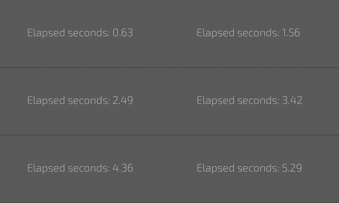
You can bind from the eml! as well, there is a full (finally) example:
// exmples/timer.rs
// cargo run --example timer
use belly::prelude::*;
use bevy::prelude::*;

fn main() {
    App::new()
        .add_plugins(DefaultPlugins)
        .add_plugin(BellyPlugin)
        .add_startup_system(setup)
        .run();
}

fn setup(mut commands: Commands) {
    commands.spawn(Camera2dBundle::default());
    commands.add(eml! {
        <body s:padding="50px">
            "Elapsed seconds: "{from!(Time:elapsed_seconds() | fmt.s("{s:0.2}"))}
        </body>
    });
}
Pay attention to how the bind is written in this example. I do not use <label> here, but put from! bind as a direct child of the body. I've mentioned earlier that rust blocks may be passed as children to tags and it is also an example of how this feature may be used: binds produced by from! macro implements the IntoContent trait and can be added as content.
To make the Data relations part looks complete I'd like to summarize the experience above and write down all possible forms of relation macro invocations.
Binds:
// bind from component
from!(entity, Component:property)
// bind from component with transformer
from!(entity, Component:property | transformer:method)
// bind from resource
from!(Resource:property)
// bind from resource with transformer
from!(Resource:property | transformer:method)
// bind to component
to!(entity, Component:property)
// bind to component with transfromer
to!(entity, Component:property | transformer:method)
// bind to component with associated transformer
to!(entity, Component:property | transform_method)
// connect binds using right shift:
from!(...) >> to!(...)
// connect binds using left shift:
to!(...) << from!(...)
Connections:
// connect to component attached to exact entity:
connect!(entity, |c: Component| c.property = value)
// connect to component attached to exaxct entity with access to context & component
connect!(entity, |ctx| info!("Happened on {:?}", ctx.target().id()))
// connect to component attached to exaxct entity with access to context only
connect!(|ctx| info!("Happened at {}", ctx.time().elapsed_seconds())
// connect to general handler
connect!(|| info!("Just happened"))
// connect to general handler with access to context
connect!(|ctx| info!("Happened at {}", ctx.time().elapsed_seconds())All this time I've been talking about widgets: the eml tags expanded into one or more entities. belly is charged with some templating features exposed as template tags. Template tags in the belly don't produce entities by themself but control how the tree or widgets is built. There are two of them supported by belly right now: <for> loops and <slot>s.
You won't repeat yourself. At least sometimes. This is why belly gives your an instrument to express loops inside eml!:
// examples/for-loop.rs
// cargo run --example for-loop
use belly::prelude::*;
use bevy::prelude::*;

fn main() {
    App::new()
        .add_plugins(DefaultPlugins)
        .add_plugin(BellyPlugin)
        .add_startup_system(setup)
        .run();
}

fn setup(mut commands: Commands) {
    commands.spawn(Camera2dBundle::default());
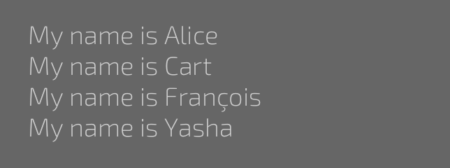
    let names = &["Alice", "Cart", "François", "Yasha"];
    commands.add(eml! {
        <body s:padding="50px">
            <for name in=names>
                <div>"My name is "{name}</div>
            </for>
        </body>
    });
}
I believe the example speaks for itself, but I'm boring and want to repeat myself. At least sometimes:
<for ident in=iterator>
    // ...
</for>
This is the syntax for eml! loops. ident is the identifier that will be used inside the loop body, the iterator is any rust expression implementing IntoIterator trait. Pretty simple.
Last thing I want to notice about the <for> loops is: it is supported only by eml! macro and not supported within eml assets.
At some point, you will find you want to alternate some parts of widgets. For example, you'd like to add some custom separator of the <progressbar> widget. This is when <slot> comes to the light.
The idea is to define some named block of widgets (slot) with default content inside the widget body and optionally replace this default content with custom one from outside. Some widgets come with predefined slots, and other ones you will define by yourself. I will focus on widget definition later within the building widgets talk, for now, I'd like to show you how to replace predefined slots:
// examples/sliders.rs
// cargo run --example sliders
use belly::prelude::*;
use bevy::prelude::*;

fn main() {
    App::new()
        .add_plugins(DefaultPlugins)
        .add_plugin(BellyPlugin)
        .add_startup_system(setup)
        .run();
}

fn setup(mut commands: Commands) {
    commands.spawn(Camera2dBundle::default());
    commands.add(eml! {
        <body s:padding="50px">
            <progressbar s:width="200px" bind:value=from!(Time:elapsed_seconds()*0.2)/>
            <br/>
            <progressbar s:width="200px" bind:value=from!(Time:elapsed_seconds()*0.2)>
                <slot separator>
                    <span s:height="100%" s:min-width="10px" s:background-color="red"/>
                </slot>
            </progressbar>
        </body>
    });
}
To understand this example better you need to remember (or read from docs when somebody writes it) that <progressbar> widget comes with <slot define="separator"> with empty content inside (actually, this slot is defined inside the <range> widget which acts like a base widget for <progressbar>, I'll talk about widget extending later).
There are two <progressbar>s in the example. The top one is the default. The bottom one comes with replaced separator slot.
The syntax for replacing slots is:
<slot slot_name>slot_content</slot>If you misspell a slot name somehow (easy one), belly will warn you and drop missed slot content.
The slot replacement and definition are supported within eml! macro as well as eml asset.
To demonstrate the way slots are defined I need to take a break and tell how to build widgets first (finally).
Coming soon
Coming soon
Coming soon
The belly is dual-licensed under either:
- MIT License (LICENSE-MIT or http://opensource.org/licenses/MIT)
- Apache License, Version 2.0 (LICENSE-APACHE or http://www.apache.org/licenses/LICENSE-2.0)
This means you can select the license you prefer! This dual-licensing approach is the de-facto standard in the Rust ecosystem and there are very good reasons to include both.
