Collection of customizable UI components for CLIs made with Ink.
npm install @inkjs/uiThis assumes you've already set up Ink. The easiest way to get started is create-ink-app.
TextInput is used for entering any single-line input with an optional autocomplete.
import {TextInput} from '@inkjs/ui';

<TextInput
	placeholder="Enter your name..."
	onSubmit={name => {
		// `name` contains user input
	}}
/>;EmailInput is used for entering an email. After "@" character is entered, domain can be autocompleted from the list of most popular email providers.
import {EmailInput} from '@inkjs/ui';

<EmailInput
	placeholder="Enter email..."
	onSubmit={email => {
		// `email` contains user input
	}}
/>;PasswordInput is used for entering sensitive data, like passwords, API keys and so on. It works the same way as TextInput, except input value is masked and replaced with asterisks ("*").
import {PasswordInput} from '@inkjs/ui';

<PasswordInput
	placeholder="Enter password..."
	onSubmit={password => {
		// `password` contains user input
	}}
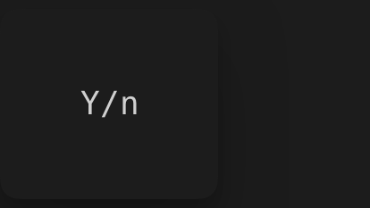
/>;ConfirmInput shows a common "Y/n" input to confirm or cancel an operation your CLI wants to perform.
import {ConfirmInput} from '@inkjs/ui';

<ConfirmInput
	onConfirm={() => {
		// confirmed
	}}
	onCancel={() => {
		// cancelled
	}}
/>;
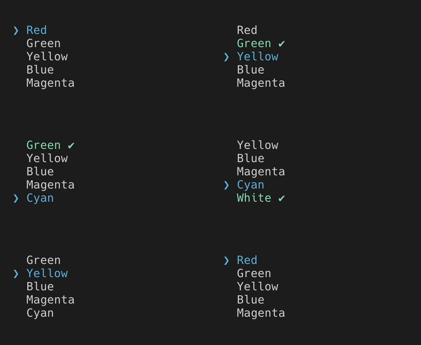
Select shows a scrollable list of options for a user to choose from.
import {Select} from '@inkjs/ui';

<Select
	options={[
		{
			label: 'Red',
			value: 'red',
		},
		{
			label: 'Green',
			value: 'green',
		},
		{
			label: 'Yellow',
			value: 'yellow',
		},
		/* ... */
	]}
	onChange={newValue => {
		// `newValue` equals the `value` field of the selected option
		// For example, "yellow"
	}}
/>;MultiSelect is similar to Select, except user can choose multiple options.
import {MultiSelect} from '@inkjs/ui';

<MultiSelect
	options={[
		{
			label: 'Red',
			value: 'red',
		},
		{
			label: 'Green',
			value: 'green',
		},
		{
			label: 'Yellow',
			value: 'yellow',
		},
		/* ... */
	]}
	onChange={newValue => {
		// `newValue` is an array of `value` fields of the selected options
		// For example, ["green", "yellow"]
	}}
/>;
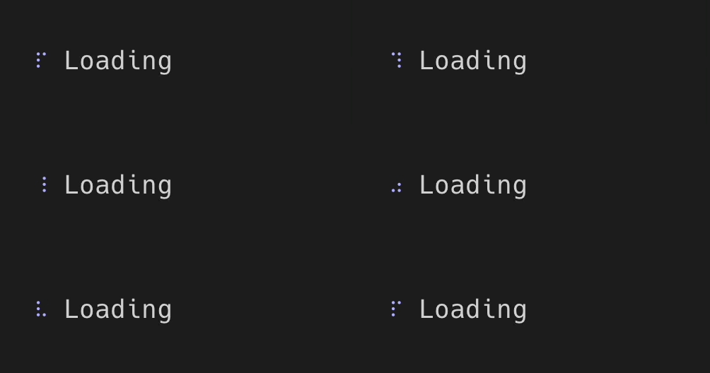
Spinner indicates that something is being processed and CLI is waiting for it to complete.
import {Spinner} from '@inkjs/ui';

<Spinner label="Loading" />;ProgressBar is an extended version of Spinner, where it's possible to calculate a progress percentage.
import {ProgressBar} from '@inkjs/ui';

// `progress` must be a number between 0 and 100
<ProgressBar value={progress} />;
Badge can be used to indicate a status of a certain item, usually positioned nearby the element it's related to.
import {Badge} from '@inkjs/ui';

<Badge color="green">Pass</Badge>
<Badge color="red">Fail</Badge>
<Badge color="yellow">Warn</Badge>
<Badge color="blue">Todo</Badge>StatusMessage can also be used to indicate a status, but when longer explanation of such status is required.
import {StatusMessage} from '@inkjs/ui';

<StatusMessage variant="success">
	New version is deployed to production
</StatusMessage>

<StatusMessage variant="error">
  Failed to deploy a new version of this app
</StatusMessage>

<StatusMessage variant="warning">
    Health checks aren't configured
</StatusMessage>

<StatusMessage variant="info">
    This version is already deployed
</StatusMessage>
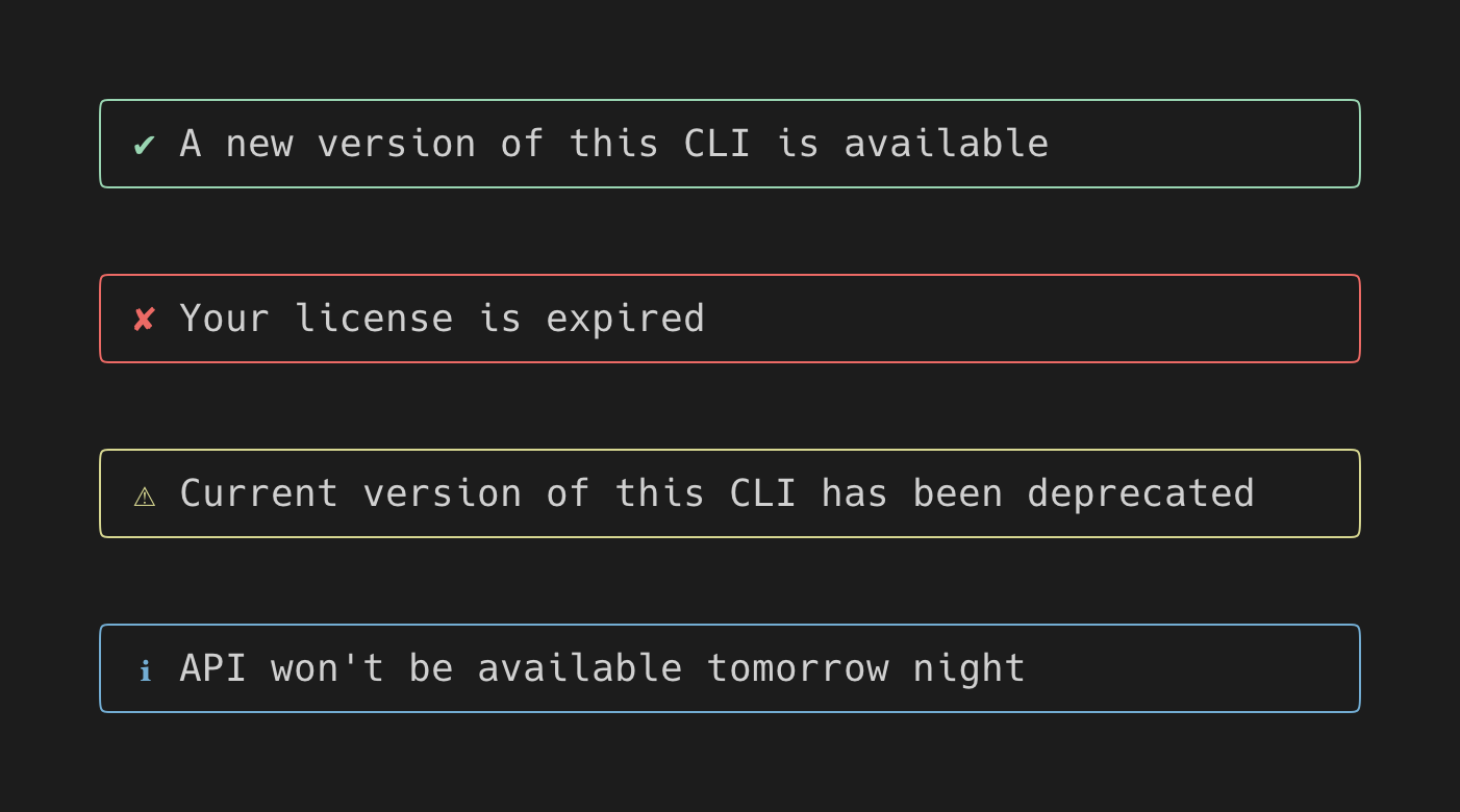
Alert is used to focus user's attention to important messages.
import {Alert} from '@inkjs/ui';

<Alert variant="success">
    A new version of this CLI is available
</Alert>

<Alert variant="error">
    Your license is expired
</Alert>

<Alert variant="warning">
    Current version of this CLI has been deprecated
</Alert>

<Alert variant="info">
    API won't be available tomorrow night
</Alert>UnorderedList is used to show lists of items.
import {UnorderedList} from '@inkjs/ui';

<UnorderedList>
	<UnorderedList.Item>
		<Text>Red</Text>
	</UnorderedList.Item>

	<UnorderedList.Item>
		<Text>Green</Text>

		<UnorderedList>
			<UnorderedList.Item>
				<Text>Light</Text>
			</UnorderedList.Item>

			<UnorderedList.Item>
				<Text>Dark</Text>
			</UnorderedList.Item>
		</UnorderedList>
	</UnorderedList.Item>

	<UnorderedList.Item>
		<Text>Blue</Text>
	</UnorderedList.Item>
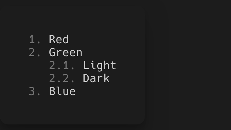
</UnorderedList>;OrderedList is used to show lists of numbered items.
import {OrderedList} from '@inkjs/ui';

<OrderedList>
	<OrderedList.Item>
		<Text>Red</Text>
	</OrderedList.Item>

	<OrderedList.Item>
		<Text>Green</Text>

		<OrderedList>
			<OrderedList.Item>
				<Text>Light</Text>
			</OrderedList.Item>

			<OrderedList.Item>
				<Text>Dark</Text>
			</OrderedList.Item>
		</OrderedList>
	</OrderedList.Item>

	<OrderedList.Item>
		<Text>Blue</Text>
	</OrderedList.Item>
</OrderedList>;All component have their styles defined in a theme, which is accessible to components via React context. Ink UI ships with a default theme and it can be customized or replaced with a different theme altogether.
Let's get a quick look on how to customize a Spinner's component theme. Here's how it looks by default:
First, look up component's default theme, which will give an overview which parts does this component consist of. Documentation of each component includes a link to component's theme.ts file on top. In the case of Spinner, it's source/components/spinner/theme.ts.
Here's the part we care about:
const theme = {
	styles: {
		container: (): BoxProps => ({
			gap: 1,
		}),
		frame: (): TextProps => ({
			color: 'blue',
		}),
		label: (): TextProps => ({}),
	},
} satisfies ComponentTheme;

export default theme;
This component theme hints that Spinner has 3 parts: container, frame and a label. So to customize the color of the spinner itself, we'd want to change the color prop returned from the frame function.
To customize the default theme, use extendTheme function and make that custom theme available to children components via ThemeProvider.
import {render, type TextProps} from 'ink';
import {Spinner, ThemeProvider, extendTheme, defaultTheme} from '@inkjs/ui';

const customTheme = extendTheme(defaultTheme, {
	components: {
		Spinner: {
			styles: {
				frame: (): TextProps => ({
					color: 'magenta',
				}),
			},
		},
	},
});

function Example() {
	return (
		<ThemeProvider theme={customTheme}>
			<Spinner label="Loading" />
		</ThemeProvider>
	);
}

render(<Example />);
With custom theme applied, Spinner now renders a magenta spinner, instead of the default blue one.
There are also cases where styles change based on some condition. For example, StatusMessage changes the color of an icon based on the variant prop.
Here's a sample code from its theme.
const colorByVariant = {
	success: 'green',
	error: 'red',
	warning: 'yellow',
	info: 'blue',
};

const theme = {
	styles: {
		icon: ({variant}) => ({
			color: colorByVariant[variant],
		}),
	},
};
Since each field in styles object is a function, it can return different styles based on the props that were passed in or a state of a component.
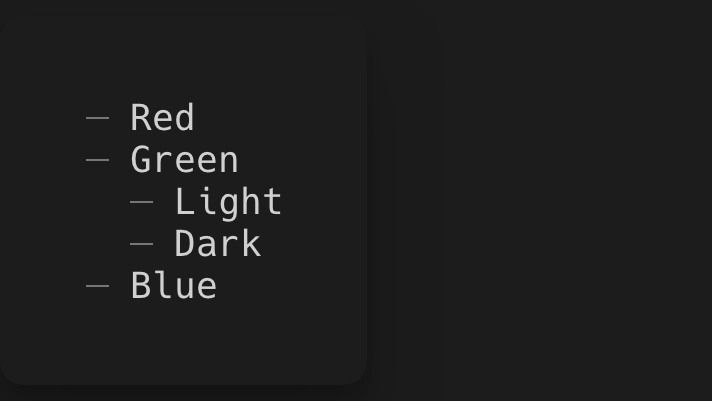
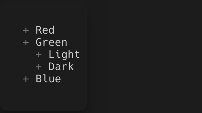
Component themes can also include configuration for rendering a component in a config object, that's not related to styling. For example, UnorderedList specifies a marker, which is a character that's rendered before each list item.
Here's a sample code from its theme.
const theme = {
	config: () => ({
		marker: '─',
	}),
};
Changing marker to '+' would render this:
Components shipped in Ink UI automatically read the necessary styles and configuration from a theme. However, if you're adding a new custom component and a theme for it, use useComponentTheme hook to access it.
import React, {render, Text, type TextProps} from 'ink';
import {
	ThemeProvider,
	defaultTheme,
	extendTheme,
	useComponentTheme,
	type ComponentTheme,
} from '@inkjs/ui';

const customLabelTheme = {
	styles: {
		label: (): TextProps => ({
			color: 'green',
		}),
	},
} satisfies ComponentTheme;

type CustomLabelTheme = typeof customLabelTheme;

const customTheme = extendTheme(defaultTheme, {
	components: {
		CustomLabel: customLabelTheme,
	},
});

function CustomLabel() {
	const {styles} = useComponentTheme<CustomLabelTheme>('CustomLabel');

	return <Text {...styles.label()}>Hello world</Text>;
}

function Example() {
	return (
		<ThemeProvider theme={customTheme}>
			<CustomLabel />
		</ThemeProvider>
	);
}

render(<Example />);


