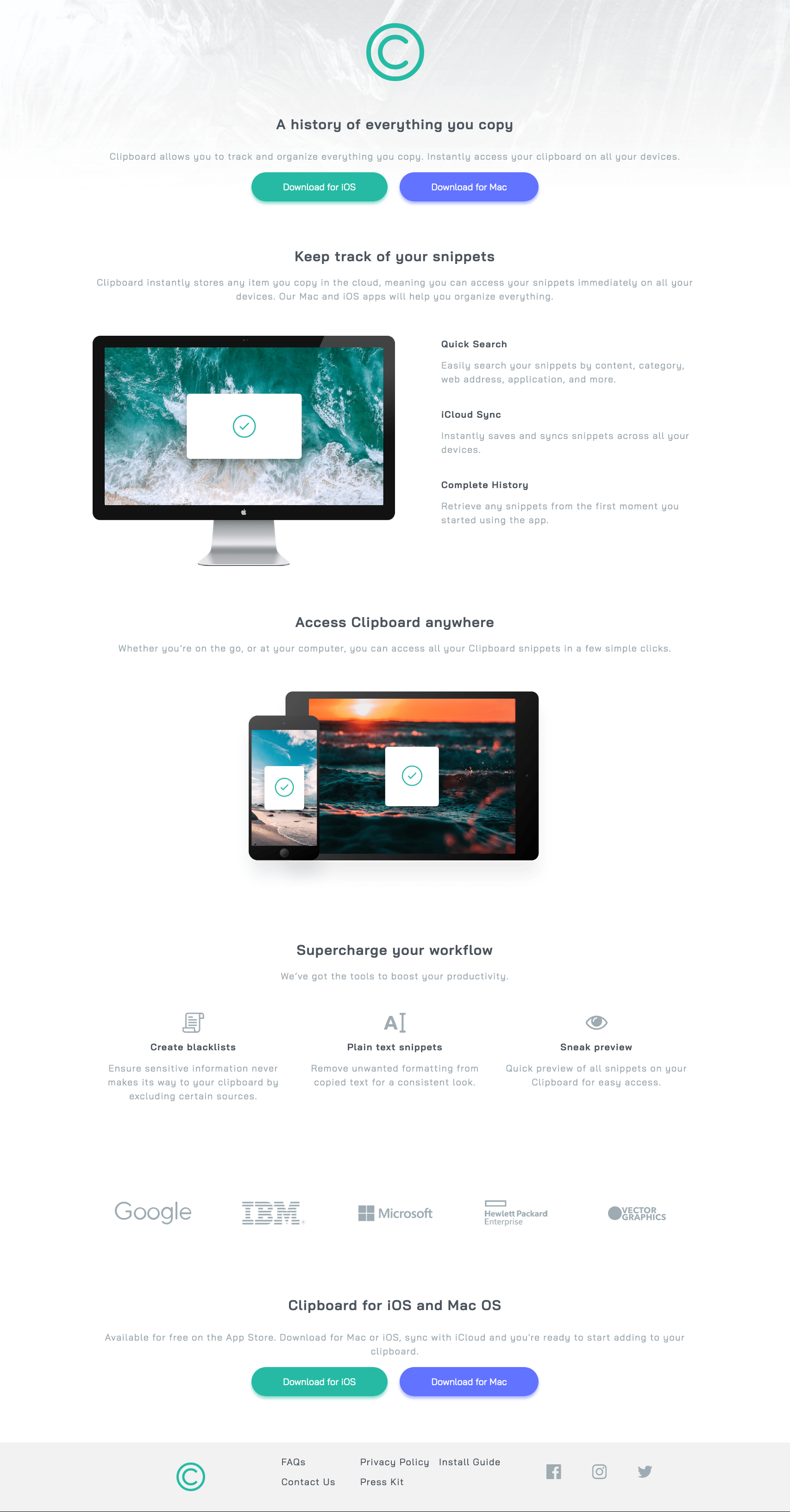
This is a solution to the Clipboard landing page challenge on Frontend Mentor. Frontend Mentor challenges help you improve your coding skills by building realistic projects.
Users should be able to:
- View the optimal layout for the site depending on their device's screen size
- See hover states for all interactive elements on the page
- Solution URL: Add solution URL here
- Live Site URL: Add live site URL here
- Semantic HTML5 markup
- CSS custom properties
- CSS Grid
- Mobile-first workflow
- Bottom-up approach
- Normalize.css - Normalize.css
This was a fantastic opportunity to approach front-end development with a mobile-first and bottom-up approach - something which made the process a lot more paletable. My major roadblocks with the bottom-up approach, however, was keeping consistency between design decicions, being only able to solve them when the components were put together and I could see the differences. There are a couple quirks with the desktop design, I think the padding and margins could be altered to match the design spec. I also need to review semantic HTML again, as there is is still confusion on how and when to use the appropriate markup. However, overall, I'm pleased with the result.
- GitHub - @valleyman89
- Frontend Mentor - @valleyman89
- Twitter - @steven_rolph

