A data visualisation project by Jan Kühn, September 2022
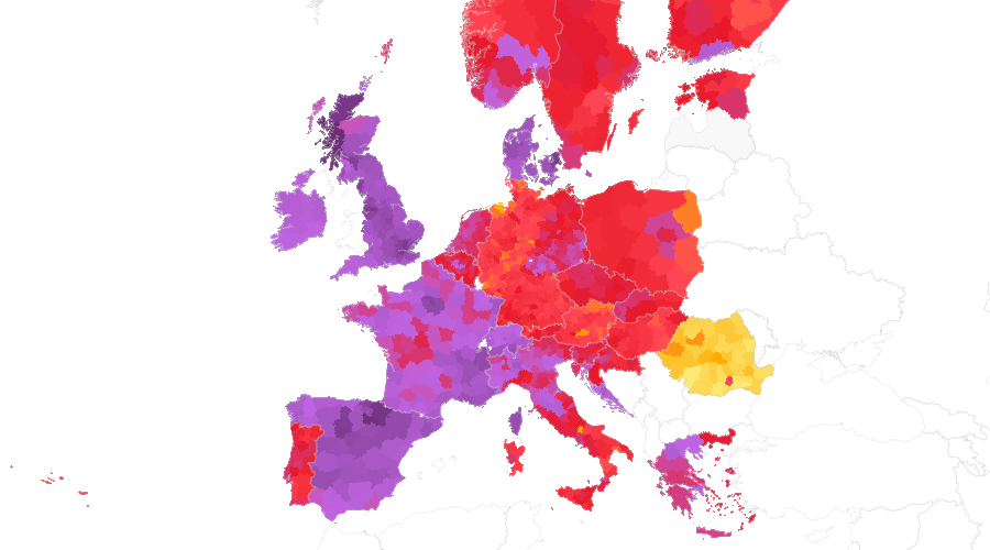
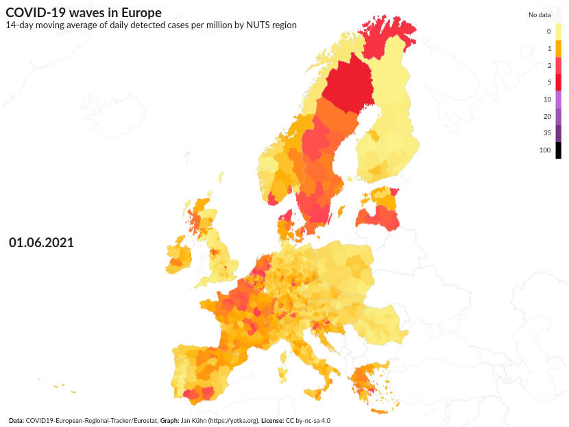
After more than two years of living with the pandemic of the new Corona virus Sars-CoV2 one thing we know for sure is that the virus spreads in waves. But how do they move across a continent – in this case Europe – that has many countries and even more policies to deal with the threat of this new pathogen? I used data to try to answer that question. The result is an animation of detected COVID-19 cases throughout the time period from February 2020 to June 2022. One possible result can be seen here or on YouTube:
anim-10M-moving14d_pop-830px-fps28.mp4
For COVID-19 cases, I used data of the (great!) COVID19-European-Regional-Tracker. It's a project by Asjad Naqvi that collected data from many sources and adapted them to Eurostat's geographic NUTS regions (the so-called "Nomenclature of territorial units for statistics" (NUTS)) in its 2016 version (why not 2021, you ask? Read more here).
The main script main.py creates an animation of the data using Plotly Choropleth Mapbox and GeoJson files provided by Eurostat. The script allows to define different characteristics of the animation like time frame, metrics, speed (frames per second), map details etc. in the file settings.py.
By default, the script uses a dataset that has already been cleaned by update_data.py (data/covid-waves-data-clean.csv). It cleans the COVID-19 data removing some extreme outliers and values below zero (both due to data corrections) and correcting some erroneous dates (years 2222 and 2121). It then adds missing dates for each NUTS region and interpolates missing values between known data points. In a last step before the export, different metrics are calculated both for daily data and for weekly aggregated data.
In settings.py, the cleaning process can be set to be repeated (setting: update_data: True). In that case, the original data in data/european-regional-tracker.csv is imported and cleaned as described above. If in that case refresh_source is set to True, the data is fetched from the COVID19-European-Regional-Tracker repository first.
There are multiple metrics available to be used for the visualisation (to be set in settings.py). Default is the 14-day moving average of daily detected cases per million by NUTS region (moving14d_pop).
cases_pop: Daily detected cases per million by NUTS regionmoving7d_pop: 7-day moving average of daily detected cases per million by NUTS regionmoving14d_pop: 14-day moving average of daily detected cases per million by NUTS regionmoving28d_pop: 4-week moving average of daily detected cases per million by NUTS regioncumulated_pop: Cumulated detected cases per million by NUTS region
cases_pop_weekly: Weekly detected cases per million by NUTS regionmoving4w_pop: 4-week moving average of detected weekly cases per million by NUTS regionmoving8w_pop: 8-week moving average of detected weekly cases per million by NUTS region
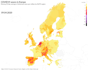
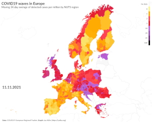
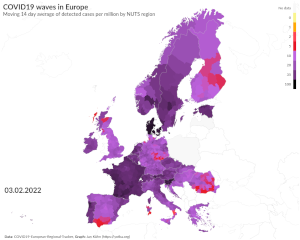
Defining colors and break points for this dataset is rather challenging, because the magnitude of detected cases varies a lot both over time and geographically. For that reason, analyzing the data I chose to use red as the 'medium' color and dark purple to black as the maximum. The break points are quantiles at 20%, 40%, 60%, 80%, 90%, 95%, and 99%.
That way, during the first waves of the pandemic in 2020, maximum numbers are reaching the red area while later on (especially with much more contagious variants like Omikron) maximums are dark purple to black. This allows for differentiation both in the first and in later waves.
I checked the color scheme with the Coblis Color blindness simulator to see if it works well for those with one or another type of color blindness. In all but one cases, the results looked good to me. I still have to come up with a solution for Monochromacy/Achromatopsia though. Hints are very welcome.
The script allows to select between png and webp for the exported images and between gif and webp for the animation. The mp4 files are created using ffmpeg aside from the script:
ffmpeg -framerate 28 -pattern_type glob -i "*.png" -c:v libx264 -crf 6 -pix_fmt yuv420p output.mp4
-frameratesets the number of frames per second, i.e. the speed-pattern_type globdefines to useglobto search for the file to be added-i "*.png"means that allPNGfiles in the current folder will be included-c:vsets the video codec to be used, in this caselibx264-crfsets the compression (0 = lossless/largest file, 51 = worst quality/small file)-pix_fmt yuv420psets the pixel format (for compatibility reasons)
COVID-19 data has many caveats and actually it's difficult to compare countries, especially regarding detected cases. Different testing policies leading to different numbers of tests and different criteria of who to test distort the numbers not only between countries, but also between different points in time, as policies change. Also, higher numbers of detected cases don't necessarily translate to the same increase in hospital admissions or deaths from COVID-19.
But even taking into account those caveats, the data shows some interesting trends. At some moments during the pandemic, COVID-19 waves seem to spread through the continent (almost) regardless of borders. This happened, for example after June 2021 when detected cases started to rise steeply on the Iberian Peninsula and then "moved" to France in Summer and the rest of Europe in December/January, just to "send back" an even bigger wave in January/February 2022:
Although the COVID19 European Regional Tracker is quite comprehensive, there is still missing data. For example, data for Portugal is just provided from November 2020 to March 2022 and on a weekly basis. The data for Latvia ends in July 2021, for Poland in January 2022, for Spain in April 2022, and for Hungary in May 2022. Other countries like Switzerland partly lack data.
Missing data points in between existing ones are interpolated so that there is a smooth transition in the animation. Missing data at the beginning and the end appear as gray areas on the map.
Cumulated data is less exact due to missing data. For regions where data is available at a later date, cumulated counts are lower than they really are because those dates are missing. For missing data at the end, the same is true. Just that for aesthetic reasons missing data is filled with the last available value.
This work is licensed under a Creative Commons Attribution-NonCommercial-ShareAlike 4.0 International License.
... to Asjad Naqvi and the COVID19-European-Regional-Tracker for preparing the data.
... to Jan T. Sott (idleberg) for the markdown of the Creative Commons license text.
