- Introduction
- Installation
- Reference Images
- Storybook Documentation
- Meta Information
- Usage
- Button Component
- Examples
- Local Project Setup
- Contributing
- License
The Button component is a customizable React button that allows you to create primary and secondary buttons with various styles. It supports additional properties such as onClick and disabled to enhance functionality.
To use the Button component in your project, follow these steps:
Install the component library:
@vedant-3010/uilib
Import the Button component in your project:
import {Button} from '@vedant-3010/uilib';
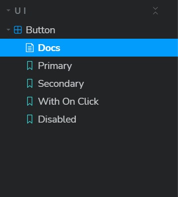
The Storybook documentation is located in the stories directory. The Button.stories.tsx file contains stories that showcase different use cases of the Button component.
- Title: 'UI/Button'
- Component: Button
- Tags: ['autodocs']
- Parameters: { layout: 'centered' }
- variant?: 'primary' | 'secondary': Specifies the button style as either primary or secondary.
- onClick?: () => void: Function to be called when the button is clicked.
- disabled?: boolean: Disables the button if set to true.
- Other standard ButtonHTMLAttributes are also supported.
import React from 'react';
import Button from '@vedant-3010/uilib';
const MyComponent = () => { return <Button variant="primary">Click Me</Button>; };
import React from 'react';
import Button from '@vedant-3010/uilib';
const MyComponent = () => { return <Button variant="secondary">Click Me</Button>; };
import React from 'react';
import Button from '@vedant-3010/uilib';
const MyComponent = () => { const handleClick = () => { alert('Clicked!'); };
return <Button variant="primary" onClick={handleClick}>Click Me</Button>; };
import React from 'react';
import Button from '@vedant-3010/uilib';
const MyComponent = () => { return <Button variant="primary" disabled>Click Me</Button>; };
Follow these steps to set up the project locally:
Clone the repository:
git clone https://github.com/vedant-3010/react-component-library.git
Navigate to the project directory:
cd react-component-library
Install dependencies:
npm install
Run the development server:
yarn storybook
This will launch the Storybook development environment where you can interactively view and develop your components.
If you'd like to contribute to this project, please follow the contribution guidelines.
This project is licensed under the MIT License. Feel free to use, modify, and distribute the code as per the terms of the license.


