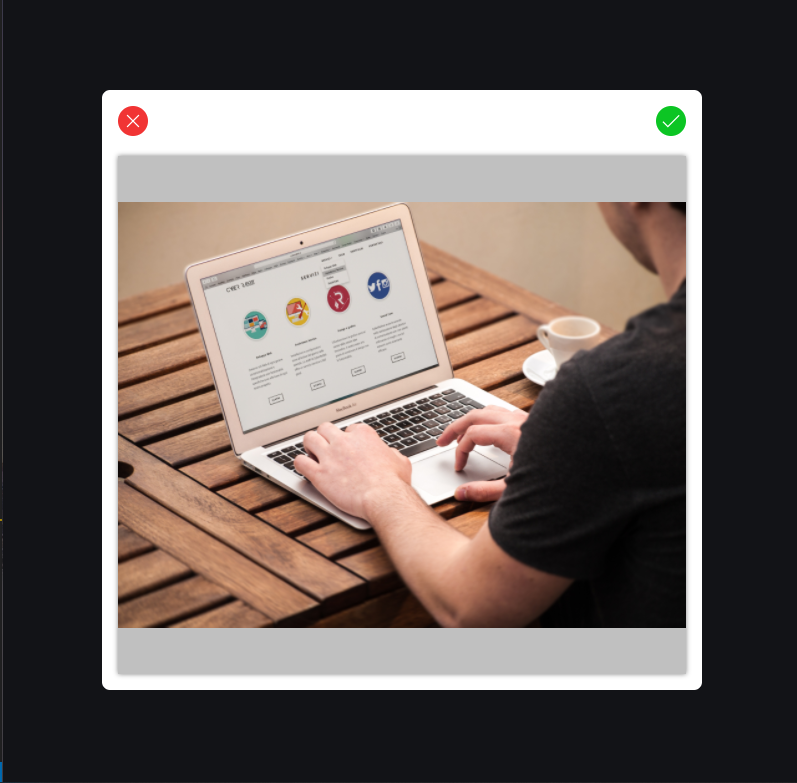
As a user of your mobile or web app, I want to personalize my experience by including profile picture 😎 but the picture I want to use is too large and does not focus the part I wanted or I want to remove some part of the image. It will be nice to use the same app to crop the image to my taste! Right?
Apart from the editting part, we might need images of a particular width and height ratio (📝 we call this aspect ratio) in our apps for better image experience.
In this article, we are going to create a simple image cropping system in React. Check out the result demo here . Great! Let's get started! 🚀.
Yeah! Knowledge of Javascript, CSS and React is required. But if you are a beginner or intermediate with React and Javascript, why not join the train 🚆.
Let's create our React projects with our command line.
npm init react-app reactimagecropAfter our reactimagecrop project has loaded, we are left with a nice structure. We won't need some files like logo.svg and the test files. I included components folder (which will hold the components we will use), helper folder for utilities files. So, I am left with
- public
- src
- components
- helpers
- app.js
- app.css
- index.js
- index.css
- serviceWorker.js
We will also use a react image cropping component, ReactCrop. You could check out it's documentation here.
npm install ReactCropTake a peek at my package.json
{
  "name": "image-cropping-in-react",

  "dependencies": {
    "@testing-library/jest-dom": "^4.2.4",
    "@testing-library/react": "^9.5.0",
    "@testing-library/user-event": "^7.2.1",
    "gh-pages": "^3.1.0",
    "react": "^16.13.1",
    "react-dom": "^16.13.1",
    "react-image-crop": "^8.6.6",
    "react-scripts": "3.4.3"
  },

}
This tutorial will in segments based on these tasks or should we call it todo?
- Creating and Styling the Upload Page
- Creating the Crop Modal Component
- Using the Crop Modal Component
- Making Image Preview from Upload Inputs
- Using the ReactImageCrop component
- Adding Custom Styles to ReactImageCrop
- Creating the Result Container
- Cropping the Image with Canvas
- Validating Upload Inputs
We are creating this page in our app.js file. We have the react template code here, we don't need some elements and so we remove them. We are left with this.
import React from 'react';
import './App.css';

function App() {
  return (
    <div className="App">

    </div>
  )
}

export default App;
So we include input[type="file"] tag for uploading files into the div.upload-bx container. We need this for our custom styling 🌈 for the upload.
// ...
return (
  <div className="App">
    <div className="upload-bx">
      <input type="file" onInput={handleInput} accept="image/gif, image/jpeg, image/png, image/jpg" />
      <span>{ handUp }</span>
      <span>Upload</span>
    </div>
  </div>
)
...
I included a svg import from my project file. If you need this file check it in here. Now we style in app.css. This is the trick! Since we're making our custom input file upload element, we use positioning to make the input fill the box and we reduce its opacity to 0. Then, the input is there but we can't see it.
.App .upload-bx {
  width: 400px;
  height: 400px;
  /* to support 'absolute'ly positioned children */
  position: relative;
}

.App .upload-bx [type=file] {
  /* fill its parent */
  position: absolute;
  top: 0;
  left: 0;
  width: 100%;
  height: 100%;
  /* make invisible */
  opacity: 0;
  cursor: pointer;
}
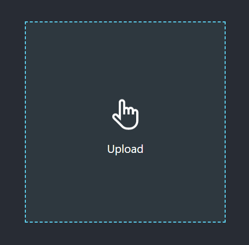
You can style it to your taste 👌. This is what I got.
We are making the crop component a modal. In the components folder, I have the ImageCropModal.js file. That's the crop modal component. For simplicity, we are making use of React's class component.
class ImageCropModal extends React.Component {
  render() {
    return (
      <main className="image-modal">
        <div className="image-crop-bx">
          <div className="modal-toolbar">
              <span>{ times }</span>
              <span>{ check }</span>
          </div>
          <div className="modal-crop-bx"></div>
        </div>
      </main>
    )
  }
}

export default ImageCropModal;
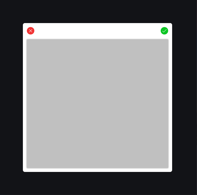
Wow! We have a nest of containers. The main.image-modal fills the entire screen with a dark translucent background. div.image-crop-bx is the modal content, the container that houses most importantly the crop component. We have the div.modal-toolbar that houses icons for closing the modal, cancelling selection and the other for choosing crop selection. The div.modal-crop-bx houses the ReactImageCrop component we installed already via npm.
In the same folder components folder, I have imagecropmodal.css for styling. We import it in the ImageCropModal.js as the following.
...
import './imagecropmodal.css';
...
Now, let's work on the styling for the modal component.
.image-modal {
  /* Fills the screen */
  width: 100vw;
  height: 100vh;
  position: fixed;
  top: 0;
  z-index: 100;
  /* Set the dark translucent background */
  background-color: rgba(0, 0, 0, 0.555);
  /* Position direct children (.image-crop-bx) to center */
  display: grid;
  place-items: center;
}

.image-modal .image-crop-bx {
  width: 600px;
  height: 600px;
  /* align children in a column */
  display: flex;
  flex-flow: column nowrap;
  /* my styling */
  border-radius: 8px;
  background-color: white;
  padding: 1rem;
  box-sizing: border-box;
}

.image-crop-bx .modal-toolbar {
    display: flex;
    justify-content: space-between;
    align-items: center;
    margin-bottom: 20px;
    height: 30px;
    box-sizing: border-box;
}

.image-crop-bx .modal-toolbar span {
    background-color: black;
    width: 30px;
    height: 30px;
    border-radius: 50%;
    display: grid;
    place-items: center;
    cursor: pointer;
}

.image-crop-bx .modal-crop-bx {
    margin: auto;
    width: 100%;
    height: calc(100% - 50px);
    background-color: #c0c0c0;
}
You could do some other works on the styling regarding the toolbar's button colors and other criteria.
In the last section, we just created the Crop Modal Component. Time ⌛ to implement it. We want the crop modal to come up when we have selected an image. Let's use this logic. We have a image-input state variable initialized to null. When image-input is null, the modal is not rendered else the modal is rendered. We will also like to keep track of the file name and type. In App.js, we could do this
// ...
function App() {
  const [ imageInput, setImageInput ] = React.useState(null); // initialised to null
  const [ fileProps, setFileProps ] = React.useState({ name: null, type: null });

  return (
    <div className="App">
    {
      imageInput ? ( {/* imageInput is not null */}
        <ImageCropModal></ImageCropModal>
      ) : ( {/* else */}
        <div className="upload-bx">
          <input type="file" />
          <span>{ handUp }</span>
          <span>Upload</span>
        </div>
      )
    }
  );
}
Let's update this to be the selected file via our upload component. I created a handleInput function to do just that. The onInput event triggered as a selection is made in the input file gives an event parameter. It comprises of all information about the event occurred. The information will include the target, which is the element, (in this case the input[type="file"] element) the event occurred on. We could get the value of the input but for file type, we get the files selected by get its files attribute. We are in this tutorial selecting just one, the first one.
// ...
function App() {
  // ...
  const handleInput = (e) => {
    const { name, type } = e.target.files[0];
    setImageInput(e.target.files[0]) //  getting the first selected file if multiple file is selected
    setFileProps({ name: name.replace(" ", "_"), type }); // getting the file infos
  }

  return (
    <div className="App">
    {/* ... */}
        <div className="upload-bx">
          <input type="file" onInput={handleInput} />
          <span>{ handUp }</span>
          <span>Upload</span>
        </div>
    {/* ... */}
    </div>
  );
}Until now, we just have the modal coming up when a file is selected and nothing else happens. Have you wondered how are files selected by input are displayed? especially without having uploaded it? Have you tried this before? Let me introduce you to what is called base64. base64 is a binary-to-text encoding scheme. Read more on here. It can be included in a data URL. That's what we need to preview the selected image.
We should be able to pass the selected file to the ImageCropModal component as props. Just after render, we should be able to display the preview.
class ImageCropModal extends React.Component {
  constructor(props) {
      super(props);
      this.state = {
        imgSrc: null,
      }
  }
  componentDidMount() { // immediately after render
    // extract the file
    const { imageSrc } = this.props;
    const reader = new FileReader();
    reader.addEventListener("load", () => {
      // set the imgSrc state variable the result dataURL
      this.setState({ imgSrc: reader.result })
    }, false);
    // create a base64 image file
    reader.readAsDataURL(imageSrc);
  }

  render() {
    return (
      <main className="image-modal">
        {/* ... */}
        <div className="modal-crop-bx">
            {  ? <img src={this.state.imgSrc} alt="preview" /> : <></> }
        </div>
          {/* ... */}
      </main>
    )
  }
}
Of course, you need to still the image to support images of various dimensions.
This is not what we are developing but what I'm driving at is how to preview images from files. This is what the ReactImageCrop components needs to display the images selected.
Great Work! 💪 This is exactly half of our tasks. Instead of the img tag for preview, we want the ReactImageCrop component for cropping 🥂.
// ...
import ReactImageCrop from 'react-image-crop';
import 'react-image-crop/dist/ReactCrop.css'; // don't forget the css

class ImageCropModal extends React.Component {
  // ...
  render() {
    return (
      <main className="image-modal">
        {/* ... */}
        <div className="modal-crop-bx">
            <ReactImageCrop src={this.state.imgSrc} />
        </div>
          {/* ... */}
      </main>
    )
  }
}
ReactImageCrop takes more than src. Check its documentation here. It accepts many props. We will use few of them.
cropis very much required. It defined the cropping dimension on the image. It states the initial crop (x, y, width, height), unit for cropping (default is 'px', it can also be '%') or aspect ratio (the rule for image cropping width-height ratio).crop: { unit: 'px', // default, can be 'px' or '%' x: 130, y: 50, width: 200, height: 200 } // or crop: { // you can either omit width and height aspect: 16 / 9, width: 50, unit: '%' }
onChange(crop, percentageCrop)is a required props. It happens for every change of the croponComplete(crop, percentageCrop)happens for every crop completed. It is optional.onImageLoaded(image)is the callback which happens when the image is loaded. It passes the image DOM element as parameter. We are to return false if we are setting crop in this callback;onImageError(error)is the callback which fires whens an error occurs during loading.
The first thing we will do is to create the handlers for the `ReactImageCrop` props. The crop will be set in the state.
class ImageCropModal extends React.Component {
    constructor(props) {
        super(props);
        this.state = {
            imgSrc: null,
            crop: {
                unit: 'px'
            }
        }
    }
I didn't set the width or height because we are supporting different images dimensions and our custom dimension in pixels migt not go quite well. We are doing that in the onImageCrop handler. In the ImageCropModal class, add the following function.
handleOnImageLoaded = (image) => {
  this.setImageRef(image);
  this.imageRef.style.maxHeight = this.cropContainer.current.getBoundingClientRect().height + 'px';
  this.setState({
      crop: {
          height: image.height - 20,
          width: image.width - 20,
          unit: "px",
          x: 10,
          y: 10
      }
  });
  return false; // as we are setting props
}
Next, we are creating the handler function for image loading error.
handleOnImageError = (error) => {
  console.log("could not load image")
  // handle error
}
After, the image is loaded, we can now have the cropping system ready and handle crop change and completion.
handleOnCropChange = (pixelCrop, percentCrop) => {
  this.setState({ crop: pixelCrop })
}

handleOnCropComplete = (pixelCrop, percentCrop) => {
  this.setState({ crop: pixelCrop })
}
For this tutorial, we are using the pixel crop value and not the percent crop value. Let's attach these handlers to their appropriate ReactImageCrop props.
<ReactImageCrop
  src={this.state.imgSrc}
  crop={this.state.crop}
  onImageLoaded={this.handleOnImageLoaded}
  onImageError={this.handleOnImageError}
  onChange={this.handleOnCropChange}
onComplete={this.handleOnCropComplete} />There are suppose two ways of creating custom styles.
- Duplicating the
react-image-crop/dist/ReactCrop.cssfile into another custom css file and changing the styles. You will link this file instead of the defaultreact-image-crop/dist/ReactCrop.css. - Knowing the classes and extending the styles in your css file.
I prefer the second one as I won't like to alter any other thing except the element I want to style. This is the order of the elements nested in the ReactCropImage component.
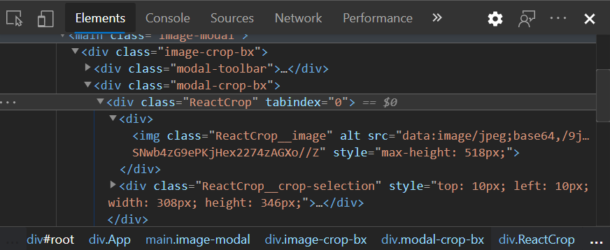
Directly from my imagecropmodal.css file, I can style the ReactImageCrop !
.image-crop-bx .modal-crop-bx .ReactCrop {
  /* your style */
}
.image-crop-bx .modal-crop-bx .ReactCrop .ReactCrop__image {
  /* Your style */
}
.image-crop-bx .modal-crop-bx .ReactCrop .ReactCrop__crop-selection {
  /* Your style */
}
All I want to style is the .ReactCrop element to support various images. So I styled only that.
.image-crop-bx .modal-crop-bx .ReactCrop {
    max-width: 100%;
    max-height: 100%;
}From the demo, the result container should be something like
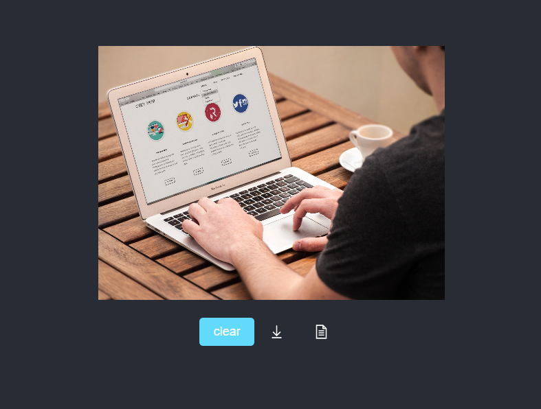
Let's optimize the code in App.js to include the result container;
function App () {
  // ...
  const canvasRef = React.useRef(null);
  const [ showCanvas, setShowCanvas ] = React.useState(false);

  const uploadBox = (
    <div className="upload-bx">
      <input type="file" onInput={handleInput} accept="image/gif, image/jpeg, image/png, image/jpg" />
      <span>{ handUp }</span>
      <span>Upload</span>
    </div>
  );

  const ImageCropModalBox = (
    <ImageCropModal
      imageSrc={imageInput}
      canvasRef={canvasRef}
      onExit={handleModalExit}
      onCropResult={handleCropResult} ></ImageCropModal>
  )

  return (
    <div className="App">
    {
      !showCanvas ? (imageInput ? ImageCropModalBox : uploadBox) : ''
    }
    <div className={`result-bx ${showCanvas ? 'show' : ''}`}>
      <div><canvas ref={canvasRef}></canvas></div>
      <div className="crop-util">
        <button onClick={() => {
          setShowCanvas(false);
          setFileProps({ name: null, type: null })
        }}>clear</button>
        <span>{ download }</span>
        <span>{ file }</span>
      </div>
    </div>
    </div>
  );
}
Nothing really hard up there. I created showCanvas state to define when the result container should be shown. I am using css's display none and flex to toggle visibility because I actually want the canvas to be rendered for use in the ImageCropModal component. For better readability, I made the uploadBox and the ImageCropModalBox variables to hold the upload container and the modal container respectively. The ImageCropModal components takes the imageSrc, canvasRef DOM element for displaying result, onExit handler and onCropResult callback. Let implements the props.
We already have the imageSrc and the canvasRef from the result container. the onExit handles the mechanism to exit the modal. Remember that the modal comes up when the imageInput state is not null. To close the modal, we have to set it to null.
const handleModalExit = () => {
  setImageInput(null)
}
Simple as that! The onCropResult handles the mechanism to bring up the result container. This is done by setting the showCanvas state variable to true. The props gives boolean, if error occured false else true, as parameter.
const handleCropResult = (bool) => {
  setShowCanvas(bool)
}
We have already attached these handlers to the modal component's props. Having these props in the modal's components, It's time we put them to use. In the ImageCropModal component, we create functions to close and handle result.
handleCropApproval = () => {
  // create result
  this.props.onCropResult(true);
  this.handleExit(); // exit the modal
}

handleExit = () => {
  this.props.onExit()
}
The best place to fire these handlers is the button to close modal and confirm cropping.
<div className="modal-toolbar">
  <span onClick={this.handleExit}>{ times }</span>
  <span onClick={this.handleCropApproval}>{ check }</span>
</div>
We have the result container setup.
The canvas element is very suitable to crop image. We already have the canvas passed to the modal. But how do we crop? We've created the helpers folder in our project directory, let's create a file imagecrophelper.js to help crop the image. In this file, I created a named export imagetoCanvas(canvasRef, image, pixelCrop) to do the cropping.
export function imagetoCanvas(canvasRef, image, pixelCrop) {
  const canvas = canvasRef;
  // create scale X and Y
  const scaleX = image.naturalWidth / image.width;
  const scaleY = image.naturalHeight / image.height;
  // set canvas dimension
  canvas.width = pixelCrop.width;
  canvas.height = pixelCrop.height;
  // draw the cropped part
  const ctx = canvas.getContext('2d');
  ctx.drawImage(
    image,
    pixelCrop.x * scaleX,
    pixelCrop.y * scaleY,
    pixelCrop.width * scaleX,
    pixelCrop.height * scaleY,
    0,
    0,
    pixelCrop.width,
    pixelCrop.height
  )
}
That will do the work. In the ImageCropModal component, we just update the handleCropApproval function to use the helper function.
handleCropApproval = () => {
  // get the canvas from the props
    const { canvasRef } = this.props;
    if (canvasRef && canvasRef.current) {
        imagetoCanvas(canvasRef.current, this.imageRef, this.state.crop)
        this.props.onCropResult(true); // no error
    } else {
      this.props.onCropResult(false); // error
    }
    this.handleExit();
}
By the way, we have to import the helper functions.
import { imagetoCanvas } from '../helpers/imagehelper';We have that done! After, cropping the file, we will like to download it. Still using the imagehelper.js helper file, we create a named export function downloadImage.
export function downloadImage (imageData, filename) {
  var element = document.createElement('a')
  element.setAttribute('href', imageData)
  element.setAttribute('download', filename)
  element.style.display = 'none'
  document.body.appendChild(element)
  element.click()
  document.body.removeChild(element)
}
What's up there is no hard. We created an invisible anchor element for download, virtually click it! and remove it. Let's use it in our App.js and setup the click handlers for download
function App () {
  // previous codes ...
  return (
    <div className="App">
      {/* ... */}
      <span onClick={handleFileDownload}>{ download }</span>
      <span onClick={consoleLogFile}>{ file }</span>
      {/* ... */}
    <div>
  )
}
let's create the functions.
const handleFileDownload = () => {
  if (fileProps && (fileProps.name && fileProps.type)) {
    // get the image data from the canvas
    const imageData = canvasRef.current.toDataURL(fileProps.type);
    /*
    The file type is like "image/jpeg"
    to extract the "jpeg", we split and select the second index
    - fileProps.type.split("/")[1]
    */
   // composing the file name
    const fileName = `${fileProps.name}.${fileProps.type.split("/")[1]}`;
    // downloadImage helper function
    downloadImage(imageData, fileName)
  }
}
You might want to use cropped image in another way in your personal projects. So, I added the second function consoleLogFile triggered by the second button in the result container. We are just console logging the file. In real life, you might want to upload to a server or something else. Let's implement it in our App component!
if (fileProps && (fileProps.name && fileProps.type)) {
  // get the image data from the canvas
  const imageData = canvasRef.current.toDataURL(fileProps.type);
  const fileName = `${fileProps.name}.${fileProps.type.split("/")[1]}`;
  // create the file from our helper function
  const newFile = imagetoFile(imageData, fileName);
  console.log(newFile)
}
We don't have this imagetoFile function yet, In our imagehelper.js add this function.
export function imagetoFile (base64String, filename) {
  var arr = base64String.split(','), mime = arr[0].match(/:(.*?);/)[1],
    bstr = atob(arr[1]), n = bstr.length, u8arr = new Uint8Array(n)
  while (n--) {
    u8arr[n] = bstr.charCodeAt(n)
  }
  return new File([u8arr], filename, {type: mime})
}All is set but on thing is important, validation! The input[type=file] tag for upload is like
<input type="file" onInput={handleInput} accept="image/gif, image/jpeg, image/png, image/jpg" />The accept attribute defined the files uploadable but that doesn't validate it all. We have to control this in the input handler function, handleInput. We could modify this to
const handleInput = (e) => {
  const { name, type } = e.target.files[0];
  const supportedFormats = ['image/jpg','image/gif','image/png', 'image/jpeg'];
  let file = (e.target.files ? e.target.files[0] : e.target.value || undefined);

  if (file && file.type) {
    if (supportedFormats.indexOf(file.type) < 0) {
      alert('Only Images Supported!');
    }
    else {
      setImageInput(e.target.files[0])
      setFileProps({ name: name.replace(" ", "_"), type })
    }
  }
}
Voila! We have our Image Upload-Crop System in React. Thanks to ReactImageCrop! Hopefully, this guide helped your project that needs cropping of images or even encouraged you to add cropping to your project!
