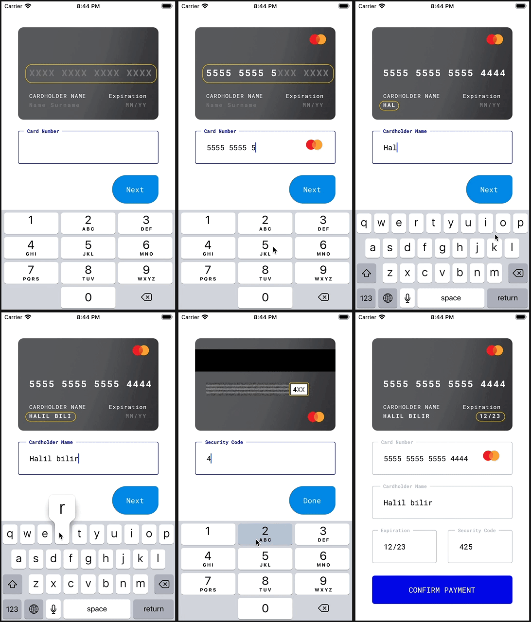
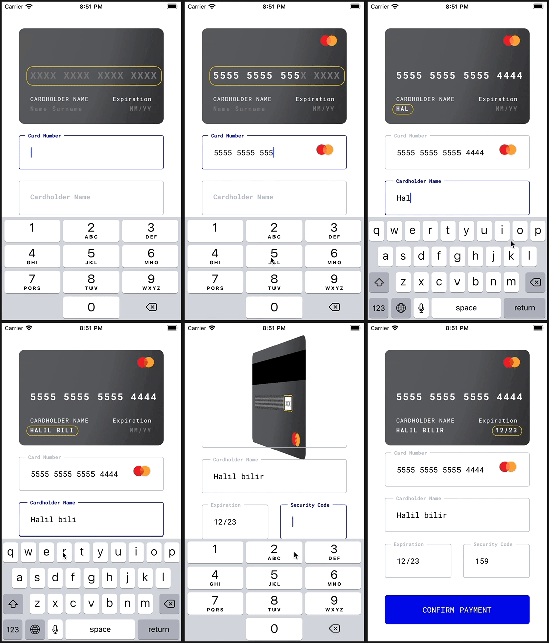
This is a fully functional and animated credit card form library, and it's ready to use 🚀
- Works on iOS and Android.
- Validations.
- Card icon animation with
Lottie. - Card flip animation with react-native-card-flip.
- Possible to access all
react-hook-formmethods. - TypeScript code base.
- Works on
Expo.
This repository also contains my initial work of building a simple react native form with react-hook-form without any fancy animations. You may read it on my blog: React Native Form Management Tutorial.
Install the library first:
npm install rn-credit-card
// OR
yarn add rn-credit-card
Install react-hook-form:
npm install react-hook-form
// OR
yarn add react-hook-form
Note: The latest version of this project works with react-hook-form version >7.0.0. Stick with the version 0.2.0 if you'd like to use it with react-hook-form: <7.0.0:
npm install rn-credit-card@0.2.0
You also need to install lottie-react-native if you want to display card icon animations. Please note that this is optional, and the library will display simple card icons if Lottie is not present:
npm install lottie-react-native
// OR
yarn add lottie-react-native
If you'd like to use the library on Android, make sure you're using a lottie-react-native version greater than 3.0.0. The animations are not working on 2.x.x versions.
Additional steps might be needed depending on your platform. Please check lottie-react-native documentation.
The library uses Roboto Mono font by default. If you'd like to keep it that way, you need to import RobotoMono_400Regular and RobotoMono_700Bold fonts to your project. Please see Expo or this dev.to post for more information.
You may also use custom fonts with this library. Please see #fonts section.
You need to create a react-hook-form and pass it down to the CreditCardForm through FormProvider context. This structure helps you accessing every propery and method of the form so you can build some features on top of the library.
The library is written in TypeScript, and types are also available out of the box. You may use FormModel to type your form.
Here is a fully functional example with KeyboardAvodingView, which manages the scroll position when keyboard is open.
import React from 'react'
import { FormProvider, useForm } from 'react-hook-form'
import {
  Alert,
  StyleSheet,
  KeyboardAvoidingView,
  Platform,
  SafeAreaView,
} from 'react-native'
import LottieView from 'lottie-react-native'
import CreditCardForm, { Button, FormModel } from 'rn-credit-card'

const App: React.FC = () => {
  const formMethods = useForm<FormModel>({
    // to trigger the validation on the blur event
    mode: 'onBlur',
    defaultValues: {
      holderName: '',
      cardNumber: '',
      expiration: '',
      cvv: '',
    },
  })
  const { handleSubmit, formState } = formMethods

  function onSubmit(model: FormModel) {
    Alert.alert('Success: ' + JSON.stringify(model, null, 2))
  }

  return (
    <FormProvider {...formMethods}>
      <SafeAreaView style={styles.container}>
        <KeyboardAvoidingView
          style={styles.avoider}
          behavior={Platform.OS === 'ios' ? 'padding' : 'height'}
        >
          <CreditCardForm
            LottieView={LottieView}
            horizontalStart
            overrides={{
              labelText: {
                marginTop: 16,
              },
            }}
          />
        </KeyboardAvoidingView>
        {formState.isValid && (
          <Button
            style={styles.button}
            title={'CONFIRM PAYMENT'}
            onPress={handleSubmit(onSubmit)}
          />
        )}
      </SafeAreaView>
    </FormProvider>
  )
}

const styles = StyleSheet.create({
  container: {
    flex: 1,
  },
  avoider: {
    flex: 1,
    padding: 36,
  },
  button: {
    margin: 36,
    marginTop: 0,
  },
})

export default App
If you are not using TypeScipt on your project, simply remove FormModel references from the example above.
This prop takes the default exported value of lottie-react-native library. This is optional because Lottie might require additional configuration steps. The library will display simple png card icons if this prop is not provided.
Please remember you need a lottie-react-native version greater than 3.x.x to make it work on Android.
| type | default | required | platform |
|---|---|---|---|
| any | undefined | NO | iOS/Android |
Example:
import LottieView from 'lottie-react-native'
;<CreditCardForm LottieView={LottieView} />This makes the form start with a horizontal scroll. This is the default behaviour.
This feature is not working on Android due to a weird problem happening when the ScrollView is switched from horizontal.
| type | default | required | platform |
|---|---|---|---|
| boolean | true | NO | iOS only |
This is the outcome when horizontalStart is false:
When true, it hides the card view and displays the credit card form only.
| type | default | required | platform |
|---|---|---|---|
| boolean | false | NO | iOS/Android |
You may use this prop to replace the background image of the card preview.
| type | default | required | platform |
|---|---|---|---|
| React.ReactNode | undefined | NO | iOS/Android |
Example:
<CreditCardForm
  backgroundImage={
    <Image
      style={{
        position: 'absolute',
        width: '100%',
        height: '100%',
        borderRadius: 12,
      }}
      source={background}
    />
  }
/>
fonts props take an object with two fields:
| field | type | default | required |
|---|---|---|---|
| fonts.regular | string | RobotoMono_400Regular | NO |
| fonts.bold | string | RobotoMono_700Bold | NO |
Please note that you should use a Monospaced font for the best user experience. The fixed width helps maintaining the same card number width while the user types.
Example:
<CreditCardForm
  fonts={{
    regular: 'RobotoMono_400Regular',
    bold: 'RobotoMono_700Bold',
  }}
/>You may modify the TextInput colors using this. It's an object with three optional fields:
| field | type | default | required |
|---|---|---|---|
| focused | string | #080F9C | NO |
| errored | string | #B00020 | NO |
| regular | string | #B9C4CA | NO |
Example:
<CreditCardForm
  inputColors={{
    focused: '#080F9C',
    errored: '#B00020',
    regular: '#B9C4CA',
  }}
/>An optional object that takes a string for each displayed text on the library. You may use it to modify any or all of those displayed texts.
| type | default | required | platform |
|---|---|---|---|
| Translations | undefined | NO | iOS/Android |
Example:
<CreditCardForm
  // those are the default values
  translations={{
    cardNumber: 'Card Number',
    cardHolderName: 'Cardholder Name',
    nameSurname: 'Name Surname',
    mmYY: 'MM/YY',
    expiration: 'Expiration',
    securityCode: 'Security Code',
    next: 'Next',
    done: 'Done',
    cardNumberRequired: 'Card number is required.',
    cardNumberInvalid: 'This card number looks invalid.',
    cardHolderNameRequired: 'Cardholder name is required.',
    cardHolderNameInvalid: 'This cardholder name looks invalid.',
    expirationRequired: 'Expiration date is required.',
    expirationInvalid: 'This expiration date looks invalid.',
    securityCodeRequired: 'Security code is required.',
    securityCodeInvalid: 'This security date looks invalid.',
  }}
/>This props might be used to override some component styles within the library. All fields are optional.
| field | type |
|---|---|
| cardPreview | ViewStyle or TextStyle |
| labelText | TextStyle |
| cardHolderPreview | TextStyle |
| expirationPreview | ViewStyle or TextStyle |
| outline | ViewStyle |
| input | ViewStyle |
| labelContainer | ViewStyle |
| inputLabel | TextStyle |
| errorText | TextStyle |
An optional prop that allows you to hide the cardholder Name from both the form and the card view. When false, it hides the CardHolder Name field.
| type | default | required | platform |
|---|---|---|---|
| boolean | true | NO | iOS/Android |
Example
<CreditCardForm
  LottieView={LottieView}
  horizontalStart
  requiresName={false}
/>- The design is from Pawel Szymankiewicz.
- Card icon animations are from Tim John.

