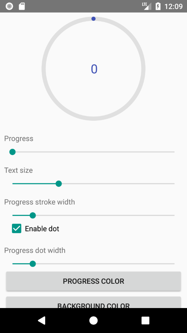
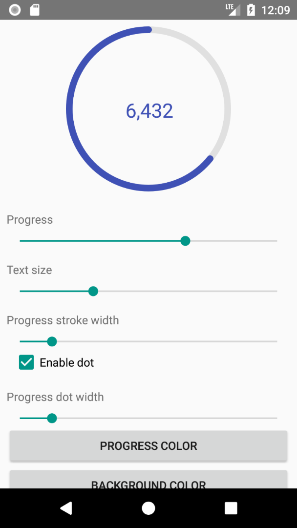
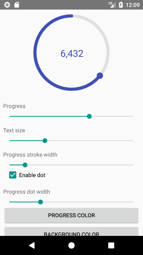
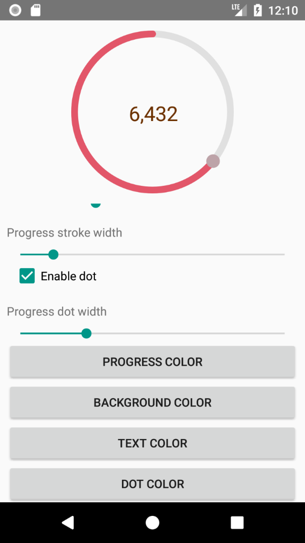
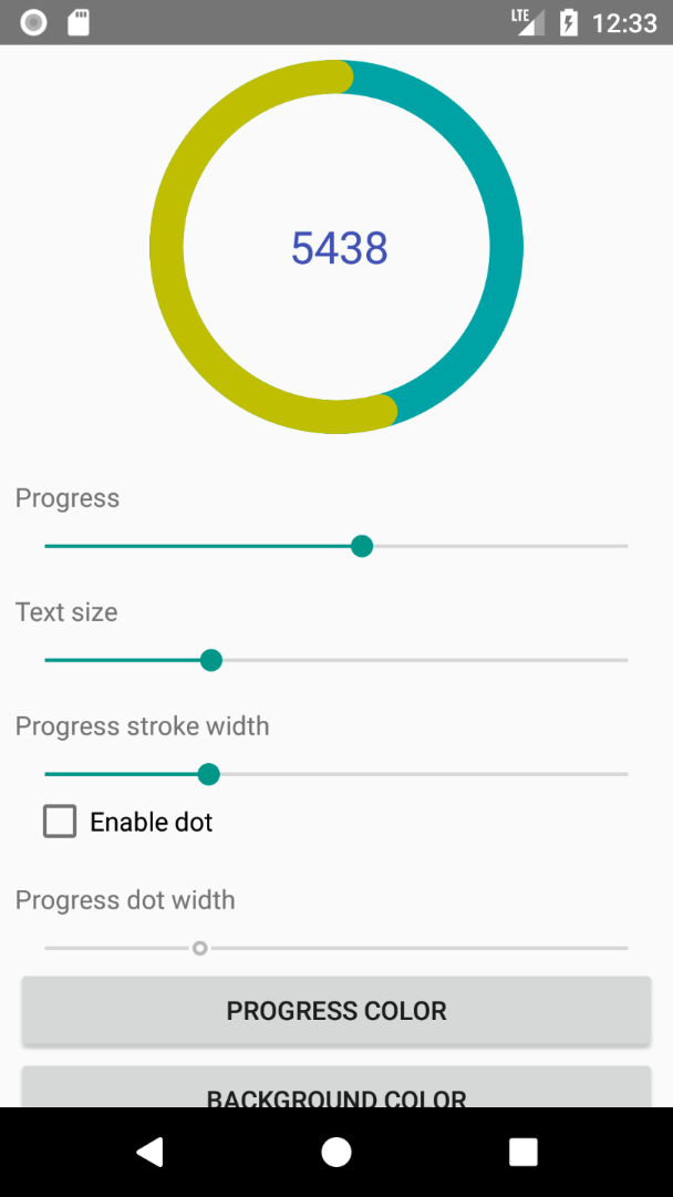
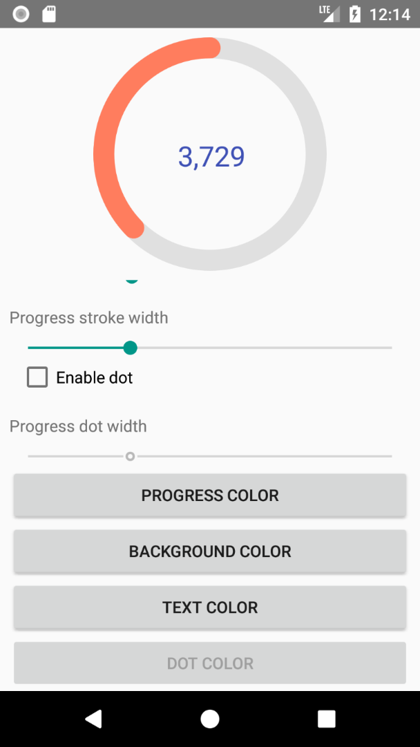
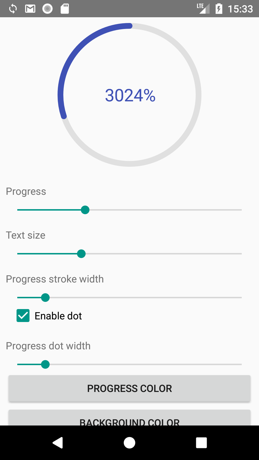
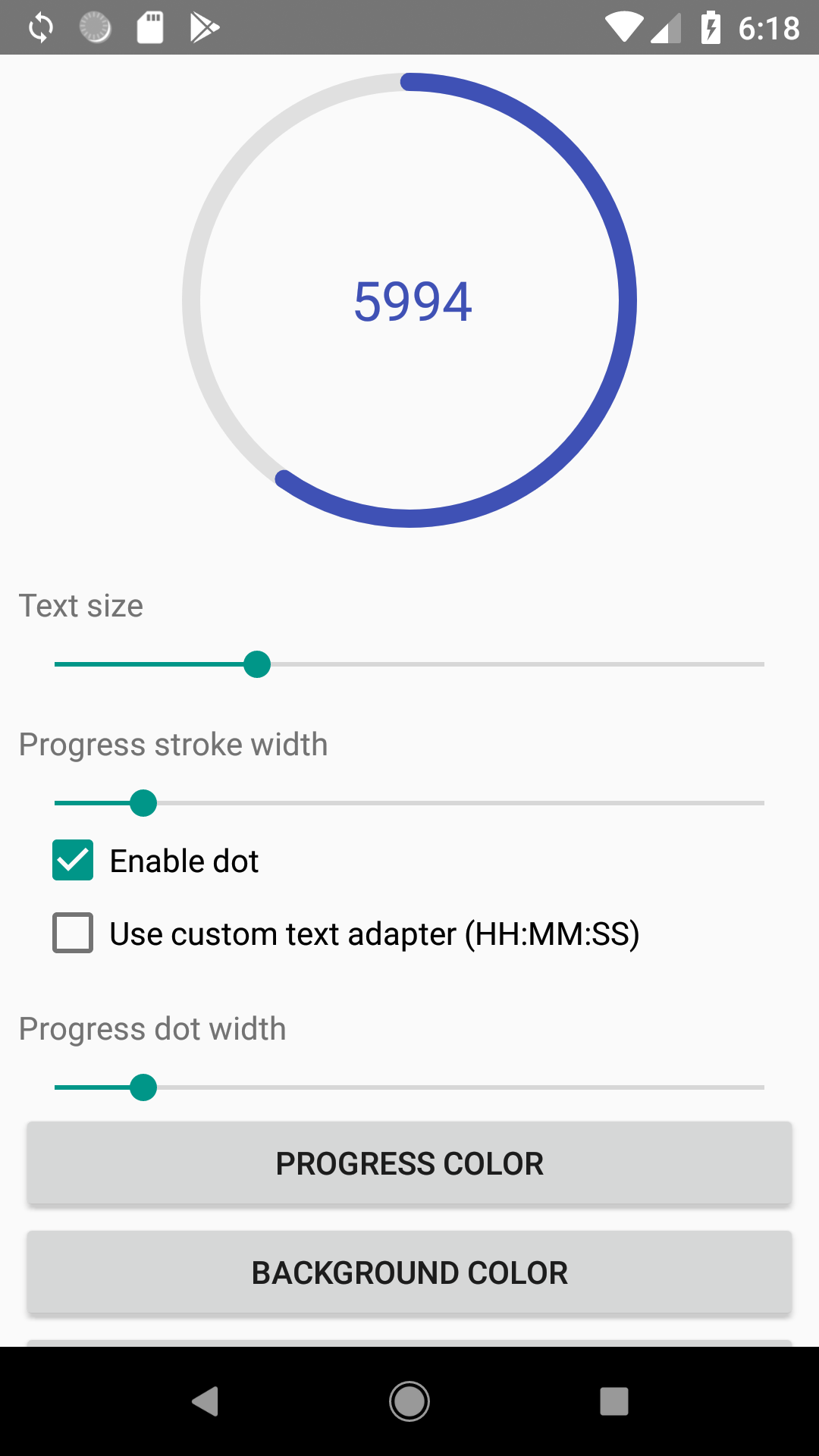
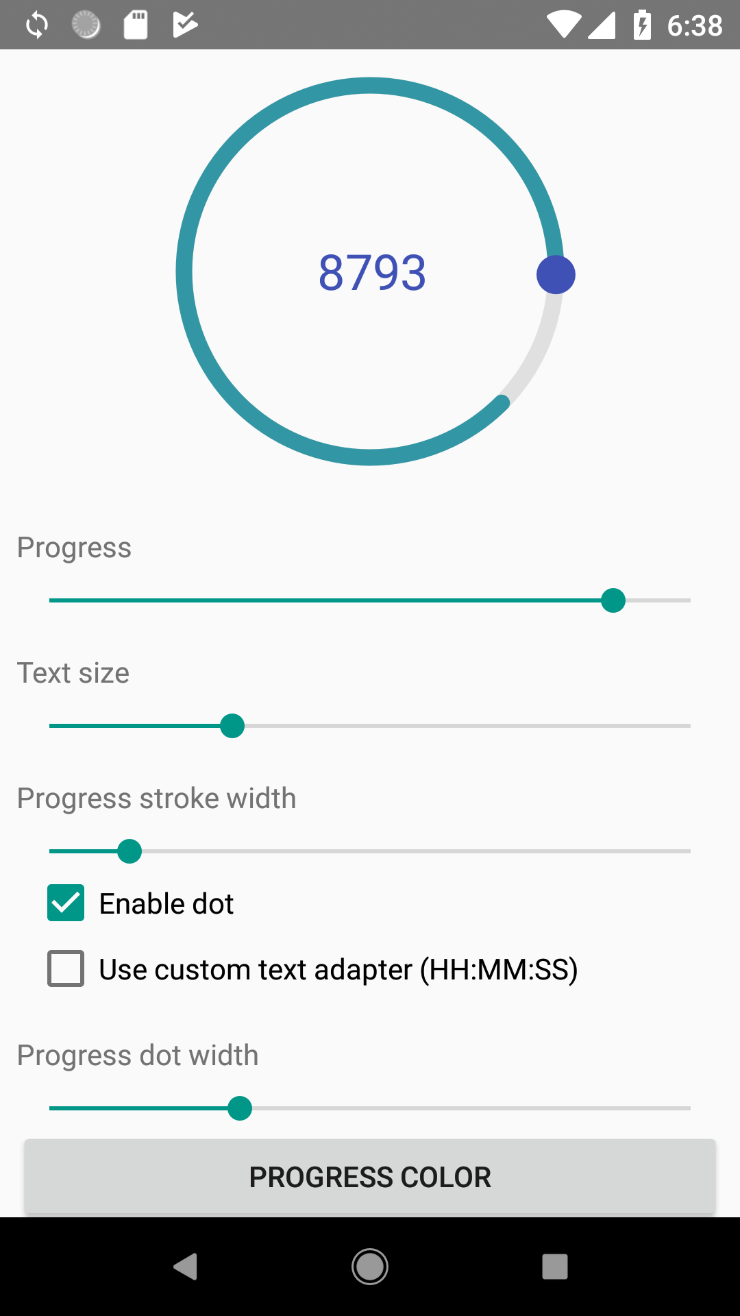
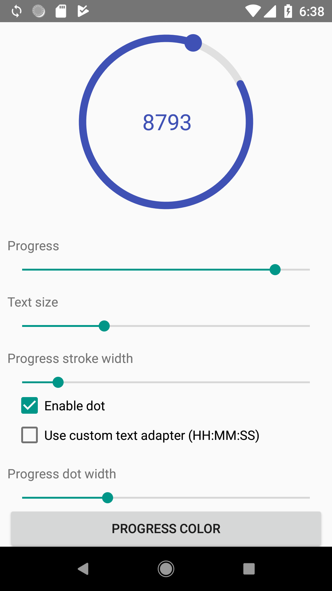
Simple but customizable view for displaying progress
With custom progress text (more examples here)
With custom start angle (details here)
Add view to your layout:
<antonkozyriatskyi.circularprogressindicator.CircularProgressIndicator
    android:id="@+id/circular_progress"
    android:layout_width="200dp"
    android:layout_height="200dp"
    android:layout_gravity="center"
    android:layout_marginBottom="8dp"
    android:layout_marginTop="8dp"
    app:progressColor="@color/colorPrimary"
    app:progressBackgroundColor="#efefefef"
    app:progressStrokeWidth="8dp"
    app:drawDot="true"
    app:dotColor="@color/colorAccent"
    app:dotWidth="16dp"
    app:textSize="24sp"
    app:textColor="@color/colorPrimaryDark" />
Since all attributes have default values, you can specify none of them. Thus following code also works:
<antonkozyriatskyi.circularprogressindicator.CircularProgressIndicator
    android:id="@+id/circular_progress"
    android:layout_width="200dp"
    android:layout_height="200dp"
    android:layout_gravity="center"
    android:layout_marginBottom="8dp"
    android:layout_marginTop="8dp" />
Than find it in code and set progress:
CircularProgressIndicator circularProgress = findViewById(R.id.circular_progress);

// you can set max and current progress values individually
circularProgress.setMaxProgress(10000);
circularProgress.setCurrentProgress(5000);
// or all at once
circularProgress.setProgress(5000, 10000);

// you can get progress values using following getters
circularProgress.getProgress() // returns 5000
circularProgress.getMaxProgress() // returns 10000| Description | XML | Java | Default value |
|---|---|---|---|
| Progress color | app:progressColor |
setter: setProgressColor(color)getter: getProgressColor() |
#3f51b5 |
| Progress background color | app:progressBackgroundColor |
setter: setProgressBackgroundColor(color)getter: getProgressBackgroundColor() |
#e0e0e0 |
| Width of progress stroke | app:progressStrokeWidth |
setters: setProgressStrokeWidthDp(widthInDp) or setProgressStrokeWidthPx(widthInPx)getter: getProgressStrokeWidth() (returns width in pixels) |
8dp |
Whether to draw dot. true or false |
app:drawDot |
setter: setShouldDrawDot(shoulDrawDot)getter: isDotEnabled() |
true |
| Dot color | app:dotColor |
setter: setDotColor(dotColor)getter: getDotColor() |
same as progress color |
| Dot width | app:dotWidth |
setters: setDotWidthDp(widthInDp) or setDotWidthPx(widthInPx)getter: getDotWidth() (returns width in pixels) |
same as progress stroke width |
| Progress text size | app:textSize |
setters: setTextSizeSp(sizeInSp) or setTextSizePx(sizeInPx)getter: getTextSize() (returns size in pixels) |
24sp |
| Progress text color | app:textColor |
setter: setTextColor(textColor)getter: getTextColor() |
same as progress color |
Formatting pattern to be used in PatternProgressTextAdapter. Checkout Formatting progress text section. |
app:formattingPattern |
setter: setProgressTextAdapter(progressTextAdapter)getter: getProgressTextAdapter() |
not specified |
Direction of the progress arc (clockwise or counterclockwise) |
app:direction |
setter: setDirection(direction)getter: getDirection() |
counterclockwise |
| Start angle. Checkout Start angle section. | app:startAngle |
setter: setStartAngle(startAngle)getter: getStartAngle() |
270 |
Before version 1.0.5 formatting text was limited to specifying prefix, suffix and delimiter. Since version 1.1 you have full control over the text to be displayed (thanks to the repitch for the idea and implementation).
!!! Attributes app:useProgressTextDelimiter, app:progressTextDelimiter, app:progressTextPrefix, app:progressTextSuffix were removed in v1.1.3.
The only thing you have to do is to provide an implementation of CircularProgressIndicator.ProgressTextAdapter.
You must override it's String formatText(double currentProgress); method.
Library already provides you with two implementations:
- DefaultProgressTextAdapter that just returns string representation of the progress value cast to
int. - PatternProgressTextAdapter that uses pattern specified in
formattingPatternattribute to format progress (if it is set, otherwise it fallbacks to theDefaultProgressTextAdapter).
DefaultProgressTextAdapter is a default text adapter, which is used when no formatterPattern attribute set or progressIndicator.setProgressTextAdapter(null) method was called.
It's implementation looks like this:
    @Override
    public String formatText(double currentProgress) {
        return String.valueOf((int) currentProgress);
    }
PatternProgressTextAdapter supports formatting progress using Java's formatting patterns.
For example, if you want to display progress with two digits for the fractional part, you can use %.2f pattern and set it via
-
attribute:
app:formattingPattern="@string/pattern"that refers to a string resource<string name="pattern">%.2f</string>
If you don't want to use string resource - you have to use unicode for percent sign (%) instead of sign itself:
app:formattingPattern="%.2f" -
or
PatternProgressTextAdapter:circularProgress.setProgressTextAdapter(new PatternProgressTextAdapter("%.2f"));
Here is the example of TimeTextAdapter by repitch that displays text in format of 'HH.MM.SS'
private static final CircularProgressIndicator.ProgressTextAdapter TIME_TEXT_ADAPTER = new CircularProgressIndicator.ProgressTextAdapter() {
        @Override
        public String formatText(double time) {
            int hours = (int) (time / 3600);
            time %= 3600;
            int minutes = (int) (time / 60);
            int seconds = (int) (time % 60);
            StringBuilder sb = new StringBuilder();
            if (hours < 10) {
                sb.append(0);
            }
            sb.append(hours).append(":");
            if (minutes < 10) {
                sb.append(0);
            }
            sb.append(minutes).append(":");
            if (seconds < 10) {
                sb.append(0);
            }
            sb.append(seconds);
            return sb.toString();
        }
    };
If you don't want any text to be displayed - just create your own ProgressTextAdapter that returns an empty string.
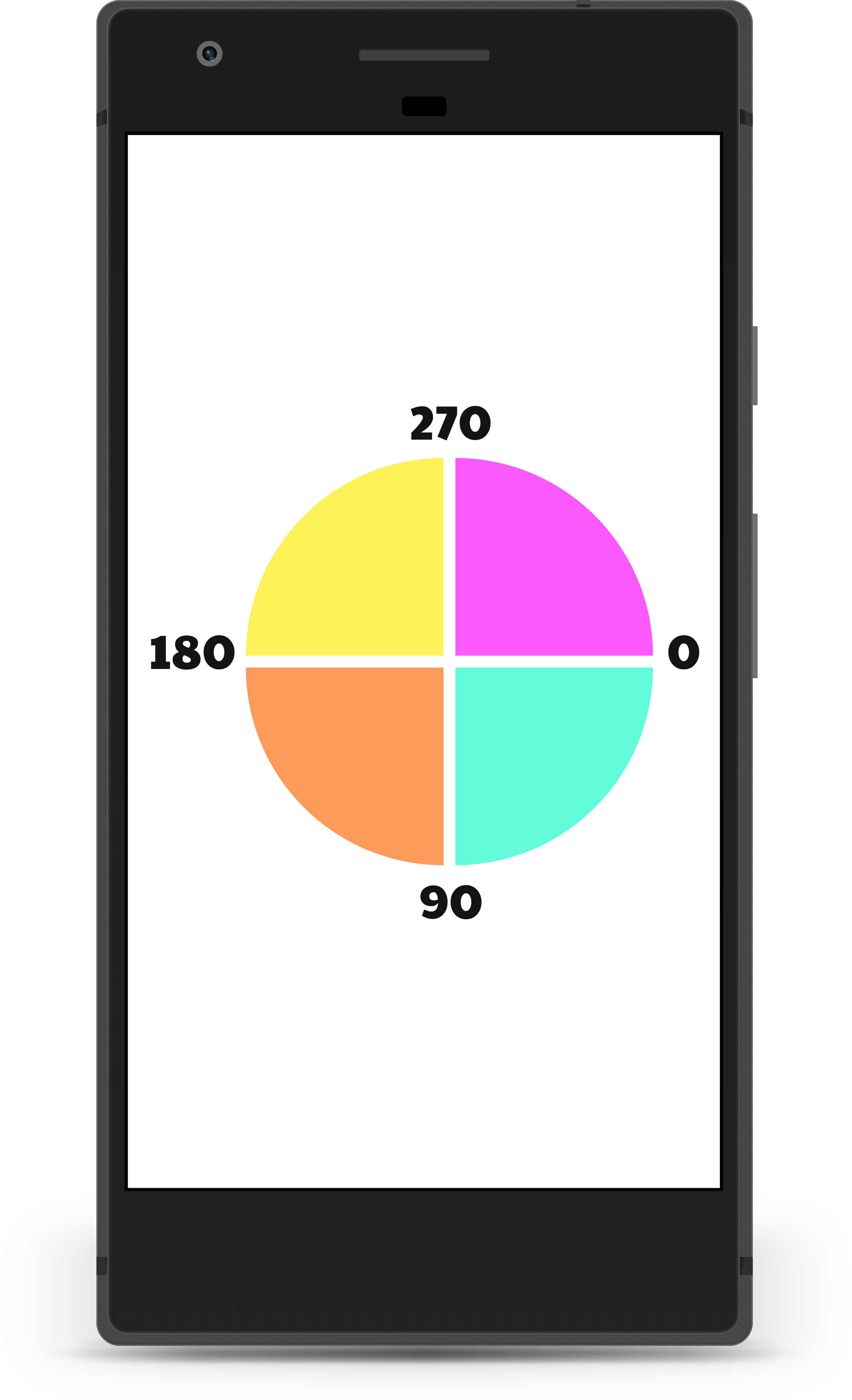
You can specify start angle for the progress arc using app:startAngle attribute or setStartAngle(startAngle) method.
Acceptable values are from 0 to 360 degrees. But be aware that they go clockwise, so:
- 0° is at 3 o'clock as usual
- 90° is at 6 o'clock
- 180° is at 9 o'clock
- 270° is at 12 o'clock
Image taken from Android Canvas' drawArc Method: A Visual Guide article.
Add this in your root build.gradle at the end of repositories in allprojects section:
allprojects {
    repositories {
        maven { url 'https://jitpack.io' }
    }
}
Then add this dependency to your module-level build.gradle in dependencies section:
implementation 'com.github.antonKozyriatskyi:CircularProgressIndicator:1.1.3'If you have any troubles downloading the library - checkout issue#5
 Copyright 2018 Anton Kozyriatskyi

   Licensed under the Apache License, Version 2.0 (the "License");
   you may not use this file except in compliance with the License.
   You may obtain a copy of the License at

       http://www.apache.org/licenses/LICENSE-2.0

   Unless required by applicable law or agreed to in writing, software
   distributed under the License is distributed on an "AS IS" BASIS,
   WITHOUT WARRANTIES OR CONDITIONS OF ANY KIND, either express or implied.
   See the License for the specific language governing permissions and
   limitations under the License.
