TDAtools provides many functions to help data scientists using TDA.
You can install the development version of TDAtools from GitHub with:
devtools::install_github("vituri/TDAtools")Let’s fix some notation:
-
Xis a data.frame with numeric and, possibly, factor columns. When needed, we select only the numeric columns (like when calculating the distance matrix ofX) and denote it by$X$ . The rows ofXare called observations, and the columns are called variables; -
f_Xis a vector with one number for each observation ofX. That is:f_Xis the result of applying a filter function$f: X \to \mathbb{R}$ toX. We provide many filter functions; -
distance_matrixis a matrix of distances calculated withXOR a function that when applied toXresults in such a matrix
We provide the Mapper algorithm and the Ball-Mapper algorithm. Both return a list consisting of:
-
a graph with weighted vertices;
-
a list showing which points of
Xare in each vertex.
See the vignettes for more examples. (to-do)
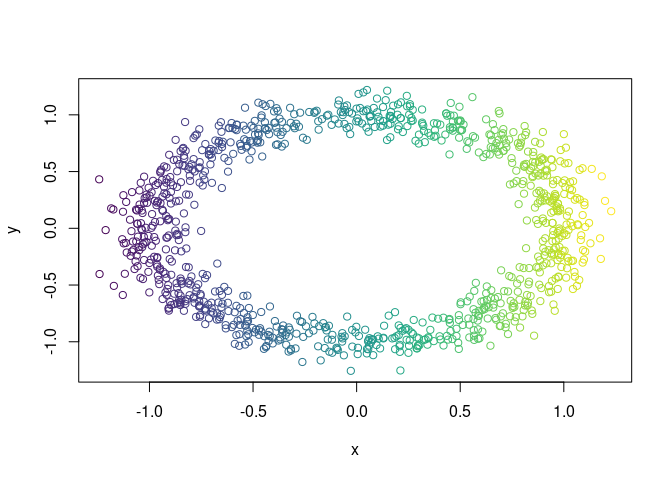
Let X be a sample of random points in a noisy circle:
library(TDAtools)
#> Carregando pacotes exigidos: shiny
#> Carregando pacotes exigidos: dplyr
#>
#> Attaching package: 'dplyr'
#> The following objects are masked from 'package:stats':
#>
#>     filter, lag
#> The following objects are masked from 'package:base':
#>
#>     intersect, setdiff, setequal, union
#> Carregando pacotes exigidos: purrr
#> Carregando pacotes exigidos: ggplot2

X = data.noisy_circle()
Let the filter function be the projetion on the x-axis and let color X
using it:
f_X = X$x

color_band = ggplot2::cut_interval(f_X, n = 50)
col_vector = viridis::viridis(nlevels(color_band))[as.integer(color_band)]
plot(X, col = col_vector)
Now we embed X in
X$z = 0
X$w = 0
and calculate its Mapper Graph:
mp =
  mapper(
    X = X
    ,f_X = f_X
  )
#> Clustering pullback 1...
#> Clustering pullback 2...
#> Clustering pullback 3...
#> Clustering pullback 4...
#> Clustering pullback 5...
#> Clustering pullback 6...
#> Clustering pullback 7...
#> Clustering pullback 8...
#> Clustering pullback 9...
#> Clustering pullback 10...
The result is a list with many objects. For example, the pullback of each interval in the covering:
mp$pullback |> str()
#> List of 10
#>  $ 1 : int [1:77] 7 39 58 62 67 68 76 86 89 100 ...
#>  $ 2 : int [1:256] 1 2 5 7 10 16 18 19 21 25 ...
#>  $ 3 : int [1:303] 1 2 5 9 10 16 17 18 19 21 ...
#>  $ 4 : int [1:199] 9 17 23 24 31 33 36 37 41 44 ...
#>  $ 5 : int [1:164] 20 29 35 36 37 41 42 43 44 46 ...
#>  $ 6 : int [1:180] 3 4 6 11 20 26 29 30 35 42 ...
#>  $ 7 : int [1:194] 3 4 6 11 12 15 26 27 30 34 ...
#>  $ 8 : int [1:272] 8 12 15 22 27 32 34 38 40 48 ...
#>  $ 9 : int [1:262] 8 13 14 22 28 32 38 40 47 49 ...
#>  $ 10: int [1:93] 13 14 28 47 61 91 105 108 111 126 ...
#>  - attr(*, "class")= chr "AsIs"
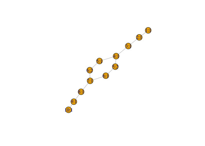
Let’s plot the mapper graph:
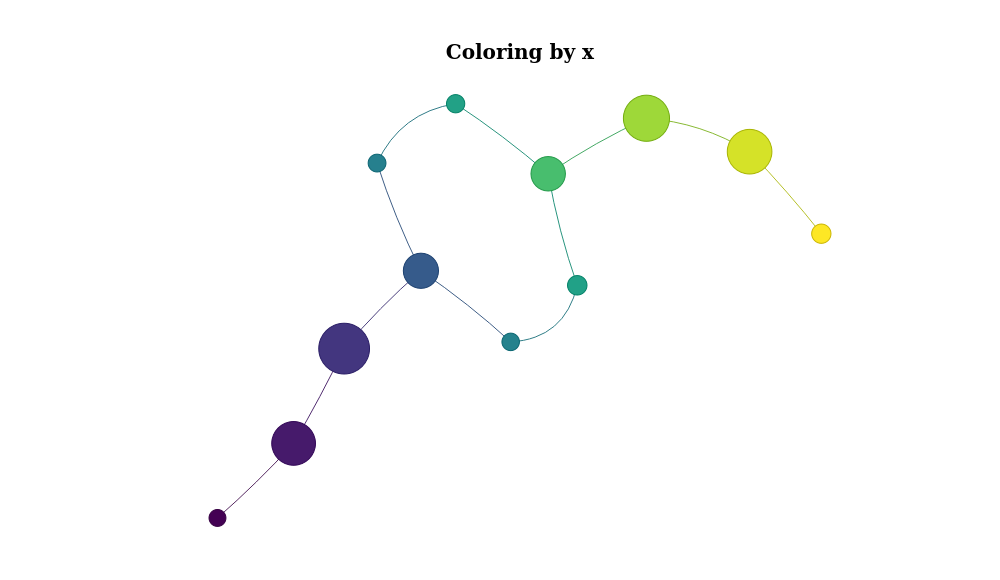
mp$graph %>% plot()Or, for a better visualization, we use the networkVis package and
color the nodes using the mean value of the x variable of X:
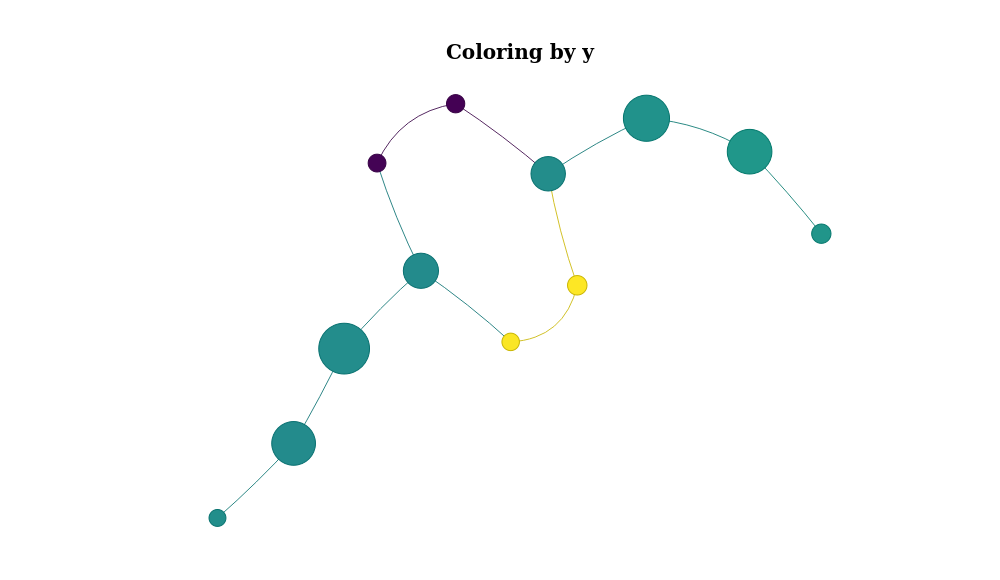
mp %>% plot_mapper()Or color it by y:
mp %>% plot_mapper(data_column = 'y')- Vignettes using mapper with factor variables
- Ball Mapper documentation
- Persistent homology examples
- Data analysis using some vertices of the mapper + machine learning


