homework-03
For any exercise where you’re writing code, insert a code chunk and make
sure to label the chunk. Use a short and informative label. For any
exercise where you’re creating a plot, make sure to label all axes,
legends, etc. and give it an informative title. For any exercise where
you’re including a description and/or interpretation, use full
sentences. Make a commit at least after finishing each exercise, or
better yet, more frequently. Push your work regularly to GitHub. Once
you’re done, inspect your GitHub repo to make sure it has all the
components you want to submit in the homework-03.md file, including the
prose, the code, and all plots.
-
Thank you. Make a plot that says “Thank you” on it. Get creative! You can make it however you like, e.g., annotation, geoms, fake data, etc. There will be points assigned to creativity for this exercise. So just annotating the plot with the letters would earn fewer points than a more creative approach. Also, use as little as defaults as possible, in terms of color scales, themes, etc. The plots you make will be shared with our guest speakers as part of a “thank you” note. If you would like your name shown on the plots shared with them, you should add your name somewhere on the plot, e.g., the caption. If you don’t want your name shown, just leave it out and the plot will be shared anonymously. (There are no points attached to this, you can choose to share with your name or anonymously.)
-
Mirror, mirror on the wall, who’s the ugliest of them all? Make a plot of the variables in the
penguinsdataset from the palmerpenguins package. Your plot should use at least two variables, but more is fine too. First, make the plot using the default theme and color scales. Then, update the plot to be as ugly as possible. You will probably want to play around with theme options, colors, fonts, etc. The ultimate goal is the ugliest possible plot, and the sky is the limit! -
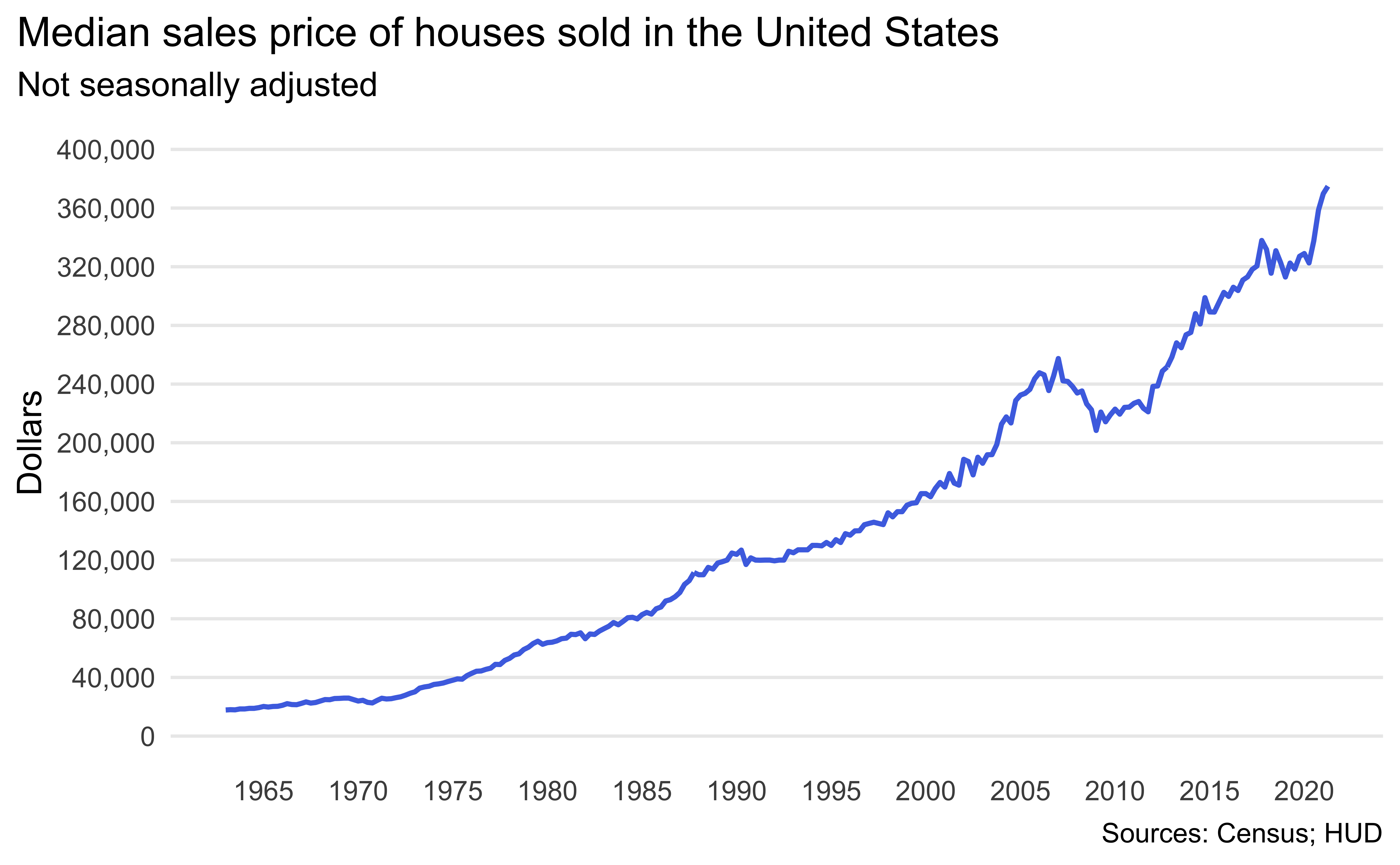
Median housing prices in the US. The inspiration and the data for this exercise comes from https://fred.stlouisfed.org/series/MSPUS. The two datasets you’ll use are median_housing and recessions, both of which are in the data folder of your repository.
-
Load the two datasets using
read_csv(). -
Rename the variables as date and price.
-
Create the following visualization.

-
Identify recessions that happened during the time frame of the
median_housingdataset. Do this by adding a new variable to recessions that takes the value TRUE if the recession happened during this time frame and FALSE if not. -
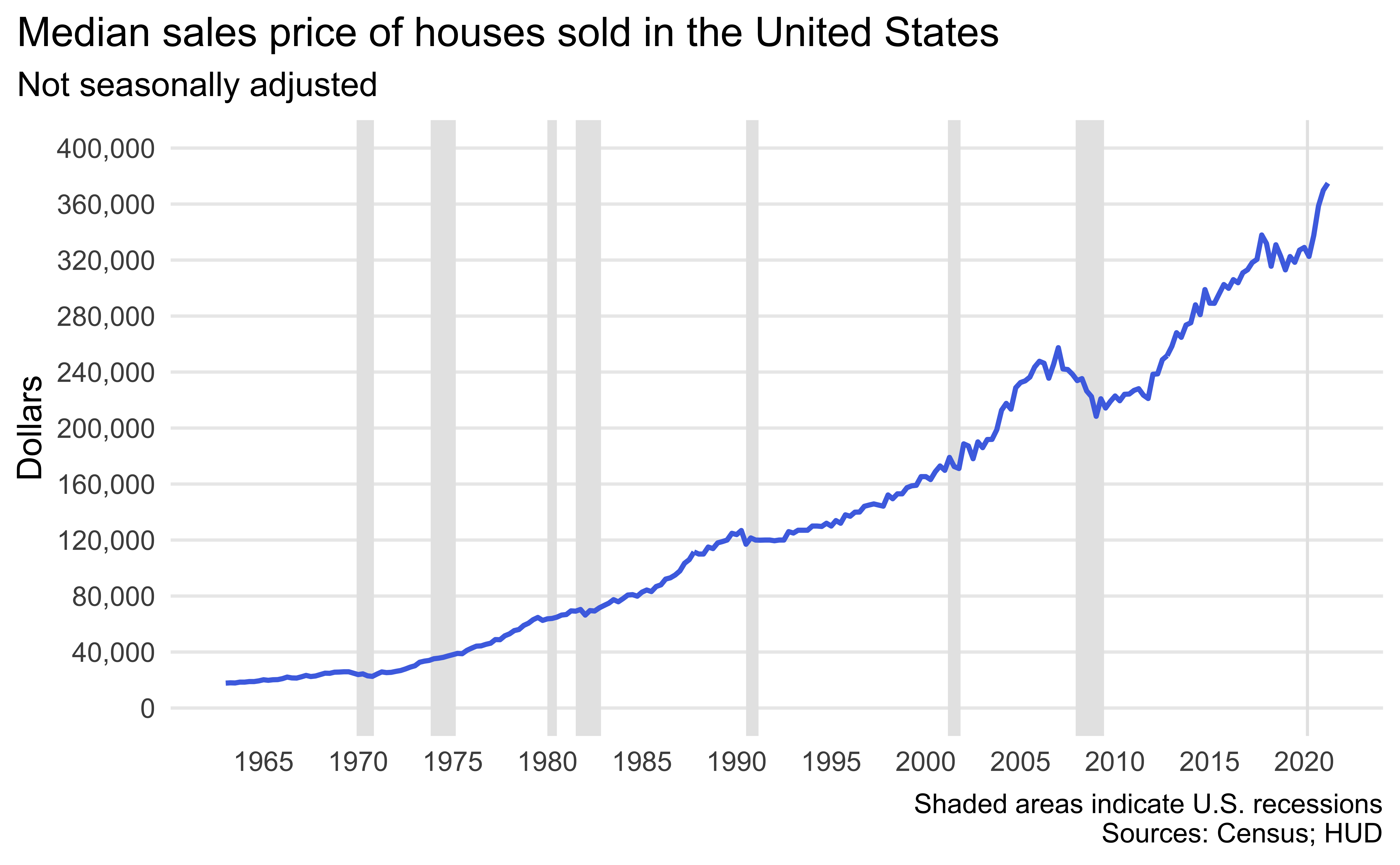
Now recreate the following visualization. The shaded areas are recessions that happened during the time frame of the
median_housingdataset. Hint: The shaded areas are “behind” the line.

-
Create a subset of the
median_housingdataset for data from 2019 and 2020 early. Add two columns:yearandquarter.yearis the year of thedateandquartertakes the values Q1, Q2, Q3, or Q4 based ondate. -
Create the following visualization.

-
-
Adopt, don’t shop. The data for this exercise comes from The Pudding via TidyTuesday.
-
Load the
dog_traveldataset included in thedatafolder of your repository withread_csv(). -
Calculate the number of dogs available to adopt per
contact_state. Save the result as a new data frame with variablescontact_stateandn. -
Make a histogram of the number of dogs available to adopt and describe the distribution of this variable.
-
Use this dataset to make a map of the US states, where each state is filled in with a color based on the number of dogs available to adopt in that state. Hints:
- Use the
state_listdataset which you can find in thedatafolder of your repo as a lookup table to match state names to abbreviations. - Use a gradient color scale and
log10transformation.
- Use the
-
Interpret the visualization.
-
-
To annotate, or not to annotate? There are two ways you can get text on a ggplot:
geom_text()andannoate(geom = "text"). Which one should you use when? Hint: Watch this video titled “Always look on the bright side of plots” by Kara Woo.