The Dolby.io Communications UIKit for React is designed to help React developers reduce the complexity of building apps based on the Dolby.io Communications SDK for Web.
The package consists of four basic elements:
Providers: The main components for initializing integration with Dolby.io Communications APIs and state management.Hooks: Functions responsible for video call logic of video call applications.UI components: Components that cover the most popular patterns of video conferencing applications.Conference components: UI components with built-in logic for the most widely used video call/live events features.
If you prefer to get started by reviewing a complete code sample of this guide, see the example here.
For a complete list of components and their usage, go to the documentation folder.
The following Dolby.io sample projects demonstrates the UIkit in action:
- Video Call app
- Build and embed a one-to-one or small-group live video conferencing app with features like recording, screen share, background blur and more.
- Events app
- Develop and customize a virtual event application with Dolby-quality audio/video and ultra-low latency.
- Dolby.io Communications UIKit for React
- A Dolby.io account
- A Dolby.io client access token
- Voxeet Web SDK >=3.8.0 or later
- Node.js 16.x or later
- Yarn v1.22.19 installed.
- A working webcam and microphone
This UI kit is tested to work best with the following browser versions
- Chrome 100+
- Safari 15+
- Firefox 100+
- Edge 100+
This guide demonstrates how to use UI components to quickly build the essential components of a Dolby.IO Communications SDK based app. Be sure to complete the Connect your app to Dolby.io section before moving onto the Adding components section.
Each component demonstrated within Add video call components can be built independent of the others. The code blocks within each section only include the code for that individual component, and exclude the components from other sections.
If you prefer to get started by reviewing a complete code sample containing all the features in this guide, see the example here.
Note: This guide is written with Yarn in mind. You can swap out yarn for NPM or a different package manager if you like.
# Create a new React application
npx create-react-app my-app

# Change into the app directory
cd my-app

# Install UI kit
yarn add @voxeet/voxeet-web-sdk @dolbyio/comms-uikit-react

# Start the dev server
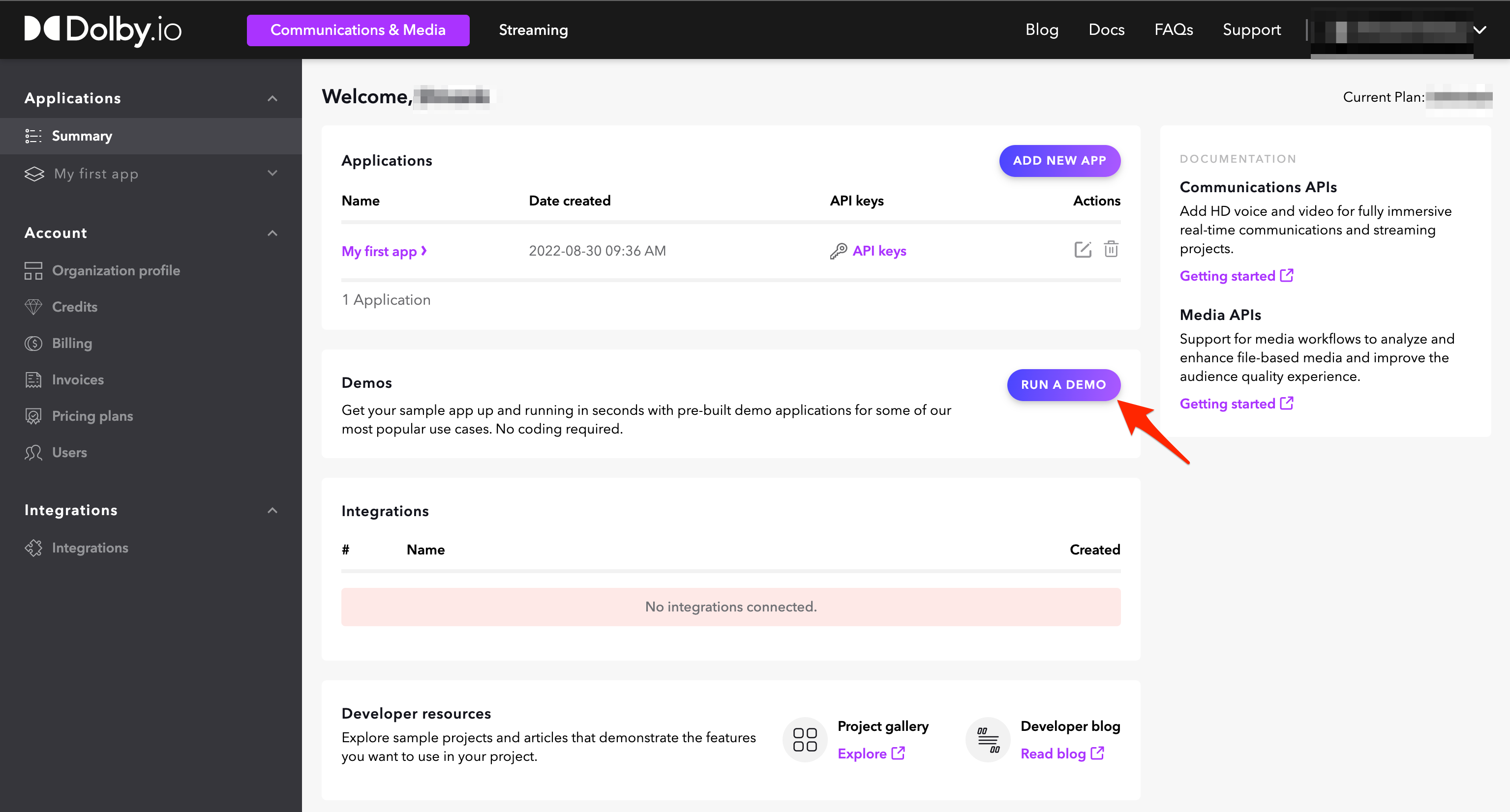
yarn run startTo setup your Dolby.io account, go to Dolby.io dashboard and complete the form. After confirming your email address, you will be logged in.
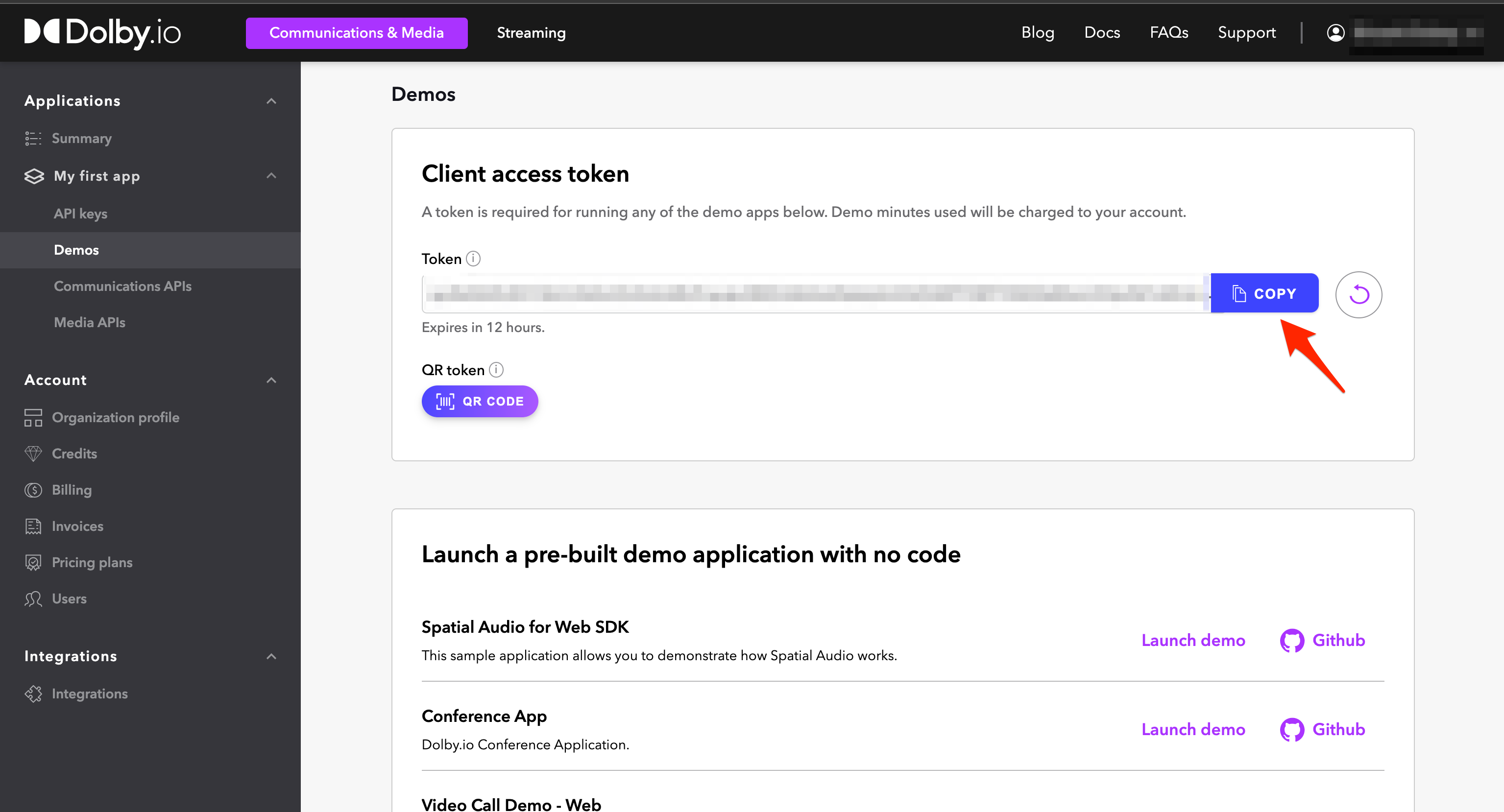
You will need to generate a client access token to run this app. Follow the steps to obtain a token.
-
On the next screen, there is a token field where you can copy the client access token to your clipboard. The generated token is active for the indicated amount of time.
This section will guide you on connecting to the Dolby.io APIs, which will enable the use of our Communications related features.
Dolby.io integration is provided by a CommsProvider component (for communication with our APIs), which should be imported and configured at the root of your web app, eg. src/App.js. Replace the placeholder value for token with your client access token from the Dolby.io dashboard.
For the purpose of this demo, you will only be working in
src/App.js. This file follows the structure below:
Import statementsGlobal variablesAppBase ComponentContent ComponentApp
// src/App.js

// 1. Import `CommsProvider` and `ThemeProvider` from the UI kit.
import { CommsProvider, InfoBar } from '@dolbyio/comms-uikit-react';

// 2. Define the `CommsProvider` configuration. We need two properties, a `token` and an async function that refreshes it.
const token = 'YOUR_CLIENT_ACCESS_TOKEN_HERE';
const refreshToken = async () => token;

// 3. Create wrapper with `CommsProvider` for entire app. Pass the `token` and `refreshToken` properties.

const AppBase = ({ children }) => {
  return (
    <CommsProvider token={token} refreshToken={refreshToken}>
      {children}
    </CommsProvider>
  );
};

// 4. Create `Content` component. It will be main component of our app. Wrap it with previously created `AppBase`. We'll also add a fixed height to the content as we'll need this later in the guide.

function Content() {
  // 5. Define styles for the main content and button containers
  const contentContainerStyle = {
    minHeight: '100vh',
    gap: '10px',
    display: 'flex',
    flexDirection: 'column',
    alignItems: 'stretch',
    justifyContent: 'center',
    backgroundColor: '#14141A',
    padding: '20px 0',
    boxSizing: 'border-box',
  };
  const buttonContainerStyle = {
    display: 'flex',
    alignItems: 'center',
    justifyContent: 'center',
  };

  return (
    <div className="App" style={contentContainerStyle}>
      <InfoBar text="Voxeet Web SDK has been initialized." style={{ margin: '0 auto' }} />
      ...
    </div>
  );
}

// 6. Connect `BaseApp` with `Content` component.

const App = () => {
  return (
    <AppBase>
      <Content />
    </AppBase>
  );
};

export default App;
This approach is only for demo purposes. To properly initialize your app for production, see API Authentication and Client Authentication.
A session is a connection between the client application and the Dolby.io Communications APIs.
- Import
Sessionfrom the UI kit.
import { Session } from '@dolbyio/comms-uikit-react';- Define the
Sessionconfigurations in theContentComponent. You should provide a name using aparticipantInfoobject, eg. the name of the participant who established the session.
const participantInfo = { name: 'John Doe' };- Insert the
Sessioncomponent inside the return statement inContentcomponent.
<Session participantInfo={participantInfo}>
  <InfoBar text="Session has been created." style={{ margin: '0 auto' }} />
</Session>
If you would like to create a session using your own component, refer to the useSession hook.
Once your app has made the connection to Dolby.io, you can access its features.
A session connects participants to one another, enabling them to communicate using audio and/or video.
- Import
Conference,JoinConferenceButtonandLeaveConferenceButtonfrom the UI kit. ImportuseStatefrom React.
import { Conference, JoinConferenceButton, LeaveConferenceButton } from '@dolbyio/comms-uikit-react';
import { useState } from 'react';- Define the
JoinConferenceButtonconfiguration in theContentcomponent. ThejoinOptionsproperty allows you to specify whether to join the conference with audio and/or video enabled, in addition to a meetingName and username (usually the name of current user) which can be made visible to all participants.
const joinOptions = {
  constraints: {
    audio: true,
    video: true,
  },
};- Define a functional component
JoinOrLeavewith a state for conference ID. Insert theConference,JoinConferenceButtonandLeaveConferenceButtoncomponents, along with thejoinOptionsandmeetingName. We want to showJoinConferenceButtonwhen there is no conference ID, andConference(which includes theLeaveConferenceButton) when there is. You can customise thetoolipTextproperty each respective join/leave buttons. Now, insert<JoinOrLeave>component inside the return statement inContentcomponent (ie. Nested insideSession).
We also pass setConferenceId as a callback to the onSuccess properties for both buttons which will set (or unset) the conference ID when the action is successful.
IMPORTANT: Rendering a component will establish a call using Dolby.io, If you are using your free minutes for this demo, remember to leave the conference or close the browser tab when you're done!
const JoinOrLeave = () => {
  const [conferenceId, setConferenceId] = useState();

  return !conferenceId ? (
    <div style={buttonContainerStyle}>
      <JoinConferenceButton
        joinOptions={joinOptions}
        meetingName="My Meeting"
        username={participantInfo.name}
        tooltipText="Join Meeting"
        onSuccess={(id) => setConferenceId(id)}
      >
        Join Video Call
      </JoinConferenceButton>
    </div>
  ) : (
    <Conference id={conferenceId}>
      <div style={buttonContainerStyle}>
        <LeaveConferenceButton tooltipText="Leave Meeting" onSuccess={() => setConferenceId(null)} />
      </div>
    </Conference>
  );
};
If you would like to create, join or leave a conference using your own components, refer to the useConference hook.
All of the video call components below are assumed to be wrapped within an Conference component that resides within the Session Component. The components are all defined and rendered within the Content component. See below for the skeleton:
// import { Session, Conference } from '@dolbyio/comms-uikit-react';
<Session participantInfo={participantInfo}>
  <Conference id={conferenceId}>...</Conference>
</Session>
Conferencecomponent contains other optional properties includingalias(string),audio(bool),video(bool),liveRecording(bool).
The ParticipantsList component can display a list of participants in the current conference and their status, eg. whether the participant is currently speaking.
- Import
ParticipantsListfrom the UI kit.
import { ParticipantsList } from '@dolbyio/comms-uikit-react';- Insert the
ParticipantsListcomponent anywhere inside ofConference. You can customize the text properties shown for each participant and their status.
<ParticipantsList localText="you" muteText="mute" unmuteText="unmute" soundOnText="sound on" soundOffText="sound off" />If you would like to display participants using your own component, refer to the useParticipants hook.
The ParticipantsGrid component displays the video streams of conference participants in a grid tile layout.
- Import
ParticipantsGridfrom the UI kit.
import { ParticipantsGrid } from '@dolbyio/comms-uikit-react';- Insert the
ParticipantsGridcomponent anywhere inside ofConference.You can customize thelocalTextproperty, which is shown for the local participant.
<ParticipantsGrid localText="you" additionalContainerStyle={{ height: 400 }} />The LocalToggleAudioButton and LocalToggleVideoButton components enable the local participant to toggle their microphone and camera on or off.
- Import
LocalToggleAudioButtonandLocalToggleVideoButtonfrom the UI kit.
import { LocalToggleAudioButton, LocalToggleVideoButton } from '@dolbyio/comms-uikit-react';- Insert the
LocalToggleAudioButtonandLocalToggleVideoButtoncomponents anywhere inside ofConference.
<div style={buttonContainerStyle}>
  <LocalToggleAudioButton />
  <LocalToggleVideoButton />
</div>
If you would like to control audio or video using your own components, refer to the useAudio and useVideo hooks.
The local participant can change their preferred camera, microphone or output speaker using the CameraSelect, MicrophoneSelect and SpeakersSelect components.
- Import
CameraSelect,MicrophoneSelectandSpeakersSelectfrom the UI kit.
import { CameraSelect, MicrophoneSelect, SpeakersSelect } from '@dolbyio/comms-uikit-react';- Insert the
CameraSelect,MicrophoneSelectandSpeakersSelectcomponents, along with thelabelandplaceholderproperties, anywhere inside ofConference. You can customize the text shown for thelabelprop (shown above the component) and aplaceholderprop (shown when no option is selected).
<CameraSelect label="Camera" placeholder="Choose a camera" labelColor="white" />
<MicrophoneSelect label="Microphone" placeholder="Choose a microphone" labelColor="white" />
<SpeakersSelect label="Speaker" placeholder="Choose a speaker" labelColor="white" />
If you would like to control input devices using your own components, refer to the useCamera, useMicrophone and useSpeaker hooks.
You can use the installed VoxeedSDK's APIs in the application directly without relying on our UIKit components. Let's enhance our example app to observe the participants' status.
- Import Voxeet SDK. Import
useEffectfrom React.
import VoxeetSDK from '@voxeet/voxeet-web-sdk';
import { useEffect } from 'react';- Insert the useEffect hook here to the
Contentcomponent. This hook subscribes to theparticipantUpdatedevent from the voxeet SDK. Define the effect of the handler. Here, you observe the participant's status and the state of their audio through the console.
useEffect(() => {
  // define the event handler here
  const handler = (participant) => {
    console.log(participant.info.name, 'status:', participant.status);
    console.log(participant.info.name, 'has audio enabled:', participant.audioTransmitting);
  };
  // register the handler for 'participantUpdated' event
  VoxeetSDK.conference.on('participantUpdated', handler);
  return () => {
    // unregister the handler
    VoxeetSDK.conference.removeListener('participantUpdated', handler);
  };
}, []);
You can learn more about the Voxeet WebSDK here
Download the sample source code here.
Please see the additional configuration options guide to learn more about other features including:
- Theming
- Screen sharing
- Recording
- Logging
- Hooks
The Dolby.io Communications UIKit for React and its repository are licensed under the MIT License. Before using the package @dolbyio/comms-uikit-react, please review and accept the Dolby Software License Agreement.
Third-party licenses can be found here.
© Dolby, 2023

