📢 Use this project, contribute to it or open issues to help evolve it using Store Discussion.
The Store Link app provides blocks for displaying links in other theme blocks, such as Product Summary.
- Add the
store-linkapp to your theme dependencies in themanifest.jsonfile. Then, you can use all the blocks exported by thestore-linkapp and its respective props.
  "dependencies": {
+   "vtex.store-link": "0.x"
}- Choose one of the blocks exported by the
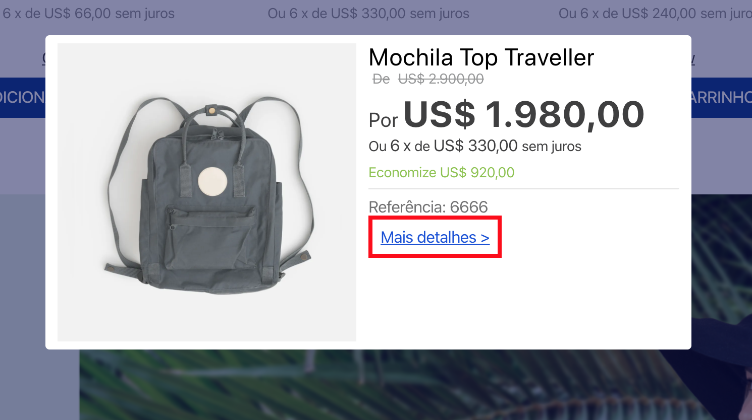
store-linkapp and declare it in the block where the link will be displayed. See below an example of alink.productbeing used in theproduct-summaryblock to display the "More details" link.
{
  "link.product#product-page": {
    "props": {
      "href": "/{slug}/p",
      "label": "More details >"
    }
  },
  "product-summary.shelf": {
    "children": [
      "product-summary-image",
      "product-summary-name",
      "product-rating-inline",
      "product-summary-space",
      "product-summary-price",
      "link.product#product-page"
    ]
  },
}
⚠️ Note that you must place thelink.productblock inside a block that provides a product context (e.g.,ProductSummary). From the previous example, note that a{slug}placeholder is being passed onto thehrefprop. When rendered, this placeholder is overwritten by the value accrued from the closest product context, generating a link like/everyday-necessaire/p.
| Block | Description |
|---|---|
link.product |
A link that uses the product context, such as a product slug or department. For example, /{slug}/p. |
link |
A regular link that does not require the product context to function. For example, /home. |
All blocks exported by store-link share the same props:
| Prop name | Type | Description | Default value |
|---|---|---|---|
label |
string |
Link text. | undefined |
href |
string |
Link URL. | # |
scrollTo |
string |
Element anchor to scroll after navigation. (E.g. "#footer") |
undefined |
target |
string |
Where the linked URL will be displayed. This prop works the same way as the target from HTML <a> element. Since the anchor element's target default is _self, this prop will be set to _self if it is undefined. |
undefined |
displayMode |
enum |
How the link will be displayed. Possible values are: anchor (displays a normal link with no styles) or button (displays a button that can be customized using the buttonProps prop). |
anchor |
buttonProps |
object |
How the link button will be displayed. Use this prop only when the displayMode prop is set as button. |
{ variant: primary, size: regular } |
escapeLinkRegex |
string |
RegExp, with global match, used to remove special characters within product specifications (e.g., if you want to use /[%]/g then escapeLinkRegex = [%]). |
undefined |
rel |
string |
This prop specifies the relationship between the current document and linked ones for better SEO. This prop works the same way as the rel attribute from <a>, the HTML anchor element. You can see supported values here. |
undefined |
buttonPropsobject:
| Prop name | Type | Description | Default value |
|---|---|---|---|
variant |
enum |
Link button that has visual prominence. Possible values are: primary or secondary (values are set following the VTEX Styleguide). |
primary |
size |
enum |
Link button size. Possible values are: small, regular or large (values are set following the VTEX Styleguide). |
regular |
When creating an URL link using the href prop, you can add custom query string values, as shown in the example below:
{
  "link#foo": {
    "props": {
      "href": "/login?returnUrl={queryString.returnUrl}",
      "label": "Sign in"
    }
  }
}
Considering the href prop from the previous example, note that the URL link will be built correctly if the current page has the returnUrl query string. Otherwise, it will be built with an empty value.
Depending on the context that the link.product block uses, you can use product variables to structure different URL paths for the href prop. For example, you could create a link to a specific product department (/{department}).
| Product variable | Description |
|---|---|
brand |
Product brand name. |
brandId |
Product brand ID. |
category1 |
Highest level category in the category tree. |
category2 |
Second highest level category. |
category3 |
Third highest level category. |
category4 |
Fourth highest level category. |
department |
Product department. |
productId |
Product ID. |
skuId |
Currently selected SKU ID. |
slug |
The link text used to create the product link. |
To build URLs with variables related to product specifications, use the following format: {specificationGroups.groupName.specifications.specificationName}. Replace groupName and specificationName with the specification group and the product specification names accordingly. For example:
{
  "link.product#vtex": {
    "props": {
      "href": "{specificationGroups.Design.specifications.Dimensions}",
      "label": "VTEX"
    }
  }
}
In the example above, Design is the specification group name, and Dimensions is the product specification name.
To apply CSS customizations in this and other blocks, see the Using CSS handles for store customization guide. All blocks have the same handles.
| CSS handles |
|---|
childrenContainer |
label |
link |
Thanks goes to these wonderful people:
anto90fg 💻 |
This project follows the all-contributors specification. Contributions of any kind are welcome!

