


A useful indicator component for React Native
Make sure that you are in your React Native project directory and run:
$ npm install react-native-indicator --save
$ npm install @react-native-community/art --save
For react-native >= 0.60 ReactNativeART should be auto-linked and no additional action is required.
For react-native < 0.60 you need to link ReactNative ART:
$ react-native link @react-native-community/art
More info, following the Art module instruction to configure.
Import react-native-indicator as a JavaScript module:
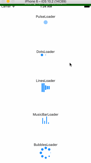
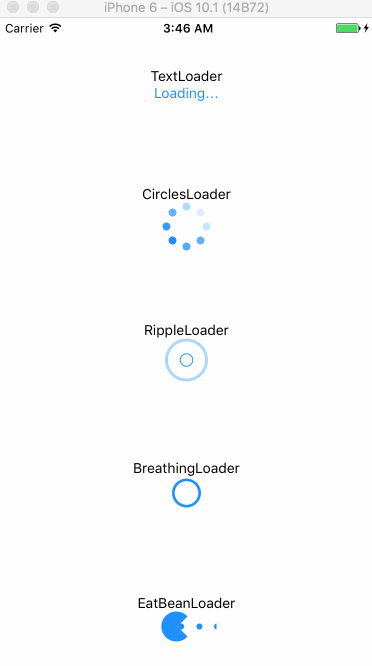
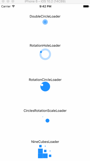
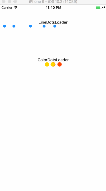
import { CirclesLoader, PulseLoader, TextLoader, DotsLoader, ... } from 'react-native-indicator';
Here is currently available types:
render(){
  return(
    <View>
      <CirclesLoader />
      <TextLoader text="Loading" />
    </View>
  );
}
| prop |
type |
default |
description |
| size |
number |
30 |
circle's size |
| color |
string |
'#1e90ff' |
indicator's color |
| frequency |
number |
1000 |
scale's frequency |
| prop |
type |
default |
description |
| size |
number |
10 |
dot's size |
| color |
string |
'#1e90ff' |
indicator's color |
| betweenSpace |
number |
5 |
distance between two dots |
| prop |
type |
default |
description |
| text |
string |
'Loading' |
contents |
| textStyle |
style |
inherited |
text's style |
| prop |
type |
default |
description |
| size |
number |
40 |
circle's size |
| color |
string |
'#1e90ff' |
indicator's color |
| dotRadius |
number |
10 |
each dot's size |
| prop |
type |
default |
description |
| size |
number |
40 |
circle's size |
| color |
string |
'#1e90ff' |
indicator's color |
| dotRadius |
number |
8 |
each dot's size |
| prop |
type |
default |
description |
| size |
number |
10 |
circle's size |
| color |
string |
'#1e90ff' |
indicator's color |
| strokeWidth |
number |
3 |
outline width |
| frequency |
number |
800 |
scale's frequency |
| prop |
type |
default |
description |
| size |
number |
10 |
circle's size |
| frequency |
number |
1600 |
scale's frequency |
| color |
string |
'#1e90ff' |
indicator's color |
| strokeWidth |
number |
3 |
outline width |
| prop |
type |
default |
description |
| color |
string |
'#1e90ff' |
indicator's color |
| barWidth |
number |
5 |
each bar's width |
| barHeight |
number |
40 |
each bar's height |
| barNumber |
number |
5 |
the number of bar |
| betweenSpace |
number |
2 |
distance between two bars |
| prop |
type |
default |
description |
| color |
string |
'#1e90ff' |
indicator's color |
| barWidth |
number |
3 |
each bar's width |
| barHeight |
number |
30 |
each bar's height |
| betweenSpace |
number |
5 |
distance between two bars |
| prop |
type |
default |
description |
| color |
string |
'#1e90ff' |
indicator's color |
| size |
number |
30 |
indicator's size |
| prop |
type |
default |
description |
| size |
number |
30 |
circle's size |
| color |
string |
'#1e90ff' |
indicator's color |
| prop |
type |
default |
description |
| size |
number |
30 |
indicator's size |
| color |
string |
'#1e90ff' |
indicator's color |
| rotationSpeed |
number |
800 |
rotation speed |
| prop |
type |
default |
description |
| size |
number |
40 |
indicator's size |
| color |
string |
'#1e90ff' |
indicator's color |
| rotationSpeed |
number |
800 |
rotation speed |
| strokeWidth |
number |
8 |
circle outline's width |
| prop |
type |
default |
description |
| size |
number |
50 |
indicator's size |
| color |
string |
'#1e90ff' |
indicator's color |
| prop |
type |
default |
description |
| size |
number |
20 |
each cube's size |
| color |
string |
'#1e90ff' |
indicator's color |
warning: this indicator will occupy a whole horizontal space automatically, which means you don't need to set any center props. Just keeping the direction of its parent View is vertical.
| prop |
type |
default |
description |
| size |
number |
10 |
dot's size |
| color |
string |
'#1e90ff' |
indicator's color |
| dotsNumber |
number |
5 |
the number of dots |
| betweenSpace |
number |
5 |
distance between two dots |
| prop |
type |
default |
description |
| size |
number |
15 |
each cube's size |
| betweenSpace |
number |
7 |
distance between two dots |
| color1 |
string |
'#ff4500'(red) |
1st color |
| color2 |
string |
'#ffd700'(yellow) |
2nd color |
| color3 |
string |
'#9acd32'(green) |
3rd color |
| prop |
type |
default |
description |
| size |
number |
10 |
dot's size |
| color |
string |
'#1e90ff' |
indicator's color |
| betweenSpace |
number |
5 |
distance between two dots |
| speed |
number |
200 |
change speed |
MIT


