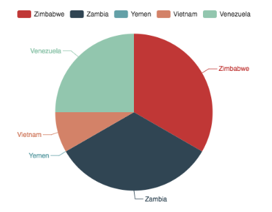
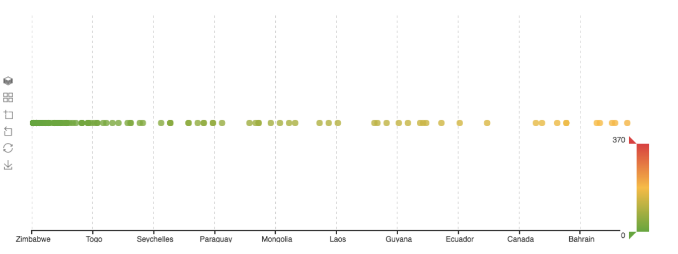
Customer visualization for splunk using echarts, to install the app, run below commands:
export SPLUNK_HOME
cp echarts_app $SPLUNK_HOME/etc/apps
cd $SPLUNK_HOME/etc/apps/echarts_app/appserver/static/visualizations
npm install
npm run build
Sample data can be found in the echarts_app/samples folder, add those data into Splunk and try following visualizations.
- SPL
source="drinks.csv" | table country, wine_servings, beer_servings, spirit_servings,total_litres_of_pure_alcohol | head 5 - Coordinates -> Coordinates Type = Single Axis
- Single Axis -> Axis Binding = 0 (country)
- Data Series -> Data Type = Pie
- Data Series -> Data Color Binding = 1 (wine_servings)
- SPL
source="drinks.csv" | table country, wine_servings, beer_servings, spirit_servings, total_litres_of_pure_alcohol - Coordinates -> Coordinates Type = Single Axis
- Single Axis -> Axis Binding = 0 (country)
- Data Series -> Data Type = Scatter
- Data Series -> Data Color Binding = 1 (wine_servings)
- SPL
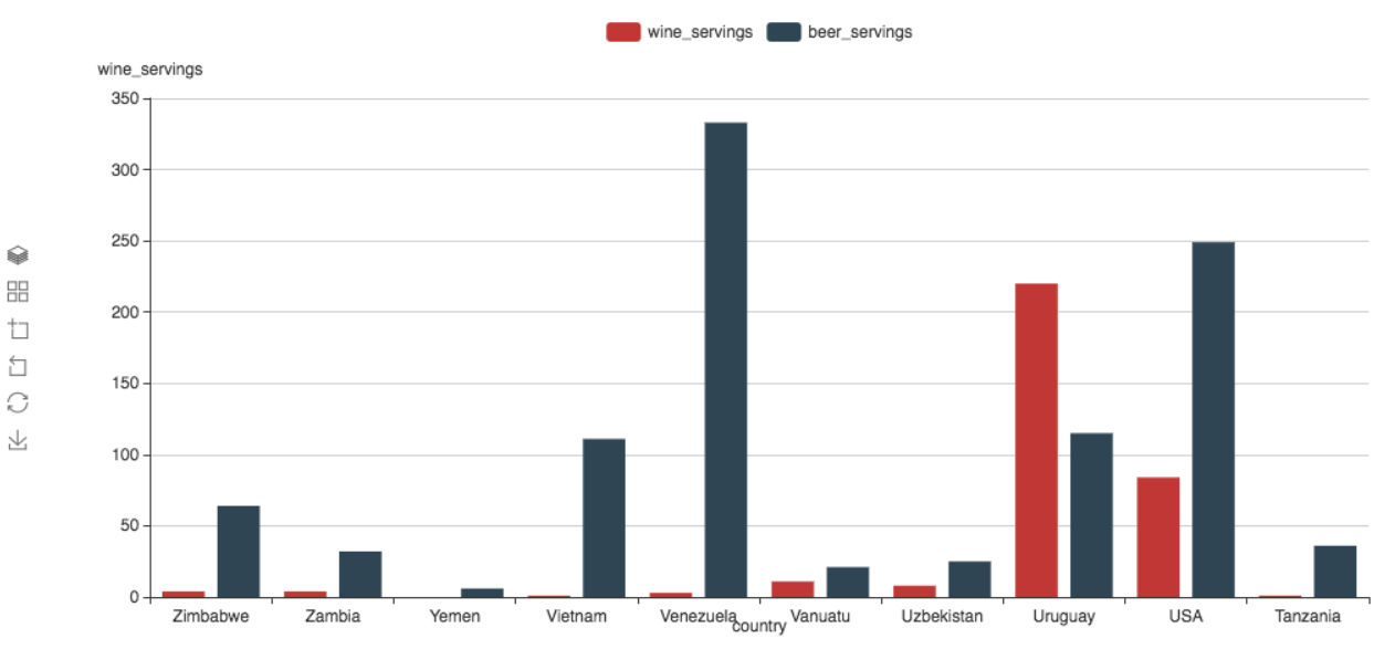
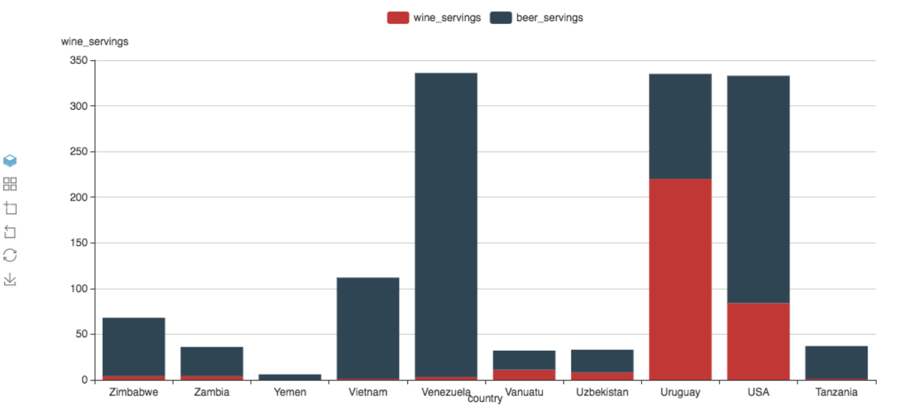
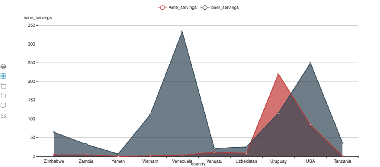
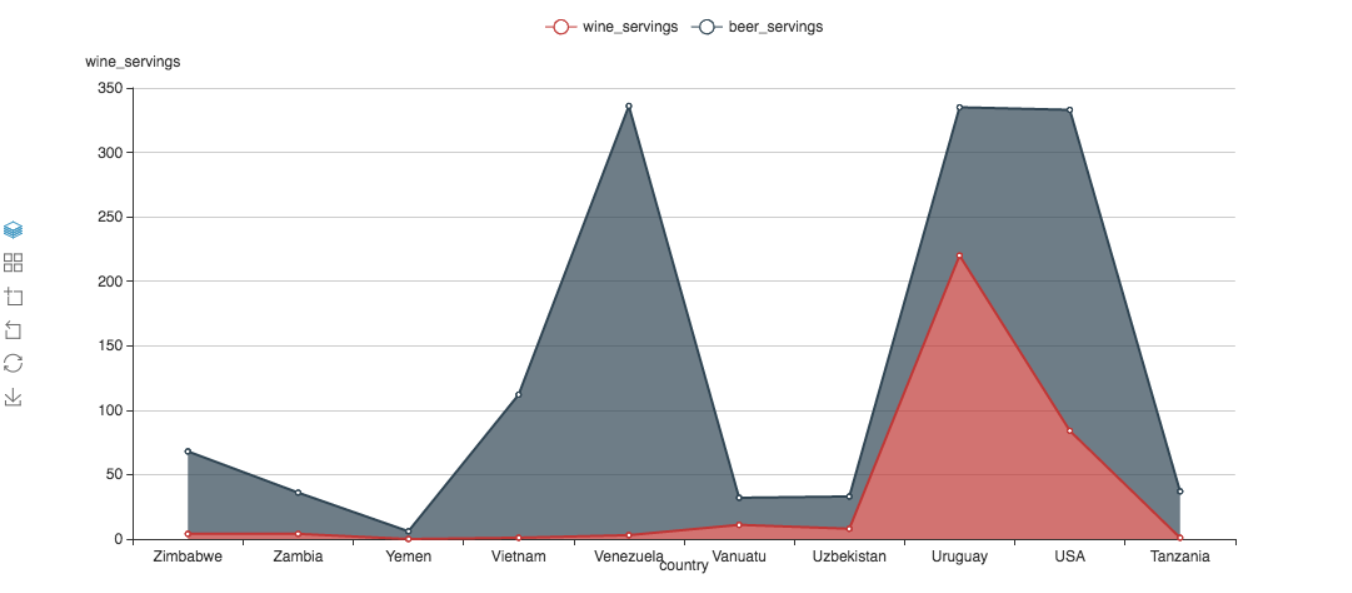
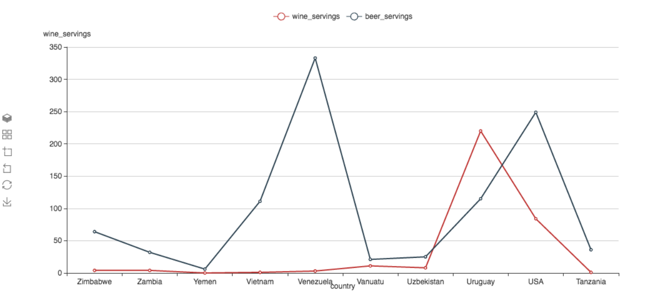
source="drinks.csv" | table country, wine_servings, beer_servings, spirit_servings, total_litres_of_pure_alcohol | head 10 - Coordinates -> Coordinates Type = X-Y
- X-Y Axis -> X-Axis Binding = 0 (country)
- X-Y Axis -> X-Axis Type = Category
- X-Y Axis -> Y-Axis Binding = 1,2 (wine_servings, beer_servings)
- X-Y Axis -> Y-Axis Type = Value
- Data Series -> Data Type = Bar
Click the tool box to switch between stack and non-stack mode
Change Data Series -> Data Type = Line to get Line chart
Change Data Series -> Show Area = True/False to swithc between Area/Line chart
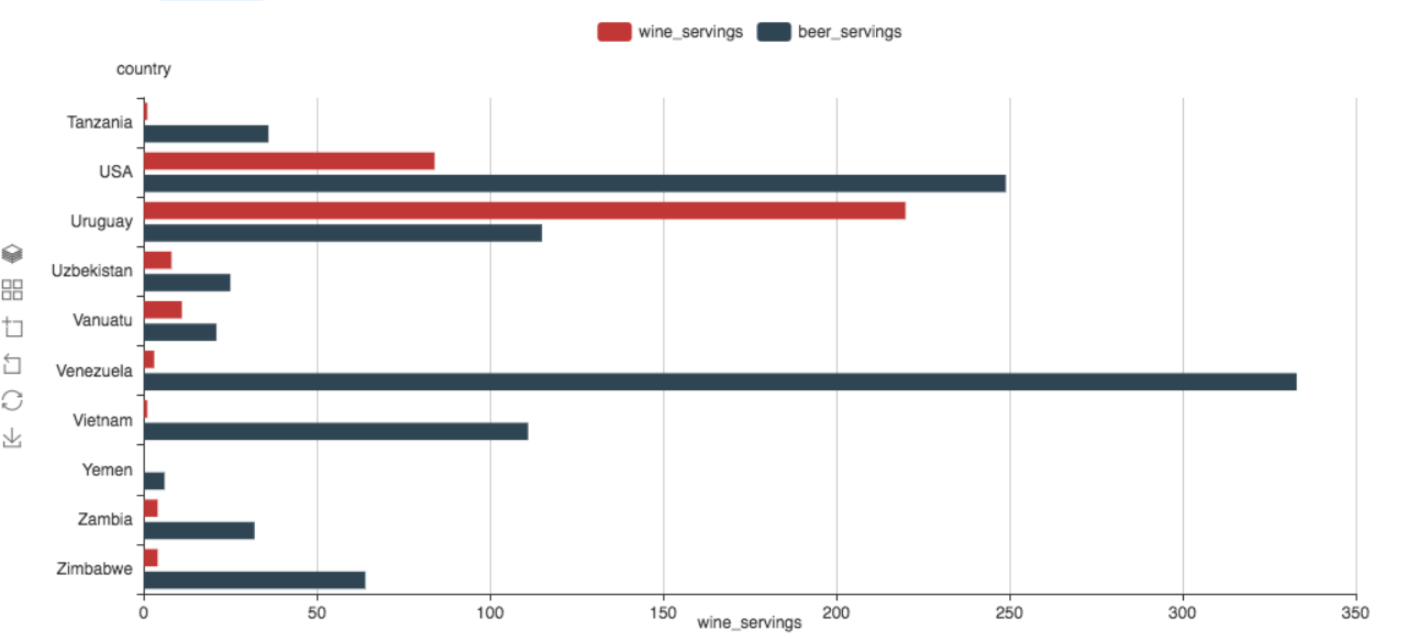
Switch X-Y binding to get bar chart from column chart
- X-Y Axis -> X-Axis Binding = 1,2 (wine_servings, beer_servings)
- X-Y Axis -> X-Axis Type = Value
- X-Y Axis -> Y-Axis Binding = 0 (country)
- X-Y Axis -> Y-Axis Type = Category
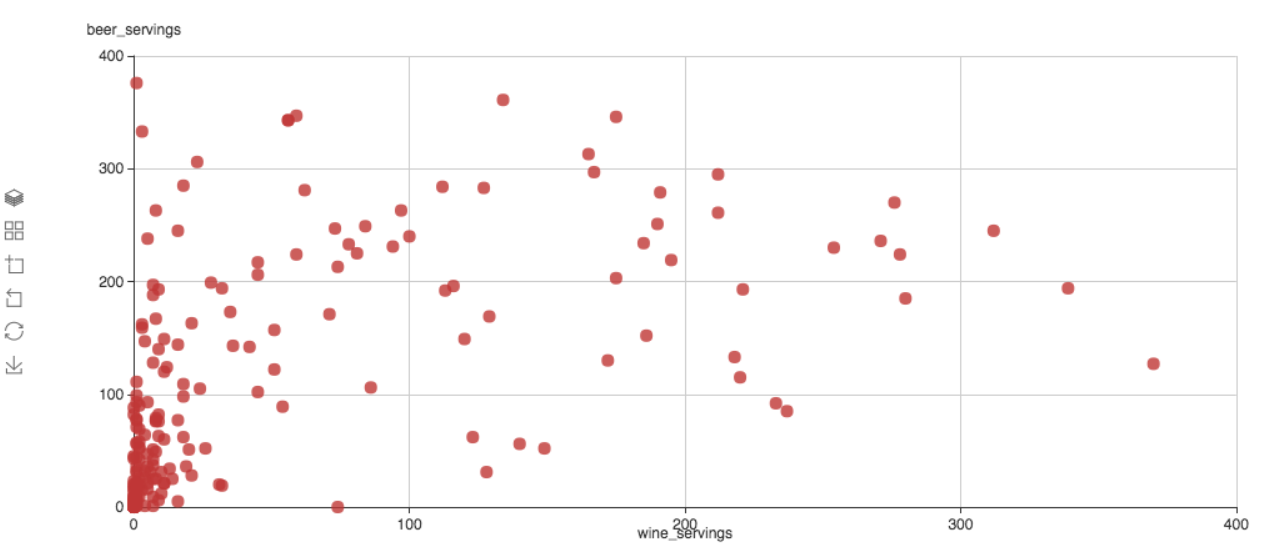
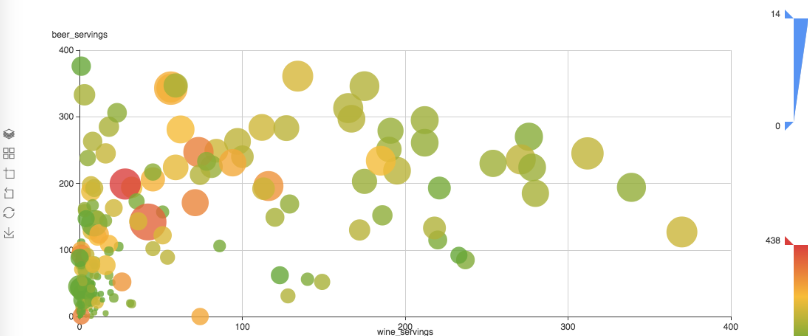
- SPL
source="drinks.csv" | table country, wine_servings, beer_servings, spirit_servings, total_litres_of_pure_alcohol - Coordinates -> Coordinates Type = X-Y
- X-Y Axis -> X-Axis Binding = 1 (wine_servings)
- X-Y Axis -> X-Axis Type = Value
- X-Y Axis -> Y-Axis Binding = 2 (beer_servings)
- X-Y Axis -> Y-Axis Type = Value
- Data Series -> Data Type = Scatter
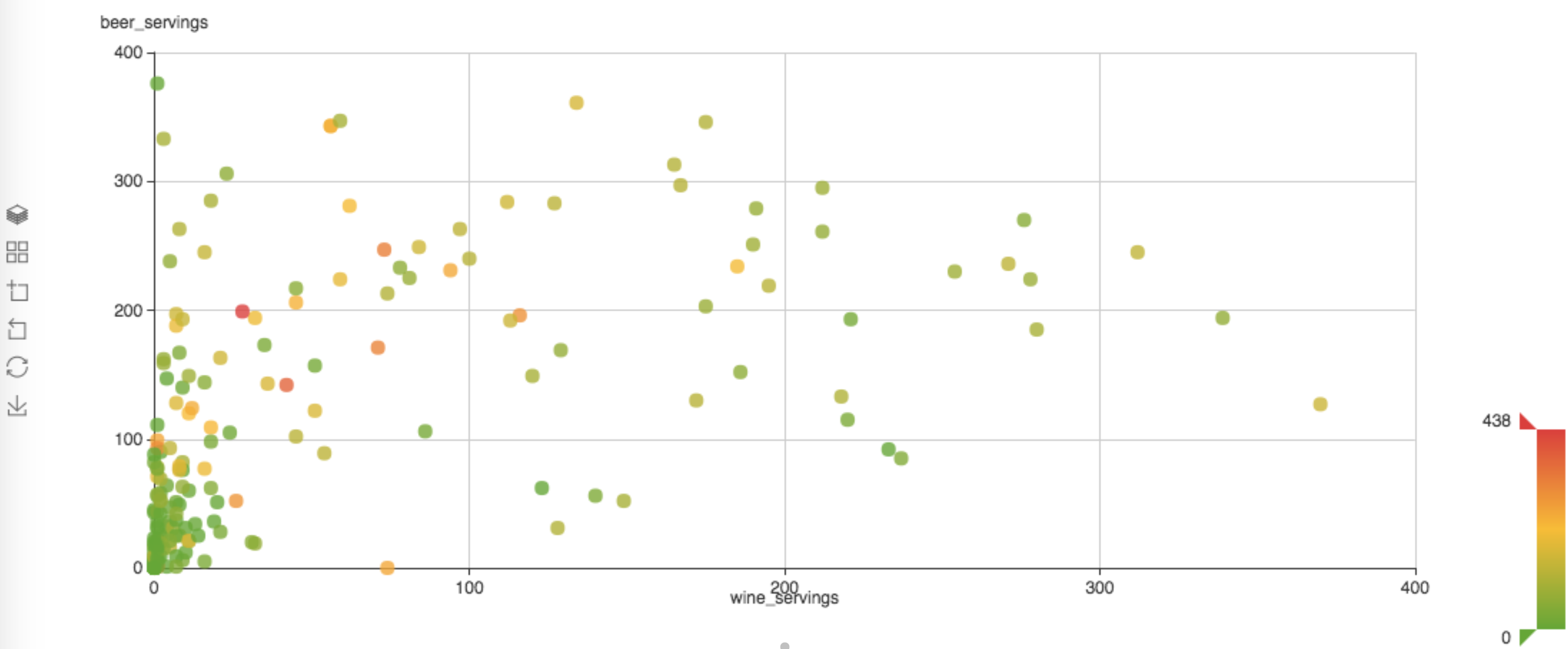
Add color binding with
- Data Series -> Data Color Binding = 3 (spirit_servings)
Add size binding with
- Data Series -> Data Size Binding = 4 (total_litres_of_pure_alcohol)
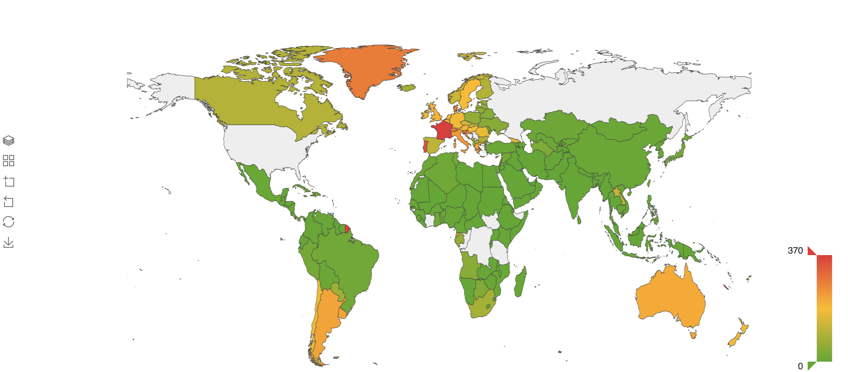
- SPL
source="drinks.csv" | table country, wine_servings, beer_servings, spirit_servings, total_litres_of_pure_alcohol - Coordinates -> Coordinates Type = Geomap
- Geomap -> Map Type = World
- Geomap -> Geo Naming Binding = 0 (country)
- Data Series -> Data Type = Map
- Data Series -> Data Color Binding = 1 (wine_servings)
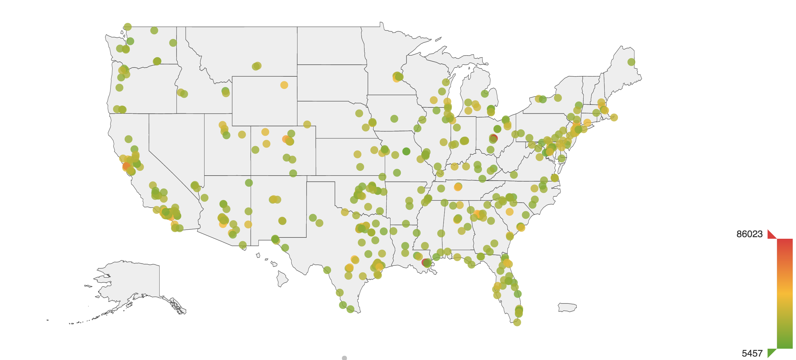
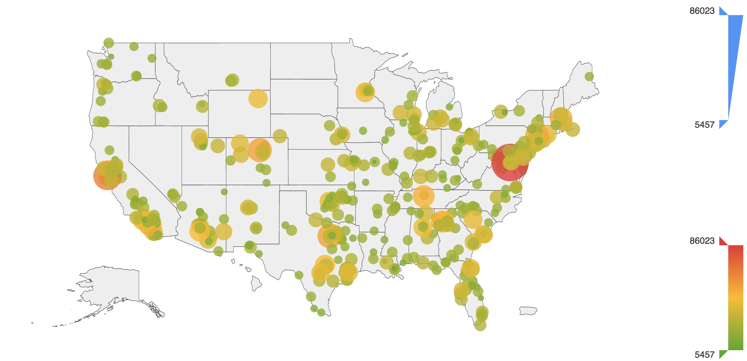
- SPL
source="police_killings.csv" | table latitude,longitude,p_income - Coordinates -> Coordinates Type = Geomap
- Geomap -> Map Type = USA
- Geomap -> Longitude and Latitude Binding = 1,0 (longitude,latitude)
- Data Series -> Data Type = Scatter
- Data Series -> Data Color Binding = 2 (p_income)
Add size binding
- Data Series -> Data Size Binding = 2 (p_income)