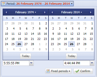
Source at GitHub
https://github.com/wencywww/Ext.ux.button.DateRangePicker
Demos
Sencha's Fiddle: https://fiddle.sencha.com/#fiddle/10t2
JSFiddle: http://jsfiddle.net/mx_starter/xLvg5yj6/
Features:
- Easily choose period between two dates via a single button
- Can be used everywhere within the app, just as a normal button
- Optionally, include start/end times in the dates
- Optionally, two datefield components could be bound and automatically updated by the pickers
- 5 preset periods available for quick set - this week, last week, this month, last month, this year
- Custom formats accepted for dates and times
- Customizable captions, icons
- Customizable via a simple config object
- Returns an object containg the period details via the getPickerValue() method
- Returned object also containg PRECISED period details, eg. 13 months are shown as 1 year and 1 month and so on
- Tested with ExtJS version 4.2.1.883 and up to 7.0.0.151
Component layout:
- It is a ExtJS button with a menu
- The menu includes a single item, panel
- The panel has separate containers for start/end datepickers and timefields
- The panel includes 2 buttons for choosing the preset periods / confirming the choice
Config object
- The config object is optional, if some of the configs are not provided, or there is no config object at all, defaults are applied
- Config object name is drpDefaults and accepts the following keys
- selectedStart, string in the format 'Y-m-d', sets the first datepicker value, defaults to the first day of the curren month
- selectedEnd, string in the format 'Y-m-d', sets the second datepicker value, defaults to today
- dateFormat, string in the Ext.Date.parse() recognisable format, determines how the dates are shown by the component, defaults to 'Y-m-d'
- showButtonTip, boolean value, if true, applies a tooltip to the main button with a current selection, defaults to true
- showTimePickers, boolean value, if true, two timefields are added below the datepickers to be able to choose start/end times
- timeFormat, formatting string for the timefields, must be recognisable by Ext.Date.parse()
- timePickerFromValue, string with a value of the first timefield, must be recognisable by Ext.Date.parse() and MUST MATCH the timeFormat config, defaults to 'H:i:s'
- timePickerToValue, string with a value of the second timefield, must be recognisable by Ext.Date.parse() and MUST MATCH the timeFormat config, defaults to 'H:i:s'
- timePickersEditable, boolean value, if true, the timefields combos will be editable, defaults to false
- timeIncrement, number, indicating the step (in minutes) the timefield's combo records are generated, defaults to 5
- timePickersQueryDelay, number, the timefield's combos query delay, defaults to 500
- timePickersWidth, number, the timefield's width, defaults to 100
- mainBtnTextPrefix, string, the prefix of the main button, defaults to 'Period: '
- mainBtnIconCls, string, for setting an icon of the main button, use null if icon is not needed, defaults to 'drp-icon-calendar'
- mainBtnTextColor, string, for setting the main button text color (excludng the prefix), defaults to '#000000'
- confirmBtnText, string, the text of the bottom-right confirm button, defaults to 'Set Range'
- confirmBtnIconCls, string, for setting an icon of the confirm button, use null if icon is not needed, defaults to 'drp-icon-yes'
- presetPeriodsBtnText, string, the text of the bottom-left preset period button, defaults to 'Preset Periods'
- presetPeriodsBtnIconCls, string, for setting an icon of the preset period button, use null if icon is not needed, defaults to 'drp-icon-calendar'
- presetPeriodsThisWeekText, string, menu option text for choosing this week, defaults to 'This Week'
- presetPeriodsLastWeekText, string, menu option text for choosing last week, defaults to 'Last Week'
- presetPeriodsThisMonthText, string, menu option text for choosing this month, defaults to 'This Month'
- presetPeriodsLastMonthText, string, menu option text for choosing the last month, defaults to 'Last Month'
- presetPeriodsThisYearText, string, menu option text for choosing the last week, defaults to 'This Year',
- bindDateFields, boolean, if true, allows two date fields to be bound to the picker and automatically updated, defaults to false
- boundStartField, Ext.form.field.Date instance, to be bound to the first datepicker, defaults to null
- boundEndField, Ext.form.field.Date instance, to be bound to the second datepicker, defaults to null
- diffPreciseUnits, object, customizes precised period details captions for year/years, month/months, day/days and so on, used to build the diffAsText property of the periodDetailsPrecise object part of the responce, defaults to
{ year: 'year', years: 'years', month: 'month', months: 'months', day: 'day', days: 'days', hour: 'hour', hours: 'hours', minute: 'minute', minutes: 'minutes', second: 'second', seconds: 'seconds', delimiter: ' ' }
Usage
- Include the
css/DateRangePicker.cssfile (can be ommited if not using icons, or you want to use own icons) - Include the
src/dateRangePicker.jsfile (Ext must be included prior to this) - Instantiate the class, for example
var myRangePicker = Ext.create('Ext.ux.button.DateRangePicker', drpDefaults: {} ), or using the 'daterangepicker' xtype - To get the value of the instance, use
var myPickerValue = myRangePicker.getPickerValue()and inspect the myPickerValue object
List of Changes
- 2019-10-10, added e preview picture to the repository, changed Sencha Fiddle's ExtJS version to be 7.0.0.151 by default
- 2017-05-18, renamed picker's getValue() to getPickerValue() to work with 6.2/6.5
- 2015-11-12, added 'requires' config for including Ext.picker.Date & Ext.form.field.Time if needed
- 2015-11-12, added support for binding two datefield components to the picker and automatically set their values upon picker change
- 2015-11-12, added diffPreciseUnits config option for customizing captions used to build the diffAsText property of the periodDetailsPrecise object part of the responce
