react-native-popup-confirm-toast


- Popup = onLayout(automatic height calculation)
| Custom Example 1 |
Custom Example 2 |
Custom Example 3 |
Custom Example 4 |
 |
 |
 |
 |
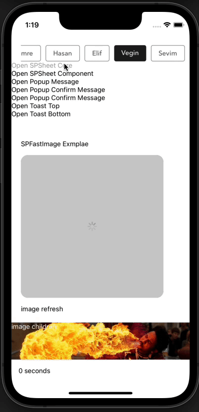
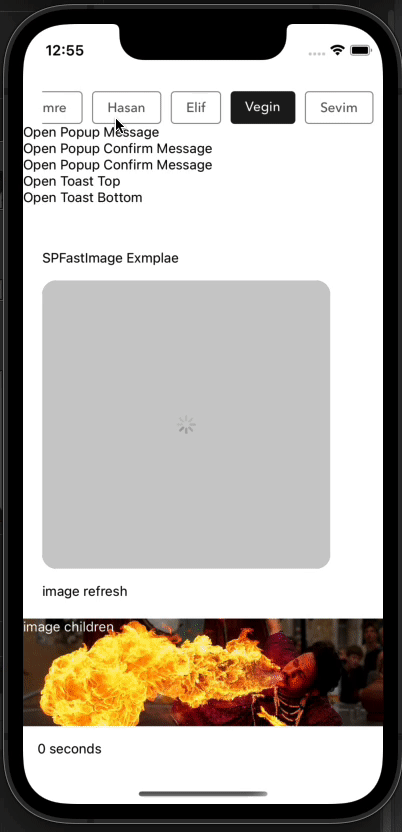
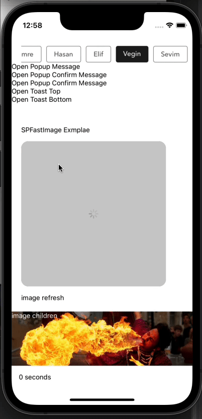
Example Popup Message
| Example Message |
Example Confirm Message |
Example Message AutoClose |
Example Custom Body Component |
 |
 |
 |
 |
| Example Toast Top |
Example Toast Bottom |
 |
 |
yarn add react-native-status-bar-height
or
npm install react-native-status-bar-height
yarn add react-native-popup-confirm-toast
or
npm install react-native-popup-confirm-toast
import { Root, SPSheet } from 'react-native-popup-confirm-toast'

const component = (props) => {
    //hook or class
    return (<Text>Hi, SekizliPenguen</Text>);

    //props.spSheet.hide();
    //props.spSheet.setHeight(150,()=>alert('nice'));
};

<Root>
    <View>
        <TouchableOpacity
            onPress={() => {
                const spSheet = SPSheet;
                spSheet.show({
                    component: () => component({...this.props, spSheet}),
                    dragFromTopOnly: true,
                    onCloseComplete: () => {
                        alert('onCloseComplete');
                    },
                    onOpenComplete: () => {
                        alert('onOpenComplete');
                    },
                    height:260
                });
            }
        >
            <Text>Open Popup Message</Text>
        </TouchableOpacity>
    </View>
</Root>
import { Root, Popup } from 'react-native-popup-confirm-toast'
<Root>
    <View>
        <TouchableOpacity
            onPress={() =>
              Popup.show({
                type: 'success',
                title: 'Dikkat!',
                textBody: 'Mutlak özgürlük, kendi başına hiçbir anlam ifade etmez. ',
                buttonText: 'Tamam',
                callback: () => Popup.hide()
              })
            }
        >
            <Text>Open Popup Message</Text>
        </TouchableOpacity>
    </View>
</Root>
import { Root, Popup } from 'react-native-popup-confirm-toast'
<Root>
    <View>
        <TouchableOpacity
            onPress={() =>
                Popup.show({
                    type: 'confirm',
                    title: 'Dikkat!',
                    textBody: 'Mutlak özgürlük, kendi başına hiçbir anlam ifade etmez. ',
                    buttonText: 'Tamam',
                    confirmText: 'Vazgeç',
                    callback: () => {
                        alert('Okey Callback && hidden');
                        Popup.hide();
                    },
                    cancelCallback: () => {
                        alert('Cancel Callback && hidden');
                        Popup.hide();
                    },
                })
            }
        >
            <Text>Open Popup Confirm Message</Text>
        </TouchableOpacity>
    </View>
</Root>
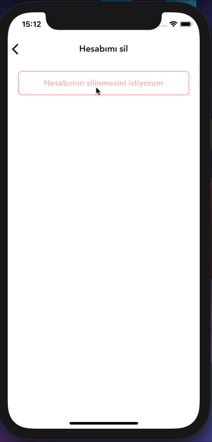
Example Custom Body Component
import { Root, Popup } from 'react-native-popup-confirm-toast'
//hooks or class component
const bodyComponent = ({props,bodyProps}) => {
    return (
        <View onLayout={(e)=>bodyProps.onLayout(e)}>
        <Text>Mustafa Kemal ATATÜRK</Text>
        </View>
    );
}

<Root>
    <View>
        <TouchableOpacity
            onPress={() =>
                const popup = Popup;
                popup.show({
                    type: 'confirm',
                    textBody: 'Hesabınızın silinme işlemini onaylamak için şifrenizi giriniz.',
                    bodyComponent: (bodyProps) => bodyComponent({...props,bodyProps,popup}),
                    confirmText: 'Vazgeç',
                    iconEnabled: false,
                    descTextStyle: GlobalAlertModalStyle.descTextStyle,
                    confirmButtonTextStyle: GlobalAlertModalStyle.confirmButtonTextStyle,
                    buttonEnabled: false,
                });
            }
        >
            <Text>Open Popup Confirm Message</Text>
        </TouchableOpacity>
    </View>
</Root>
import { Root, Toast } from 'react-native-popup-confirm-toast'
    <Root>
        <View>
            <TouchableOpacity
                onPress={() =>
                      Toast.show({
                        title: 'Dikkat!',
                        text: 'Mutlak özgürlük, kendi başına hiçbir anlam ifade etmez.',
                        color: '#702c91',
                        timeColor: '#440f5f',
                        timing: 5000,
                        icon: <Icon name={'check'} color={'#fff'} size={31}/>,
                        position: 'bottom',
                    })
                }
            >
                <Text>Open Toast</Text>
            </TouchableOpacity>
        </View>
    </Root>
| Key |
Type |
Description |
Default |
background |
string |
|
rgba(0, 0, 0, 0.5) |
height |
number |
auto height (min: 250) |
250 |
duration |
number |
animation time used when opening |
250(ms) |
closeDuration |
number |
animation time used when closing |
300(ms) |
closeOnDragDown |
boolean |
Use drag with motion to close the window |
true |
closeOnPressMask |
boolean |
press the outside space to close the window |
true |
closeOnPressBack |
boolean |
Press the back key to close the window (Android only) |
true |
dragTopOnly |
boolean |
use only the top area of the draggable icon to close the window |
false |
component |
component(hook or class) |
custom modal component container |
null |
onOpen |
function |
works after the window is opened |
null |
onOpenComplete |
function |
works after the window is opened |
null |
onClose |
function |
works after window is closed |
null |
onCloseComplete |
function |
works after window is closed |
null |
customStyles |
object |
customStyles: { draggableIcon: {}, container: {}, draggableContainer:{} } |
{} |
timing |
number |
Use this parameter for automatic shutdown. |
0(ms) |
keyboardHeightAdjustment |
boolean |
re-adjusts the height when the keyboard is opened |
false |
Popup
| Key |
Type |
Description |
Default |
title |
string |
|
false |
textBody |
string |
|
false |
bodyComponent |
component(hook or class) |
custom modal component container |
null |
bodyComponentForce |
boolean |
The component you specify covers the entire space |
false |
onLayout |
function |
which triggers this feature for us to automatically calculate the height of the component area you specify. |
|
type |
enum |
enum(success, danger, warning, confirm) |
warning |
buttonText |
string |
|
Ok |
confirmText |
string |
|
Cancel |
callback |
function |
ok button press |
popupHidden |
cancelCallback |
function |
cancel button press |
popupHidden |
background |
string |
|
rgba(0, 0, 0, 0.5) |
timing |
number |
0 > autoClose |
0 |
iconEnabled |
boolean |
|
true
|
iconHeaderStyle |
object |
|
{height: 75, width: 100, backgroundColor: '#fff'} |
icon |
requireUrl |
|
require('../assets/{type}.png') |
containerStyle |
object |
|
{ position: 'absolute', zIndex: 10, backgroundColor: 'rgba(0, 0, 0, 0.5)', alignItems: 'center', top: 0, left: 0,} |
modalContainerStyle |
object |
|
{ width: '90%',backgroundColor: '#fff', borderRadius: 8, alignItems: 'center', overflow: 'hidden', position: 'absolute'}} |
buttonContentStyle |
object |
|
{} |
okButtonStyle |
object |
|
{backgroundColor: '#702c91'} |
confirmButtonStyle |
object |
|
default |
okButtonTextStyle |
object |
|
default |
confirmButtonTextStyle |
object |
|
default |
titleTextStyle |
object |
|
default |
descTextStyle |
object |
|
default |
bounciness |
number |
|
15 |
onClose |
function |
when the popup is first closed |
false |
onCloseComplete |
function |
|
false |
onOpen |
function |
when the popup is first opened |
false |
onOpenComplete |
function |
|
false |
duration |
boolean |
|
100 |
closeDuration |
boolean |
|
100 |
| Key |
Type |
Description |
Default |
title |
string |
|
false |
text |
string |
Description |
false |
titleTextStyle |
object |
|
{color: '#fff',fontWeight: 'bold',fontSize: 16} |
descTextStyle |
object |
|
{marginTop: 5,fontSize: 13,color: '#fff', fontWeight: '400',} |
backgroundColor |
string |
|
#1da1f2 |
timeColor |
string |
time backgroundColor |
#1c6896 |
position |
enum |
parameters => top, bottom |
bottom |
icon |
component |
(react-native-vector-icons or ![]() component) component) |
null |
timing |
number |
|
5000 ms |
| Component Name |
Method Name |
Example |
Description |
| SPSheet |
show |
const spSheet = SPSheet; spSheet.show(config); |
|
| SPSheet |
hide |
const spSheet = SPSheet; spSheet.hide(); |
|
| SPSheet |
setHeight |
const spSheet = SPSheet; spSheet.setHeight(500,completeEventFunction); |
allows you to change the box height |
| Popup |
show |
const popup = Popup; popup.show(config); |
|
| Popup |
hide |
const popup = Popup; popup.hide(); |
|
| Toast |
show |
const toast = Toast; toast.show(config); |
|
| Toast |
hide |
const toast = Toast; toast.hide(); |
|
SekizliPenguen, Inspired by "popup-ui"
MIT


