A slick color picker fieldtype plugin for the Craft CMS 3 control panel. That's a mouthful.
This fieldtype plugin gives your content editors a simple tool for selecting from a color palette. Colorit also lets you create custom presets that can be selected when creating colorit fields.
This plugin requires Craft CMS 3.0.0, or later.
Log into your control panel, hit up the 'Plugin Store', search for this plugin and install.
Open terminal, go to your Craft project folder and use composer to load this plugin. Once loaded you can install via the Craft Control Panel, go to Settings → Plugins, locate the plugin and hit “Install”.
cd /path/to/project
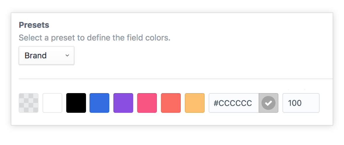
composer require presseddigital/coloritSelect a color from the palette.
Get a live preview when setting opacity.
Define a custom color.
Option field descriptions.
Each Colorit fieldtype returns a Color model.
{{ entry.myColoritFieldName }}                - (string)  // Color in format as per field settings)
{{ entry.myColoritFieldName.color }}          - (string)  // Returns the color
{{ entry.myColoritFieldName.color(format) }}  - (string)  // Optional format (hex, rgb, rgba)
{{ entry.myColoritFieldName.opacity }}        - (integer) // The opacity value
{{ entry.myColoritFieldName.handle }}         - (string)  // The color handle
{{ entry.myColoritFieldName.isCustomColor }}  - (bool)    // Is this a custom colour
{{ entry.myColoritFieldName.isTransparent }}  - (bool)    // Is this transparent
{{ entry.myColoritFieldName.hasColor }}       - (bool)    // Does the field have a color set
{{ entry.myColoritFieldName.palette }}        - (array)   // All available colours in the palette
{{ entry.myColoritFieldName.hex }}            - (string)  // Get the hex value
{{ entry.myColoritFieldName.hashhex }}        - (string)  // Get the hex value including #
{{ entry.myColoritFieldName.rgb }}            - (string)  // Get the rgb value
{{ entry.myColoritFieldName.rgba }}           - (string)  // Get the rgba value

{{ entry.myColoritFieldName.r }}              - (string) // Get the red value
{{ entry.myColoritFieldName.g }}              - (string) // Get the green value
{{ entry.myColoritFieldName.b }}              - (string) // Get the blue value
{{ entry.myColoritFieldName.a }}              - (string) // Get the alpha value

{{ entry.myColoritFieldName.red }}            - (string) // Get the red value
{{ entry.myColoritFieldName.green }}          - (string) // Get the green value
{{ entry.myColoritFieldName.blue }}           - (string) // Get the blue value
{{ entry.myColoritFieldName.alpha }} - (string) // Get the alpha valueColorit makes a few utilities avaiable in your templates.
{{ craft.colorit.colours.baseColours }}                - (array)
{{ craft.colorit.colours.baseColoursAsOptions }}       - (array)
{{ craft.colorit.colours.hexIsWhite(hex) }}            - (bool)
{{ craft.colorit.colours.hexIsBlack(hex) }}            - (bool)
{{ craft.colorit.colours.hexIsTransparent(hex) }}      - (bool)
{{ craft.colorit.colours.hexToRgb(hex) }}              - (string)
{{ craft.colorit.colours.hexToRgba(hex, opacity) }} - (string){{ ('#555')|hexIsWhite }} - (bool)
{{ ('#555')|hexIsBlack }} - (bool)
{{ ('#555')|hexIsTransparent }} - (bool)
{{ ('#555')|hexToRgb }} - (string)
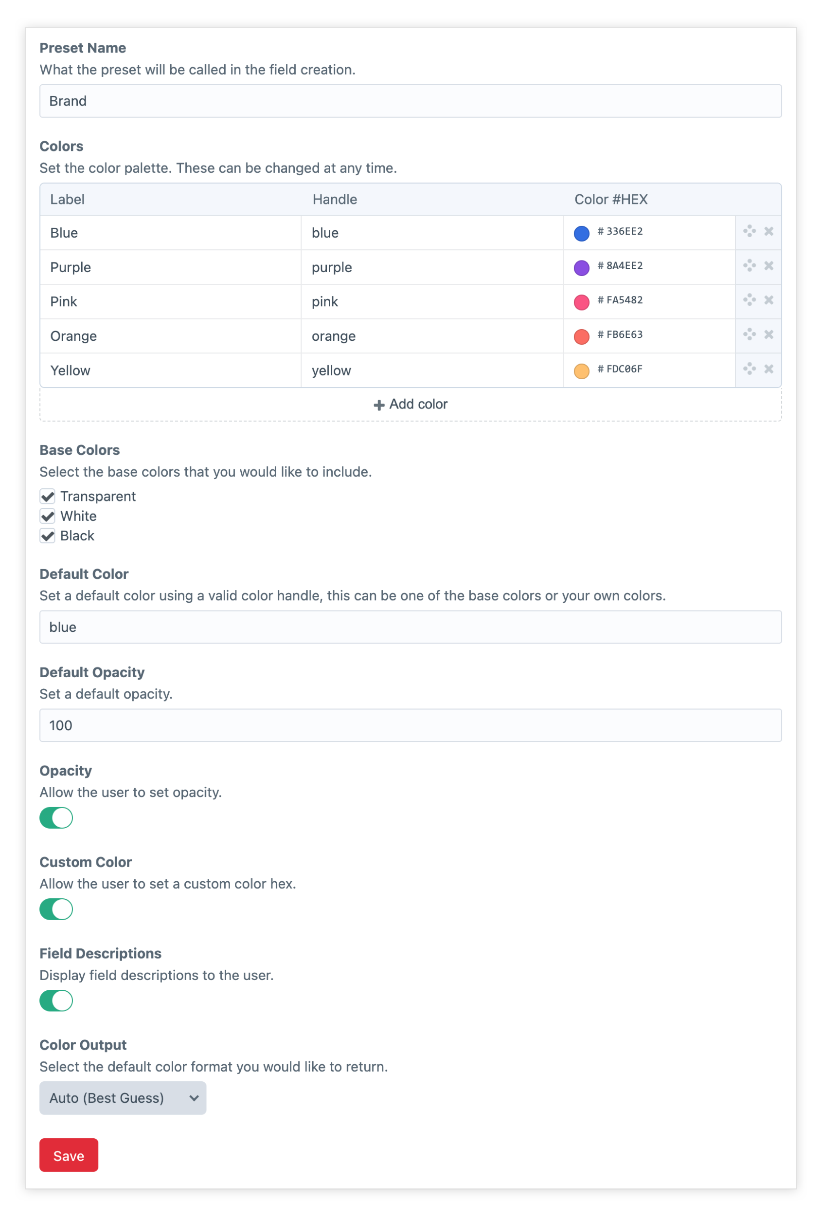
{{ ('#555')|hexToRgba(opacity = 100) }} - (string)Colorit lets you create custom presets that can be selected when creating colorit fields. For example, you might want to create a "Brand" preset and another for "Secondary" colors. If you make changes to the preset, it will update any fields where it is in use.
When creating a new Colorit field you'll have the option to choose one of your presets or create custom field settings for that field. Settings include defining your color palette, appending transparent, black and white. Allowsing custom colours to be created, opacity and label settings.
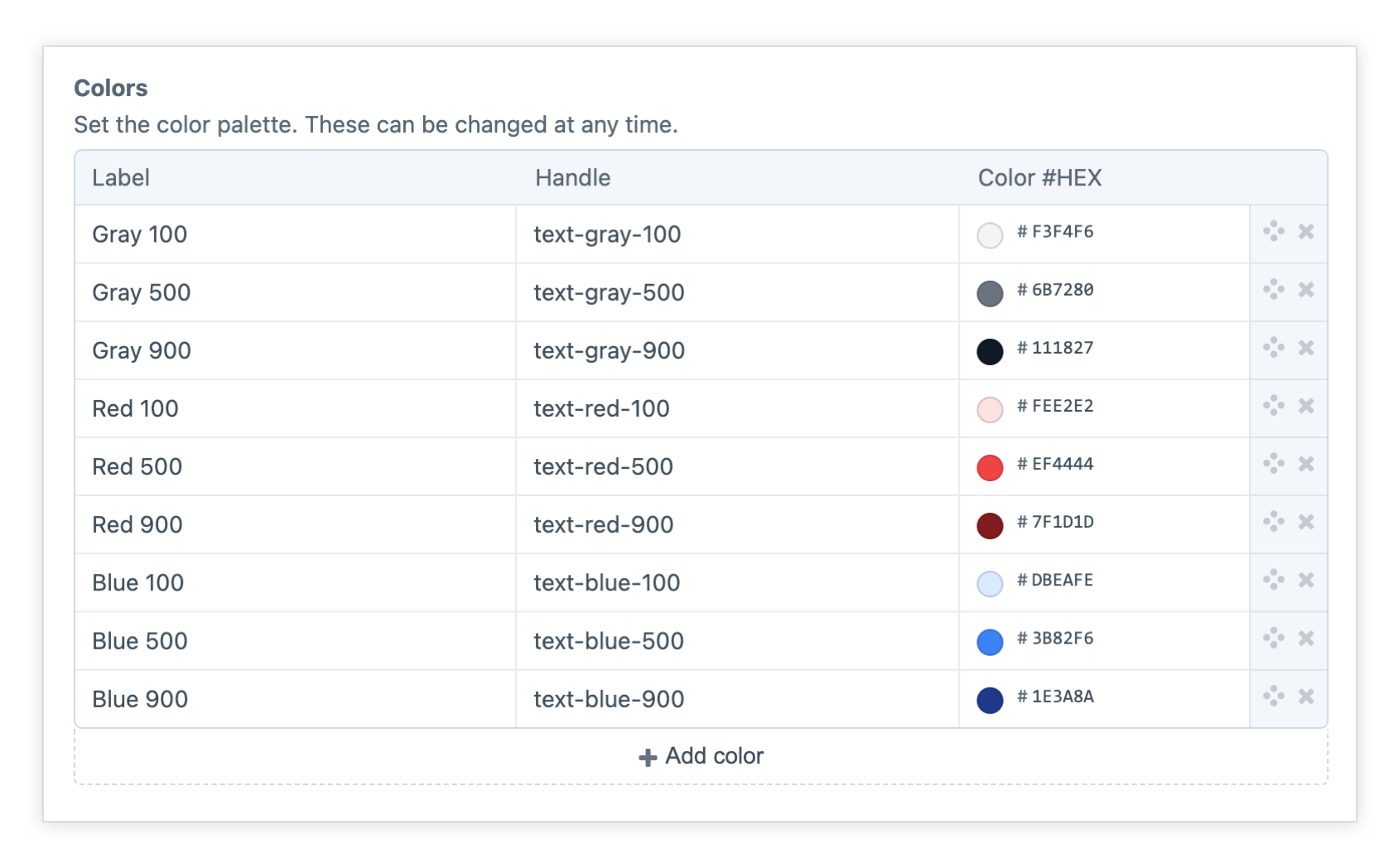
You can easily use Colorit with Tailwind CSS by outputting the Colorit field handle to the class attribute.
Brought to you by Pressed Digital.


