Sliders allow users to make selections from a range of values. We can adjust volume, brightness or use it for selection in e-commerce application. Lets see how to create Slider.
import { MaterialSlider, SliderModel, SliderType } from '@ohos/materialslider'Access slider attributes through a object of SliderModel and customize the slider(if needed) using setter functions and finally pass the object to MaterialSlider.
Below are list of properties available.
| Properties | Description | Type |
|---|---|---|
| SliderType | Defined the type of the Slider | SliderType Enum (Continue, Discrete) |
| SliderStyle | Defines the style of the Slider | SliderStyle Enum (InSet, OutSet) |
| min, max | Defines the minimum and maximun values of the Slider | number |
| step | Step of the slider | number |
| showSteps | Whether to display the current step | boolean (Default: false) |
| showTips | Displays the bubble to indicate the percentage while sliding | boolean (Default: false) |
| showMin, showMax | Displays the minimum and maximum values on the screen | boolean |
| showValue | Displays the value of the Slider on the screen | boolean |
| trackThickness | Defines the thickness of the track | number |
| reverse | Whether to display the slider values in reverse | boolean (Default: false) |
| direction | Defines the direction of the slider (Horizontally or Vertically) | Axis Enum (Horizontal, Vertical) |
| currentValue | Current progress of the slider | number |
| blockColor | Color of the Slider | ResourceColor |
| trackColor | Background color of the Slider | ResourceColor |
| selectedColor | Color of the Slider rail that has been slid | ResourceColor |
Below are the events that are supported by Slider
| Properties | Description |
|---|---|
| onSliderChange(callback: (value: number, mode: SliderChangeMode) => void) | Callback is invoked when the slider slides value - Current Value of the Slider mode - Dragging state or Mode of the Slider (SliderChangeMode Enum - Begin, Moving, End) |
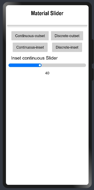
Continuous sliders allow users to make selections that don’t require a specific value. These sliders are often used to adjust brightness or volume.
//Creating object of the SliderModel class with Slider type as Continue
private sliderModel: SliderModel = new SliderModel(SliderType.Continue)

//Customization of the SliderModel object and mentioning the SliderStyle as OutSet
aboutToAppear(){
    this.sliderModel.setSliderStyle(SliderStyle.OutSet)
    this.sliderModel.setMin(100)
    this.sliderModel.setMax(1000)
    this.sliderModel.setStep(1)
    this.sliderModel.setCurrentValue(500)
    this.sliderModel.setShowSteps(false)
    this.sliderModel.setShowTips(true)
    this.sliderModel.setTrackThickness(8)
    this.sliderModel.setReverse(false)
    this.sliderModel.setDirection(Axis.Horizontal)
    this.sliderModel.setShowValue(true)
    this.sliderModel.setShowMin(false)
    this.sliderModel.setShowMax(false)
    this.sliderModel.setBlockColor("#ff0477ff")
    this.sliderModel.setTrackColor("#D0D0D0")
    this.sliderModel.setSelectedColor("#ff0477ff")
}

//Passing SliderModel object to MaterialSlider and defining the Event onSliderChange
MaterialSlider({
      obj: this.sliderModel1,
      onSliderChange:((value: number, mode: SliderChangeMode) => {
           console.log("Value: " + value + " Mode: " + mode);
      })
})
//Creating object of the SliderModel class with Slider type as Continue
private sliderModel: SliderModel = new SliderModel(SliderType.Continue)

//Customization of the SliderModel object and mentioning the SliderStyle as InSet
aboutToAppear(){
    this.sliderModel.setSliderSliderStyle(SliderStyle.InSet)
    this.sliderModel.setMin(0)
    this.sliderModel.setMax(100)
    this.sliderModel.setStep(1)
    this.sliderModel.setCurrentValue(40)
    this.sliderModel.setShowSteps(false)
    this.sliderModel.setShowTips(true)
    this.sliderModel.setTrackThickness(15)
    this.sliderModel.setReverse(false)
    this.sliderModel.setDirection(Axis.Horizontal)
    this.sliderModel.setShowValue(true)
    this.sliderModel.setShowMin(false)
    this.sliderModel.setShowMax(false)
    this.sliderModel.setBlockColor(Color.White)
    this.sliderModel.setTrackColor("#D0D0D0")
    this.sliderModel.setSelectedColor("#ff0477ff")
}

//Passing SliderModel object to MaterialSlider and defining the Event onSliderChange
MaterialSlider({
      obj: this.sliderModel1,
      onSliderChange:((value: number, mode: SliderChangeMode) => {
           console.log("Value: " + value + " Mode: " + mode);
      })
})
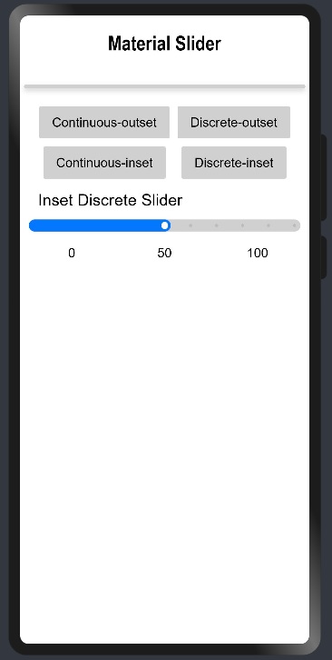
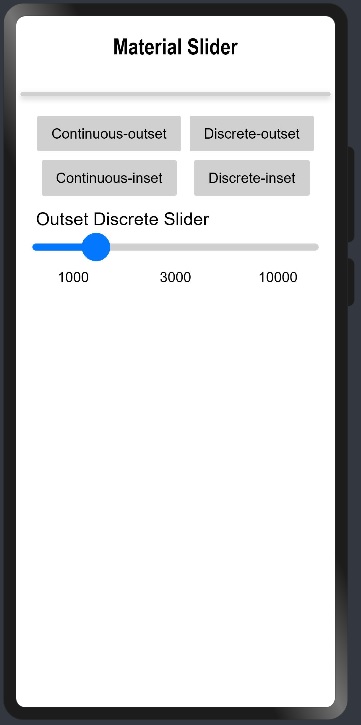
Discrete sliders display a numeric value label upon pressing the thumb, allowing users to input an exact value. Discrete sliders only allow predefined sets of options or values to be selected. These sliders are often used in scenarios where there are pre-defined values are available like choosing shoe size or any clothing size, etc.
//Creating object of the SliderModel class with Slider type as Discrete
private sliderModel: SliderModel = new SliderModel(SliderType.Discrete)

//Customization of the SliderModel object and mentioning the SliderStyle as OutSet
aboutToAppear(){
    this.sliderModel.setSliderStyle(SliderStyle.OutSet)
    this.sliderModel.setMin(1000)
    this.sliderModel.setMax(10000)
    this.sliderModel.setStep(1000)
    this.sliderModel.setCurrentValue(3000)
    this.sliderModel.setShowSteps(true)
    this.sliderModel.setShowTips(true)
    this.sliderModel.setTrackThickness(8)
    this.sliderModel.setReverse(false)
    this.sliderModel.setDirection(Axis.Horizontal)
    this.sliderModel.setShowValue(true)
    this.sliderModel.setShowMin(false)
    this.sliderModel.setShowMax(false)
    this.sliderModel.setBlockColor("#ff0477ff")
    this.sliderModel.setTrackColor("#D0D0D0")
    this.sliderModel.setSelectedColor("#ff0477ff")
}

//Passing SliderModel object to MaterialSlider and defining the Event onSliderChange
MaterialSlider({
      obj: this.sliderModel1,
      onSliderChange:((value: number, mode: SliderChangeMode) => {
           console.log("Value: " + value + " Mode: " + mode);
      })
})
//Creating object of the SliderModel class with Slider type as Discrete
private sliderModel: SliderModel = new SliderModel(SliderType.Discrete)

//Customization of the SliderModel object and mentioning the SliderStyle as InSet
aboutToAppear(){
    this.sliderModel.setSliderStyle(SliderStyle.InSet)
    this.sliderModel.setMin(0)
    this.sliderModel.setMax(100)
    this.sliderModel.setStep(10)
    this.sliderModel.setCurrentValue(50)
    this.sliderModel.setShowSteps(true)
    this.sliderModel.setShowTips(true)
    this.sliderModel.setTrackThickness(15)
    this.sliderModel.setReverse(false)
    this.sliderModel.setDirection(Axis.Horizontal)
    this.sliderModel.setShowValue(true)
    this.sliderModel.setShowMin(true)
    this.sliderModel.setShowMax(true)
    this.sliderModel.setBlockColor(Color.White)
    this.sliderModel.setTrackColor("#D0D0D0")
    this.sliderModel.setSelectedColor("#ff0477ff")
}

//Passing SliderModel object to MaterialSlider and defining the Event onSliderChange
MaterialSlider({
      obj: this.sliderModel1,
      onSliderChange:((value: number, mode: SliderChangeMode) => {
           console.log("Value: " + value + " Mode: " + mode);
      })
})