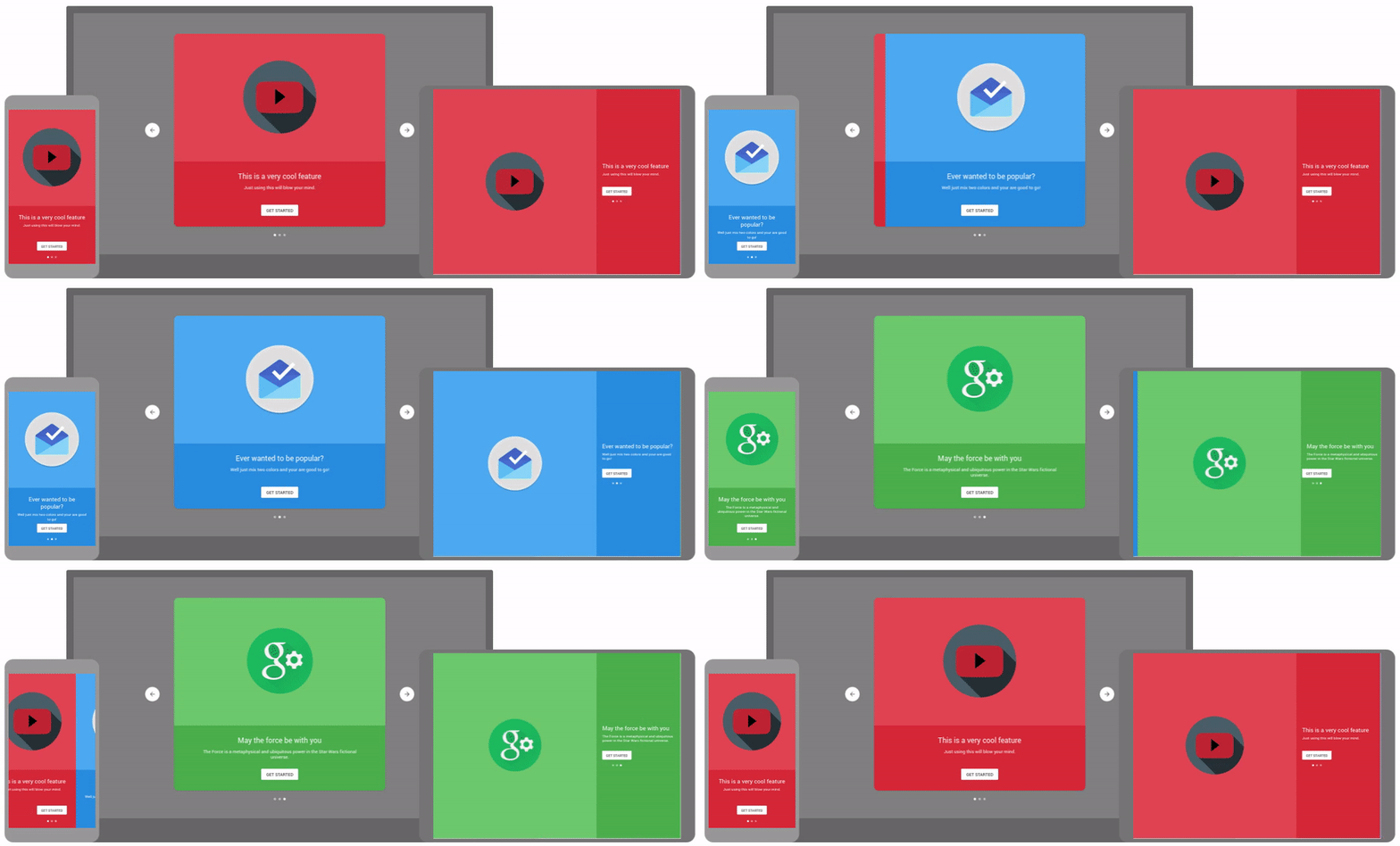
So you wrote a great app and deployed it and everything. But how do you introduce new users to your app? Well, the Material design guidelines have a solution: Displaying the top benefits in a beautiful auto-rotating carousel!
This project implements such a carousel for material-ui. See the storybook for an interactive demo.
npm i --save material-auto-rotating-carousel
npm i --save react-swipeable-views react-motionThe usage is similar to the usage of Material UI's tabs. Create AutoRotatingCarousel as a main frame and add Slides as children.
import { AutoRotatingCarousel, Slide } from 'material-auto-rotating-carousel'
import { green400, green600, blue400, blue600, red400, red600 } from 'material-ui/styles/colors'

// ...

render() {
  return (
    <div>
      <AutoRotatingCarousel
        label="Get started"
        open
      >
        <Slide
          media={<img src="http://www.icons101.com/icon_png/size_256/id_79394/youtube.png" />}
          mediaBackgroundStyle={{ backgroundColor: red400 }}
          contentStyle={{ backgroundColor: red600 }}
          title="This is a very cool feature"
          subtitle="Just using this will blow your mind."
        />
        <Slide
          media={<img src="http://www.icons101.com/icon_png/size_256/id_80975/GoogleInbox.png" />}
          mediaBackgroundStyle={{ backgroundColor: blue400 }}
          contentStyle={{ backgroundColor: blue600 }}
          title="Ever wanted to be popular?"
          subtitle="Well just mix two colors and your are good to go!"
        />
        <Slide
          media={<img src="http://www.icons101.com/icon_png/size_256/id_76704/Google_Settings.png" />}
          mediaBackgroundStyle={{ backgroundColor: green400 }}
          contentStyle={{ backgroundColor: green600 }}
          title="May the force be with you"
          subtitle="The Force is a metaphysical and ubiquitous power in the Star Wars universe."
        />
      </AutoRotatingCarousel>
    </div>
  )
}| Name | Type | Default | Description |
|---|---|---|---|
| autoplay | bool |
true |
If false, the auto play behavior is disabled. |
| contentStyle | object |
Override the inline-styles of the content container. | |
| interval | integer |
3000 |
Delay between auto play transitions (in ms). |
| label* | string |
Button text. | |
| landscape | bool |
If true, slide will adjust content for wide mobile screens. |
|
| mobile | bool |
false |
If true, the screen width and height is filled. |
| open | bool |
false |
Controls whether the AutoRotatingCarousel is opened or not. |
| onChange | function |
Fired when the index changed. Returns current index. | |
| onRequestClose | function |
noop |
Fired when the gray background of the popup is pressed when it is open. |
| onStart | function |
Fired when the user clicks the getting started button. | |
| style | object |
Override the inline-styles of the root component. |
| Name | Type | Default | Description |
|---|---|---|---|
| contentStyle | object |
Override the inline-styles of the content. | |
| media* | node |
Object to display in the upper half. | |
| mediaBackgroundStyle | object |
Override the inline-styles of the media container. | |
| mediaStyle | object |
Override the inline-styles of the media. | |
| subtitle* | string |
Subtitle for the slide. | |
| subtitleStyle | object |
Override the inline-styles of the subtitle. | |
| textStyle | object |
Override the inline-styles of the text container. | |
| title* | string |
Title for the slide. | |
| titleStyle | object |
Override the inline-styles of the title. |
* required property
The files included in this repository are licensed under the MIT license.

