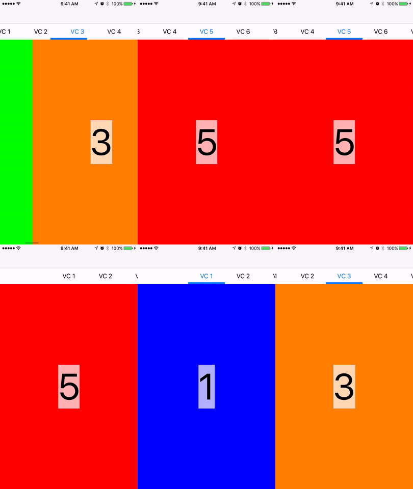
The ScrollingTabController provides a tab based container view with navigational tabs at the top and a swipeable content area below. This component follows a similar design and functionality as the Android tab interface. The following features are supported:
- Support for a large number of tabs and view controllers.
- Customizable tab cells, dividers, and delegate callbacks to configure each cell
- Customizable selection indicator
- Dynamic tab sizes
- Customizable tab selection positioning.
The preferred method to install is to use CocoaPods
pod 'WillowTreeScrollingTabController'
The ScrollingTabController supports instantiation either through InterfaceBuilder or through code and may also easily be subclassed to provide the necessary data and view controllers. The ScrollingTabControllerExample project shows the basic subclassing method of creating the view controller. The basic setup involves the following:
- Provide the controller with the set of view controllers that it will manager through the
viewControllersproperty. - Implement the
func tabView(tabView: ScrollingTabController, configureTitleCell cell: UICollectionViewCell, atIndex index: Int) -> UICollectionViewCell?
protocol method of ScrollingTabControllerDataSource to provide the titles for the tabs in the view controller.
There are several options for customizing the tab controller. In addition to the ability to configure the tab cells by implementing the TabDataSource protocol, the ScrollingTabController itself has the following properties to configure appearance:
sizeTabItemsToFit- Specifies if the tabs should resize to fit the size of the tab titlecenterSelectTabs- Specifies if the selected tab should remain centered in the view
In addition, even more customization of the tab bar itself can be had by accessing the tabBar property of the controller. The tab bar has the following properties to configure appearance.
selectionIndicatorOffset- Specify the offset of the selection indicator from the bottom of the viewselectionIndicator- Direct access to change the selection indicator viewselectionIndicatorHeight- Height of the selection indicatorselectionIndicatorEdgeInsets- Edge insets for the selection indicatorclassForCell- Custom class to use for the tabsclassForDivider- Custom decorator view to use for tab separators
Update to Swift 3.
When the view controller specified an initial tab before it was displayed, that tab was not set before the appearance happened. This changes the order so that the tab is selected in viewWillAppear to fix the issue.
- Add support for programatically channging the selected tab. You can now call
- Fix crash when the bounds of the tab controller were 0.
- Manually manage appearance calls to child VCs
- In order to support only calling the view lifecycle calls (willAppear, didAppear, willDisappear, didDisappear) when the child view controller is in that state, update the scrolling tab controller to manually control the view lifecycle of the child controllers.
- Add support for changing the height of the tab bar.
- Add support for cell highlighting.
- Breaking API change of removing the data source delegate to the scrolling controller. This was not used heavily and lead to confusion. The new API is much more in-line with UITabBarController
We are always open to contributions and pull requests on GitHub. Please follow us at @willowtreeapps on Twitter or http://www.willowtreeapps.com
