Using pitch detection to graph the opening glissando in "Rhapsody in Blue"
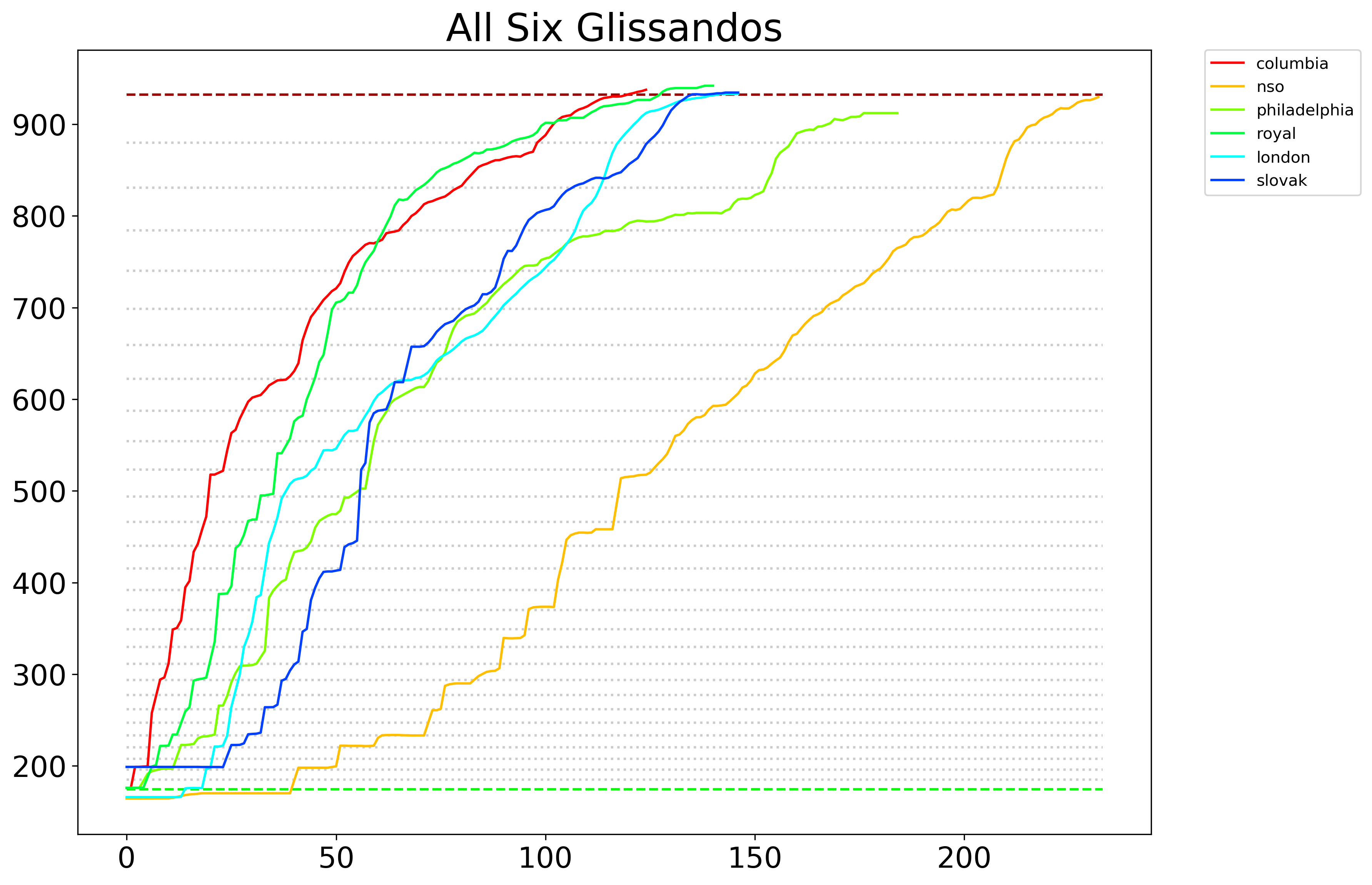
George Gershwin's Rhapsody in Blue, which debuted in 1924, famously beginnings with a clarinet trill that launches into a glissando in which the clarinets bends the pitch all the way from the F below middle C on a piano to a high B♭, spanning two-and-a-half octaves in a continuous pitch. It's up to the clarinetist how she wants to get there—in animation terms, she chooses which easing function to apply to the tween. These scripts plot six different versions to visualize how different players attack this challenge.
Here are the complete performances on YouTube for six of my favorite examples:
- Columbia Symphony Orchestra (Leonard Bernstein)
- National Symphony Orchestra (Jon Kimura Parker)
- Philadelphia Orchestra
- Royal Philharmonic Orchestra
- Slovak National Philharmonic Orchestra
- London Symphony Orchestra
I've already extracted just the glissandos from each performance, which you can find (and tinker with, if you desire) in the samples directory. If you want to add any performances, just tack the YouTube URL and start and end times to performances.json. To download the clips, you'll need Node.js and ffmpeg:
npm install
brew install ffmpeg # for Mac users
Then, assuming you added your clip to the JSON file correctly, just run:
node getAudio --names=[name(s) of new performances in JSON file]
(For example, if you were to tinker with the start_time of the performance with the name nso and add one called losangeles, you'd run: node getAudio --names=nso,losangeles). Note that the start_time and end_time parameters are accurate down to 100ths of a second and may require some trial and error or zooming in with Audacity, though the Python script we'll be using does trim noise at the beginning. If you want to add a new clip, please add it to the JSON file and generate it with the script, not by hand.
While I'm a Node.js guy, this is a good example of where Python has more mature bindings to advanced algorithms—specifically, in this case, the YIN algorithm with a Fast Fourier transform, which Python's aubio toolkit provides, but is still marked as "To Do" in the leading Node module, node-pitchfinder.
To set up the Python virtual environment, it's best to install Miniconda and then run:
conda env create --file environment.yml -n gershwin
conda activate gershwin
This should install the correct dependencies. I don't use conda very often so do let me know if you run into trouble. The dependencies are also in [requirements.txt].
The Python scripts are Jupyter notebooks in the notebooks directly, which you can fire up with jupyter notebook or any Python editor of your choice.
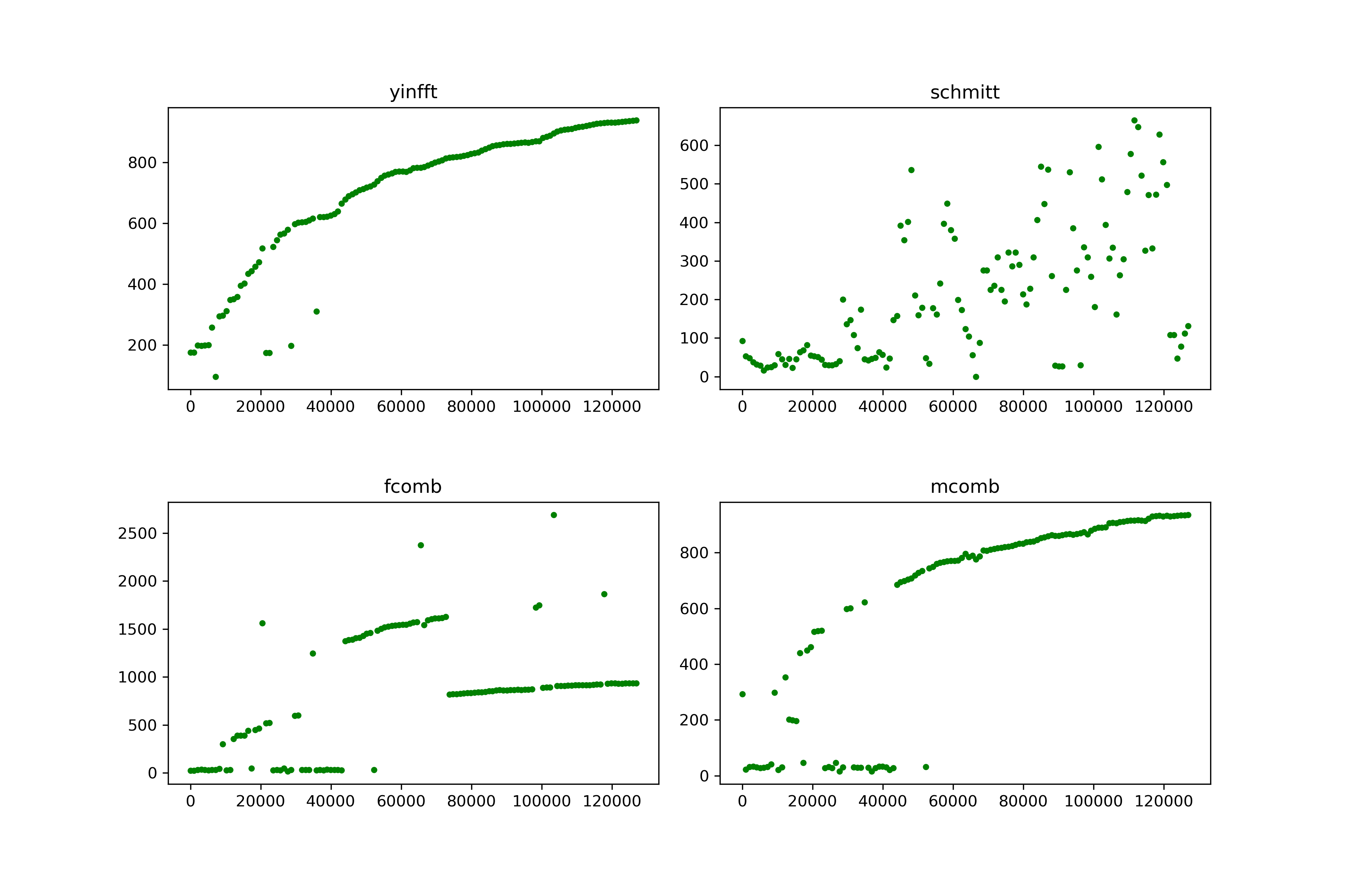
I know very little about pitch detection, but of the handful of pitch-detection algorithms supported by the aubio.pitch function, here's a comparison of the output for the sample columbia.wav, which you can tinker with in notebooks/Test_Pitch_Detection.ipynb:
It's pretty clear that yinftt (YIN with Fast Fourier) is the best bet. But none of these methods are going to produce a perfect glissando. Not only are harmonics complicated; sometimes someone in the front row coughs.
So I've written a fairly simple algorithm in notebooks/Generate_Glissandos.ipynb to rein in the outliers, under the premise that no frequency should be significantly lower than the preceding one. We'll be estimating the frequencies at a "hop size" of 1024, which, given the standard sampling frequency of 44100 Hz, comes out to 43 data points per second. Glissandos are typyically around 4 seconds long.
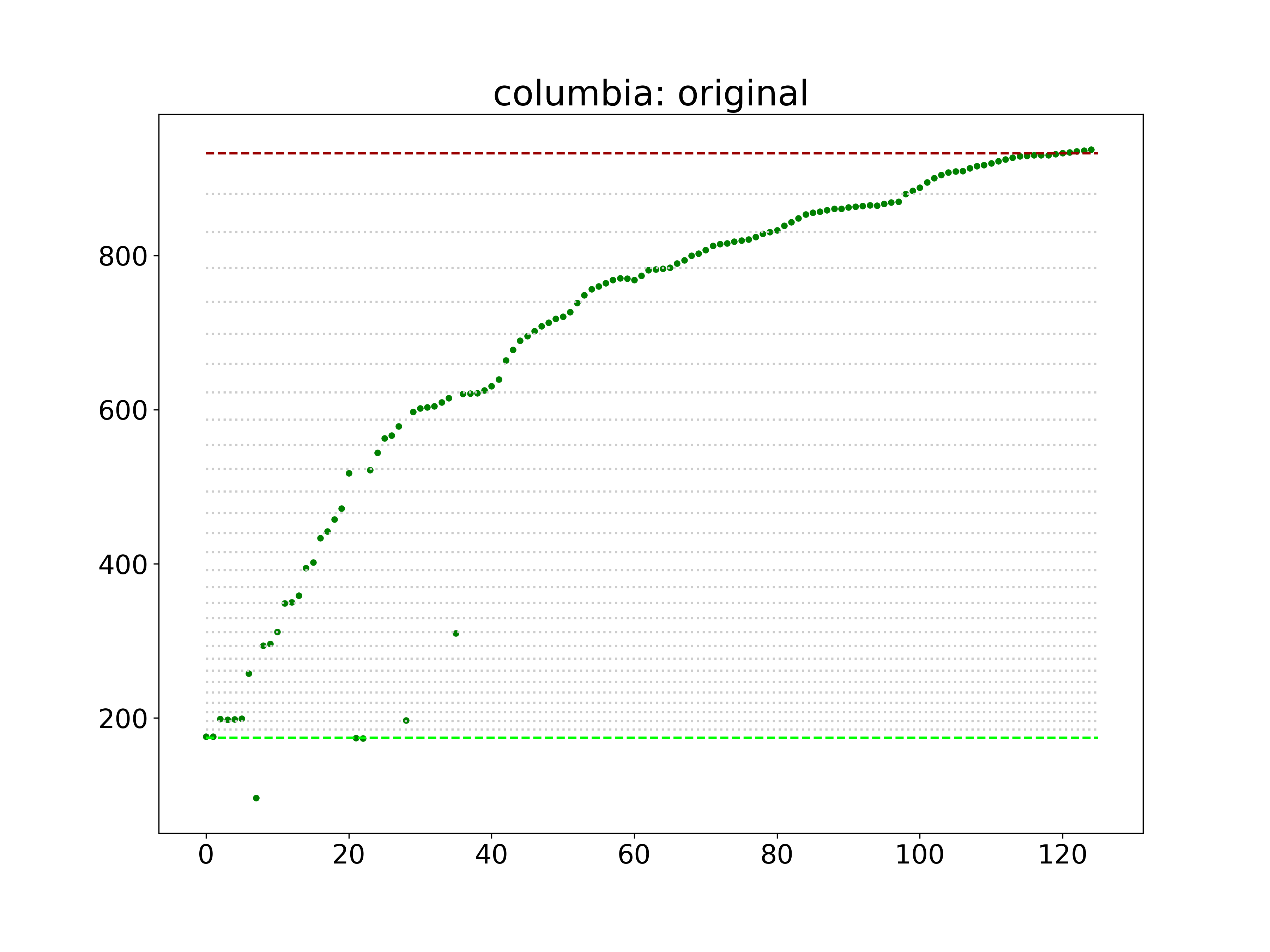
The Python script notebooks/Generate_Glissandos.ipynb starts with the YIN/FFT algorithm and both graphs the output, if you're using an interactive kernal like Jupyter, and writes the graph to outputs/images/[name]_original.png. Some initial results are better than others. For example, here's the raw output for the Columbia Symphony Orchestra:
To correct for the inevitable noise, the "correction" algorithm guesses where the outliers ought to be. It's not perfect and arguably overfits some of the time, but it's reasonably consistent across the six samples. Bear in mind that some clarinetists begin with a step-wise crawl before launching into the bend.
In short, the script uses a hyperparamter THRESHOLD to look for any pitch that's below the previous sample my more than a hair, than either averages that outlier with the following note, if the following note is higher than the preceding one, or just brings the outlier in line with the previous pitch:
THRESHOLD = 0.001

def correctPitches(pitches, name):
    corrected = [ ( pitch, "green" ) for pitch in pitches ]

    for i in range(1, len(corrected)):
        current = corrected[i][0]
        previous = corrected[i-1][0]
        diff = (previous - current) / previous

        if diff > THRESHOLD:
            if (i < len(corrected) - 1 and (corrected[i+1][0] - previous) / previous > THRESHOLD):
                average = (previous + corrected[i+1][0]) / 2
                #print("averaging", i, current, corrected[i+1][0], previous, diff, average)
                corrected[i] = ( average, "orange" )
            else:
                #print('moving up note at %s from %s to %s (%s)' % (i, current, previous, diff))
                corrected[i] = ( previous, "red" )

    data_path = "../output/data/%s.csv" % name

    with open(data_path, "w") as csvfile:
        spamwriter = csv.writer(csvfile)
        spamwriter.writerow(["freq"])
        spamwriter.writerows(map(lambda x: [x[0]], corrected))
        print('Wrote corrected frequencies to ../output/data/%s.csv' % name)

    return corrected
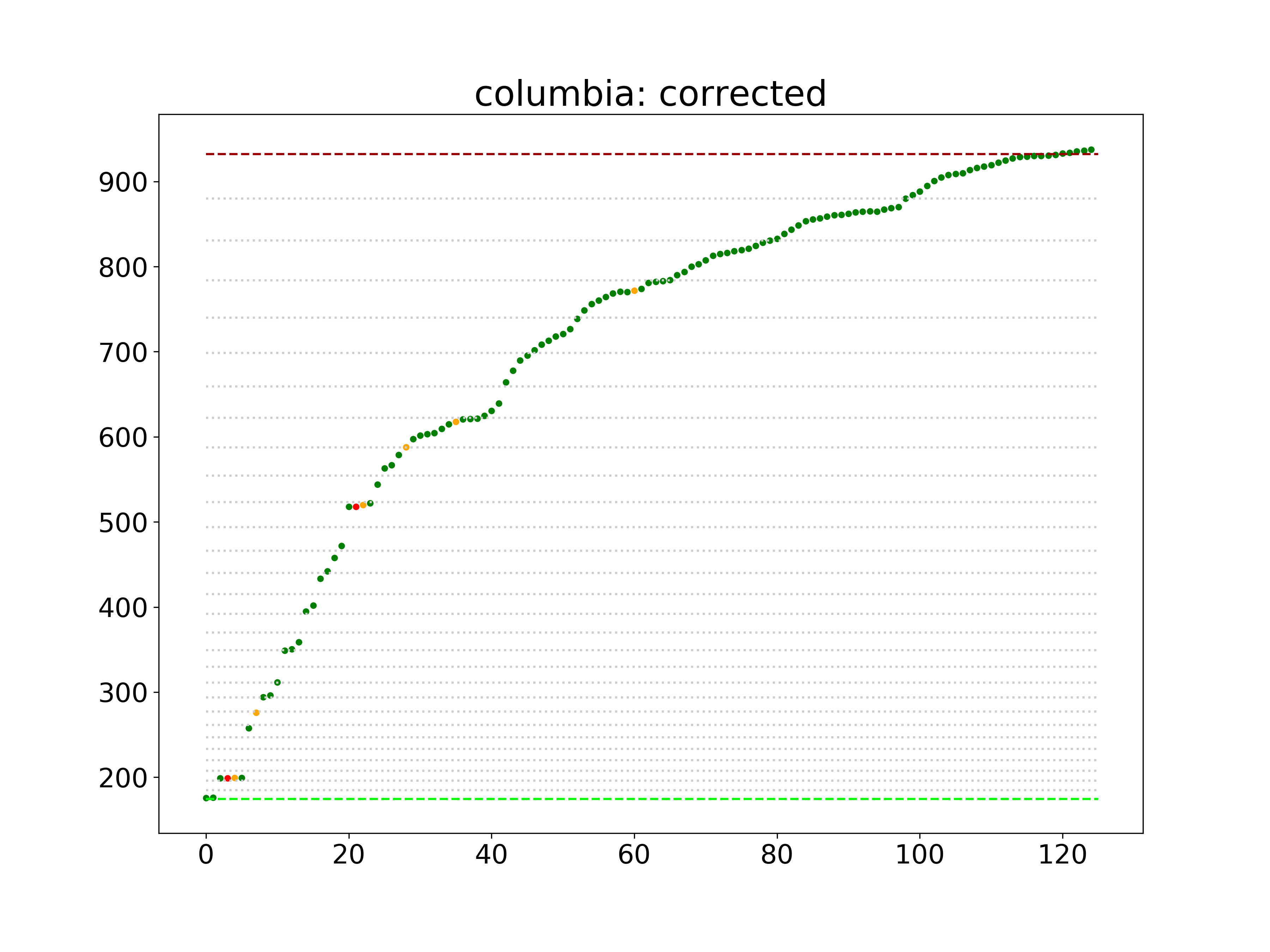
Here's how it fixes up the Columbia output. The orange dots are the averaged corrections and the red ones are those that fall back to the previous sample.
The Python script outputs three files: Two images in the output/images directory that graph the algorithm's raw output and corrected output, and a csv file in the output/data directory that contains the smoothed frequency for each point.
At the end of the file, you'll see a loop to run through each sample. Now let's compare them and see how they stack up! You can load the csv files in notebooks/Compare_Results.ipynb.
This also writes an image called comparison.png to the output/images directory and, for the sake of convenience, writes a JSON files called glissandos.json to the output/data directory.
To test if we did this right, we can generate .wav files from the outputted data:
node makeWave.js --name=columbia
That examples outputs a file called columbia.wav to the output/sounds directory. Warning: These do not sound attractive! They won't shatter your glasses—the frequencies are identical—but they may irritate the cat.


